Table of Contents
- Why Most B2B Pages Underperform
- Examples of B2B Landing Pages by Funnel Stage and Intent
- 30-Day Plan to Improve B2B Page Performance
- Common Mistakes and Fast Fixes
- FAQ
Most B2B teams can launch a campaign page quickly. Far fewer teams can launch one that consistently turns qualified clicks into high-quality pipeline. That difference usually comes from structure and decision logic, not from cosmetic design quality.
A B2B page has to do more than collect form submissions. It has to help multiple stakeholders evaluate relevance, business value, implementation risk, and next-step clarity in a short attention window. If those factors are misaligned, you can get activity without real pipeline movement.
Many teams study successful pages and copy surface patterns like layout style, icon sets, or headline tone. The stronger move is to extract underlying conversion logic: section sequence, objection timing, proof placement, and qualification depth.
This guide gives you a practical way to use examples of B2B landing pages without copying wording or structure. The goal is actionable: better-fit conversions, clearer routing, and stronger downstream sales outcomes.
sbb-itb-bf47c9b
Key Takeaways
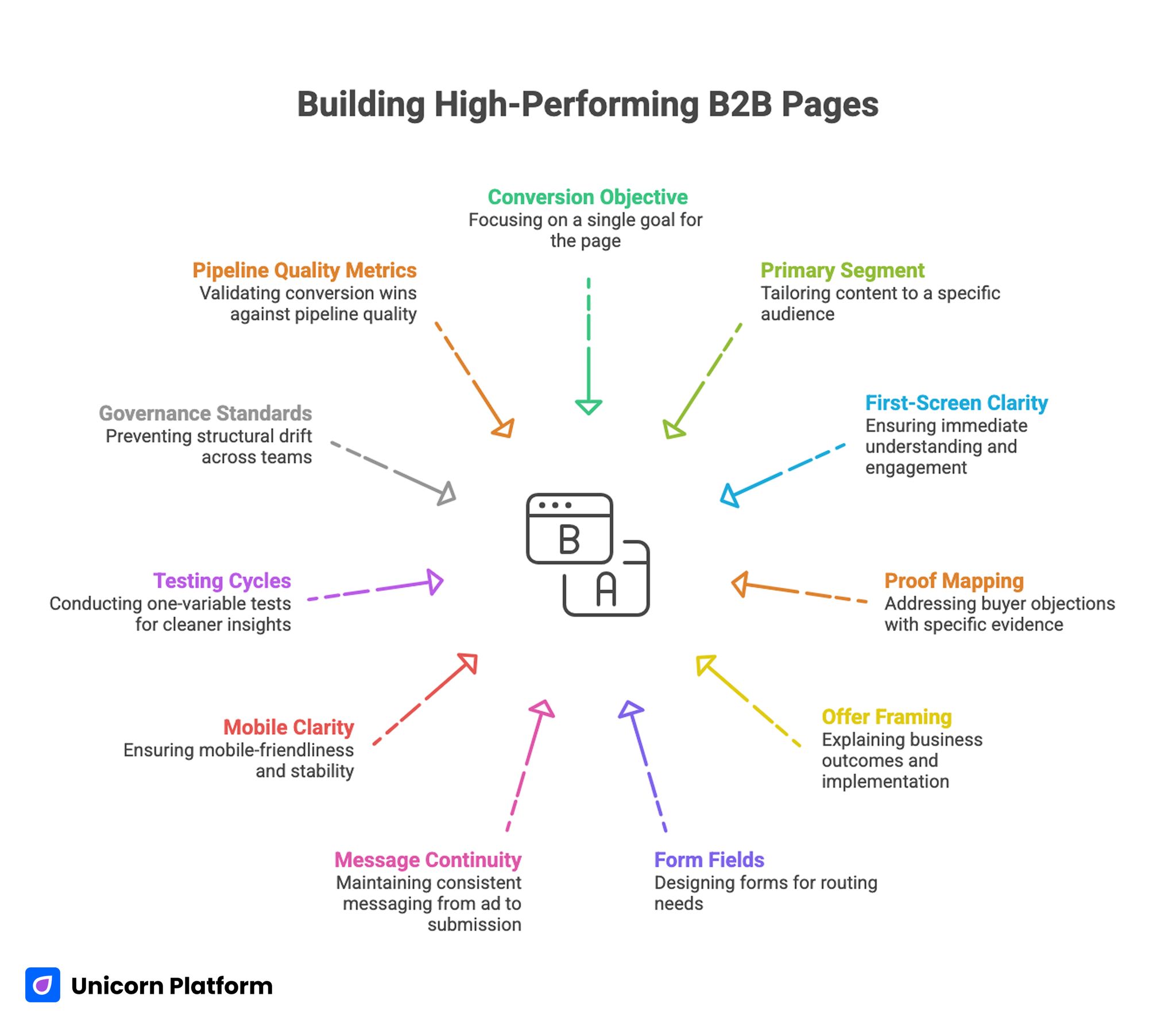
Building High-Performing B2B Pages
- High-performing B2B pages are built around one conversion objective and one primary segment.
- Strong first-screen clarity improves both conversion rate and lead quality.
- Proof should be mapped to specific buyer objections, not gathered in one generic block.
- Offer framing should explain business outcome and implementation scope.
- Form fields should reflect routing needs, not internal curiosity.
- Message continuity from ad click to post-submit flow is a major performance lever.
- Mobile clarity and load stability directly impact campaign efficiency.
- One-major-variable testing cycles generate cleaner insights.
- Governance standards prevent structural drift across teams.
- Conversion wins should be validated against pipeline-quality metrics.
Why Most B2B Pages Underperform
The first issue is relevance ambiguity. Visitors arrive with a problem and budget pressure, but the page opens with broad brand messaging that does not reflect role context or buying stage.
The second issue is mixed intent on a single page. Teams try to educate first-time visitors, compare alternatives, and close demo-ready buyers in one flow. Competing narratives usually reduce confidence for all segments.
The third issue is trust timing. Case studies, proof signals, and implementation detail appear after the first major CTA. Buyers are asked to commit before they can reasonably validate risk.
The fourth issue is over-friction in forms. Teams ask for too much information on first contact, then lose qualified visitors who are interested but not ready for deep intake.
The fifth issue is weak post-submit continuity. Confirmation language is generic, response expectations are unclear, and momentum drops immediately after conversion.
What Strong B2B Landing Pages Consistently Do
Reliable pages use a clear decision sequence: fit, value, proof, action, and continuity. This sequence reduces interpretation burden and makes next steps feel safer.
They also keep one dominant objective per variant. Even when secondary actions exist, route hierarchy stays clear. Users do not have to guess which action is intended.
Another common pattern is objection-aware design. Instead of presenting proof as decoration, strong pages place evidence where hesitation appears: near pricing context, implementation questions, and commitment points.
Finally, high-performing pages protect message continuity from click source through post-submit handoff. Consistency across that journey improves both conversion quality and sales readiness.
If your team wants a reusable framework for section jobs before writing, this high-converting landing page structure guide is useful for defining page logic before design decisions lock.
Examples of B2B Landing Pages by Funnel Stage and Intent
The most useful way to study examples is to group them by buyer readiness, not by visual style. Below are twelve practical archetypes with when-to-use guidance and common failure modes.
1) Demo Request Page for Mid-Funnel Buyers
Use this archetype when users already understand the category and need product-specific validation. The page should emphasize business outcome, implementation fit, and next-step clarity.
Failure mode: generic headline plus hard form. Fix by clarifying who the demo is for, what will be covered, and what users receive after submission.
2) Product Tour Signup Page for Early Evaluation
This structure works for buyers who want low-commitment exploration before speaking to sales. It performs best when value is concrete and onboarding effort is transparent.
Failure mode: feature dump without workflow context. Fix by showing one practical journey from problem to first value, then offering a guided tour path.
3) ROI Calculator Entry Page
Use this model when buyers need financial justification to continue internal conversations. It is especially useful in long cycles with CFO or operations stakeholders.
Failure mode: calculator positioned as gimmick. Fix by clarifying assumptions, data inputs, and how results should be interpreted.
4) Audit or Assessment Offer Page
Assessment pages can perform well for service-led and hybrid B2B models. They convert when diagnostic value is credible and scope is realistic.
Failure mode: audit offer too broad to trust. Fix by defining method, output format, and delivery timeline before form submission.
5) Industry-Specific Solution Page
Use this archetype when one vertical has clear terminology, compliance concerns, or workflow differences. It helps increase relevance for segment-specific campaigns.
Failure mode: replacing only headline language while keeping generic body content. Fix by adapting objections, proof, and success criteria to the target vertical.
6) Use-Case Page for Functional Teams
This page type targets one job-to-be-done such as onboarding automation, lead routing, or forecasting clarity. It works when business users are searching for practical outcomes, not broad category education.
Failure mode: technical depth without decision framing. Fix by connecting mechanism to measurable team impact and implementation boundaries.
7) Comparison Page for Competitive Evaluation
Comparison pages are effective when buyers are actively weighing alternatives. They should reduce ambiguity without sounding defensive.
Failure mode: one-sided claims that ignore tradeoffs. Fix by using clear criteria, acknowledging fit boundaries, and clarifying who gets the most value from your approach.
8) Migration or Switching Page
Migration pages help buyers who already use another solution and worry about transition cost. This archetype should focus on risk reduction and process visibility.
Failure mode: strong promise, weak transition detail. Fix by outlining migration phases, support model, and expected time-to-stability.
9) Webinar or Workshop Registration Page
Use this model for demand capture when audience education is needed before direct sales engagement. Strong pages align topic depth with role-specific pain.
Failure mode: event promotion without business relevance. Fix by connecting session outcomes to practical decisions users must make after attending.
10) Template or Resource Download Page
Resource pages convert best when the asset is directly tied to an in-progress decision. They should attract qualified demand, not vanity leads.
Failure mode: broad content offer that captures low-fit contacts. Fix by narrowing asset scope to one concrete challenge and one target role.
11) Pricing Conversation Page
This archetype works when users need commercial clarity before engaging sales. It should explain packaging logic and qualification path without forcing full pricing disclosure if that is not your model.
Failure mode: vague pricing language with no action guidance. Fix by clarifying what inputs shape pricing and what users should expect in the first pricing conversation.
12) Partner or Co-Marketing Offer Page
Use this page for referral, integration, or channel growth motions. It should clarify mutual value and operational fit for both sides.
Failure mode: partnership language without practical pathway. Fix by defining ideal partner profile, engagement model, and first collaboration milestone.
How to Choose the Right Page Archetype
Archetype selection should start with one clear objective. Decide whether the page is meant to generate qualified conversations, capture segment leads, or accelerate active evaluations.
Then map intent stage. Cold search audiences usually need stronger context and proof depth, while warm retargeting audiences need faster objection resolution and clearer action paths.
A simple decision model:
- Early-stage intent: educational and low-commitment formats.
- Mid-stage intent: solution-fit and use-case pages.
- Late-stage intent: demo, pricing, and migration pages.
If you run mixed traffic through one destination, build controlled variants with shared architecture. This keeps governance manageable while improving relevance by channel.
Messaging System for B2B Conversion Clarity
Copy should reduce uncertainty in business terms. High-performing pages explain practical outcome, mechanism, and expected implementation effort before asking for commitment.
A reliable message sequence is:
- Role context and problem framing.
- Outcome with measurable direction.
- Mechanism in plain operational language.
- Confidence cue linked to buyer risk.
- Next-step CTA with expectation copy.
This sequence can adapt across industries without losing clarity. It also makes testing easier because each block has a specific job.
Avoid overusing transformation language without boundaries. In B2B settings, realistic scope often outperforms ambitious phrasing because buyers prioritize reliability.
Trust Architecture and Proof Placement
Trust in B2B is built through relevance, not volume. Ten generic logos can be less persuasive than one proof point matched to the buyer's core concern.
Map proof to common objections:
- Outcome risk: case evidence with context and constraints.
- Implementation risk: onboarding detail and timeline transparency.
- Team risk: support model and ownership clarity.
- Commercial risk: contract and commitment expectations.
Place each proof element near the decision stage where that objection appears. Distributed trust generally converts better than one stacked social-proof section.
For teams refining hesitation points across the full page, this user behavior optimization guide is useful for prioritizing friction fixes by observed behavior.
Form Design and Qualification Strategy
A B2B form should collect routing essentials, not full discovery data. Over-collection at first touch usually lowers completion quality and creates avoidable drop-off.
Use progressive qualification where possible. Gather minimum actionable data first, then collect deeper detail in follow-up steps once trust is established.
Field order also matters. Start with low-friction context, then move to qualifying inputs only where needed. This protects momentum while preserving downstream quality.
Always pair forms with expectation copy. Users should know who responds, what happens next, and when to expect follow-up.
Mobile and Technical Reliability for B2B Campaigns
Even in B2B, a large share of traffic arrives on mobile during early research. If first-screen clarity or form usability breaks on mobile, campaign efficiency drops quickly.
Prioritize stable layout, readable hierarchy, clear CTA access, and reliable input behavior. Mobile quality should be treated as a launch gate, not a post-launch patch.
Keep media payloads controlled. Heavy visuals that delay core message visibility can weaken conversion even when desktop performance looks strong.
When your team needs a repeatable responsive process, this mobile-friendly landing page workflow helps maintain decision flow across breakpoints.
Optimization Workflow That Produces Reliable Learning
High-output teams often run too many simultaneous edits, then struggle to attribute results. Structured testing cycles prevent this noise.
Use one-major-variable tests while keeping page architecture stable. Typical high-leverage variables include first-screen relevance, proof placement, and CTA expectation copy.
A practical cycle:
- Week 1: baseline and instrumentation QA.
- Week 2: first-screen relevance hypothesis.
- Week 3: trust placement hypothesis.
- Week 4: action and form clarity hypothesis.
Document hypothesis, expected signal, and decision threshold before launch. This keeps interpretation objective and improves knowledge transfer across teams.
Role-Based Messaging Matrix for B2B Buying Committees
Most B2B conversions involve more than one evaluator. Even if one person submits the form, other stakeholders often influence the final decision. Pages perform better when messaging anticipates this committee dynamic.
A practical approach is to map three to four common evaluator roles and define what each role needs to believe before moving forward. For example, an economic buyer may need budget confidence, an operational buyer may need implementation clarity, and a technical reviewer may need integration confidence.
You do not need separate pages for every role in every campaign. Instead, use one core architecture and add concise role-aware proof or clarifying copy where objections diverge.
Use a simple matrix for planning:
- Role: who influences this decision.
- Priority concern: what risk they are trying to avoid.
- Required proof: what evidence reduces that risk.
- Section location: where this evidence should appear.
- Next-step requirement: what they need before agreeing to proceed.
This matrix makes collaboration easier across marketing, sales, and product teams. It also improves testing quality because each content change has a clear rationale tied to a stakeholder concern.
When teams skip role mapping, pages often become generic and overlong. They mention many value points but fail to resolve decision-critical objections for any specific evaluator.
Governance Standards for Multi-Campaign Page Operations
As B2B programs scale, page quality often declines due to speed pressure. Different contributors launch variants for paid search, partner campaigns, webinars, and outbound sequences. Without standards, section logic drifts and results become inconsistent.
A governance framework keeps experimentation fast while protecting conversion integrity. Start by defining mandatory components for every page type: first-screen fit, proof near friction points, action hierarchy, and post-submit expectation copy.
Then document optional components by use case. For example, comparison pages may require a criteria block, while audit-offer pages may require clear deliverable definitions. This reduces debate during production and helps teams launch faster.
Operational standards should include:
- Approved CTA naming patterns by intent stage.
- Form-field limits by traffic temperature.
- Required trust elements for high-friction offers.
- Mobile QA gates before paid scaling.
- Event taxonomy standards for section-level analysis.
Ownership also needs to be explicit. One person should own conversion architecture, one should own editorial clarity, and one should own analytics integrity. Shared ownership without clear responsibility usually creates contradictory edits.
Version history is another practical safeguard. Record each major change with date, hypothesis, section edited, and observed impact. This prevents repeated low-value experiments and improves onboarding for new team members.
30-Day Plan to Improve B2B Page Performance
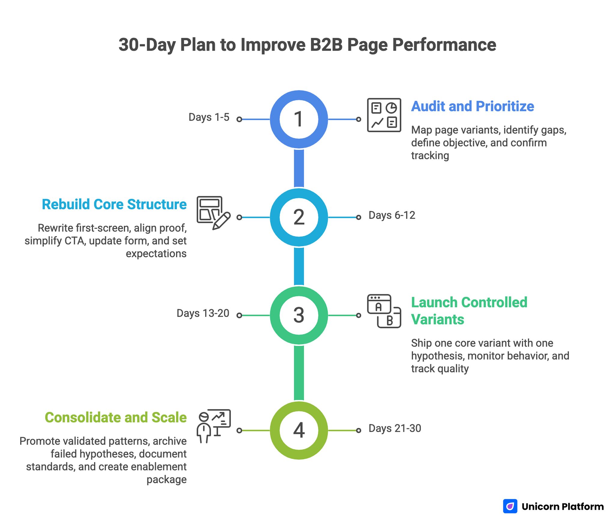
30-Day Plan to Improve B2B Page Performance
Days 1-5: Audit and Prioritize
Map current page variants by traffic source and intent stage. Identify relevance gaps, trust delays, and route conflicts.
Define one primary objective and one quality metric for the next cycle. Confirm tracking consistency before structural edits.
Days 6-12: Rebuild Core Structure
Rewrite first-screen and mechanism sections for role clarity. Align proof blocks with top objections and simplify CTA hierarchy.
Update form fields for minimum viable qualification and add clear post-submit expectations.
Days 13-20: Launch Controlled Variants
Ship one core variant with one major hypothesis. Keep secondary variables stable to preserve attribution quality.
Monitor section-level behavior and quality outcomes, not just top-line submissions.
Days 21-30: Consolidate and Scale
Promote validated patterns into your default page blueprint. Archive failed hypotheses with brief reasons and evidence.
Document new standards so future launches start from proven logic rather than from scratch.
Create a short enablement package for sales and RevOps teams at this stage. Include the live page objective, segment assumptions, qualification logic, and expected post-submit sequence so handoff behavior stays aligned with page promises. This package reduces friction between marketing and sales and improves consistency in first-touch conversations. It also gives the next campaign team a practical starting point, so each launch builds on verified learnings rather than resetting assumptions.
Common Mistakes and Fast Fixes
Mistake 1: Broad first-screen promise with no role context
Fix: Define audience, outcome, and next step in one clear opening sequence.
Mistake 2: Proof isolated in one section at the bottom
Fix: Place trust cues where objections appear, especially near commitment moments.
Mistake 3: Heavy first-touch form for cold traffic
Fix: Use progressive qualification and keep first-step friction proportionate to intent.
Mistake 4: Multiple equal-priority CTAs
Fix: Keep one dominant path per variant and make secondary actions clearly supportive.
Mistake 5: Testing many variables at once
Fix: Change one major variable per cycle and keep architecture stable for cleaner learning.
Mistake 6: Evaluating success by submissions alone
Fix: Include lead acceptance, meeting quality, and pipeline progression in performance review.
FAQ: Examples of B2B Landing Pages
How should I use examples of B2B landing pages without copying other websites?
Use them to extract logic, not wording. Focus on sequence, objection handling, and action hierarchy, then rebuild those patterns in your own voice and offer context.
Which page archetype usually works best for SaaS demand capture?
For many SaaS teams, demo-request and use-case pages perform well when intent is mid-to-late funnel. Early-stage audiences often need educational or workshop-style entry points first.
Should one page serve both cold and warm traffic?
It can, but controlled variants often perform better. Keep the same architecture while adjusting first-screen framing and proof emphasis by intent stage.
How many proof elements should a B2B page include?
Include enough to resolve top objections, not every proof asset you have. Relevance and placement usually matter more than volume.
What should appear near a B2B form?
Add expectation copy, response timing, and clarity on what the first interaction includes. This reduces uncertainty and improves completion quality.
Are longer B2B pages better than shorter pages?
Length should match decision complexity. Complex offers need more context, but each section still needs a specific conversion job.
What is the first thing to test when performance stalls?
Test first-screen relevance and route clarity first. If users cannot confirm fit quickly, downstream changes rarely recover performance.
How do I improve lead quality without losing too much volume?
Refine offer targeting, tighten first-screen relevance, and adjust qualification flow gradually. Abrupt friction increases often hurt both volume and quality.
Can templates still work for high-quality B2B conversion?
Yes, when template structure is adapted to your objective, segment, and objection map. Defaults alone rarely perform well.
Which metrics matter most after launch?
Track conversion plus quality indicators such as accepted leads, meeting attendance, and opportunity progression. That combination shows real business impact.
Final Takeaway
Strong B2B page performance comes from conversion logic, not design novelty. When teams align structure, proof timing, qualification depth, and testing discipline, results become more predictable.
Use examples as strategic inputs, then build original pages around your buyer journey and offer model. That approach produces cleaner experimentation and stronger pipeline quality over time.
A structured learning cycle on every launch helps your page system improve faster than isolated redesign efforts.