Table of Contents
Most mobile product teams do not fail because they cannot drive clicks. They fail because the page after the click does not reduce uncertainty fast enough. Visitors arrive with interest, scan the first screen, and leave before they understand why the product is relevant to their specific workflow.
That gap is expensive. Traffic costs increase, creative fatigue grows, and teams start over-testing ad angles while the underlying page logic stays weak. In many cases, the page looks modern but still underperforms because message order, trust placement, and action flow are not aligned.
A strong conversion page for an app should be treated as an operating system, not a one-time design asset. It needs clear section jobs, clear route hierarchy, and clear post-submit continuity so every update improves outcomes instead of creating drift.
This guide gives a full framework you can run in Unicorn Platform. It focuses on practical decisions that improve both conversion rate and activation quality, so the leads or installs you capture are more likely to become retained users.
sbb-itb-bf47c9b
Key Takeaways
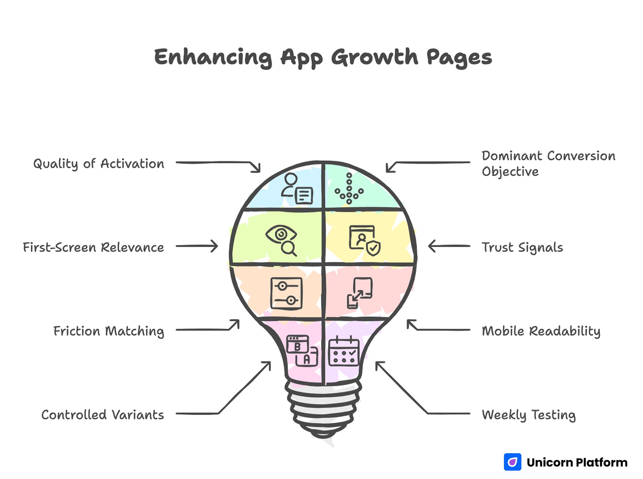
Enhancing App Growth Pages
- App growth pages should optimize for quality of activation, not just front-end click-to-submit volume.
- One page should have one dominant conversion objective per campaign cycle.
- First-screen relevance and outcome clarity are the highest-leverage improvements.
- Trust signals should appear near action points, not only in bottom-of-page blocks.
- Form and CTA friction should match user readiness stage.
- Mobile readability and interaction reliability should be treated as release gates.
- Controlled variants should use one shared architecture to keep learning clean.
- Weekly testing works best when one major variable changes per cycle.
Why App-Focused Conversion Pages Underperform
Underperformance usually begins with positioning ambiguity. The headline sounds broad, the subheadline adds more abstract language, and the visitor still cannot answer a basic question: is this product for someone like me right now.
The second issue is feature stacking without decision guidance. Pages list capabilities, screenshots, and claims, but they never explain which user problem is solved first and what the first success moment looks like. Users delay action because expected value remains vague.
The third issue is weak trust timing. Many teams place proof far below the first action point, forcing users to choose before they see enough confidence cues. This sequence is especially costly on mobile, where attention windows are short.
The fourth issue is handoff mismatch. Ad or creator messaging promises one experience, while the page and post-click flow communicate another. Even when top-level conversion improves, activation quality can decline because expectations were set incorrectly.
What App-Landing Pages Must Do in 2026
A high-performing page should handle five jobs in one coherent flow. It should establish fit, define near-term value, reduce risk, guide one action path, and preserve momentum after action. If one of these jobs is weak, performance volatility increases with every campaign launch.
This means design quality alone is not enough. Good visuals help, but conversion stability comes from information architecture that mirrors how people decide under uncertainty.
In practical terms, your page should answer these questions before asking for commitment:
- Who is this product for and who is it not for?
- What concrete result can users expect first?
- How much effort is required to get first value?
- What trust evidence supports the claim?
- What happens immediately after click or submit?
When those answers are explicit, both conversion quality and downstream onboarding consistency improve.
A Conversion Sequence That Improves Install Quality
Users tend to evaluate app offers in a predictable order: relevance, mechanism, proof, effort, and action. Pages that preserve this sequence typically produce stronger install intent and better activation behavior.
Use this flow as a default structure:
- Relevance: audience and use-case fit.
- Outcome: what improves first and why it matters.
- Mechanism: how the product delivers that outcome.
- Confidence: proof, constraints, and reliability cues.
- Action: one clear next step with expected timeline.
Breaking this order creates avoidable uncertainty. Asking for install before clarifying first value often drives low-intent activity and higher churn risk.
If your team needs a repeatable architecture baseline, this step-by-step landing page structure guide is useful for defining section roles before copy iteration starts.
First-Screen Design Rules for App-Landing Pages
The opening block should do one thing well: help the right user self-identify and move confidently to the next section or action. It should not try to tell the whole product story.
A practical first-screen stack includes audience context, one concrete outcome, one confidence cue, and one dominant CTA. Supporting copy should reduce interpretation burden, not introduce additional marketing themes.
Outcome language usually performs better than generic aspiration language. "Reduce weekly planning overhead in one dashboard" is often stronger than "the smartest way to work" because it names a specific operational benefit.
CTA text should also set expectation. If the next step is a demo preview, say that. If it is an install path, clarify what users can do immediately after installing.
First-Screen Quality Check
Run these checks before launch:
- A first-time visitor can explain the product fit in one sentence.
- The main outcome is explicit and practical.
- Only one primary action is visually dominant.
- A trust cue is visible without deep scrolling.
If one check fails, revise before scaling traffic.
Messaging Model: Problem to First-Value Journey
Strong copy for app growth pages should be calm, specific, and execution-oriented. Overly broad language attracts curiosity clicks but weakens qualified action. Industry research also supports the importance of simple, clear messaging on landing pages. Studies summarized by Search Engine Journal show that pages written in simpler language often convert significantly better than complex marketing copy because visitors can understand value faster and with less cognitive effort.
A useful message model is problem context, workflow mechanism, first-value timeline, and boundary clarity. Boundary clarity matters because users trust products more when limitations are acknowledged clearly.
Teams often skip boundary language out of concern that it will reduce conversion. In practice, realistic scope statements usually improve conversion quality by filtering low-fit traffic early.
Message Components That Improve Quality
- Role-aware problem statement.
- Mechanism described in plain language.
- Time-to-first-value expectation.
- Boundary statement for non-fit scenarios.
- One crisp transition to primary CTA.
This structure creates confidence without hype and lowers mismatch between page promise and product reality.
Visual Strategy for Product Understanding
Visual assets should shorten understanding time, not increase decorative complexity. Screenshots, short motion blocks, and sequence graphics work best when each element explains one job in the user workflow.
The most common visual mistake is UI overload. Teams show many screens at once without context, so users cannot map visuals to outcomes. It is better to show fewer visuals with direct captions tied to user decisions.
Visual order should follow decision flow. Show first-value interaction before advanced options. This helps users evaluate practical onboarding effort and reduces perceived complexity.
When mobile behavior is central to your funnel, this mobile app conversion-page guide helps align screen hierarchy with user intent across devices.
Trust Architecture: Proof Near Decision Risk
Trust is strongest when it appears exactly where hesitation appears. If the first major CTA is above the fold, confidence signals should not be hidden three sections lower.
Use trust blocks that match user objection type. For example, onboarding concerns need setup clarity. Reliability concerns need process transparency. Outcome concerns need context-rich evidence, not generic praise.
A practical trust stack can include:
- Short, specific user outcomes.
- Reliability language around support or stability.
- Clear expectation on onboarding effort.
- Policy and privacy links where relevant.
This approach improves conviction without forcing long testimonial walls that users may skip.
CTA and Route Design by Readiness Stage
Not every visitor should be pushed into the same action. Some visitors are discovery-stage and need low-friction exploration. Others are decision-stage and ready for install or booking.
Keep one primary route per campaign objective and one secondary route for adjacent readiness. Too many equal-priority actions reduce clarity and make analytics harder to interpret.
Primary CTA wording should reflect user outcome. Secondary CTA wording should reduce pressure while preserving relevance. Together, they create cleaner routing and stronger funnel quality.
Route Mapping Example
- Awareness traffic: preview workflow or learn path.
- Evaluation traffic: compare fit and implementation clarity.
- Decision traffic: install, start, or request guided setup.
Clear route mapping is one of the easiest ways to improve both conversion confidence and downstream activation quality.
Form Design for Demo or Waitlist Paths
Some app pages use direct install CTAs. Others use demo or waitlist capture as intermediate conversion steps. In either model, forms should collect only routing-critical data on first touch.
Asking for too much context early can reduce completion and attract low-quality entries from users who rush through fields. A short first-step form plus progressive qualification usually performs better for real pipeline quality.
Field-level reviews should be strict. If a field does not change routing or follow-up value, defer it. Simpler forms with clear helper text often improve both completion rate and data reliability.
Form QA Rules
- Labels remain clear while typing.
- Error messages are actionable and immediate.
- Field order moves from easy to higher effort.
- Submit action remains visible on mobile.
- Confirmation state is explicit and immediate.
These rules catch high-frequency friction that dashboards often hide until volume scales.
Mobile-First QA and Responsive Discipline
Many teams review pages on desktop and assume responsive behavior will hold. That assumption creates conversion loss because real mobile interactions expose different friction points.
Real-device QA should test first-screen comprehension, tap comfort, keyboard behavior, media load sequencing, and action continuity after submit. Each of these can affect conversion quality independently. Performance also plays a measurable role in mobile conversion outcomes. Industry benchmarks show that load speed, visible above-the-fold CTAs, and simplified navigation significantly affect user engagement and completion rates on mobile landing pages.
Responsive quality is not only about layout adaptation. It is about preserving decision order and trust cues across screen contexts.
If your campaign mix depends on cross-device journeys, this responsive landing-page workflow is useful for keeping message hierarchy stable under breakpoint changes.
SEO and Discovery Strategy for App-Landing Pages
Search visibility for app-focused pages improves when intent clusters are explicit and section structure answers practical questions directly. Pages that rely only on visual design often underperform in discovery because they lack semantic clarity.
A practical approach is to include concise definition blocks, implementation-oriented sections, and FAQ coverage tied to real user concerns. This structure helps both readers and search systems interpret page value quickly.
Topic depth should be meaningful, not padded. Each section should answer a specific decision question and support an action path.
For long-term discoverability, keep content freshness visible through routine updates of proof, screenshots, and process details. Freshness signals are especially valuable in app categories where features evolve quickly.
Measurement Stack for Install and Activation Quality
Conversion rate alone does not represent performance health. Teams should track quality signals that connect page behavior to retained usage outcomes.
A balanced measurement stack includes:
- CTA click-through rate by source.
- Submit or install completion quality.
- First-session activation behavior.
- Early retention or return signals.
- Source-level variation in qualification quality.
Use one primary metric and one guardrail for each experiment. This prevents local improvements that hurt downstream performance.
Practical Metric Pairing
- Primary: qualified conversion completion.
- Guardrail: first-week activation consistency.
This pairing is often more informative than high-level volume metrics during rapid iteration periods.
Governance Model for App-Landing Pages
Performance usually declines when publishing speed increases without clear ownership. One contributor edits headline framing, another adjusts form fields, and a third changes follow-up flow, but no shared review process checks how those edits affect the full conversion journey. Over time, results become less predictable even though activity appears high.
A practical governance model uses three role lanes. A messaging owner protects fit clarity and offer consistency. A workflow owner protects form logic, route rules, and continuity signals. A QA owner protects device reliability, event integrity, and release readiness before traffic scaling.
This model should stay lightweight and repeatable. Short checklists are more effective than long process documents when teams are launching weekly. The goal is fast execution with stable quality controls, not bureaucratic approval chains.
A useful pre-release checklist for app growth pages includes:
- first-screen fit and outcome clarity check.
- proof placement validation near primary action points.
- CTA hierarchy and route-logic validation.
- form error-state and helper-text review on real devices.
- confirmation flow and tracking-event verification.
After publish, run a 24-48 hour verification pass focused on quality signals, not only volume. Early review windows catch route mistakes and continuity gaps before they affect larger traffic batches.
Teams that maintain this discipline learn faster because each release has cleaner data and fewer hidden regressions. That consistency is often a bigger advantage than adding more variants at once.
Common Failure Modes and Fixes
Failure Mode 1: Generic audience framing
Pages try to address every user segment with one broad message. Visitors cannot determine fit quickly.
Fix by narrowing first-screen role context and stating explicit use-case boundaries. This helps the right audience self-qualify faster and reduces low-intent conversions that create downstream noise.
Failure Mode 2: Feature-first narrative
Pages list capabilities before explaining user outcomes. Visitors understand what exists, but not why they should care now.
Fix by moving outcome and first-value language ahead of feature detail. Users should understand practical benefit first, then evaluate supporting capabilities with clearer intent.
Failure Mode 3: Proof placed too late
Trust cues are buried below early CTA blocks. Qualified visitors hesitate before confidence is established.
Fix by placing scenario-relevant proof near the first high-intent action area. Align proof type with likely objections so confidence is built at the moment users decide.
Failure Mode 4: Heavy first-touch forms
Too many required fields create friction and low-quality data capture on mobile.
Fix by reducing first-step fields and using progressive qualification post-submit. Collect deeper context after value exchange so completion stays smooth and data quality improves.
Failure Mode 5: Weak confirmation continuity
Users submit but do not understand next steps, timing, or expected response behavior.
Fix by rewriting confirmation states with explicit timeline and one clear next action. This keeps momentum after submission and improves early engagement consistency.
Failure Mode 6: Uncontrolled variant sprawl
Teams launch many page versions without shared structure, making insights hard to compare.
Fix by enforcing one canonical template and controlled high-impact variant surfaces. Keep section order stable so test outcomes remain interpretable across channels and cycles.
30-Day Execution Plan
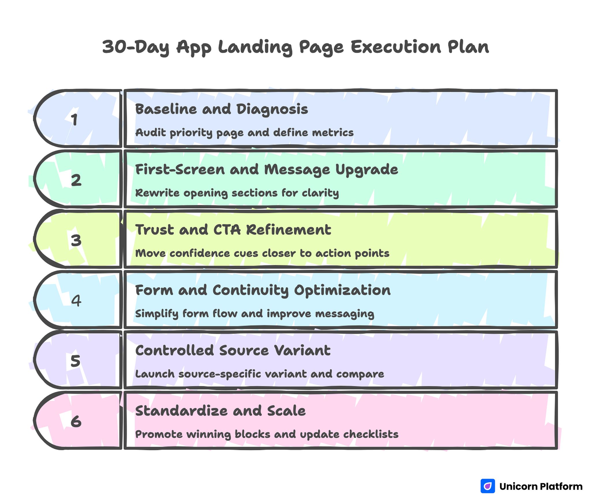
30-Day App Landing Page Execution Plan
Days 1-5: Baseline and diagnosis
Audit one priority page for fit clarity, trust placement, form friction, and mobile interaction quality. Lock baseline metrics and define one primary plus one guardrail metric.
Days 6-10: First-screen and message upgrade
Rewrite opening sections for role-fit clarity and concrete first-value language. Keep route hierarchy stable while this message update is tested.
Days 11-15: Trust and CTA refinement
Move confidence cues closer to action points and improve CTA outcome wording. Validate changes on real devices before live scale.
Days 16-20: Form and continuity optimization
Simplify first-touch form flow, improve helper copy, and strengthen confirmation messaging. Verify event tracking for key steps.
Days 21-25: Controlled source variant
Launch one source-specific variant built from the same architecture. Change one major variable and compare against baseline with pre-defined decision rules.
Days 26-30: Standardize and scale
Promote winning blocks into template defaults, archive weak variants, and update team checklists for repeatable release quality.
90-Day Scale Plan
A 30-day cycle fixes visible bottlenecks. A 90-day plan is what turns those fixes into a compounding growth system that remains stable across campaigns, devices, and traffic sources.
Month 1: Stabilize core conversion architecture
Focus on first-screen relevance, trust placement, route clarity, and continuity messaging. Keep one canonical template and remove low-value variation points that create noise in test results.
By month-end, your team should have clean baseline metrics and clear ownership for message, workflow, and QA decisions. This foundation reduces rework when campaign volume increases.
Month 2: Expand controlled source variants
Create source-level variants from the same architecture and change only high-impact messaging surfaces. Track performance by source and device using primary-plus-guardrail metric pairs.
Documentation quality is critical in this phase. Record each hypothesis, what changed, what improved, and what should be rolled back so lessons are reusable.
Month 3: Harden governance and handoff quality
Turn successful patterns into standardized modules, review checklists, and release gates. Enforce consistency for event tracking, confirmation behavior, and mobile interaction reliability.
Then strengthen handoff rules so post-conversion workflows receive clear context and priority signals. This is the step that converts page-level gains into predictable activation quality at scale.
At the end of ninety days, evaluate success by consistency of outcomes, not isolated campaign spikes. Reliable systems win over time because they keep quality stable while velocity grows.
Running This System in Unicorn Platform
Unicorn Platform is effective for app growth pages when teams combine fast publishing with strict structural discipline. Reusable blocks help maintain consistency while allowing controlled iteration at high speed.
Set one canonical template for fit, value, confidence, action, and continuity. Then apply source-level messaging variations without changing core sequence.
Teams that pair this approach with regular quality reviews usually gain faster learning cycles and cleaner activation outcomes than teams relying on ad-hoc redesigns.
A practical benefit of this system is onboarding speed for new contributors. When section jobs, QA gates, and variant rules are documented clearly, new team members can ship updates without guessing how quality decisions should be made. That reduces drift during high-velocity campaign periods.
FAQ: App-Landing Pages in 2026
What should app-landing pages prioritize first?
They should prioritize fit clarity and first-value communication before deep feature detail. If visitors cannot quickly see relevance, later sections will not recover conversion quality.
How much copy is too much for app pages?
Length is not the core issue. Irrelevant or poorly ordered content is the issue. Keep each section tied to a decision job and remove blocks that do not support the main route.
Should we use one page for all traffic sources?
Start with one canonical architecture and controlled source variants. This preserves consistency while allowing targeted message adjustment where intent differs.
What is the best CTA strategy for mixed-intent traffic?
Use one dominant action for your primary objective and one secondary route for adjacent readiness. Avoid equal-priority actions that split attention.
How do we improve install quality, not just install volume?
Strengthen first-screen fit, clarify effort expectations, and improve post-action continuity. These changes reduce low-intent conversions and improve early activation signals.
Are long forms ever useful on app conversion pages?
They can be useful when routing complexity requires deeper qualification, but only after strong value exchange is established. First-touch friction should remain low whenever possible.
How often should we update proof and visuals?
Monthly reviews are a practical baseline for active campaigns. Refresh screenshots, outcome cues, and trust modules whenever product behavior or positioning changes meaningfully.
What causes the biggest mobile conversion losses?
Unclear first-screen hierarchy, form interaction friction, and weak CTA visibility are the most common causes. Real-device QA catches these issues earlier than desktop review.
How do we know if our page message is mismatched with traffic?
Watch source-level quality signals such as activation readiness and first-session behavior. High click-through with weak post-click quality usually indicates message mismatch.
What is the fastest high-impact fix?
Rewrite first-screen fit and outcome language, then validate CTA and form flow on mobile. This often produces measurable quality gains within one iteration cycle.
Final Takeaway
High-performing app growth pages are not built from random design inspiration. They are built from clear decision architecture that aligns message, trust, route design, and continuity.
When teams run that architecture consistently in Unicorn Platform, they move faster with less rework and stronger activation outcomes. The result is not only better conversion numbers. It is better conversion quality that scales.


