Table of Contents
- Build an Outcome Map Before You Touch a Page
- Build an Experimentation System That Produces Reliable Decisions
- A 30-60-90 Day Execution Plan
- Common Failure Modes and How to Fix Them
- FAQ
Many teams work hard on site improvements and still struggle to show commercial impact. They speed up pages, redesign sections, polish headlines, and add new calls to action, yet qualified demand and pipeline quality barely move. The issue is rarely effort. The issue is weak alignment between what gets optimized and what the business actually needs.
A useful optimization program starts from outcomes and works backward to page behavior. If the business needs stronger demo quality, the site should reduce unqualified hand-raisers and increase intent clarity before form submission. If the business needs lower acquisition cost, high-friction steps in conversion paths must be removed before adding new traffic sources. When priorities are anchored this way, optimization becomes a growth system instead of a sequence of disconnected tasks.
This guide walks through a complete execution model you can use with Unicorn Platform or any modern no-code stack. You will get a clear way to map goals to pages, choose the right metrics, run experiments with discipline, and build a cadence that compounds over time. The objective is simple: every meaningful change should have a visible path to business value.
sbb-itb-bf47c9b
Key Takeaways Before You Start
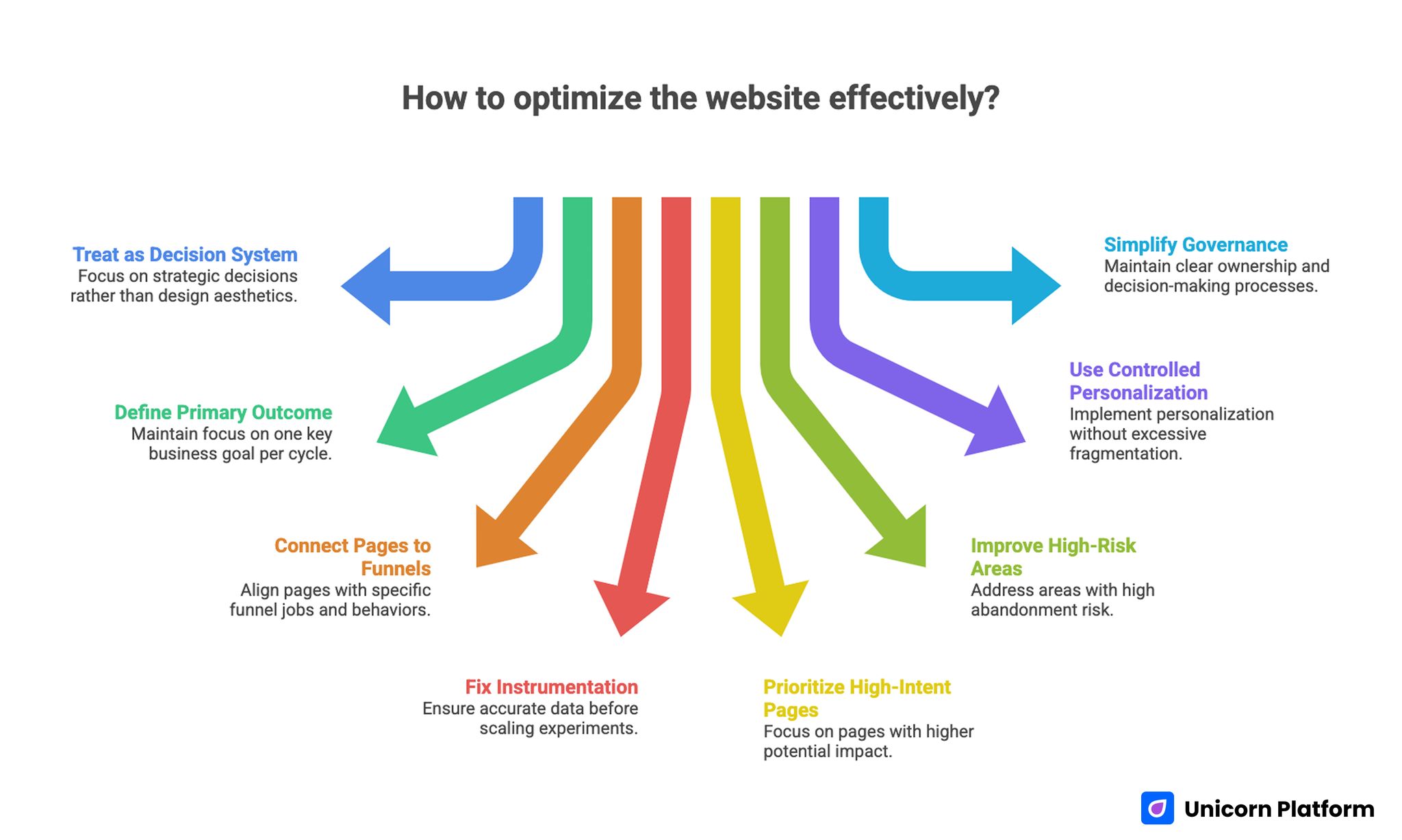
Key Takeaways on Website Optimization for Better Performance and Conversions
- Treat every optimization initiative as a decision system, not a design project.
- Define one primary business outcome per optimization cycle and protect focus.
- Connect each core page to one funnel job and one measurable behavior.
- Fix instrumentation before scaling experiments, or results will be misleading.
- Prioritize high-intent pages first; impact is usually larger and faster there.
- Improve speed and UX where abandonment risk is highest, not where metrics look easiest.
- Use controlled personalization instead of broad page fragmentation.
- Keep internal governance simple: one owner, one primary metric, one decision date per test.
Why Most Optimization Programs Stall
Optimization work often stalls because teams chase visible tasks instead of leverage points. Redesigns feel productive, new sections feel substantial, and technical cleanups feel rigorous. None of that guarantees commercial movement if the core decision friction on high-intent pages remains unresolved.
Another frequent problem is metric confusion. Dashboards may highlight bounce rate, session time, and click depth while leadership cares about qualified opportunities, expansion revenue, or retention quality. When reporting language and commercial language drift apart, optimization work becomes hard to defend, even if parts of the site improve.
Execution fragmentation adds a third risk. Content, design, technical SEO, and lifecycle marketing often run in parallel with weak coordination. One team changes headline strategy, another team adjusts form structure, and a third team updates paid traffic targeting. Without clear sequencing and shared hypotheses, nobody can isolate what worked.
The highest-performing teams resolve this by introducing a strict operating model. They define success upfront, treat pages as decision environments, run tightly scoped tests, and document outcomes in reusable playbooks. That discipline is what converts optimization from occasional effort into a predictable growth engine.
Build an Outcome Map Before You Touch a Page
A strong outcome map links commercial priorities to visitor behavior and then to page-level interventions. Start with the business target for the quarter, then identify which user decision most directly influences that target. Only after this mapping should you propose design, content, or technical changes.
For example, if the priority is better sales efficiency, your optimization focus may shift from raw form volume to qualification quality. In that case, changes should target expectation setting, use-case clarity, proof depth, and conversion path logic. If the priority is retention expansion, the focus may move to onboarding pages, feature education, and upgrade transition points.
Use a compact mapping model that every stakeholder can understand:
| Business Priority | Critical User Decision | Core Page Type | Primary Metric | Supporting Signals |
| More qualified pipeline | "Is this right for my situation?" | Product/solution pages | Qualified demo rate | Form completion quality, return visits |
| Lower paid CAC | "Should I continue from this ad click?" | Campaign landing pages | Cost per qualified action | Message-match score, CTA progression |
| Better activation | "Can I get value quickly?" | Onboarding/education pages | Activation completion | Time-to-first-value, setup abandonment |
| Expansion revenue | "Is upgrade value clear?" | Feature comparison/pricing pages | Upgrade conversion rate | Plan page engagement, support deflection |
This map becomes your prioritization anchor. If a proposed change cannot connect to one row in the map, it should not enter the sprint backlog.
Diagnose Intent and Message Match Across Traffic Sources
Traffic sources arrive with different expectations. Organic visitors often need conceptual clarity and trust framing. Paid visitors usually need immediate message match with the promise that triggered the click. Referral and partner traffic frequently needs stronger contextualization because intent is partially borrowed from another brand environment.
Begin each optimization cycle with a source-by-page audit. Review your top entry pages and document what each audience likely expects within the first screen. Then check whether page hierarchy, headline framing, and early proof actually satisfy that expectation. A mismatch at this stage can depress conversion even when the rest of the page is strong.
Intent diagnosis should also include uncertainty mapping. List the top objections users are likely to hold before acting: implementation effort, price risk, quality confidence, timing concerns, or integration fit. Your page structure should answer these objections in a deliberate order, not in random blocks added over time.
Message match improves fastest when teams write decision-stage-specific variants. A first-touch informational visitor should not see the same lead framing as a late-stage comparison visitor. Small shifts in framing can improve qualified action rates without increasing content volume.
Fix Measurement Before Scaling Experiments
A test program is only as reliable as the instrumentation beneath it. If conversion definitions are inconsistent, source tags are incomplete, or event naming changes every sprint, you will optimize toward noise. This is one of the most expensive mistakes in growth operations because it makes low-value changes look successful.
Create a measurement baseline before the next optimization cycle. Define one canonical event dictionary, one conversion taxonomy, and one attribution logic that all teams use. Keep the system simple enough to survive turnover and handoffs.
A practical instrumentation checklist includes:
- Stable naming for macro and micro conversions.
- Clear distinction between lead volume and lead quality events.
- Source and medium hygiene across all campaign URLs.
- Event validation on mobile and desktop experiences.
- Consistent timestamp handling for multi-region traffic.
- Explicit ownership for analytics QA after each release.
After baseline setup, run one week of observation with no major experiments. Use that week to confirm metric integrity and identify obvious tracking gaps. Only then should you launch broader optimization tests.
Prioritize High-Leverage Pages First
Every page can be improved, but not every page deserves first priority. High-leverage pages combine meaningful traffic, clear purchase intent, and direct influence on commercial outcomes. That is where optimization resources typically generate the strongest return.
A useful prioritization score combines four variables: impact potential, implementation effort, confidence, and strategic timing. Impact potential should carry the highest weight, followed by confidence. Teams often overvalue ease of implementation and end up shipping low-impact edits quickly while bigger opportunities wait.
Start with a short list of five pages per sprint cycle. Assign one primary goal for each page, one key friction theme, and one hypothesis family. Keep the list stable through the cycle to avoid priority drift.
This discipline prevents backlog inflation. It also makes post-cycle learning clearer because you can compare outcomes across a constrained, high-value set rather than dozens of unrelated edits.
Strengthen Page Architecture and Information Scent
Visitors decide very quickly whether a page is worth continued attention. Strong architecture reduces interpretation effort by making the page job obvious, sequencing evidence logically, and presenting actions at the right moment. Weak architecture forces users to piece together intent manually, which increases abandonment.
Begin with structure clarity: problem framing, value proposition, proof, risk reduction, and action path. This sequence does not need rigid templates, but it does need predictable logic. If trust claims appear before relevance is established, or if pricing appears before context, decision friction rises.
When your team needs a deeper framework for section sequencing and hierarchy choices, use the principles in a high-converting landing page structure to validate whether each section earns its place.
Navigation clarity matters as much as section order. Menus and in-page jumps should support decision flow, not internal org charts. Labels like "Solutions" or "Platform" can be useful, but intent-specific labels often perform better on high-stakes pages because they reduce cognitive translation.
Information scent is the final layer. Headlines, subheads, and CTA labels should keep promise continuity from ad copy, SERP snippets, and referral messages. Any break in this scent creates doubt and slows progression.
Improve Behavioral Clarity and Decision Momentum
Conversion quality improves when users understand not just what you offer, but what happens next after they act. Many pages underperform because action steps remain vague. Users see a call to action but cannot predict effort, timeline, or expected response.
Clarify the path around each primary action. If a visitor starts a request form, explain response timing, qualification process, and next milestone. If a user begins a trial, show setup scope and first success checkpoint. This removes uncertainty and increases confident actions.
Behavioral data should guide these edits. Review scroll depth, interaction sequences, and form drop-off points to identify where momentum collapses. Teams that treat this analysis as routine usually discover repeat friction patterns across multiple pages.
For additional heuristics on reducing hesitation and improving interaction flow, this guide on user behavior tips to optimize landing pages can support your review process.
Once momentum blockers are identified, group fixes by theme: clarity, trust, effort reduction, and commitment timing. This makes implementation easier and avoids random patchwork updates.
Use Speed and Responsiveness as Revenue Levers
Performance work should be prioritized by business-critical moments, not by vanity score chasing. A two-second improvement on a low-intent blog page may have little commercial effect. The same improvement near pricing, request forms, or checkout paths can materially change outcomes.
Define performance budgets per page type and device class. For high-intent pages, include targets for largest content render, interaction readiness, and visual stability. Pair these with behavior metrics so you can verify whether technical gains translate to better progression.
Mobile experiences deserve explicit treatment. Layout shifts, heavy media, and delayed interaction states create outsized friction on smaller screens. Teams that validate first-screen clarity and action visibility on mobile often recover conversion opportunities that desktop-focused QA misses.
If your team is revising mobile-first conversion paths, practical patterns from creating a high-converting mobile app landing page can help align readability, trust cues, and call-to-action timing.
Keep technical execution tied to business language. Report performance wins as reduced abandonment on high-value steps, faster progression to action, or stronger completion quality. This framing keeps engineering and growth teams aligned.
Align Content Depth With Decision Stage
Content underperforms when every page tries to do every job. Early-stage users need orientation and relevance. Mid-stage users need differentiation and proof. Late-stage users need risk resolution and execution clarity. Mixing all three without structure often weakens results.
Define a content depth profile for each critical page. Early pages should prioritize clarity and motivation. Comparison pages should emphasize fit and evidence. Decision pages should reduce uncertainty around implementation, support, and expected outcomes.
Avoid generic claims that force users to infer value. Replace broad language with context-specific outcomes, practical scenarios, and explicit limits. Precision builds trust, especially when audiences evaluate multiple options.
Internal content architecture should also support stage transitions. A user reading strategic guidance should be able to move naturally into implementation detail without searching. For teams serving complex B2B journeys, the examples in the ultimate guide to B2B landing pages are useful for comparing depth expectations across funnel stages.
Treat content updates like product releases. Write hypotheses, define expected behavior changes, and measure downstream impact. This discipline reduces opinion-driven rewrites and increases learning quality.
Introduce Controlled Personalization, Not Page Fragmentation
Personalization can improve relevance quickly, but unbounded personalization creates maintenance burden and attribution chaos. A safer approach is controlled personalization: vary only high-impact elements while keeping structural consistency and measurement stability.
Common controlled elements include hero framing by traffic source, proof examples by segment, and CTA wording by lifecycle stage. Keep these variations narrow and hypothesis-driven. If a variant has no measurable impact, remove it and preserve simplicity.
Governance rules are essential. Define which components are eligible for variation, how long tests run, and how outcomes are documented. Without this guardrail, teams accumulate versions that are hard to maintain and impossible to interpret.
Personalization should also respect brand coherence. Visitors moving between pages should recognize a consistent voice and offer logic even when specific examples change by segment.
Build an Experimentation System That Produces Reliable Decisions
A mature optimization program is less about running many tests and more about running decisive tests. Industry guidance from HubSpot also reinforces that effective website optimization depends on structured experimentation, clear hypotheses, and consistent measurement rather than isolated design changes. Reliability comes from clear hypotheses, controlled scope, predefined duration, and explicit decision rules.
Use one experiment brief template for every test:
- Opportunity statement linked to a commercial objective.
- Hypothesis with expected user behavior shift.
- Primary metric and guardrail metrics.
- Target audience and exclusion logic.
- Implementation scope and ownership.
- Run window and minimum evidence threshold.
- Rollout, iteration, or rollback criteria.
Avoid overlapping tests on the same decision path unless you have strong isolation controls. Concurrent changes can destroy interpretability and lead to false conclusions.
Cadence matters as much as method. Weekly standups keep execution moving, but monthly decision reviews create strategic coherence. Use the monthly review to retire weak ideas, scale validated patterns, and update playbooks.
Prepare for AI-Mediated Discovery and Answer-First Search
Search behavior now includes more answer-layer experiences, not only classic click-through results. Pages that perform well in this environment are usually explicit, well-structured, and semantically coherent. They answer real questions quickly while still offering deeper detail for committed readers.
Start by improving entity clarity. Define concepts in plain language, explain relationships between terms, and avoid vague placeholders that require interpretation. Well-structured explanations help both users and machine-mediated retrieval systems understand your page.
Schema and structured context can support discoverability when used correctly. Apply only relevant markup and keep on-page claims consistent with metadata. Over-markup or inconsistent signals can reduce trust and make maintenance harder.
Answer architecture is also critical. Use concise subhead-led sections, direct definitions, and practical follow-up guidance. This format helps your content serve both scanning users and deeper evaluators.
Finally, maintain factual quality. Unsupported claims, inflated certainty, and contradictory statements weaken trust across all discovery channels. Editorial rigor remains a competitive advantage.
Establish Cross-Functional Ownership and Governance
Even strong optimization ideas fail without operational ownership. Marketing may identify friction, design may propose solutions, and engineering may implement changes, but outcomes stall when accountability is diffuse.
Assign one optimization owner per priority journey. That owner does not need to execute every task, but must own hypothesis quality, implementation sequencing, and decision readiness. This reduces handoff ambiguity and accelerates cycle time.
Governance should remain lightweight. A simple operating rhythm works in most teams: weekly execution sync, biweekly QA checkpoint, and monthly decision review. Each review should focus on what was learned, what changed in user behavior, and what should happen next.
Documentation should be brief but durable. Record test rationale, implementation notes, observed impact, and final decision. Over time, this creates a reusable evidence base that improves future prioritization.
A 30-60-90 Day Execution Plan
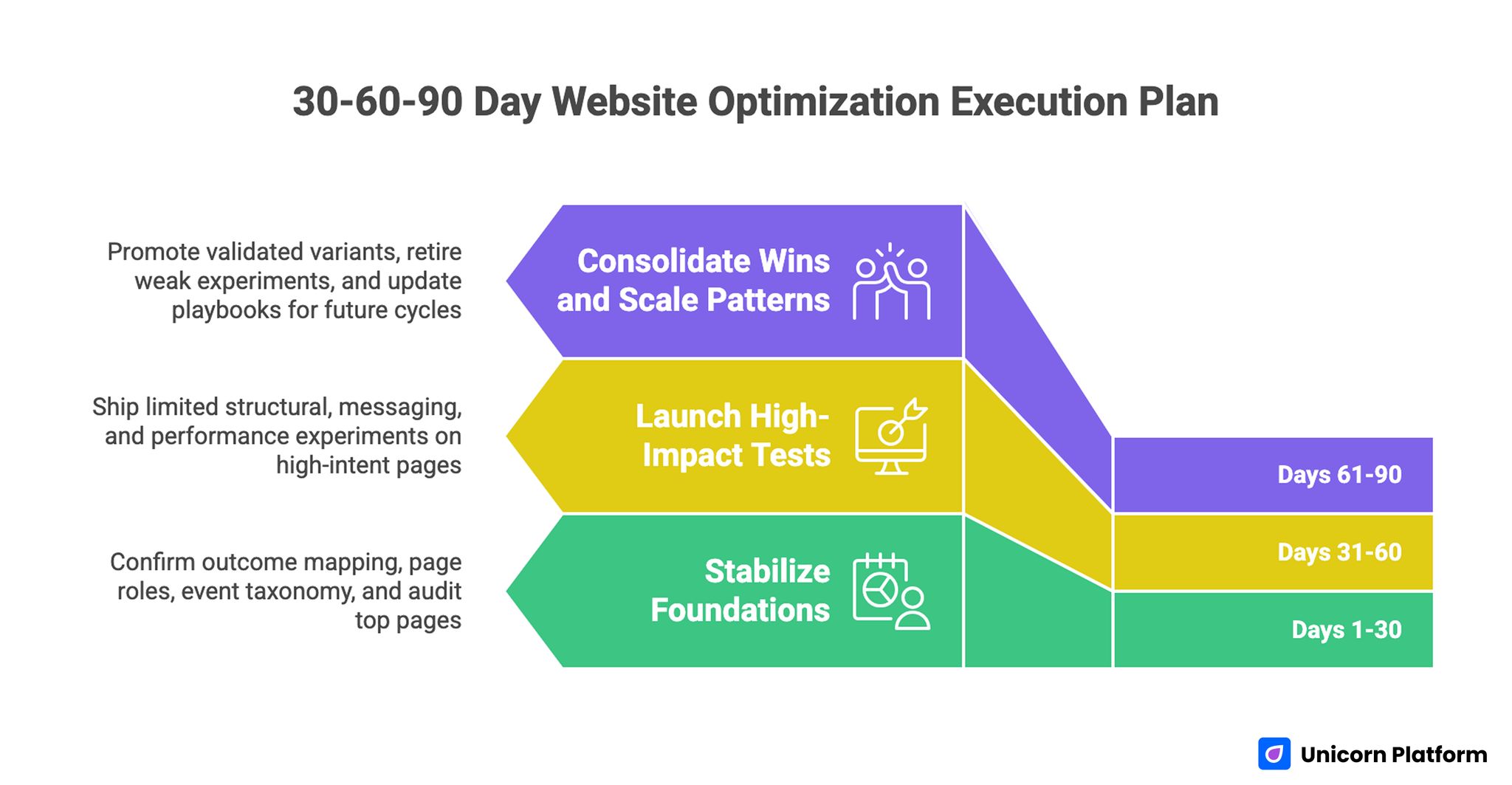
30-60-90 Day Website Optimization Execution Plan
Days 1-30: Stabilize Foundations
First month priorities should focus on clarity and measurement integrity. Confirm outcome mapping, page-role assignments, and event taxonomy. Audit top entry and decision pages for message match, trust sequencing, and obvious performance blockers.
At the end of this phase, you should have a constrained backlog of high-leverage opportunities, each linked to one commercial objective and one measurable behavior.
Days 31-60: Launch High-Impact Tests
Second month priorities should move from diagnosis to controlled execution. Ship a limited set of structural, messaging, and performance experiments on high-intent pages. Keep change scopes tight enough to preserve interpretability.
During this phase, enforce QA discipline across devices, sources, and conversion steps. Validate that event tracking remains stable after each release.
Days 61-90: Consolidate Wins and Scale Patterns
Third month priorities should emphasize consolidation. Promote validated variants, retire weak experiments, and convert successful patterns into reusable standards. Update playbooks for architecture, copy sequencing, performance budgets, and experimentation briefs.
The key deliverable at day 90 is not a redesigned site. It is an operating system that can continue producing reliable improvements in future cycles.
Two Practical Scenarios to Apply the Framework
Scenario A: B2B Service Team Improving Pipeline Quality
A B2B team receives steady form volume but sales reports weak fit quality. Most leads lack urgency or budget alignment, and reps spend too much time disqualifying. The immediate instinct is often to drive more top-of-funnel traffic, but that worsens efficiency when qualification remains weak.
A better path starts with outcome mapping. The team defines the primary objective as higher qualified opportunity rate, not higher submission volume. They identify high-intent solution pages and demo-request flows as critical decision points.
Next, they revise page sequencing to improve self-qualification. Hero sections clarify ideal use cases, proof blocks emphasize relevant buyer profiles, and form intros explain what the conversation includes. Friction is reduced for qualified prospects while mismatch becomes clearer for low-fit visitors.
Measurement focuses on post-form quality signals rather than raw completion rate. Over the next cycles, the team tests qualification prompts, trust timing, and CTA framing. Submission volume may remain stable or decline slightly, but sales efficiency improves because a larger share of conversations are commercially viable.
Scenario B: Ecommerce Brand Improving Margin-Safe Conversion
An ecommerce team sees strong traffic but unstable conversion quality and rising discount dependency. Promotions increase order volume, yet margin pressure worsens and repeat behavior remains weak. The real problem is not just conversion rate; it is conversion quality.
The team redefines its objective around profitable conversion and healthy repeat potential. They audit product, cart, and checkout experiences for uncertainty points that trigger hesitation: shipping clarity, return confidence, comparison context, and trust timing.
Rather than applying broad discounts, they optimize decision confidence. Product pages receive clearer fit guidance and proof detail. Checkout steps surface critical policy information earlier. Mobile interaction friction is reduced on high-abandonment steps.
Tests are evaluated against blended outcomes: completion quality, support ticket impact, and repeat propensity signals. This approach protects margin while still improving progression through key funnel stages.
Common Failure Modes and How to Fix Them
Failure Mode 1: Activity Without Outcome Ownership
Teams ship frequent changes and still cannot explain business impact. The root cause is usually missing outcome ownership. Different contributors optimize local metrics without a shared commercial objective.
Fix: require a clear objective statement and primary metric for every initiative. If no owner can defend the expected business impact, pause the change.
Failure Mode 2: Metric Overload and Decision Paralysis
Dashboards with too many signals create indecision. Teams debate interpretation instead of taking action.
Fix: define one primary metric, two guardrails, and a fixed decision date per test. Supporting metrics can inform diagnosis, but they should not block decisions unless guardrails are breached.
Failure Mode 3: Weak Test Hygiene
Overlapping experiments and inconsistent run windows make outcomes unreliable. Teams then either overreact to noise or ignore valid signals.
Fix: tighten experiment governance. Avoid concurrent tests on the same path, enforce minimum evidence thresholds, and document decision logic before launch.
Failure Mode 4: Copy and UX Updated Separately
Content teams edit language while design teams modify layout independently. The combined user experience becomes inconsistent and underperforms.
Fix: treat critical sections as integrated units. Test message framing, visual hierarchy, and CTA context together when they influence the same decision step.
Failure Mode 5: Mobile Treated as a QA Step, Not a Strategy Layer
Many teams review mobile only at final QA. That misses structural issues that originate in desktop-first planning.
Fix: define mobile-specific intent paths, performance budgets, and proof sequencing early in the cycle. Mobile outcomes should be measured independently, not inferred from blended data.
Failure Mode 6: Technical Work Detached From Funnel Context
Engineering teams improve performance metrics that do not correspond to conversion-critical moments. Business stakeholders see limited impact and lose confidence.
Fix: prioritize technical work on high-intent pages and high-abandonment steps. Translate improvements into behavior and revenue language.
Failure Mode 7: No Knowledge Capture
Teams run tests, ship decisions, and move on without documenting why. New contributors repeat old experiments and lose momentum.
Fix: maintain lightweight decision logs with hypothesis, implementation scope, result summary, and next action. Compounding learning is a major competitive advantage.
Implementation Checklist for the Next Sprint
Use this list to convert strategy into immediate action:
- Confirm one commercial objective for the sprint.
- Select five high-leverage pages tied to that objective.
- Define page role and primary behavior metric for each page.
- Audit message match by traffic source and device class.
- Validate event taxonomy and attribution hygiene.
- Identify top three friction themes across selected pages.
- Build hypotheses that combine content, UX, and technical changes.
- Assign owner, run window, and decision date for each test.
- Run pre-launch QA across mobile and desktop critical flows.
- Publish concise post-test summaries and update playbooks.
Execution quality usually improves when this checklist is completed before any major design work starts.
Technical Reliability Playbook for Scalable Optimization
Strategic direction fails quickly when technical reliability is inconsistent. Teams may design excellent journeys, yet users still encounter broken redirects, delayed interactions, or unstable forms. Reliability work is not separate from optimization; it is the delivery layer that allows optimized journeys to perform in real conditions.
Start with crawl and index hygiene. Confirm canonical logic on template families, eliminate redirect chains on high-intent paths, and audit index bloat from low-value parameter pages. If search engines keep discovering duplicate or shallow variants, authority becomes diluted and reporting noise increases. A quarterly crawl review catches this drift before it compounds.
Template governance is equally important in no-code and hybrid environments. When teams can publish quickly, they can also introduce untracked variation quickly. Define a small set of approved components for conversion-critical pages, then enforce versioning so structural updates remain consistent. This prevents accidental divergence in trust sections, action blocks, or proof presentation across similar journeys.
Media operations deserve explicit standards. Large images, uncompressed videos, and non-prioritized assets often degrade first interaction quality on revenue-relevant pages. Set upload rules for dimensions and compression, standardize responsive media behavior, and review above-the-fold payload on mobile networks. These controls protect experience quality without slowing production velocity.
Form reliability should be tested like a product workflow. Every major form path should be validated for field behavior, validation messaging, error recovery, and submission confirmation. Include edge cases such as slow networks, browser autofill, and interrupted sessions. A form that fails silently can erase the gains from months of content and UX optimization.
Technical reliability checklist for each release:
- Verify canonical and redirect behavior on edited URLs.
- Confirm structured data validity after template updates.
- Test critical forms on mobile and desktop with real device conditions.
- Validate event tracking continuity for primary and guardrail metrics.
- Check media payload and rendering behavior on first-screen sections.
- Review accessibility basics: heading hierarchy, focus states, contrast, and label clarity.
Accessibility should be treated as both quality and growth discipline. Clear semantics and navigable interfaces help assistive technology users and improve overall comprehension for all visitors. Teams that embed accessibility checks in release QA usually reduce friction for broader audiences while improving trust and brand credibility.
Security and privacy layers also influence conversion outcomes. Broken consent flows, unclear data handling language, or inconsistent security cues can suppress action even when offer quality is strong. Coordinate with legal and security stakeholders so trust-critical messaging is accurate, visible, and consistent across high-intent pages.
The final reliability practice is rollback readiness. Every significant optimization release should include a rollback trigger and owner. If guardrail metrics degrade or technical defects appear, teams need a defined response path within hours, not days. Fast rollback discipline protects commercial performance while preserving team confidence in experimentation.
Quarterly Scorecard and Decision Ritual
Optimization maturity improves when teams evaluate progress through a stable quarterly scorecard. Weekly and monthly reporting is useful for execution control, but quarterly reviews reveal whether local wins are creating durable business impact. This perspective helps leaders allocate resources to the right opportunities.
A practical scorecard combines four layers:
- Commercial outcomes: qualified pipeline, efficient revenue acquisition, expansion influence, and retention quality indicators.
- Behavioral outcomes: decision-step progression, high-intent engagement depth, and abandonment reduction at critical stages.
- Technical outcomes: performance stability on key templates, error rates, tracking integrity, and accessibility compliance trends.
- Operational outcomes: experiment velocity, decision clarity, rollout quality, and playbook reuse across teams.
Each layer should include both current state and directional trend. One isolated improvement is less valuable than sustained movement across multiple cycles. Trend visibility also helps teams detect regression early, especially after major product launches or campaign shifts.
Quarterly reviews work best with a fixed agenda:
- Reconfirm commercial priorities for the next cycle.
- Evaluate which journeys produced the highest business leverage.
- Identify experiments that generated reusable patterns.
- Surface failures and classify root causes.
- Decide what to scale, what to retire, and what to retest.
- Update ownership, timelines, and guardrails for the next quarter.
Decision documentation should remain concise and operational. For each significant initiative, capture objective, hypothesis family, implementation scope, observed impact, and final disposition. Long narratives are less useful than clear records teams can reference when planning new work.
Root-cause classification is particularly valuable. Instead of labeling experiments as simple wins or losses, categorize outcomes by message mismatch, structural friction, technical instability, audience fit, or measurement limitations. This classification sharpens future hypothesis quality and reduces repeated mistakes.
Scorecard governance also helps with stakeholder alignment. Leadership can see where optimization contributes to revenue efficiency, while execution teams gain clarity on priorities and evidence standards. This shared language reduces conflict between short-term campaign goals and long-term conversion quality work.
As programs mature, introduce escalation triggers tied to material risk:
- Conversion-quality decline beyond predefined tolerance.
- Tracking integrity failures on primary metrics.
- Repeated experiment conflicts on the same journey.
- Performance regressions on high-intent templates.
- Major mismatch between acquisition promises and landing experience.
Escalation criteria prevent slow deterioration. Teams can intervene quickly before losses accumulate, then return to normal cadence once stability is restored.
The quarterly ritual should conclude with a capability plan, not only a results report. Identify which skills need reinforcement next: behavioral analysis, experimentation design, technical QA, stakeholder communication, or content architecture. Capability planning keeps optimization performance resilient as market conditions shift.
Over a full year, disciplined scorecard use creates compounding advantage. Teams stop debating subjective preferences and start scaling what repeatedly works. That shift is where optimization becomes a durable business capability rather than a reactive project stream.
FAQ: Business-Aligned Website Optimization
1) How long does it usually take to see meaningful results?
Early behavior improvements can appear within a few weeks, especially on high-intent pages. Commercial outcomes often take longer because downstream sales and retention cycles need time to mature. A 90-day window is a practical baseline for judging program quality.
2) Should we optimize for conversion rate or lead quality first?
That depends on the business constraint. If sales capacity is constrained or close rates are weak, quality usually matters more than volume. If pipeline is too small, conversion rate on qualified traffic may be the better immediate focus.
3) What is the right number of experiments to run at once?
Fewer, better-scoped tests usually outperform broad test volume. Most teams get stronger decisions from a small set of high-leverage experiments than from many overlapping changes. Reliability should be prioritized over throughput.
4) How do we avoid overfitting to one traffic source?
Segment analysis and guardrails are essential. Monitor outcomes by source, device, and lifecycle stage so one segment does not dominate decision-making. If a win is isolated to one segment, treat rollout scope carefully.
5) Do we need advanced tooling to run this framework?
No. Strong prioritization, consistent measurement, and disciplined execution create more value than complex tooling alone. Advanced tools help once fundamentals are stable, but they cannot compensate for weak operating logic.
6) How much personalization is healthy before complexity explodes?
Start with limited, high-impact elements and strict governance. If your team cannot explain why each variant exists and how success is measured, you likely have too much variation. Simplicity with clear evidence beats uncontrolled customization.
7) What should we do when tests are inconclusive?
Inconclusive outcomes are still useful signals, not failures. Revisit hypothesis clarity, sample quality, and instrumentation integrity before rerunning. In many cases, refining scope produces clearer results than extending the same test indefinitely.
8) How do we align leadership expectations with experiment timelines?
Set expectations upfront using decision windows tied to your business cycle. Report progress through leading indicators while clarifying when lagging revenue signals become reliable. Transparent timing prevents premature judgments.
9) How can smaller teams compete with larger organizations in optimization?
Smaller teams can move faster when focus is tight. Prioritizing a few high-leverage journeys, documenting learnings, and avoiding low-impact busywork often creates stronger compounding gains than broad but shallow activity.
10) What is the most important habit for long-term optimization success?
Consistency in decision quality. Teams that repeatedly map outcomes, run disciplined tests, and capture learnings build an advantage that is difficult to copy. The process compounds even when individual tests vary in impact.
Final Takeaway
Sustainable optimization performance comes from alignment, not volume. When each page has a clear funnel job, each experiment has a measurable business rationale, and each release is evaluated with disciplined governance, site improvements translate into real growth outcomes.
Use this framework to turn optimization into a repeatable operating system. Start with outcome mapping, protect measurement quality, prioritize high-intent decisions, and scale only what proves value. Over time, that rigor creates faster learning, stronger conversion quality, and better commercial efficiency.
Related Blog Posts
- 10 Best Ecommerce Landing Page Examples to Boost Your Sales in 2026
- Ecommerce CRO in 2026: A Practical System to Recover Lost Revenue
- B2B Landing Page Conversion System in 2026: How Teams Build Qualified Pipeline at Scale
- Landing Page Conversion Optimization in 2026: A Behavior-Driven Operating System for Consistent Growth