Table of Contents
- AI Prompting System That Produces Better Drafts
- 30-Day Execution Plan
- Common Mistakes That Keep Pages Stuck
- FAQ
Publishing a page is easy now. Publishing one that earns trust quickly and drives qualified action is still difficult.
Most teams have access to AI tools that generate polished headlines, body copy, and CTA options in seconds. The problem is that fast output often sounds interchangeable. Visitors can feel when a page was produced quickly without enough decision logic, proof quality, or audience specificity.
That is why conversion performance depends less on raw generation speed and more on editorial and strategic discipline. The winning teams use AI to accelerate workflow, but they still run a structured process for audience research, message architecture, proof validation, and iteration.
This guide explains that process in detail. It is designed for founders, growth teams, marketers, and operators who want a repeatable system that produces landing pages with real business impact.
sbb-itb-bf47c9b
Quick Strategic Takeaways
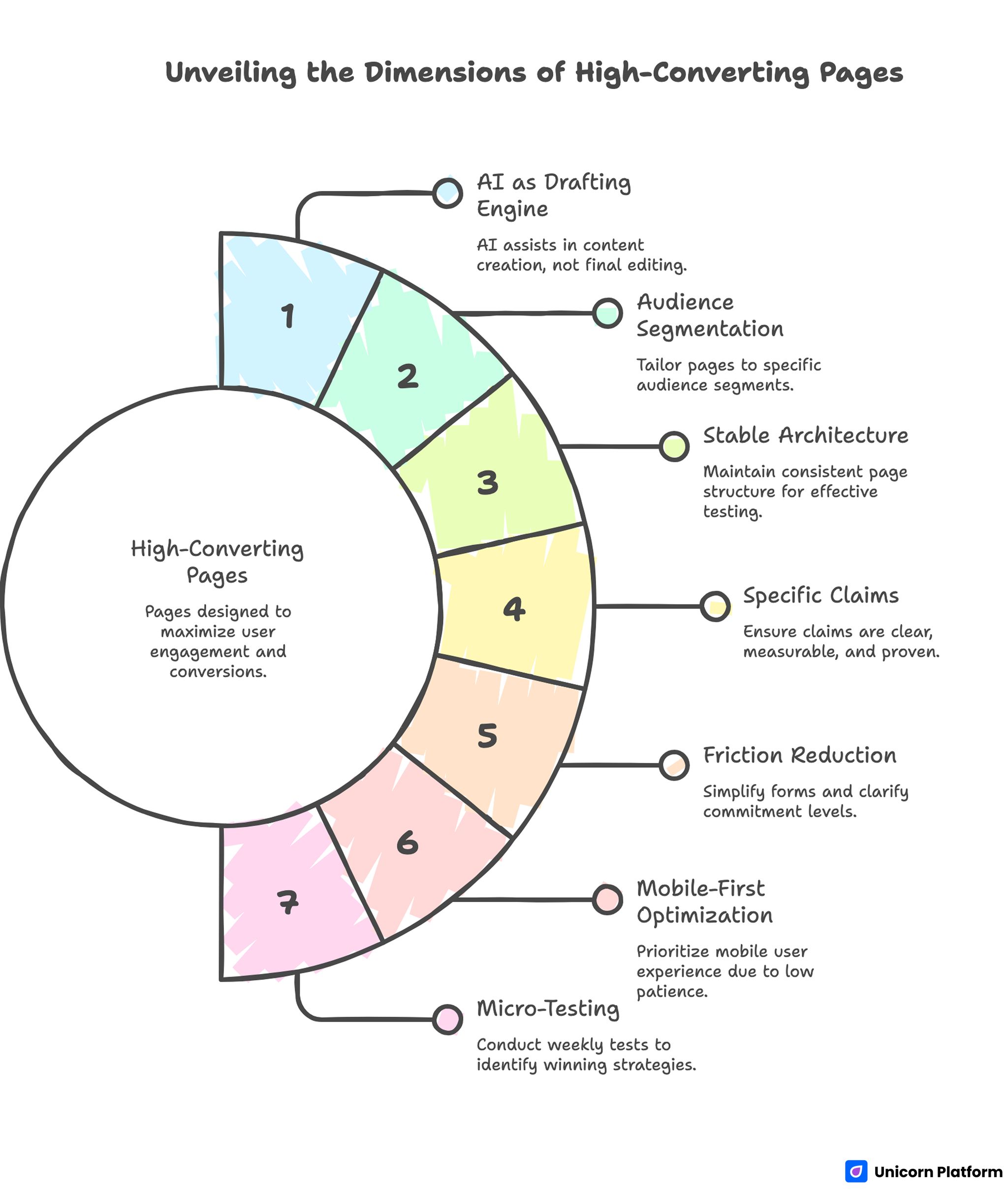
Unveiling the Dimension of High-Converting Pages
- Treat AI as a drafting engine, not as final editorial authority.
- Build each page around one audience segment and one primary action.
- Use a stable section architecture so tests isolate message quality, not layout chaos.
- Keep claims specific, measurable, and supported by visible proof.
- Reduce conversion friction by simplifying forms and clarifying commitment levels.
- Optimize mobile behavior first because user patience is lowest on mobile traffic.
- Run weekly micro-tests and preserve only measurable winners.
Why AI-Generated Pages Often Underperform
When an AI-assisted page fails, the issue is rarely grammar or formatting. Most failed pages are readable. They fail because they do not help the user make a confident decision.
The most common failure pattern is broad positioning. A page promises speed, simplicity, and growth, but it does not clearly explain who the offer is for, what changes after adoption, or why this option is more credible than alternatives.
Another frequent issue is proof mismatch. Copy claims strong outcomes, while the proof section stays generic or disconnected from the claim. That disconnect increases skepticism, especially for higher-consideration offers.
The third issue is action friction. Pages ask for high commitment too early, hide critical details behind vague CTAs, or force users into forms that request too much information upfront. Even interested visitors abandon when effort feels disproportionate.
The Decision Flow Your Page Must Support
A strong page should mirror the user’s internal decision sequence. Most visitors evaluate pages through the five checkpoints below.
- Is this relevant to my situation?
- Is this credible enough to trust?
- Is the value clear and practical?
- Is the next step easy and low-risk?
- Do I understand what happens after I click?
If the page answers those questions in order, conversion probability rises. If the order is reversed, users spend mental effort resolving uncertainty instead of acting.
This sequence is why section architecture is not a design preference. It is conversion infrastructure.
Start With Offer Clarity Before Any Copy Drafting
Before prompting AI, define the offer with operational precision. Teams that skip this step usually get fluent but unfocused drafts.
At minimum, define the inputs below before any generation starts. This simple prep step prevents generic first drafts.
- Audience: who this page is for.
- Problem: what friction they want removed.
- Outcome: what changes after adoption.
- Mechanism: how the result is delivered.
- Proof expectation: what evidence will support claims.
- Action: what exact step the visitor should take.
This input structure improves output quality immediately because it constrains generation around real business context.
Offer clarity also improves analytics quality later. If one page has one dominant objective, conversion data becomes interpretable and optimization decisions become faster.
Build an Intent-Aligned Architecture
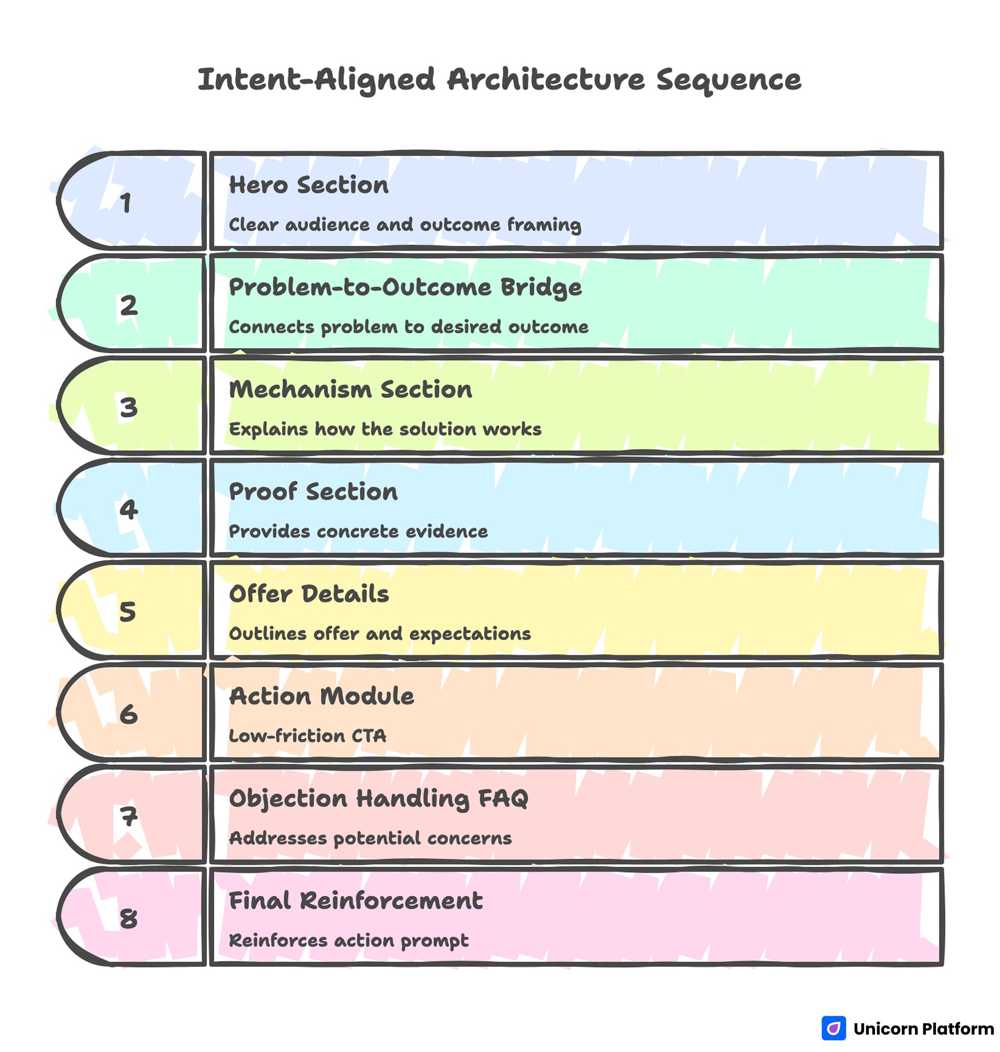
Intent-Aligned Architecture Sequence
A repeatable architecture helps teams launch faster without sacrificing quality. Use the sequence below as a baseline for decision momentum.
- Hero with clear audience and outcome framing
- Problem-to-outcome bridge
- Mechanism section explaining how it works
- Proof section with concrete evidence
- Offer details and expectation framing
- Action module with low-friction CTA
- Objection handling FAQ
- Final reinforcement and action prompt
For teams refining this sequence, the practical framework in this guide on high-converting landing page structure is useful for deciding what appears early versus later.
Architecture consistency creates another advantage: testing speed. When structure stays stable, copy and proof experiments produce cleaner signal.
Hero Section: Specificity Wins the First Five Seconds
The hero does not need clever language. It needs immediate relevance.
Effective hero copy usually includes three elements: audience context, practical outcome, and timeline or mechanism cue. This combination helps visitors self-identify quickly and reduces bounce from message ambiguity.
Weak heroes often sound universal, which means they connect with no one in particular. Strong heroes feel intentionally written for one segment and one job-to-be-done.
Avoid stacking multiple equal-priority CTAs in the hero. One primary action should dominate. Secondary actions can exist, but they should support exploration without competing visually with the main path.
Problem and Mechanism: Explain Value Without Overwriting
After the hero, users need fast clarity on why the problem matters and how your solution resolves it. If mechanism clarity is weak, users hesitate even when the offer sounds attractive.
A useful method is to define the current-state friction in plain language, then show the mechanism in three to five concrete steps. This approach increases perceived competence because users can visualize execution.
Mechanism quality is a common differentiator between average and high-converting pages. Vague claims such as "improve productivity" are weak unless paired with specific workflow change and measurable impact.
Keep this section practical rather than exhaustive. The goal is decision confidence, not full product documentation.
Proof Layer: Replace Marketing Claims With Verifiable Signals
Proof should appear close to high-impact claims, not only in a generic testimonial block at the end. Proximity between claim and evidence lowers skepticism at the exact moment decisions are made.
Use diverse evidence types to reduce skepticism. Mixed proof formats help different buyer types validate confidence in their preferred way.
- Outcome metrics tied to realistic conditions
- Customer quotes with role and context
- Process snapshots or implementation examples
- Security, compliance, or reliability indicators
- Known partner references where appropriate
Proof quality is more important than proof volume. Two specific, high-trust examples usually outperform ten broad statements.
When evidence is still developing, be explicit about scope. Honest constraints are more persuasive than inflated certainty.
Offer and Pricing Communication
Visitors should understand commitment level before they click. Hidden expectations are one of the fastest ways to lose trust.
Clarify whether the CTA leads to free trial, call scheduling, consultation, demo request, or direct purchase. If the next step includes sales follow-up, communicate that transparently.
For pricing-sensitive audiences, give directional context even when full pricing is not listed. Explaining the pricing model often reduces bounce more than vague "contact us" language.
Offer clarity also helps lead quality. Users who convert with informed expectations are more likely to complete downstream funnel stages.
CTA Design by Readiness Level
Not every visitor is ready for the same commitment level. A layered CTA system prevents early-stage drop-off while preserving action velocity for ready buyers.
A practical hierarchy usually includes three action levels. This protects momentum without forcing premature commitment. Marketing research from HubSpot shows that landing pages perform better when they guide visitors toward a single clear primary action while still offering lower-commitment alternatives. This structure helps reduce friction for early-stage visitors without slowing down ready buyers.
- Primary CTA for ready visitors
- Secondary CTA for evaluators
- Low-friction CTA for cautious users
The page should keep one dominant outcome metric, but supporting actions can guide different readiness states without forcing premature commitment.
CTA labels should be explicit. "See how it works" and "Book a 20-minute walkthrough" set clearer expectations than abstract labels like "Get started now."
Form Strategy: Minimize Friction, Maximize Signal
Long forms reduce completion unless intent is exceptionally high. Ask only for data required to route the next step effectively.
For many offers, a short initial form plus progressive profiling outperforms a single long form. This approach preserves conversion flow while still collecting useful qualification data over time.
Field sequencing also matters. Start with low-friction fields first to create momentum, then request high-friction details later in the process.
Every extra required field should have a clear operational reason. If a field does not influence routing or support quality, remove it.
Mobile-First Quality Controls
Mobile traffic often includes lower patience and higher interruption risk. If mobile UX is weak, performance declines even when desktop experiences look strong.
Prioritize the mobile foundations below before visual polish. Faster clarity usually beats advanced effects on conversion pages.
- Fast first content render
- Readable spacing and heading hierarchy
- Tap-friendly CTA sizing
- Short, scannable form flow
- Stable layout during load
Real-device testing is essential. Emulator success does not guarantee reliable behavior on common user conditions such as slower networks or older devices.
When teams optimize mobile fundamentals early, they usually see gains in both conversion rate and lead quality because friction falls at critical decision moments.
AI Prompting System That Produces Better Drafts
Generic prompts create generic pages. Better drafts come from constrained, section-level prompting.
A practical prompt template should include the inputs below. Constraint quality is the fastest way to improve draft quality.
- Audience profile and context
- Core pain points in user language
- Desired outcome and timeline
- Mechanism summary
- Required proof placeholders
- Tone boundaries and forbidden styles
- CTA intent and commitment level
Generate sections independently, then integrate manually. Section-level generation improves coherence and reduces repetitive phrasing.
For quick ideation before editorial passes, this practical AI landing page generator workflow can help teams explore direction while preserving speed.
Editorial QA Before Publish
Every AI-assisted page needs a pre-release gate. Without one, weak drafts reach production and pollute performance data.
A practical QA gate checks the areas below before publication. Consistent gates prevent low-quality drafts from reaching live traffic.
- Intent alignment: first-screen match with channel promise
- Claim quality: specificity and support
- Proof relevance: direct connection to claims
- CTA clarity: expectation transparency
- Readability: concise, professional paragraph flow
- Mobile behavior: friction and tapability
- Compliance: legal and policy consistency
Keep the checklist short enough to run consistently. Reliability beats complexity in operating systems.
Internal Linking and Topical Depth
Internal links should feel like next-step assistance, not SEO decoration. Link only when deeper guidance genuinely helps the reader finish a decision.
For teams building a robust production process, this landing page development playbook is useful for operational planning and execution standards.
Link placement should be distributed across the article rather than clustered in one area. That keeps narrative flow natural and improves user experience.
Segment-Specific Variants Beat One Universal Page
One broad page can attract traffic, but segment-aligned variants usually convert better because message fit improves. Relevance is easier to communicate when examples and objections match one audience profile.
Useful segmentation dimensions include the categories below. Choose one primary dimension first, then expand only after baseline performance is stable.
- Industry vertical
- Use case
- Buyer role
- Acquisition channel
- Funnel stage
Each variant should keep core structure while adapting examples, objections, and proof emphasis.
This is where teams gain leverage from Unicorn Platform. Shared components preserve brand consistency, while copy and proof blocks can be adjusted quickly for each segment.
Multi-Page Funnel Design for Higher Consideration Offers
Higher-consideration offers often convert better through a short multi-page funnel instead of one dense page. This structure lets teams spread complexity across controlled steps.
A common three-step model works well for many B2B and service offers. Each step should answer one dominant question before introducing the next decision.
- Value page for relevance and positioning
- Evidence page for trust and comparison
- Action page for conversion and scheduling
This model lets visitors build confidence progressively. It reduces cognitive overload compared with forcing all information into one screen.
Funnel coherence matters more than page count. Each step should clearly answer one decision question and point to one next action.
Content Design Patterns That Improve Response Quality
Pattern-based writing helps teams avoid blank-page drift and improves consistency across campaigns. It also improves prompt quality because structure is predefined.
Practical patterns include the options below. Teams should test and keep only the patterns that improve both clarity and conversion.
- Problem, cause, consequence, action
- Before, after, bridge
- Objection, evidence, reassurance
- Timeline-based value breakdown
Patterns are most useful when grounded in real customer language from calls, demos, and support tickets.
Teams that maintain a shared message bank of approved claims, proof snippets, and CTA patterns can scale output without sacrificing brand voice.
Accessibility and Readability as Conversion Multipliers
Accessibility improvements are not just compliance tasks. They often improve conversion for all users.
High-impact fundamentals include the list below. These improvements are small individually but compounding in aggregate.
- Logical heading hierarchy
- Clear button labels
- Sufficient color contrast
- Descriptive alt text for decision-critical visuals
- Consistent focus states for keyboard navigation
Readable spacing and concise paragraphs reduce effort during fast scanning, especially on mobile.
For teams running behavior-focused optimization cycles, this guide with user behavior tips for landing pages is a useful reference for prioritizing interaction fixes.
Technical Foundations That Support Rankings and Conversion
Conversion-focused pages still depend on discoverability fundamentals. Weak technical hygiene can limit distribution even when message quality is strong.
Maintain the technical practices below for every production page. Consistency matters more than occasional deep cleanup.
- Clean title and description intent match
- Structured heading logic
- Fast performance on mobile conditions
- Internal links to relevant depth pages
- FAQ content that answers real user questions
AI search systems also reward clarity and answer quality. Pages that provide concrete, structured explanations are easier for retrieval systems to interpret and cite.
Technical setup cannot rescue weak message architecture, but it can amplify strong content when fundamentals are consistent.
Measurement Framework for Weekly Iteration
Testing without a framework creates noise. Use a simple operating model that connects hypotheses to measurable outcomes. Conversion optimization research from CXL highlights that structured experimentation frameworks produce more reliable insights than ad-hoc redesign efforts.
Track core metrics that directly map to your primary action. Secondary metrics are useful only after these core signals are stable.
- Primary CTA click-through rate
- Form completion rate
- Qualified lead rate
- Scroll depth to proof and CTA sections
- Mobile versus desktop conversion gap
Use testing rules that protect signal quality. Controlled experiments produce better learning than broad redesign cycles.
- One major variable per experiment
- Stable traffic sources during test windows
- Predefined success threshold
- Keep, revise, or archive decision for each test
This discipline helps teams learn faster than ad hoc redesign cycles.
30-Day Execution Plan
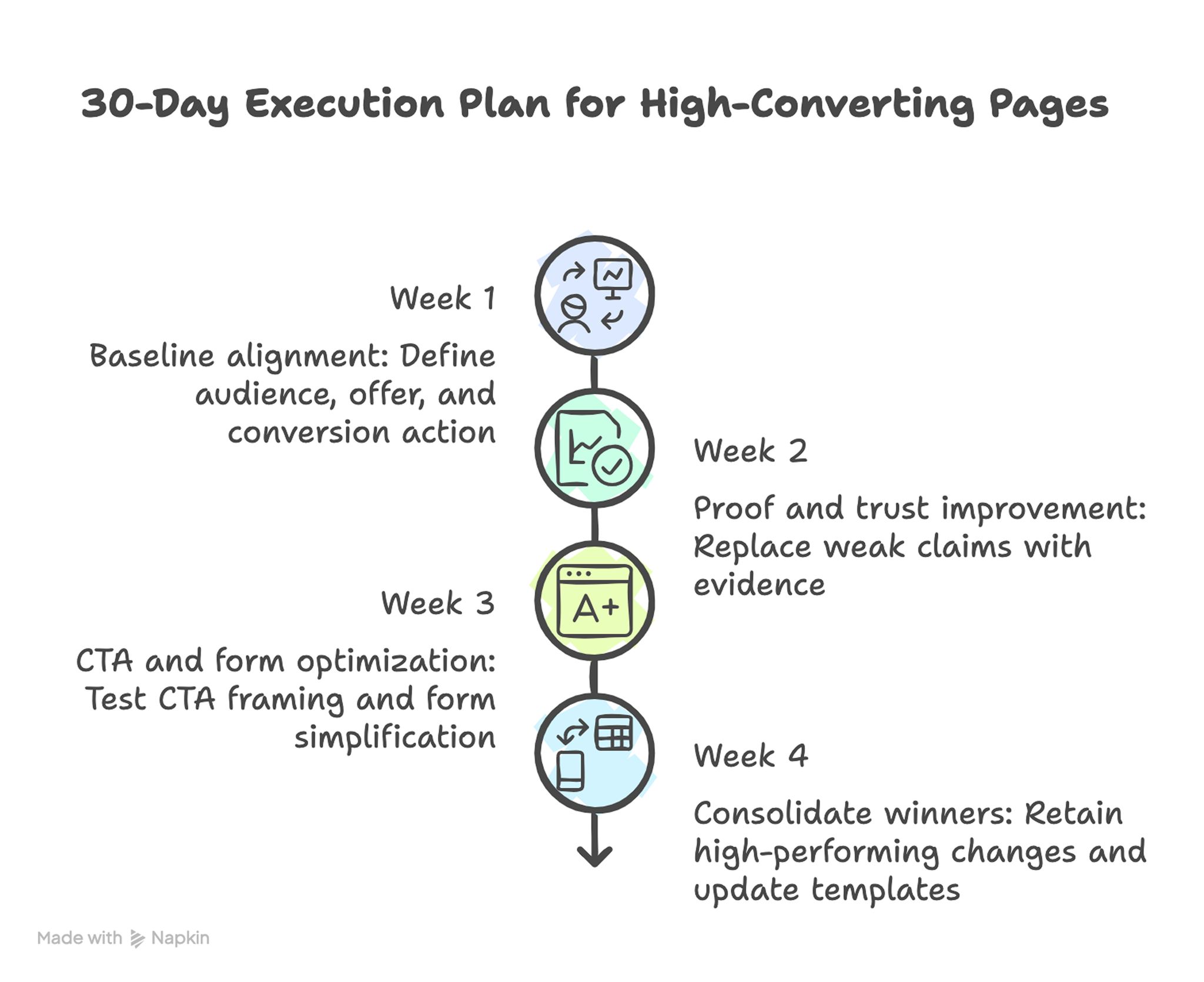
30-Day Execution Plan for High-Converting Pages
Week 1: Baseline alignment
Define one audience, one offer, and one primary conversion action. Rewrite hero and mechanism sections for clarity and verify channel-message alignment.
Week 2: Proof and trust improvement
Replace weak claims with concrete evidence and move trust signals closer to high-friction decision points. This reduces uncertainty before users reach commitment steps.
Week 3: CTA and form optimization
Test one CTA framing variation and one form simplification change. Keep all other variables stable.
Week 4: Consolidate winners
Retain high-performing changes, remove weak experiments, and update shared templates with proven copy patterns. This keeps future pages from repeating known mistakes.
A focused month usually produces stronger gains than broad redesign efforts because learning quality stays high. Narrow scope also makes team accountability clearer.
90-Day Scale Plan
Month one should stabilize quality standards and tracking discipline. Month two should introduce segment-specific variants using the same core architecture. Month three should formalize governance for proof refresh, experimentation cadence, and content QA ownership.
Scale should follow operational reliability. Publishing more pages without process maturity usually increases inconsistency and slows performance improvement.
Cross-functional ownership is critical at this stage. Marketing, product, and sales teams should align on approved claims, evidence quality, and conversion intent so page updates remain coherent.
Common Mistakes That Keep Pages Stuck
Mistake 1: broad positioning with no clear audience signal
Fix by naming the audience context and desired outcome in the first screen. Relevance must be visible immediately.
Mistake 2: claims without supporting evidence
Fix by adding proof near each major claim and removing unsupported statements. Evidence proximity is often a faster win than rewriting all copy.
Mistake 3: overloaded first screen
Fix by reducing competing CTAs and keeping one primary path dominant. A clear visual hierarchy makes next steps easier to choose.
Mistake 4: long forms that request low-value data
Fix by shortening required fields and moving optional details to later stages. Progressive profiling preserves lead quality without suppressing conversion.
Mistake 5: irregular testing with no documentation
Fix by running weekly tests with one hypothesis and recording keep-or-revert decisions. The documentation layer is what turns testing into repeatable progress.
Mistake 6: publishing AI drafts without editorial QA
Fix by enforcing a mandatory review gate for claim quality, readability, and compliance. This gate should be required even during fast campaign launches.
Team Workflow in Unicorn Platform
A reliable build workflow in Unicorn Platform typically follows the sequence below. Keep steps stable so new team members can execute reliably.
- Duplicate a proven structural template.
- Draft section-level copy with constrained AI prompts.
- Insert validated proof and segment-specific examples.
- Configure CTA hierarchy and form flow.
- Publish and test mobile interactions.
- Run weekly experiments and update shared standards.
This process helps teams maintain speed while preserving quality across multiple campaigns. It also improves handoffs because ownership boundaries are explicit.
Reusable blocks reduce production overhead, and controlled copy variation keeps messaging aligned with audience intent. Over time, this creates a high-quality production baseline instead of one-off page experiments.
Channel Adaptation Strategy
The same offer should not be framed identically across every acquisition channel. Users arriving from paid search often need immediate intent confirmation, while users from social channels may require stronger context and trust before acting.
A practical channel model starts with one core message spine, then applies channel-specific wrappers. Paid search pages should mirror query intent and reduce distraction. Email-driven pages can assume higher familiarity and move faster into mechanism and proof. Social traffic often needs stronger framing of problem urgency before detailed offer explanation.
Teams should also align page promises to ad or email language exactly where possible. Message mismatch between source and destination is one of the most common causes of avoidable drop-off, especially when users have many alternatives open in parallel tabs.
For teams testing multiple acquisition channels at once, this practical guide to OpenAI website builder workflows for high-converting pages can help map channel intent to page structure without rebuilding from scratch each week.
Channel adaptation should still preserve brand voice and proof standards. The variation should be strategic, not chaotic, so users experience one coherent brand across campaigns.
Prompt Library Governance for Teams
A prompt library becomes a performance asset only when it is managed like product documentation. Teams that store random prompts without version control usually repeat weak patterns and lose the benefits of prior experimentation.
A high-quality prompt library should include metadata for each prompt: intended audience, section target, expected tone, required proof fields, and known failure modes. This metadata allows faster selection and safer reuse during campaign pressure.
Version history matters. When a prompt generates high-performing output, save the exact prompt with context about where it worked and why. When a prompt produces weak results, document the failure mode and either revise or archive it. This prevents quality regression when team members rotate ownership.
Prompt governance should include editorial boundaries as well. Define language patterns that are not acceptable in final copy, including vague outcomes, exaggerated certainty, and unsupported superlatives. These rules prevent AI drafts from drifting into low-trust marketing language.
A useful operating rhythm is monthly prompt review. During each review, keep prompts tied to winning tests, revise those with mixed results, and retire prompts that repeatedly generate generic copy. This process turns prompt engineering into a cumulative advantage rather than a one-time setup task.
Post-Conversion Experience and Handoff Quality
Landing page performance is not only about top-of-funnel actions. Post-conversion quality determines whether the leads generated by the page become qualified opportunities or noisy pipeline entries.
After a form submission, users need immediate clarity on what happens next. Confirmation messaging should include response timing, next-step format, and preparation expectations. This reduces uncertainty and improves call or demo attendance rates.
Internal handoff quality also matters. If sales or support teams receive incomplete context, they spend early interactions rediscovering user intent. That disconnect weakens trust and reduces downstream conversion efficiency.
A practical fix is structured lead capture fields that map directly to routing and conversation needs. Collect only essential information at conversion time, but ensure that what is collected supports useful follow-up without repeated questioning.
Teams should review post-conversion metrics alongside page metrics. If top-of-funnel conversion rises while qualified-opportunity rate drops, the page may be attracting low-fit traffic or overpromising in messaging. Balanced measurement prevents teams from optimizing for vanity conversion rates.
Weekly Performance Scorecard
A weekly scorecard keeps iteration disciplined and helps teams avoid reactive redesigns. The scorecard should include both conversion metrics and quality diagnostics so decisions reflect full funnel impact.
Recommended scorecard categories:
- Traffic quality by channel and campaign intent
- Primary action rate and form completion trend
- Qualified lead rate and downstream progression
- Mobile friction indicators and page speed signals
- Content freshness status for proof and examples
- Test outcomes with keep-or-revert decision
Each scorecard entry should end with an owner and a next action. Metrics without ownership rarely produce improvements.
Weekly reviews work best when they are short and consistent. A thirty-minute review with clear decisions usually outperforms irregular long meetings that end without execution commitments.
FAQ: How to Build High-Converting AI Landing Pages in 2026
How much of a landing page can AI write safely?
AI can draft most sections quickly, but final publication should always involve human review. Claims, proof, and commitment language must be validated before launch.
What is the fastest way to improve a weak page?
Start with hero specificity, proof relevance, and CTA clarity. These three areas usually deliver the largest immediate impact.
Should one page serve every audience segment?
One page can be a starting point, but segment-specific variants generally convert better. Message fit improves when examples and objections match user context.
How many CTA options are ideal?
Most pages perform best with one dominant CTA and one or two supporting options. Too many equal-priority actions can reduce decision confidence.
Do longer pages always convert better?
Not always. Depth helps when it answers real objections, but filler content lowers engagement. The right length is determined by decision complexity, not word count alone.
How often should proof sections be updated?
Monthly is a practical baseline for active campaigns. High-change offers may require more frequent updates to maintain credibility.
What if we have limited customer proof early on?
Use process clarity, implementation transparency, and realistic scope statements until stronger outcome evidence accumulates. Honest specificity beats inflated claims.
Which metric should we prioritize first?
Start with primary CTA click-through and form completion rate. Those metrics reveal whether relevance and friction are aligned.
How can we reduce mobile abandonment quickly?
Improve load speed, simplify forms, and test tap behavior on real devices. Small interaction fixes often produce measurable gains.
What is the biggest risk with AI-assisted page production?
The biggest risk is publishing generic, unsupported copy at scale. A strict editorial QA process is the best protection.
Final Takeaway
High-converting AI-assisted landing pages come from process quality, not from prompt volume. Teams that combine structured architecture, credible proof, and disciplined iteration consistently outperform teams that rely on fast generation alone.
Use AI to move faster, but keep strategy and validation human-led. When your workflow is stable, each new page starts stronger, learns faster, and contributes more reliably to growth.
That is the real advantage of AI in landing-page operations: not just speed, but repeatable performance.

