Table of Contents
- A Practical Conversion Sequence
- Post-Submission Experience: The Hidden Conversion Stage
- 30-Day Execution Plan
- Common Mistakes and Fixes
- FAQ
Most teams do not lose conversions because their page looks outdated. They lose conversions because the page asks users to commit before giving them the clarity needed to commit. In reservation and signup flows, this mistake shows up quickly: people click with intent, hesitate at key moments, and leave with unresolved questions.
Visitors usually need five things before they take action. They need to know the offer is relevant, the provider is trustworthy, the process is clear, the time cost is reasonable, and the next step is low risk. If any of those pieces is missing, completion rates drop even when traffic quality is strong.
This is why a strong booking and signup system is structural, not cosmetic. The goal is to sequence information in the same order users make decisions. When this sequence is respected, users move forward with less friction and teams get better-quality outcomes after submission.
Unicorn Platform is useful in this context because it enables fast page iteration without sacrificing consistency. Speed matters, but only when paired with clear architecture, measurable hypotheses, and repeatable QA.
This guide gives a practical operating model for teams running reservation, signup, waitlist, and event-intent pages. It focuses on conversion quality, not just top-line volume.
sbb-itb-bf47c9b
Key Takeaways
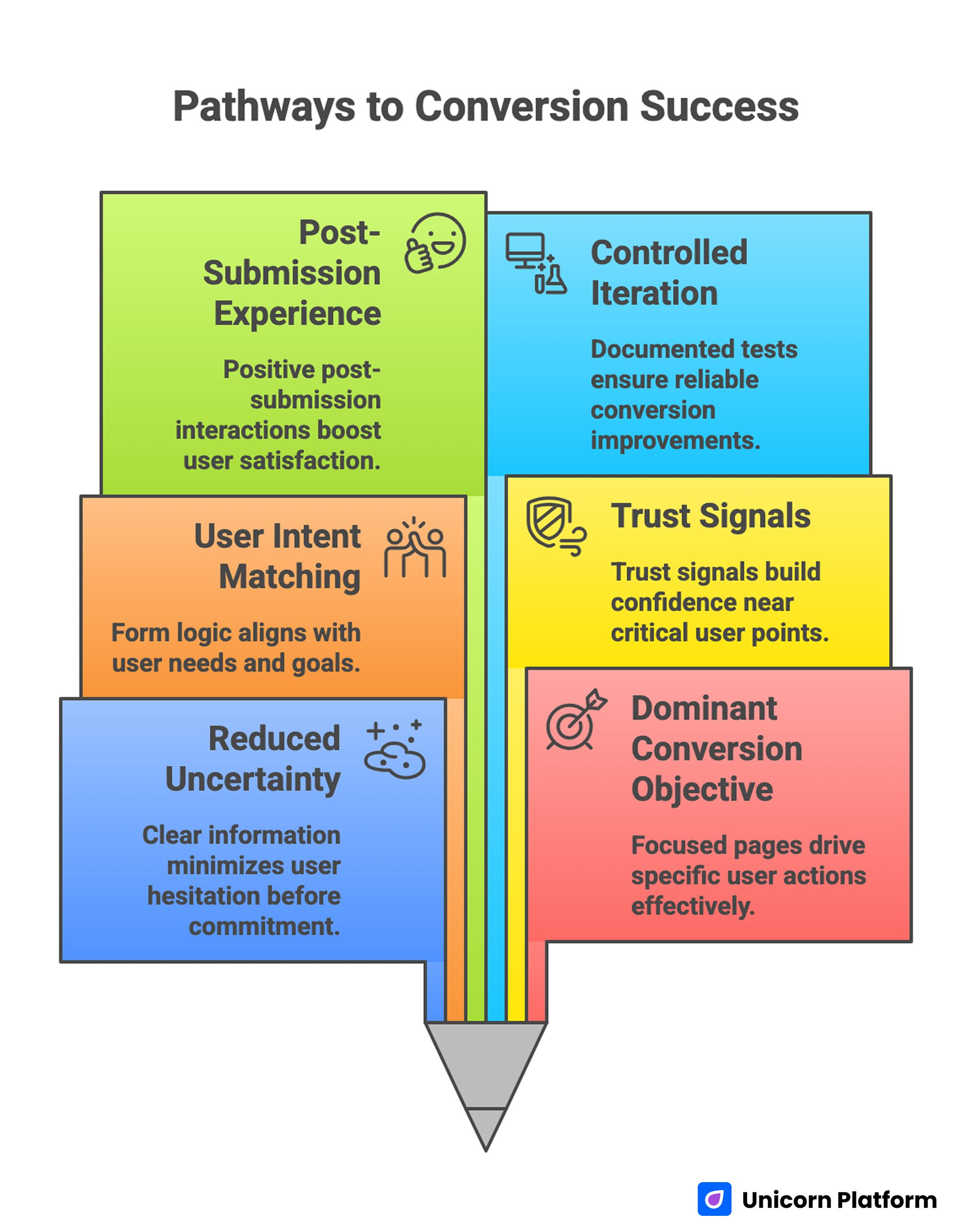
Pathways to Conversion Success
- High-converting pages reduce uncertainty before increasing commitment.
- One page should have one dominant conversion objective.
- Form logic should match user intent stage, not internal data wishlist.
- Trust signals should appear near friction points, not in isolated blocks.
- Post-submission experience strongly affects real business outcomes.
- Iteration works best when tests are controlled and documented.
Why Booking and Signup Pages Underperform
The most common failure pattern is mixed objectives. Teams try to educate, persuade, segment, cross-sell, and capture data in one surface. Users encounter too many decisions and too little direction, then postpone action.
Another issue is message mismatch between source and destination. Ads promise speed, simplicity, or clear availability, but landing pages open with generic brand language and delay practical details. Users quickly sense the gap and bounce.
Form friction is a third major problem. Many pages request fields that are not necessary for first-step conversion. Every extra field adds cognitive cost, especially on mobile devices where typing is slower and context switching is frequent.
Finally, teams often optimize for submission count while ignoring quality signals such as booking attendance, signup activation, or support burden after submission. This can make performance appear strong while business outcomes decline.
A Practical Conversion Sequence
Users typically follow a predictable decision pattern. Your page should mirror it directly.
1. Relevance Confirmation
Start by confirming who the page is for and what concrete outcome the user can expect. Avoid broad benefit language that could apply to any offer.
2. Trust Confirmation
Once users see relevance, they evaluate credibility. Show practical trust cues early, such as proof, process transparency, response reliability, or policy clarity.
3. Process Clarity
Before forms, users need to understand what happens after submission. Explain steps, timeline, and effort requirements in plain language.
4. Commitment Choice
Present one primary action aligned with intent stage. If secondary actions exist, keep hierarchy clear so users do not split attention.
5. Confidence Reinforcement
After submission, confirm next steps clearly. A strong confirmation state improves downstream completion quality and reduces avoidable cancellations or drop-off.
This sequence works for reservations, demos, account signups, waitlists, and event registrations because all of these actions depend on uncertainty reduction before commitment. Teams that preserve this order usually see more stable results across different traffic sources.
Architecture for Reservation-First Pages
Reservation pages usually serve users who are already motivated but still evaluating logistics and risk. They should therefore prioritize speed and certainty.
A high-performing reservation structure often includes the elements below. Together they keep the action path focused while still covering the details users need before booking.
- Intent-matched headline and subhead.
- Essential logistics summary.
- Compact trust snapshot.
- Friction-aware booking form or booking trigger.
- Objection cards for high-friction concerns.
- Confirmation and modification expectations.
Teams looking to tighten top-of-funnel qualification before reservation can use this lead generation page framework to balance quality and volume. That approach is useful when pure reservation volume is high but operational fit is inconsistent.
Logistics Must Be Visible Early
Users booking services or events usually need timing, availability context, and location clarity before anything else. If this information is hidden, conversion slows regardless of visual quality.
Use concise logistics modules near the top of the page. For time-sensitive offers, highlight availability windows and confirmation timing without overloading users with dense policy language.
Reservation Forms Should Be Stage-Aware
Early-intent users should see lightweight forms focused on minimum viable booking details. Additional information can be requested later in confirmation flows when intent is stronger.
Avoid asking for information that does not change routing or service quality at this step. Unnecessary questions reduce completion and add operational cleanup for your team.
Architecture for Signup-First Pages
Signup pages often fail because they frame the action as "create account" instead of "start outcome." Users care about what they can do after signing up, not the form itself. When teams reframe signup around immediate value, completion and activation usually improve together.
A conversion-focused signup structure usually includes the parts listed below. Each component removes a specific uncertainty that commonly blocks first-time users.
- Clear value proposition tied to one immediate benefit.
- Short "what happens next" explainer.
- Social or usage proof relevant to intended audience.
- Minimal initial fields.
- Optional confidence signals around data and privacy.
If signup connects to ongoing communications or lifecycle flows, this newsletter subscription page guide can help align early conversion with long-term retention quality. It is especially useful when your team needs better continuity between first signup and repeat engagement.
Clarify Immediate Post-Signup Experience
Users should know what happens within minutes of submitting. Will they access a dashboard, receive a confirmation email, join a waitlist, or book onboarding time? Ambiguity here is one of the largest causes of low activation.
Use concise step language to reduce uncertainty. The best copy here is specific and operational, not promotional.
Keep Initial Signup Forms Lean
Capture only what you need to deliver first value. Every optional field can be moved into progressive profiling after activation.
This strategy improves both conversion and data quality because users provide deeper details later when trust is higher. It also reduces drop-off from users who are willing to start but not ready to complete long forms.
Trust Signals: Timing Beats Volume
More proof is not always better proof. Users respond to trust cues when they appear at the moment hesitation occurs.
Practical trust signals include the options below. Select the ones that match the user’s immediate concern rather than adding every proof type to the same section.
- Service reliability or response-time standards.
- Real user outcomes tied to context.
- Policy transparency for high-risk concerns.
- Clear support pathways.
Place trust modules near forms, booking actions, and potential objection points. Buried testimonial blocks at page bottom rarely affect high-friction decisions.
Objection Handling Without Breaking Flow
Objection handling should be compact and contextual. Long FAQ walls often reduce momentum because users must scan too much to find one answer.
A better pattern is targeted objection cards positioned where concern naturally appears. For example, cancellation details near booking CTA, data use details near signup form, and timing details near availability modules.
This keeps page flow focused while still addressing real concerns. Users get fast answers without having to scan an oversized FAQ block.
Form Microcopy and Field Design
Form performance often depends on small wording decisions rather than large layout changes. Labels, helper text, and button language influence confidence and speed.
Use action language that reflects user outcome. "Reserve my time" can outperform generic labels because it confirms intent and next step. Helper text should remove ambiguity, not repeat labels.
Error states should be plain and actionable. Vague errors increase abandonment and support tickets. Research from Baymard Institute shows that even small improvements in form design—such as clearer labels, better error messaging, and reduced field count—can significantly increase completion rates. Users are highly sensitive to friction during input tasks, making form clarity one of the highest-leverage areas for conversion improvement.
Post-Submission Experience: The Hidden Conversion Stage
Submission is not the end of conversion. It is the start of fulfillment quality. Weak post-submit communication can erase gains from strong pre-submit design.
A good confirmation state should include the points below. These details reduce post-submit uncertainty and improve follow-through quality.
- What was submitted.
- What happens next.
- Expected timeline.
- How to modify or cancel if relevant.
- Where to get help.
For event or appointment pathways, teams can extend this model with a focused event registration page framework to improve attendance and preparedness. Bringing confirmation clarity into that flow usually lowers no-show risk.
Why This Stage Matters
If users do not understand next steps, they are more likely to disengage, no-show, or submit duplicate inquiries. Clear confirmations reduce operational noise and improve real conversion value.
Source-Specific Variant Strategy
Reservation and signup traffic often comes from channels with different intent readiness. Paid search users may expect immediate logistics. Social users may need more trust context. Referral users may need less explanation but faster action.
One static page can serve all channels at a basic level, but intent-specific variants usually outperform in mature programs. Keep one shared architecture and adapt first-screen framing, proof order, and CTA wording by source.
This improves relevance while preserving comparability in analytics. It also makes future optimization faster because each variant has a clear intent context.
Mobile Behavior and Context Friction
Many reservation and signup actions happen on mobile devices, often in distracted contexts. Desktop-first QA misses critical friction points like keyboard jumps, field focus issues, and CTA visibility problems.
Run real-device checks for common screen sizes and networks. Validate date selection, input completion, error handling, and form submission behavior end to end.
Small mobile fixes often deliver outsized conversion gains because they remove high-frequency friction in critical steps. These fixes are often inexpensive but have strong impact on completion quality.
Copy Precision for Time and Availability
Time-sensitive conversion pages must avoid vague urgency language. Users trust specific context more than broad pressure statements.
Explain availability mechanics clearly. If slots are limited by capacity or timing, state how allocation works. If response windows vary, set realistic expectations.
When time promises are specific and accurate, completion quality improves and downstream disappointment decreases. This protects trust and lowers support follow-up caused by mismatched expectations.
Measurement Model for Conversion Quality
Measure beyond raw submissions. A practical model should include both pre-submit and post-submit quality signals.
Core metrics to track include the list below. Tracking them together gives a more realistic view of business impact than submission count alone.
- Form start and completion rate.
- Qualified reservation or qualified signup rate.
- No-show or cancellation rate by source.
- Signup-to-activation rate.
- Support contacts per conversion.
- Time-to-fulfillment after submission.
These metrics help teams detect whether page changes improve real outcomes or just surface activity. They also help prioritize experiments based on operational impact.
Read Metrics by Segment
Segment analysis is essential. A variant that improves paid-search conversion may reduce referral quality, and vice versa. Without segmented analysis, teams risk scaling changes that hurt profitable cohorts.
Tie Tests to One Primary Metric
Each experiment should have one primary success metric and one guardrail metric. This keeps decisions focused and reduces post-test debate.
Experimentation Discipline for Faster Learning
Testing works when scope is controlled. Many teams slow learning by changing multiple major variables at once, then drawing conclusions from noisy results.
High-value tests for reservation and signup pages include the priorities below. Start with the areas where behavior data already indicates hesitation.
- First-screen relevance framing.
- Form length and field order.
- Trust-block placement near CTA.
- Confirmation-page clarity.
Change one structural variable per cycle and document the result. This creates cumulative learning and prevents repeated mistakes.
QA and Governance Standards
Fast publishing without standards leads to inconsistency. Build a lightweight governance model with clear owners for copy, form logic, analytics validation, and mobile QA.
Use a repeatable pre-launch checklist for every page update. This reduces release risk and protects quality as campaign volume grows.
A useful QA checklist includes the items below. Keep this checklist visible to every contributor so release standards remain consistent.
- Relevance and offer clarity.
- Trust timing and policy visibility.
- Form friction and field necessity.
- Mobile interaction quality.
- Confirmation-state clarity.
- Event tracking integrity.
When this checklist is standard, teams can move quickly without sacrificing conversion reliability. The same process also reduces avoidable rework after launch.
30-Day Execution Plan
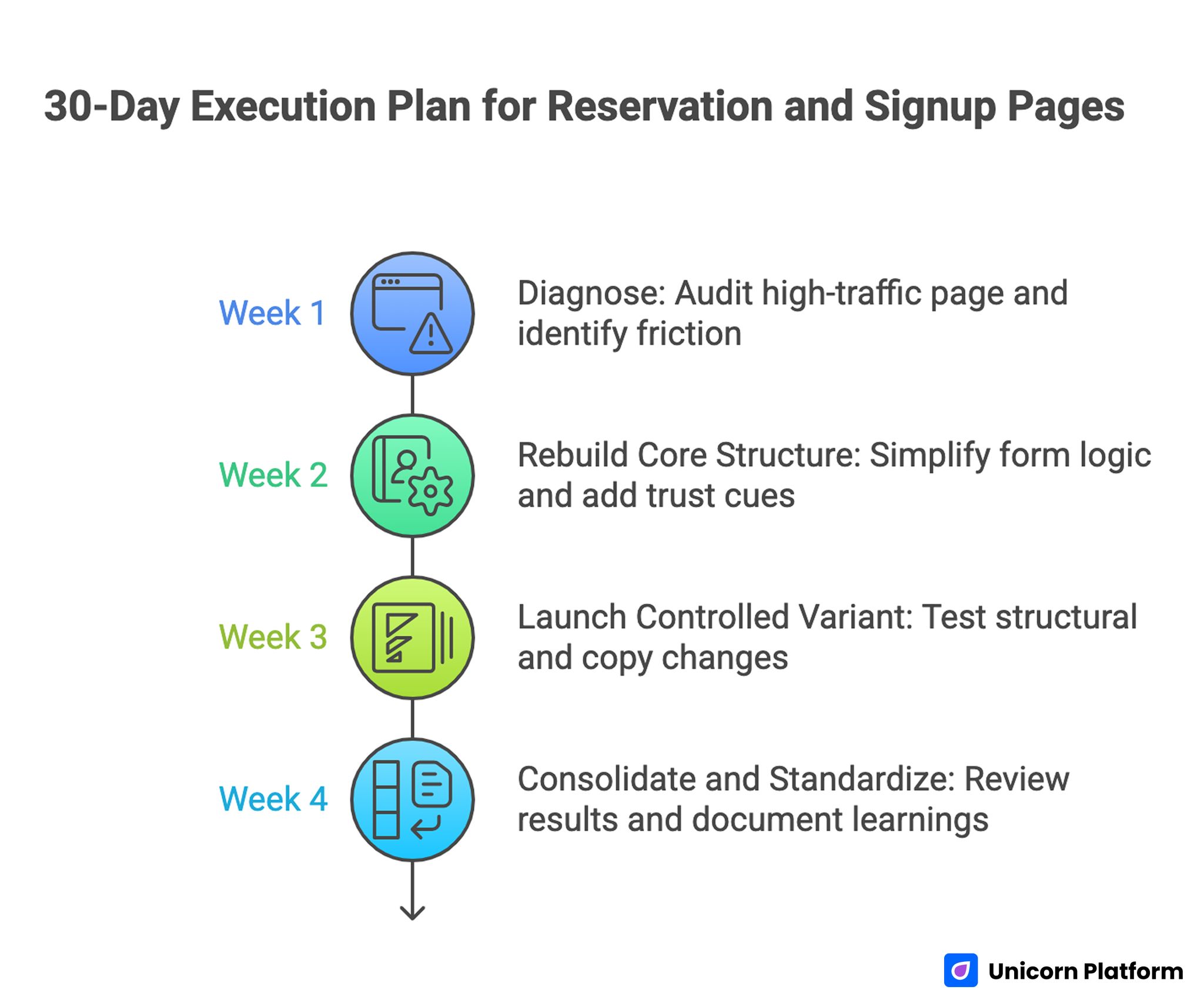
30-Day Execution Plan for Reservation and Signup Pages
Week 1: Diagnose
Audit one high-traffic reservation or signup page. Map drop-off points, identify unclear messages, and prioritize one primary friction source.
Week 2: Rebuild Core Structure
Apply clear sequence architecture, simplify form logic, and move key trust cues closer to action points. Keep changes focused so you can attribute performance shifts accurately.
Week 3: Launch Controlled Variant
Test one structural change and one copy change tied to a primary quality metric. Keep traffic sources and timing windows stable.
Week 4: Consolidate and Standardize
Review results, promote winning changes into templates, and document learnings for the next cycle. This step is what turns one good test into repeatable team capability.
Repeat monthly so improvements compound instead of resetting with each campaign. Consistent cadence usually outperforms occasional major redesigns.
Scenario Playbooks
Scenario 1: High Reservation Starts, Weak Completion
A business sees strong reservation starts from paid campaigns but weak completion after users reach form steps. Analysis shows that logistics and cancellation details appear too late, creating hesitation just before commitment. Moving essential timing and policy context above the form usually improves completion quality without increasing page length.
Scenario 2: Strong Signup Volume, Low Activation
A SaaS team increases signup count but activation remains low. The page promises quick onboarding yet does not explain first-session steps. Updating post-signup expectation copy and simplifying initial form fields often improves both completion and early activation because users understand immediate value and effort.
Scenario 3: Multi-Source Traffic, Inconsistent Quality
A team uses one generic page for search, social, and referral channels. Conversion rates vary widely and support load increases from low-fit submissions. Building source-aware variants with shared structure but tailored first-screen framing usually stabilizes quality across channels and improves attribution clarity.
Common Mistakes and Fixes
Mistake 1: Too many goals on one page
Fix: Keep one dominant action and remove competing conversion paths from primary sections. This improves focus and makes user decisions faster.
Mistake 2: Asking for commitment before confidence
Fix: Place trust and process clarity before forms and CTAs. Users submit more confidently when they understand what will happen after action.
Mistake 3: Overloading early forms
Fix: Capture only essential first-step data and move secondary fields later. Progressive profiling usually improves both completion and data quality.
Mistake 4: Treating confirmation pages as afterthoughts
Fix: Use confirmations to reinforce next steps, timing, and support channels. Strong confirmation copy reduces drop-off between submission and fulfillment.
Mistake 5: Running broad tests with unclear attribution
Fix: Limit each experiment to controlled variables tied to one primary metric. This keeps interpretation clean and prevents false optimization conclusions.
Mistake 6: Ignoring mobile-specific friction
Fix: Validate full interaction flow on real devices before and after launch. Mobile-specific checks should be treated as release gates, not optional extras.
FAQ: Reservation and Signup Pages
1. How long should a reservation or signup page be?
Length should match decision complexity. Simple actions can convert with concise pages, while higher-risk decisions require more trust and process detail.
2. Should reservations and signups share the same page?
Only if they support the same primary goal. If user intent diverges, separate variants usually convert better.
3. What is the most important element above the fold?
A clear relevance statement plus one obvious next step. Users should understand fit and action within seconds.
4. How many fields should a first-step form include?
Use the minimum required to route or initiate fulfillment. Extra fields should be deferred to later steps.
5. What trust signal works best?
The signal that answers the user’s current concern. Trust cues are most effective when matched to context and placed near friction points.
6. How often should these pages be updated?
Review high-traffic pages monthly and update sooner when offers, policy, or user behavior changes. Faster refresh cycles are especially important for seasonal campaigns.
7. Which metric matters more: conversion rate or submission count?
Conversion rate is useful, but quality metrics such as activation, show rate, and support burden provide the real business picture. Without quality metrics, teams can scale low-value conversions by mistake.
8. Can one template scale across campaigns?
Yes, if structure is stable and message emphasis is adapted by source and intent stage. This allows scale without sacrificing relevance for specific traffic cohorts.
9. How do I reduce no-shows after reservations?
Improve pre-submit clarity and post-submit confirmation guidance. Most no-shows come from uncertainty, not lack of interest.
10. What is the first change most teams should test?
Test first-screen relevance and trust placement near the initial action. This combination often drives immediate quality gains.
Final Takeaway
High-performing reservation and signup pages win by making decisions easier in the exact order users make them. Clear relevance, timely trust, simple form logic, and explicit next steps create the foundation for reliable conversion quality.
When teams combine this framework with fast iteration in Unicorn Platform, they can launch quickly without losing rigor. That balance of speed and structure is what produces durable gains across campaigns, not one-off conversion spikes.
Related Blog Posts
- Booking Landing Page Examples in 2026: How to Turn Scheduling Intent Into Reliable Conversions
- Travel Agency Website Strategy That Turns Visits Into Qualified Bookings
- Resort Booking Page Playbook: How to Turn Resort Traffic Into Qualified Direct Revenue
- Beauty Conversion Pages in 2026: From Social Attention to Qualified Bookings
