Table of Contents
- Why Product-Focused Pages Underperform
- Build First-Screen Architecture for Decision Speed
- 30-60-90 Day Execution Plan
- Common Failure Patterns and Fixes
- FAQ
A high-performing product page does more than collect clicks. It helps the right buyers understand fit quickly, trust your claims, and take the next step with realistic expectations. When these page jobs are done well, conversion quality improves across the funnel, not only at the first form submit.
Many teams still treat page optimization as visual polishing. They change hero images, tweak button colors, or shuffle sections without fixing core decision friction. Those updates may move engagement metrics briefly, but they rarely improve qualified revenue outcomes.
The more reliable approach is structural. You map buyer intent, sequence claims and proof in the right order, remove commitment friction, and align pre-click promises with post-click reality. This guide breaks that model into clear actions you can run with Unicorn Platform.
sbb-itb-bf47c9b
Key Takeaways
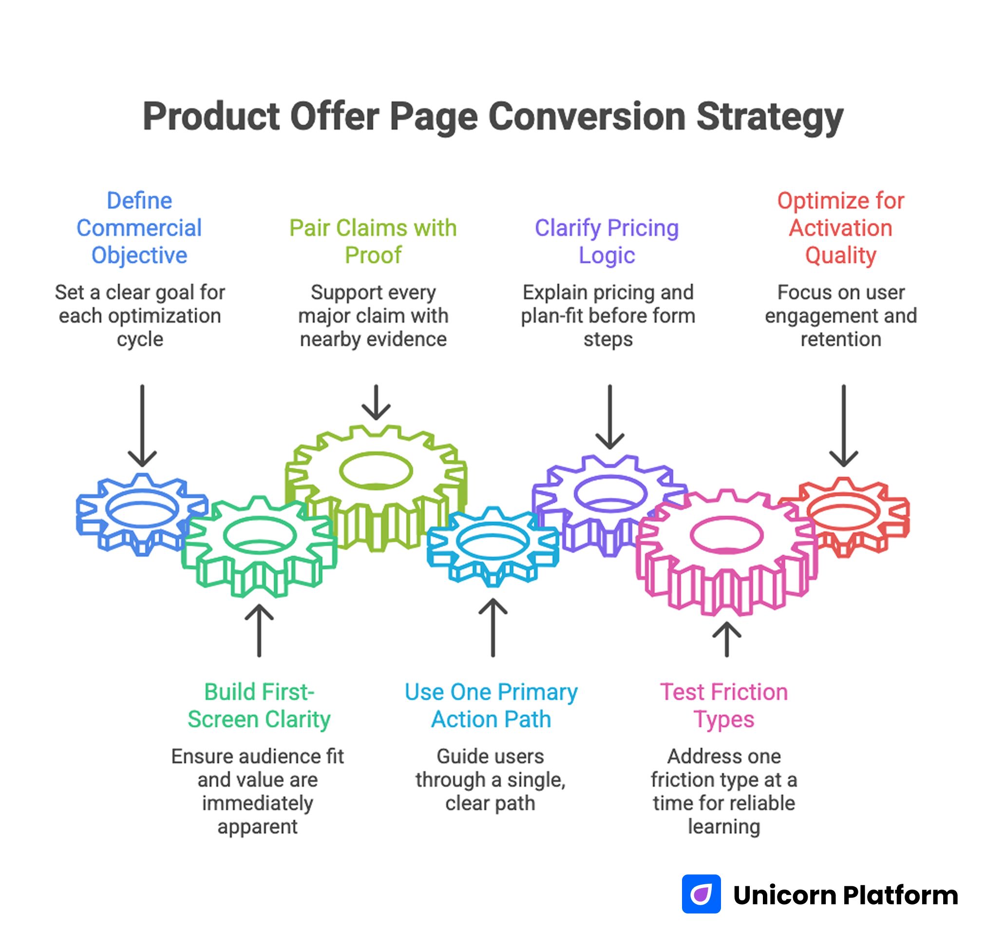
Product Offer Page Conversion Strategy
- Define one commercial objective per optimization cycle.
- Build first-screen clarity around audience fit and outcome value.
- Pair every major claim with nearby proof.
- Use one primary action path per page and match commitment level to intent stage.
- Clarify pricing logic and plan-fit guidance before deep form steps.
- Test one major friction type at a time for reliable learning.
- Optimize for activation quality, not only signup volume.
Why Product-Focused Pages Underperform
Most weak pages fail in predictable ways. They open with broad value language, delay practical specifics, and ask for high-commitment actions before trust is established. Visitors may click because the acquisition message sounded compelling, then leave once they cannot quickly validate fit.
Another frequent issue is proof detachment. Teams add testimonials and logos, but those trust elements are not connected to concrete claims. Users see social proof without understanding how it supports their specific concern.
CTA overload is another conversion leak. When one page presents "Start free," "Book demo," "Watch video," "Read docs," and "Contact sales" with equal visual weight, decision effort rises. Friction increases at the exact moment clarity should be highest.
Pages also underperform when acquisition and lifecycle teams use different narratives. If ads promise instant value while the page reveals onboarding complexity late, conversion quality suffers and early churn rises.
Set a Commercial Objective Before Editing Sections
Every serious optimization cycle should start with one commercial target. Possible targets include higher qualified trial share, stronger activation rate from paid traffic, lower acquisition cost for high-fit users, or improved plan-upgrade progression.
A single objective creates decision discipline. It helps determine what belongs in first-screen messaging, which objections need early handling, and what the primary action should be.
Define the objective in operational terms. For example: increase qualified self-serve trials from product-led teams while reducing short-lived, low-fit activations. This statement links page behavior to real business outcomes.
Without this objective anchor, teams often chase local wins that do not improve revenue quality. The result is high activity with weak commercial progress.
Map Visitor Intent and Decision Stages
Traffic is not one audience. Product pages receive visitors at different readiness levels, and each group needs different clarity.
A practical intent map:
- Problem-aware visitors looking for orientation and relevance.
- Solution-aware visitors comparing options and risk.
- Decision-ready visitors evaluating fit, cost, and implementation effort.
A single page can support all three groups if section sequencing is explicit. Start with relevance, then provide mechanism clarity, then address risk and commitment.
Intent mapping should also include source context. Paid visitors may need stronger message match. Organic visitors may need deeper explanatory content. Referral visitors may need faster credibility validation.
When intent assumptions are explicit, section priorities become easier to defend and test. Teams can also segment reporting by readiness stage instead of blending unlike visitors.
Build First-Screen Architecture for Decision Speed
The first screen should resolve five questions in seconds: who this is for, what outcome it creates, why it is different, what evidence supports it, and what to do next.
A reliable first-screen pattern includes one focused headline, one mechanism-oriented subhead, one trust cue, and one dominant CTA. Keep visual complexity low and copy concrete.
If your team needs benchmark inspiration for first-screen hierarchy and section sequence, this breakdown of product-focused campaign examples is useful when validating structure choices.
The first screen should not carry every detail. Its job is to establish relevance and momentum toward deeper evaluation.
Clarify the Value Mechanism, Not Just the Benefit
Benefit claims without mechanism detail often sound generic. Buyers trust outcomes more when they can see how results are produced.
After the first screen, include a short mechanism section that explains what the product changes in a user's workflow. This can be process simplification, decision automation, collaboration speed, or risk reduction.
Mechanism clarity should be specific enough to differentiate you from alternatives. Replace statements like "Work smarter" with precise language such as "Reduce handoff errors by centralizing approval and feedback steps in one flow."
This section should also bridge to proof. If you claim faster execution, show where that speed appears in practical usage.
Connect Claims to Evidence at the Right Moment
Evidence works best when placed near the claim it validates. Large testimonial blocks with no contextual link often feel decorative rather than persuasive.
Pair major claims with compact proof modules:
- Baseline condition.
- Change introduced.
- Outcome observed.
- Implementation context.
Case snippets are especially effective when they include scope and constraints. Even qualitative evidence can build trust if it is specific and realistic.
Proof diversity matters too. Mix customer outcomes, expert validation, and product-usage credibility signals. This gives different buyer personas the evidence format they trust most.
Improve Offer Clarity and Plan Fit
Pricing and packaging confusion is one of the fastest ways to lose high-intent visitors. Buyers do not need every line item immediately, but they do need a clear mental model of value and fit.
A practical offer section should answer:
- Which plan fits which use case.
- What each plan unlocks.
- What common factors influence cost.
- What support or onboarding differences exist by tier.
Plan-fit guidance reduces low-quality conversions by helping users self-select. It can reduce raw signup volume while improving activation and retention quality.
If your team uses ecommerce-style comparison logic, the structure examples in ecommerce landing benchmarks can help adapt merchandising clarity to software or product offers.
Match CTA Commitment to Readiness
CTA strategy should reflect intent stage. Asking for high commitment from early-stage visitors creates avoidable drop-off.
Use a commitment ladder:
- Low commitment: explore guided resources or short demo view.
- Medium commitment: start trial with limited setup requirements.
- High commitment: schedule consultative walkthrough for complex needs.
Each page should still preserve one dominant action. Secondary options should support progression without stealing attention.
Form design is part of CTA strategy. Keep first-step forms short and qualification-focused. Collect additional detail after initial intent is confirmed.
Handle Objections Before the Final CTA
Most buyers do not convert because they still carry unresolved uncertainty. Objection handling sections should appear before the main conversion point.
Common objection categories:
- Implementation effort and timeline.
- Integration or migration risk.
- Cost justification and ROI confidence.
- Team adoption complexity.
- Support responsiveness and reliability.
Address objections in concise, practical language. Overly defensive or overly broad responses reduce trust.
Risk-reduction elements such as trial terms, onboarding guidance, and clear support expectations can improve conversion quality when presented transparently. These details make commitment feel safer without weakening offer strength.
Borrow Ecommerce Logic Without Copying Storefront Patterns
Ecommerce teams have refined decision-speed patterns that product teams can adapt effectively. The value is not in copying visual style. The value is in copying decision clarity discipline.
High-impact principles to borrow:
- Clear hierarchy from value to action.
- Strong comparison and selection guidance.
- Trust reinforcement near commitment points.
- Policy transparency to reduce post-click anxiety.
When adapting these principles, translate them to your product's buying context. A B2B workflow tool and a consumer product have different trust requirements, even if they share conversion architecture patterns.
For deeper intent and structure mapping, this SaaS content hierarchy framework helps teams align section order with buyer readiness.
Keep Visual Design in Service of Comprehension
Visual quality matters, but readability and decision clarity matter more. Dense visual effects can make pages look premium while hiding core value signals.
Use visuals that directly reduce uncertainty:
- Product interfaces tied to specific outcomes.
- Comparison blocks that simplify selection.
- Short explainer graphics for complex mechanics.
Keep screenshot labeling explicit so users understand what they are seeing and why it matters. Unlabeled UI shots can increase noise instead of confidence.
Animation and interactive demos should be selective and purposeful. If advanced visual tools are used, they should support explanation rather than decoration.
Optimize for Mobile Buyer Behavior
Mobile traffic is often underestimated in B2B and product-led funnels. Many early-stage comparisons and stakeholder shares happen on smaller screens, even when final purchase occurs later on desktop.
Mobile optimization priorities:
- First-screen readability without zooming.
- Clear CTA visibility above key scroll breaks.
- Fast loading of primary value and trust content.
- Stable layout around media and form components.
- Tap targets that avoid accidental interactions.
Real-device checks are essential. Desktop previews rarely capture all friction patterns that appear during real usage.
Mobile quality should be validated before campaign scaling. Paying for traffic to weak mobile experiences creates unnecessary acquisition waste.
Build Discovery Pathways From Intent to Conversion
A conversion page should not operate in isolation. Supporting discovery content can pre-qualify visitors and improve downstream conversion quality.
Create a layered path:
- Intent-focused educational articles.
- Comparison or evaluation resources.
- Product decision page with clear action.
Internal links should connect these layers naturally, based on user questions rather than arbitrary placement. For broader layout and sequence standards, a high-converting landing page structure guide is useful when auditing navigation flow.
Discovery pathways also improve measurement clarity by showing how users progress from problem education to product decision. That visibility helps teams identify which content actually creates pipeline value.
Run Experiment Streams by Friction Type
Testing works best when each experiment targets one friction category. Mixing unrelated changes in one release makes results hard to interpret.
Useful friction streams:
- Relevance friction in first-screen messaging.
- Trust friction in proof placement and specificity.
- Offer friction in pricing and plan-fit communication.
- Commitment friction in CTA and form design.
Run one primary experiment per stream in each cycle, with predefined success and guardrail metrics. Keep test windows long enough for reliable signal.
Document hypothesis, change scope, expected behavior shift, and final decision. This creates an evidence base that compounds over time.
Protect Post-Conversion Quality
A page that increases signups but decreases activation quality is not a true win. Post-conversion outcomes should be part of page evaluation.
Track quality signals by variant:
- Activation completion rate.
- Early support request patterns.
- Short-term churn by acquisition source.
- Time-to-value for new users.
If a variant attracts low-fit traffic, adjust expectation setting and scope clarity before scaling spend. Conversion quality is a revenue efficiency problem, not just a volume problem.
Lifecycle teams should be involved in page reviews so pre-click and post-click messaging stay aligned. This alignment reduces expectation gaps that often trigger early churn.
Establish Governance for Continuous Optimization
Consistency requires ownership. Even small teams need clear responsibilities for messaging quality, proof freshness, analytics review, and release QA.
A practical governance cadence:
- Weekly metric review for emerging shifts.
- Monthly structural review for section-level decisions.
- Quarterly strategy review for audience and offer alignment.
Use concise change logs for each release. Record what changed, why it changed, and what happened. Avoid long narrative reports that obscure decisions.
On Unicorn Platform, modular sections and rapid publishing make this governance model lightweight enough for startup teams while still supporting rigorous learning. Teams can move quickly without abandoning decision quality standards.
Channel-Specific Variant Strategy for Better Conversion Quality
Most product teams run several acquisition channels at once, but they still send all traffic to one generic conversion page. That decision usually lowers performance because each source arrives with different expectations and trust levels. A paid-search visitor with active intent is not evaluating the same way as a social visitor discovering your product for the first time.
A stronger approach is to build a controlled variant system by channel and intent stage. The key word is controlled. You are not creating dozens of unrelated pages. You are using one core narrative with targeted emphasis shifts that preserve brand consistency.
A practical variant model can include:
- Paid search variant focused on direct problem-solution relevance and rapid action.
- Content referral variant focused on deeper context and mechanism explanation.
- Partner/referral variant focused on trust transfer and fit clarification.
- Retargeting variant focused on objection handling and risk-reduction clarity.
Each variant should keep the same structural backbone:
- Audience-fit relevance statement.
- Mechanism clarity.
- Contextual proof.
- Offer or plan guidance.
- Primary action path.
What changes is emphasis order and copy detail. For paid search, shorten explanation and accelerate proof. For referral traffic, highlight credibility and onboarding expectations earlier. For retargeting flows, foreground uncertainty resolution and policy transparency.
Message match is the central performance lever in this model. If ad copy promises speed and the page opens with abstract product philosophy, trust breaks immediately. If educational content promises strategic depth and the page asks for signup before explanation, visitors hesitate. Channel variants solve this mismatch.
Teams should also adapt CTA language by source intent. A high-intent search visitor may respond to direct trial start wording. A social visitor may need a lower-commitment transition such as guided walkthrough or use-case preview before committing.
Variant design should include guardrails:
- Maintain one dominant CTA per variant.
- Keep shared proof modules consistent across variants.
- Limit changes to one or two friction themes each cycle.
- Document every variant hypothesis before launch.
Without guardrails, variant programs become hard to maintain and impossible to evaluate.
Operationally, this system works best with a simple naming convention and ownership map. Label each variant by channel and intent stage, then assign one owner for message quality and one owner for measurement QA. This reduces drift when campaigns move quickly.
Variant measurement should focus on quality signals, not only top-funnel actions. A variant that increases signups but lowers activation quality should not be scaled. Always pair conversion metrics with downstream outcomes when making rollout decisions.
A practical weekly variant review can include:
- Traffic and conversion by variant.
- Qualified conversion by variant.
- Activation completion by variant.
- Early support burden by variant.
- Churn risk indicators by variant.
This review format helps teams detect false positives early. It also makes it easier to retire underperforming variants before they consume additional budget.
Channel-specific design is not only for paid media. Email campaigns, product launches, partner announcements, and webinar recaps can all benefit from intent-aligned page variants. Consistency in this system compounds over time and improves forecast reliability.
When executed with discipline, variants increase both speed and clarity. Teams launch faster because templates are reusable, and decisions improve because each variant has a clear hypothesis and measurable commercial role.
Quarterly Scorecard for Revenue-Quality Conversion
Monthly optimization cycles are useful, but quarterly scorecards reveal whether local improvements are producing durable business outcomes. Without a structured scorecard, teams can misread short-term wins as strategic progress.
A high-value scorecard blends four layers:
- Commercial outcomes.
- Conversion-quality behavior.
- Activation and retention health.
- Operational consistency.
Commercial outcomes should include qualified pipeline impact, efficient acquisition trends, and progression to paid or expanded usage where relevant. These are the outcomes leadership evaluates when deciding budget and priority.
Conversion-quality behavior gives diagnostic depth. Track first-screen progression, proof-section engagement, offer-page interactions, and CTA step-through quality. These metrics explain why results changed, not just whether they changed.
Activation and retention health protects against misleading wins. If a page variant drives strong top-of-funnel numbers but weak onboarding completion, the cost of low-fit acquisition can erase headline performance gains.
Operational consistency measures whether your optimization system is becoming stronger. Useful indicators include test completion rate, documentation quality, decision latency, and percentage of winning patterns rolled into base templates.
A practical quarterly review agenda:
- Reconfirm target audience assumptions.
- Evaluate which variants produced strongest qualified outcomes.
- Review failure clusters by friction type.
- Decide what to scale, retire, or retest.
- Update next-quarter experiment priorities.
Failure clustering is one of the most valuable steps. Instead of labeling tests simply as "win" or "loss," classify outcomes by root cause category:
- Relevance mismatch.
- Trust-proof weakness.
- Offer ambiguity.
- Commitment friction.
- Post-conversion quality mismatch.
This taxonomy improves next-quarter hypothesis quality and reduces repeated errors.
Scorecards should also include threshold alerts. Examples:
- Qualified conversion drops below baseline for two consecutive weeks.
- Activation completion declines after page rollout.
- Support burden rises sharply from new users by variant.
- Early churn increases for one acquisition source.
Threshold alerts create action triggers that prevent silent performance decay.
Ownership is critical. Assign one scorecard owner and define clear responsibilities for data integrity, interpretation, and follow-up actions. Shared accountability with no owner often leads to reporting without decisions.
Report format should stay concise and decision-first. For each major variant or section change, include:
- What changed.
- Why it changed.
- What happened.
- What decision was made.
- What happens next.
This format keeps quarterly review practical for both growth operators and leadership stakeholders.
Quarterly scorecards also improve cross-team alignment. Acquisition, product marketing, onboarding, and lifecycle teams can evaluate page outcomes through one language instead of disconnected dashboards.
Over time, this discipline creates compounding advantages. Teams spend less energy debating subjective preferences and more energy scaling proven structures. Revenue-quality conversion becomes predictable because decisions are tied to evidence and repeated in a stable cadence.
30-60-90 Day Execution Plan
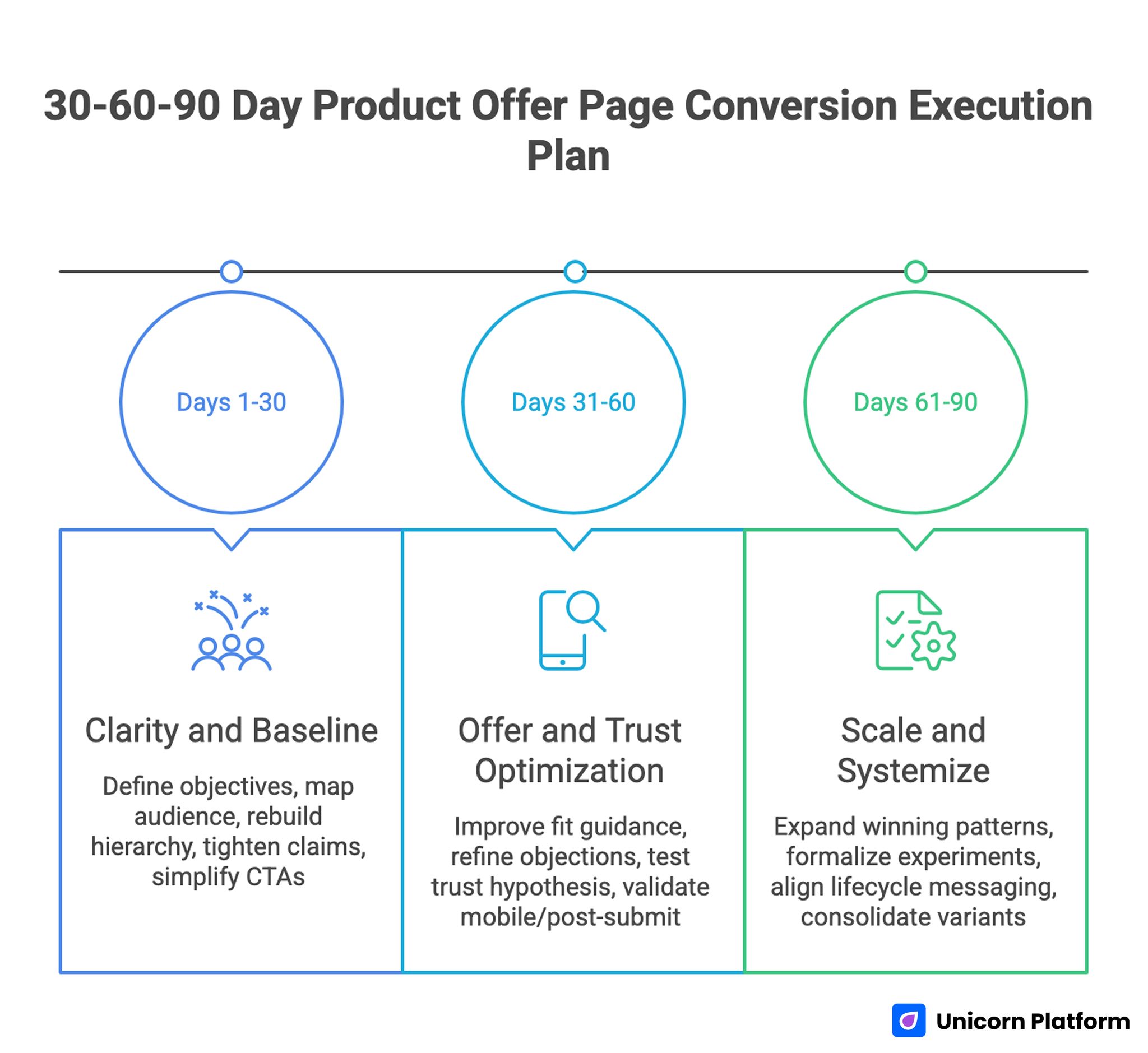
30-60-90 Day Product Offer Page Conversion Execution Plan
Days 1-30: Clarity and Baseline
Define commercial objective, map audience intent, and rebuild first-screen hierarchy. Tighten claim-proof connections and simplify CTA structure.
By day 30, buyers should be able to evaluate fit and take the right first action with less hesitation. Early performance signals should reflect stronger message match across top acquisition channels.
Days 31-60: Offer and Trust Optimization
Improve plan-fit guidance, refine objection handling, and test one trust-friction hypothesis. Validate mobile experience and post-submit flow quality.
By day 60, qualified conversion behavior should improve and low-fit submissions should decline. Activation readiness should also improve because expectation-setting is clearer.
Days 61-90: Scale and Systemize
Expand winning patterns across major variants, formalize experiment logs, and align lifecycle messaging with acquisition promises. Consolidate underperforming variants so maintenance complexity stays controlled.
By day 90, the team should operate a repeatable page optimization system rather than isolated redesign cycles. Reporting should show measurable quality gains, not only top-funnel fluctuations.
Common Failure Patterns and Fixes
Failure: Broad Messaging, Weak Buyer Fit
Visitors read the page but cannot tell whether the product is for them. Use audience-specific first-screen framing and clearer outcome language so relevance is obvious before deeper evaluation.
Failure: Attractive Page, Low Trust Conversion
Design quality is high but evidence is vague or detached from claims. Pair each major claim with nearby contextual proof so trust builds at the exact point of doubt.
Failure: High Signup Volume, Weak Activation
Top-funnel conversion improves while downstream quality drops. Tighten expectation setting and clarify implementation effort before signup so activation quality remains healthy.
Failure: Pricing Interest, Low Commitment
Users engage with pricing sections but hesitate to act. Improve plan-fit guidance and reduce hidden ambiguity so buyers can choose with confidence.
Failure: Multiple CTAs Compete for Attention
Visitors click around without clear progression. Enforce one primary action and structured secondary paths to preserve decision momentum.
Failure: Mobile Bounce on Paid Traffic
Campaigns drive traffic that leaves quickly on small screens. Improve mobile-first readability, load order, and interaction comfort to protect paid efficiency.
Failure: Endless Redesigns Without Learning
Teams make frequent changes but cannot identify what caused improvement. Test one friction type at a time with clear success criteria so conclusions remain reliable.
FAQ: Product Conversion Pages in 2026
1) What is the most important section on a conversion-focused product page?
The first screen has the highest impact because it sets relevance, trust direction, and action clarity. Weak first-screen messaging limits everything that follows.
2) Should every page include pricing?
Not always full pricing, but users need enough value and fit context to decide whether deeper engagement is worthwhile. Pricing ambiguity often causes unnecessary drop-off.
3) How many CTA options are too many?
If multiple actions look equally primary, there are too many. Preserve one dominant action and keep alternatives supportive rather than competitive.
4) How often should sections be updated?
Run monthly structural reviews and update immediately when offer scope, onboarding process, or policy terms change. This rhythm keeps page promises aligned with product reality.
5) What kind of proof works best?
Proof with context works best: baseline, change introduced, and outcome observed. Generic testimonials are usually less persuasive.
6) Can ecommerce patterns really improve B2B product pages?
Yes, when adapted thoughtfully. Decision-speed architecture, comparison clarity, and risk-reduction cues often translate well across categories.
7) What is the first experiment to run if conversion is weak?
Test first-screen relevance framing and claim-proof alignment before deeper layout changes. These areas typically produce the clearest early signal.
8) Which metric should guide decisions first?
Use qualified conversion rate as a primary signal, then pair it with activation and churn quality to validate downstream impact. This combination prevents false wins from low-fit acquisition.
9) How do we prevent low-fit signups?
Improve self-qualification through audience-fit language, plan guidance, and transparent expectation setting before commitment. Better self-selection usually improves both conversion quality and support efficiency.
10) What makes optimization sustainable over time?
Clear ownership, consistent review cadence, and disciplined experiment documentation create compounding improvement. Teams that maintain this discipline usually outperform teams relying on periodic redesigns.
Final Takeaway
Strong product conversion pages are built with structural discipline. When relevance, proof, offer clarity, and action design are sequenced correctly, pages attract better-fit buyers and improve downstream outcomes.
Use this framework to make optimization measurable, repeatable, and commercially useful. The result is not only more conversions, but higher-quality growth.
