Table of Contents
- The Decision Architecture Behind High-Converting Product Pages
- Analytics Model for Business-Grade Optimization
- 30-Day Implementation Plan
- Common Failure Modes and Practical Fixes
- FAQ
Teams rarely fail because they cannot drive traffic. They fail because the page after the click does not reduce uncertainty fast enough. Visitors arrive with some level of intent, but they cannot quickly understand what the product does, why it is credible, and what to do next.
That gap between attention and decision is where revenue is won or lost. A page can be visually strong, technically modern, and still underperform when its decision flow is unclear. The issue is usually not design taste. The issue is message architecture, proof timing, and CTA hierarchy.
High-performing product pages function like operating systems, not launch artifacts. They guide a buyer through relevance, understanding, confidence, and commitment in an intentional sequence. When that sequence is stable, teams can scale campaigns faster with less performance volatility.
Unicorn Platform is useful in this context because it supports fast iteration without forcing teams to rebuild structure every sprint. Speed only becomes valuable when it is paired with consistency. Consistency is what turns page editing from ad hoc activity into measurable growth work.
sbb-itb-bf47c9b
Quick Takeaways
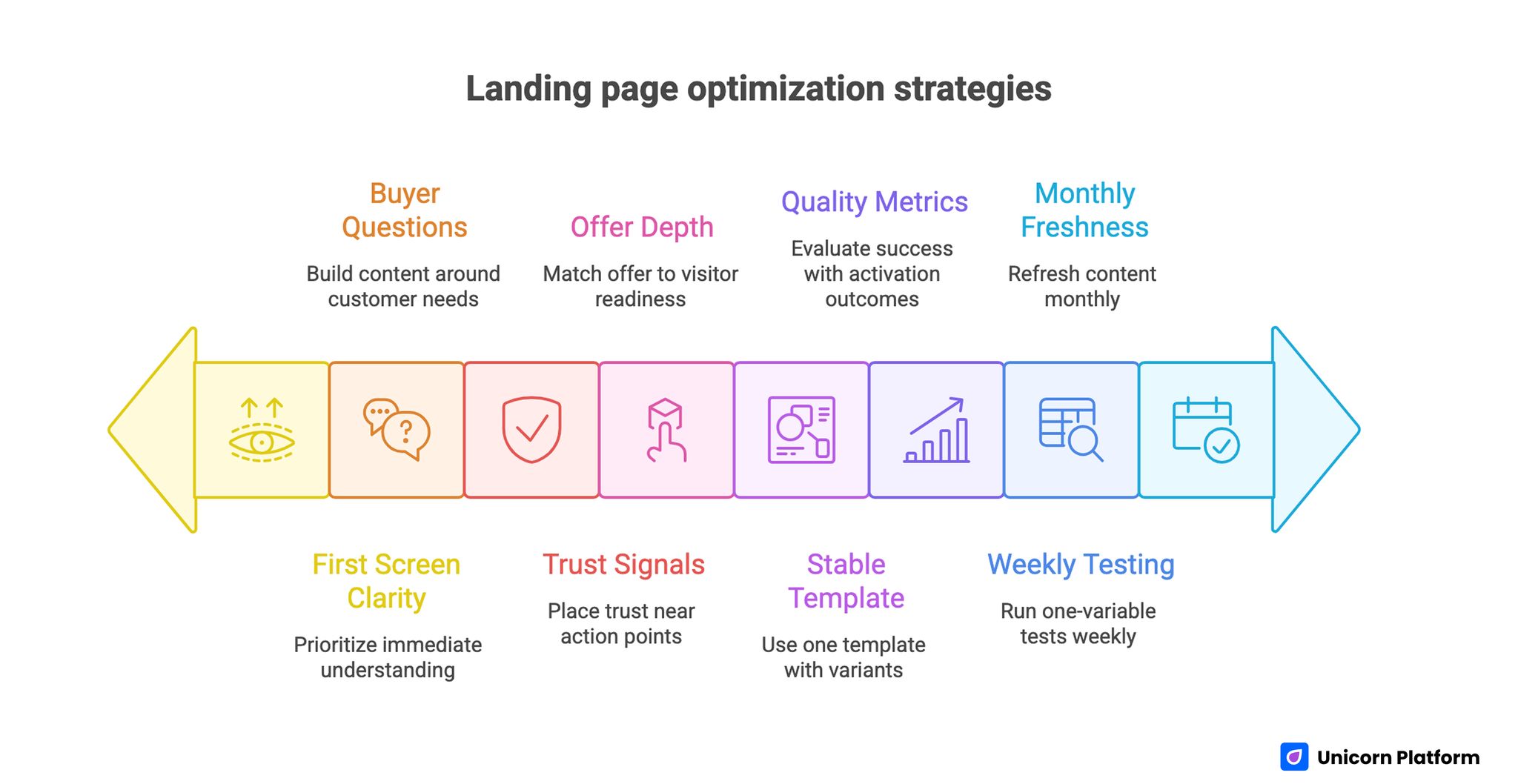
Landing Page Optimization Strategies
- Treat each page as a decision journey with one primary objective.
- Build content blocks around buyer questions, not internal feature lists.
- Prioritize first-screen clarity before adding extra visuals or sections.
- Place trust signals near action points instead of burying proof lower on the page.
- Match offer depth and CTA type to visitor readiness.
- Use one stable template and create channel-aware variants with controlled differences.
- Evaluate success with quality metrics tied to activation and revenue outcomes.
- Run a weekly one-variable testing cadence and a monthly freshness cycle.
Why Product Pages Underperform After Launch
Most underperformance starts with mixed intent handling. A single page attempts to serve first-time visitors, evaluators, procurement stakeholders, and late-stage buyers with equal emphasis. The result is weak priority signaling and slower decisions.
Another frequent issue is feature-heavy copy without workflow clarity. Buyers do not convert because they read a longer list of capabilities. They convert when they understand how the product changes their process and what outcomes to expect.
Teams also underestimate proof decay. A page may launch with relevant social proof, strong positioning, and clear trust cues, but as product direction and buyer expectations evolve, those signals can become stale. Conversion declines gradually, then suddenly feels unpredictable.
Finally, operational drift causes silent regressions. Different contributors update sections independently, CTA hierarchy shifts, and message consistency erodes. Without governance, the page becomes a collection of edits instead of a coherent conversion path.
The Decision Architecture Behind High-Converting Product Pages
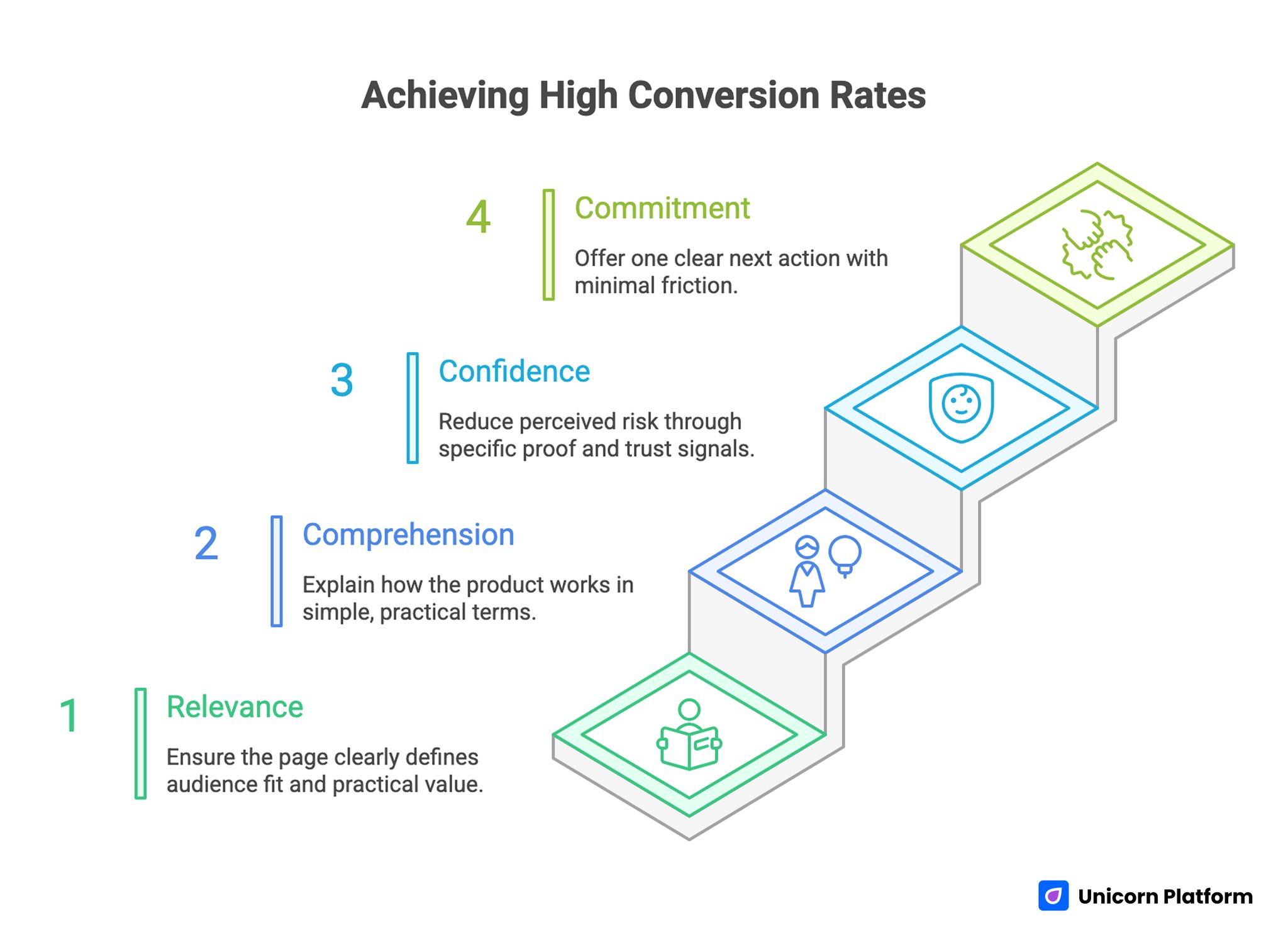
Architecture Behind High-Converting Product Pages
Strong pages usually follow a stable four-stage decision structure. Stage one is relevance. Stage two is comprehension. Stage three is confidence. Stage four is commitment. This pattern aligns with real buyer behavior under limited attention.
Relevance answers whether the visitor should continue. Comprehension explains how the product works in practical terms. Confidence reduces perceived risk through specific proof. Commitment offers one clear next action with minimal friction.
When one stage is missing, friction multiplies. A visitor who does not understand fit ignores proof. A visitor who sees proof but cannot map it to their context postpones commitment. A visitor who wants to act but sees multiple equal CTAs often abandons the decision.
This architecture is useful because it gives teams objective section jobs. Copy reviews become about stage performance rather than subjective preference. That shortens production cycles and improves edit quality.
Stage 1: Relevance
The opening section should define audience fit and practical value in plain language. It should be obvious who the page is for and what change the product creates.
Relevance does not require exhaustive detail. It requires directional clarity. If visitors cannot answer "is this for me" in seconds, deeper sections lose impact.
Stage 2: Comprehension
After relevance, buyers need a simple mental model of usage. What happens first, what happens next, and what result should appear if implementation is successful.
This is where many teams over-index on terminology. Comprehension improves when copy emphasizes process and outcomes rather than internal product taxonomy.
Stage 3: Confidence
Confidence depends on evidence quality and evidence placement. Buyers need proof that the promise is reliable for users like them.
Relevant trust signals include implementation outcomes, credible comparisons, operational transparency, and practical support clarity. Proof is strongest when it directly resolves known hesitations.
Stage 4: Commitment
Commitment should feel like a natural continuation of the evaluation flow, not a sudden leap. The page needs one dominant path and one strategic fallback path.
If commitment options are visually equal, decision energy collapses. CTA hierarchy is not a cosmetic preference. It is a core conversion mechanism.
First-Screen Messaging That Actually Moves Decisions
The first screen has one job: earn the next scroll or click. It should communicate fit, expected outcome, and immediate next step without requiring interpretation.
Outcome-led messaging consistently performs better than identity-led messaging in high-intent contexts. Buyers need to see what changes for them, not only how the company describes itself.
A practical first-screen formula is useful for teams under launch pressure: audience fit line, outcome statement, effort framing, primary action, and one concise credibility cue. This formula prevents vague openings that look polished but fail to convert.
For teams refining section sequence and hierarchy decisions, this high-converting product landing page guide provides a useful implementation reference for structural choices.
Product Narrative: Features, Workflows, and Outcomes
Feature lists have a role, but they are rarely persuasive on their own. Buyers need to understand how capabilities combine into a workflow that changes performance, speed, or risk.
Use a three-part narrative pattern. First, define the current operational problem. Second, show how the product changes the process. Third, clarify the expected outcome and timeline.
This pattern improves comprehension because it connects product capability to buyer reality. It also improves sales handoff quality, since visitors arrive with clearer expectations.
A Practical Workflow Block Template
- Starting state: what the current process looks like.
- Transition state: what changes when the product is introduced.
- End state: what measurable condition improves.
Teams can repeat this block for primary use cases without making the page feel repetitive. Each block should resolve one distinct buyer question.
Proof Design: Building Trust With Specificity
Proof should not be treated as a decorative section. It is part of decision engineering. Buyers use proof to estimate implementation risk and outcome reliability.
High-quality proof is specific, recent, and contextual. It names the problem environment, the approach, and the observed result. Generic praise without context rarely reduces risk perception.
Placement matters as much as content. Proof should appear before major commitment asks and near sections where hesitation is most likely. If trust appears only near the bottom, many high-intent visitors never see it.
Risk Reversal and Friction Reduction
Buyers hesitate around cost, effort, compatibility, and reversibility. High-performing pages handle these concerns proactively instead of assuming they belong in post-click conversations.
A risk-reduction block can include onboarding expectations, implementation support clarity, cancellation transparency, and integration boundaries. The goal is not to eliminate all uncertainty. The goal is to show that uncertainty is manageable.
When teams ignore these concerns, conversion rates often look reasonable while downstream activation and retention quality declines. Risk-reversal content protects both immediate conversion and long-term fit.
Offer Design by Readiness Level
Not all visitors should receive the same ask. Cold visitors may need a low-friction entry. Warm visitors may need evidence depth. High-intent visitors may be ready for direct activation.
Offer architecture should align with these readiness states. One dominant action should map to the current campaign objective. A secondary action can serve adjacent intent without competing visually.
This is where many teams confuse optionality with effectiveness. More options do not always improve outcomes. Better sequencing and clearer priority usually outperform broad choice density.
Offer Ladder Model for Product Teams
- Entry offer: low commitment, high clarity, fast value.
- Evaluation offer: deeper context, comparison support, qualification signals.
- Activation offer: direct commitment path with minimal friction.
Use the ladder to map conversion routes by source intent and campaign stage.
CTA Hierarchy and Route Logic
CTA strategy is a routing system, not a copy exercise. The page should make the preferred route obvious while still supporting legitimate secondary paths.
A reliable model includes one dominant primary CTA and one contextual secondary CTA. Tertiary actions should remain available but visually subordinate.
Route logic should be audited monthly. As campaigns evolve, legacy CTAs can survive longer than they should and pull qualified traffic into lower-value paths.
Pricing and Plan Framing
Pricing sections often fail not because price is too high, but because decision context is weak. Buyers need to understand why a plan exists, who it is for, and what tradeoffs are involved.
Good plan framing compares outcomes and use conditions, not just feature counts. This reduces analysis paralysis and helps buyers choose without escalating uncertainty.
When price sensitivity is high, reinforce value certainty with practical implementation signals. Buyers can accept higher price points when risk and expected benefit are explained clearly.
Visual Narrative: Showing Product Logic, Not Just Design Polish
Screenshots and interface clips should explain usage flow. Visuals that look impressive but do not clarify workflow can increase curiosity while decreasing conversion confidence.
Each visual should serve a section job: demonstrate setup simplicity, show operational visibility, or confirm output quality. Pair visuals with concise interpretation so users know what to notice.
For physical products, visual narrative should emphasize context of use and result visibility. Buyers need to imagine real-world fit, not just aesthetic presentation.
Mobile Conversion Engineering
Mobile traffic is often the first touchpoint even in longer B2B cycles. If first-screen clarity, CTA visibility, or form usability is weak on smaller screens, intent can disappear before deeper evaluation begins.
A mobile-ready page should pass real-device checks for readability, tap comfort, route continuity, and form friction. Emulator checks are useful, but they rarely capture all interaction failures.
Teams should monitor mobile drop-off by source, not only aggregate mobile metrics. Severe friction can hide inside one channel while overall averages look acceptable.
Channel-Aware Variants Without Template Chaos
Search, paid social, email, partner referrals, and direct traffic do not enter with the same expectations. Pages perform better when message emphasis reflects source intent.
The safest approach is one canonical template with controlled variation. Modify headline angle, trust sequence, and offer emphasis by source, while preserving structural consistency.
This creates clearer attribution and faster production cycles. Teams can test message hypotheses without rebuilding core architecture or fragmenting brand voice.
For teams with SaaS-heavy acquisition routes, this content hierarchy guide for SaaS landing pages can help calibrate section depth by buyer stage.
Ecommerce and Product-Led Benchmarks
Cross-vertical benchmarking can reveal blind spots in conversion architecture. Product teams often discover that ecommerce-oriented pages are stronger at urgency framing and offer clarity, while SaaS pages are stronger at process explanation.
Borrow principles, not surface structure. Keep your own buyer context central while adapting proven decision patterns from adjacent categories.
If you need comparative inspiration for merchandising and purchase-path clarity, these ecommerce landing page benchmarks can be useful for evaluating offer presentation and conversion cues.
Forms and Qualification Without Killing Completion
Forms should collect routing-critical information while preserving completion flow. Asking for too much too early can reduce qualified volume more than it improves lead quality.
A staged approach usually works well. Gather essential data first, then expand qualification after initial commitment through progressive profiling or follow-up steps.
This protects top-of-funnel momentum and improves downstream handoff quality. It also aligns with mobile behavior, where long forms amplify abandonment risk.
Post-Conversion Continuity
Conversion events are not finish lines. They are handoff moments. If the next interaction does not reinforce page promise, trust can decline immediately.
Post-conversion continuity includes confirmation language, onboarding sequence, response expectations, and first-value delivery. These steps should feel like an extension of the same narrative.
Teams that align page promise with early lifecycle experience often see stronger activation and lower early churn compared with teams that optimize only click metrics.
Analytics Model for Business-Grade Optimization
Click-through rate is a useful signal, but it is incomplete. High-quality optimization requires a metric stack aligned with business outcomes.
Industry benchmarks reinforce this point. Research shows that the average landing page conversion rate across industries sits around 4–6%, while top-performing pages often exceed 10–11% conversion, highlighting the large performance gap between average and optimized pages.
Use three layers. Layer one tracks page actions such as CTA clicks and form starts. Layer two tracks quality filters such as qualification, activation, or meaningful usage. Layer three tracks commercial outcomes such as paid conversion, revenue contribution, or retention.
Define one primary metric and one guardrail metric per campaign. This prevents over-optimization toward vanity gains that damage downstream performance.
Example Metric Pairs
- Trial campaign: primary metric is qualified trial starts, guardrail is first-week activation rate.
- Demo campaign: primary metric is completed scheduling rate, guardrail is attended-demo ratio.
- Purchase campaign: primary metric is checkout completion, guardrail is refund rate within first cycle.
Metric discipline helps teams scale what works rather than scale what merely looks active.
Weekly Operating Rhythm for Conversion Teams
Predictable rhythm outperforms random redesign spikes. A weekly loop keeps teams focused and improves experimental integrity. Continuous experimentation is a key driver of performance improvement. Studies show that structured A/B testing programs can increase landing page conversion rates by around 11% on average, with much larger gains possible when optimization is sustained over time.
A practical cadence: Monday insight review, Tuesday hypothesis selection, Wednesday implementation, Thursday signal check, Friday decision and documentation. Keep each cycle scoped to one major variable.
Documentation quality matters. Record why the test was run, what changed, which metric moved, and what decision followed. Good logs prevent repetitive low-value experiments.
High-Impact Test Backlog Starters
- Outcome-led headline vs capability-led headline.
- Trust block above first CTA vs below workflow section.
- One-step form vs two-step qualification flow.
- Single dominant CTA vs dual CTA with strict hierarchy.
- Comparison section included vs omitted for warm traffic.
Use backlog prioritization based on expected impact and implementation effort.
Objection Mapping Framework for Pre-Conversion Clarity
Many product teams assume objections should be handled in sales calls or onboarding flows. That assumption usually lowers page efficiency because high-intent visitors abandon before they ever enter those downstream steps.
A practical objection framework starts with collection, not guesswork. Pull recurring concerns from sales call notes, support tickets, onboarding chats, and implementation reviews. Group them by stage in the decision journey so each concern is handled where it naturally appears.
For example, relevance-stage objections often include fit uncertainty and category confusion. Comprehension-stage objections usually involve workflow ambiguity and implementation effort. Confidence-stage objections focus on reliability, proof quality, and risk. Commitment-stage objections center on timing, internal approval, and route friction.
Once mapped, each objection needs one page-level response: concise explanation, evidence block, comparison cue, or process clarification. This keeps the page focused while reducing the need for reactive clarifications after form submission.
Objection-to-Section Mapping Template
- Relevance objections: resolve in first-screen copy and immediate supporting context.
- Comprehension objections: resolve in workflow and use-case explanation blocks.
- Confidence objections: resolve in trust modules, proof snapshots, and risk-reduction details.
- Commitment objections: resolve near CTA with route clarity and next-step transparency.
This model improves both conversion rate and lead quality because buyers enter the funnel with clearer expectations.
Template Governance in Unicorn Platform
Teams moving quickly often create unintentional template drift. One campaign introduces a new section order, another adds an untested CTA cluster, and a third removes key trust elements to save space. Over time, results become harder to predict because structure changes faster than learning quality.
Template governance solves this without slowing execution. Use one canonical template for the core decision architecture and maintain a small set of approved variant modules for specific objectives. Contributors can move fast inside guardrails instead of rebuilding page logic on each launch.
A strong governance model includes three layers. The base layer defines non-negotiable section jobs and CTA hierarchy. The variant layer allows controlled swaps, such as channel-specific headlines or proof order. The QA layer enforces route integrity, tracking, and readability standards before release.
Ownership should also be explicit. One owner manages messaging quality, one owner manages evidence freshness, and one owner manages final release checks. This prevents ambiguous edits and keeps launch accountability clear.
Change Control Rules That Preserve Performance
- Do not change more than one high-impact structural element in a single live test.
- Require evidence notes for every structural change, including expected impact and rollback criteria.
- Archive losing variants quickly to avoid accidental reuse in future campaigns.
- Promote winning changes to the canonical template only after guardrail metrics remain healthy.
These rules protect learning continuity and reduce the operational cost of experimentation.
Content Freshness Operations
Proof, plan framing, and risk language can become outdated even when the product itself improves. Freshness operations ensure that page narrative stays aligned with current market context and customer expectations.
Use a monthly refresh cycle for high-traffic pages and a quarterly deep review for core templates. Monthly cycles should focus on tactical updates such as proof recency, offer wording, and route relevance. Quarterly reviews should evaluate structural fit against current acquisition strategy and buyer behavior.
Freshness should be data-driven. Prioritize updates based on friction signals from analytics, onboarding feedback, and win/loss notes. Teams that refresh based on evidence maintain stronger conversion quality than teams that refresh based only on visual preference.
When freshness operations are institutionalized, the page becomes a living growth asset rather than a static campaign artifact.
Scenario: Recovering Conversion Drift in a Product Launch Cycle
A mid-stage software company had stable paid traffic but declining trial quality. Session depth looked normal, yet activation dropped and sales reported weaker fit.
Audit showed three structural issues. First, the hero communicated category language but not user outcome. Second, trust cues appeared late, below secondary sections with lower relevance. Third, CTA routing split attention across too many equal actions.
The team rebuilt the page in Unicorn Platform using one canonical architecture and source-aware messaging variants. They moved proof near first commitment points, simplified route hierarchy, and introduced staged qualification.
Within six weeks, qualified starts improved and activation stabilized. The most significant gain came from clearer sequencing and route discipline, not from new design assets.
30-Day Implementation Plan
Week 1: Diagnose and Prioritize
Run a section-by-section audit against the four decision stages: relevance, comprehension, confidence, and commitment. Identify the single highest-friction stage for the current campaign objective.
Map all active CTAs and classify them by business value. Remove or demote routes that conflict with the primary objective.
Define one primary metric and one guardrail metric. Capture baseline performance before edits start.
Week 2: Rebuild Core Messaging and Flow
Rewrite first-screen messaging around audience fit and concrete outcome. Replace broad claims with process-level clarity.
Introduce or refresh a workflow explanation block that shows adoption path and expected result. Reposition trust cues near primary action points.
Validate mobile interaction quality on real devices before release.
Week 3: Launch Controlled Variant
Create one variant for the highest-volume traffic source. Keep structure stable and adjust only headline angle, proof order, and CTA language.
Run one controlled test with predefined success and rollback criteria. Monitor both primary and guardrail metrics.
Document outcome and decision regardless of result.
Week 4: Consolidate and Standardize
Promote validated improvements into the canonical template. Archive losing variants and remove unsupported assumptions.
Schedule monthly freshness tasks for proof and offer relevance. Confirm ownership lanes for messaging, proof, and QA.
Prepare next cycle hypothesis from observed friction points, not intuition.
90-Day Scale Plan
Month 2: Extend Objective Coverage
Expand the canonical template into objective-specific variants for trial growth, demo conversion, and direct purchase flows. Preserve section architecture while adapting message emphasis.
Introduce modular blocks for common use cases so teams can launch quickly without rebuilding from scratch.
Month 3: Operationalize Reliability
Formalize release governance, QA gates, and rollback protocols. Add route integrity checks and tracking validation to the default release process.
At this stage, scale should come from repeatable execution quality rather than increasing page complexity.
Common Failure Modes and Practical Fixes
1) Category Language Without Buyer Outcome
Pages use industry terms that sound credible but do not explain what changes for the visitor. Replace abstract positioning with explicit outcome framing tied to audience context.
2) Feature Overload Without Workflow Clarity
Long feature grids overwhelm evaluation when buyers cannot map capabilities to process improvement. Use workflow blocks that connect capability, action, and expected result.
3) Late Trust Placement
Evidence appears after commitment asks, so hesitation rises before confidence forms. Move proof closer to primary decisions and align each proof element with a known concern.
4) Equal-Weight CTA Stacks
Multiple CTAs with similar prominence fragment attention and reduce completion. Enforce one dominant route and one secondary route with clear visual hierarchy.
5) Pricing Without Decision Context
Plan tables list options but do not explain fit or tradeoffs, increasing paralysis. Add concise guidance on who each plan is for and what outcome it supports.
6) Mobile Friction Hidden by Desktop QA
Pages pass desktop checks but fail on tap comfort, form flow, or first-screen legibility. Require real-device validation before major campaign launches.
7) Channel Mismatch
Traffic sources with different intent see identical messaging and underperform. Use source-aware variants with controlled changes while preserving template structure.
8) Over-Collection in Forms
Aggressive qualification fields reduce volume and frustrate high-intent visitors. Use staged qualification to gather essential data first and expand later.
9) Metrics Focused Only on Clicks
Top-funnel metrics improve while downstream quality weakens. Use layered metrics that include activation and business outcomes.
10) No Freshness Cadence
Proof and offer context age out, reducing credibility over time. Run monthly updates for trust signals, route logic, and core message relevance.
Pre-Launch QA Checklist
Confirm that first-screen copy clearly states audience fit, value outcome, and primary action. Verify that each major section maps to one decision-stage job.
Check proof freshness, risk-reduction clarity, and CTA hierarchy. Ensure the page has one dominant conversion path and one deliberate fallback path.
Validate mobile interaction flow on real devices, including form behavior and route continuity. Confirm all conversion paths resolve correctly and tracking fires as expected.
Review one primary and one guardrail metric setup before traffic scale. Require final sign-off from messaging owner and QA owner.
FAQ: Product Landing Page Strategy
What should teams optimize first on a product page?
Start with first-screen relevance and CTA hierarchy. These two elements usually produce the fastest change in meaningful conversion behavior.
Should every visitor see the same conversion ask?
No. Route design should reflect readiness, with one primary objective for the campaign and one secondary option for adjacent intent.
How much proof is enough?
Use enough evidence to resolve top hesitations, but prioritize specificity and placement over volume. A few relevant proof elements can outperform a long, generic testimonial stack.
How often should page structure be changed?
Structure should remain stable during a test cycle. Major structural changes should follow documented evidence, not weekly preference shifts.
What is the best way to handle multiple traffic sources?
Keep one canonical template and create controlled variants by source. Change emphasis, not the core architecture.
How can teams improve form completion without harming lead quality?
Use staged qualification with essential fields first, then collect deeper context after initial commitment.
Which metrics matter beyond click-through rate?
Track activation quality, qualification, commercial conversion, and early retention. These metrics show whether page improvements translate into business value.
Where should trust signals be placed?
Place trust near high-friction decisions and before major commitment actions. Trust that appears too late often goes unseen.
When should a variant be rolled back?
Roll back when guardrail metrics decline materially and targeted remediation does not recover performance within the predefined window.
What creates compounding conversion gains over time?
Stable architecture, disciplined testing, freshness governance, and strong continuity between page promise and post-conversion experience.
Final Takeaway
High-performing product pages are not the result of one creative sprint. They are the outcome of structured decision design, clear route hierarchy, relevant proof, and disciplined operational cadence.
Unicorn Platform enables this system by combining fast publishing with repeatable templates. Keep the decision sequence stable, adapt message emphasis intentionally, and optimize against quality outcomes that reflect real revenue impact.