Table of Contents
- Why Podcast Show Pages Underperform
- Build Page Architecture Around Listening Decisions
- 30-60-90 Day Execution Plan
- Common Mistakes and Fast Fixes
- FAQ
Publishing episodes is no longer the hard part of podcast growth. Most creators can record, edit, and distribute consistently. The harder part is turning scattered attention into repeat listening behavior. That conversion usually happens on the page experience, not inside the audio feed itself.
A strong show landing page does three jobs at once. It explains the show quickly, proves that the content is worth a listener's time, and gives a frictionless path to subscribe. When those jobs are unclear, traffic can look healthy while subscriber growth stays flat.
This guide provides an execution framework for creators, media teams, and brands using Unicorn Platform. It focuses on conversion quality, not vanity metrics, so your page structure supports long-term audience growth instead of one-off spikes.
sbb-itb-bf47c9b
Quick Takeaways
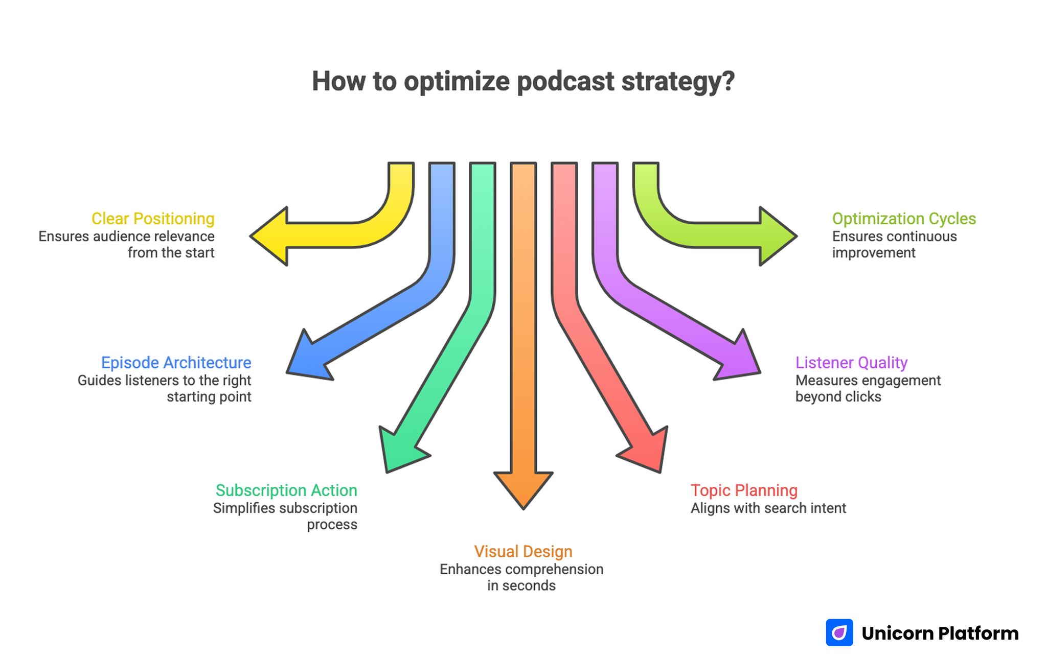
Quick Takeaways for Optimizing Podcast Strategy
- Lead with clear show positioning and audience relevance in the first screen.
- Build episode architecture that guides people to the right starting point.
- Use one primary subscription action and keep platform links structured.
- Design visuals for comprehension in seconds, not decoration alone.
- Align topic planning with search intent and recurring listener questions.
- Measure listener quality signals, not just page traffic and clicks.
- Run monthly optimization cycles with clear decision criteria.
Why Podcast Show Pages Underperform
Most underperforming pages fail in predictable ways. First, the page does not clearly explain what the show is about or who it serves. Visitors land, skim, and leave because relevance is unclear.
Second, episode content appears as an unorganized list. Without curation, new visitors do not know where to start, which increases bounce and lowers first-subscribe conversion.
Third, subscription actions are often overloaded. Multiple equal-priority buttons, platform options, and promotional blocks compete for attention. This creates hesitation instead of momentum.
Finally, many teams separate editorial, design, and promotion workflows. Social hooks promise one angle, but the landing page introduces another. Message mismatch reduces trust and weakens conversion quality.
Start With a Clear Show Positioning Model
Show positioning should be explicit enough that a new visitor understands fit in under ten seconds. That means your first-screen language needs to answer three questions quickly: who the show is for, what practical value listeners get, and why this host perspective is worth following.
A strong positioning statement usually includes audience, problem space, and outcome. For example, a B2B operations show may state that it helps revenue teams scale systems without adding process chaos. Specificity creates confidence.
Avoid broad descriptors such as "insightful conversations" or "stories that inspire." These phrases can describe almost any show and do not help a listener decide.
A practical positioning template:
- Audience: who the show serves.
- Focus: which recurring problems it tackles.
- Outcome: what the listener can apply after an episode.
Once positioning is stable, page design and distribution messaging become easier to align. It also becomes easier to evaluate whether growth issues come from traffic quality or page architecture.
Design the First Screen for Fast Comprehension
The first screen should communicate value before the user scrolls. Include one clear headline, one supporting sentence, one trust cue, and one primary action. Keep this section compact and readable on mobile.
Visual clarity matters because visitors often make a stay-or-leave decision in seconds. Your layout should emphasize recognition, not novelty. Show identity, voice, and topic direction need to be instantly legible.
If your team uses short-form clips to promote episodes, align those assets with your first-screen language. The hooks that work in social should map directly to what users see after clicking. For campaign planning around visual assets, this video marketing strategy for startups can help standardize message flow.
A first-screen checklist:
- Show value in one sentence.
- Clarify listener type.
- Add one credibility signal.
- Display one primary subscribe action.
Build Page Architecture Around Listening Decisions
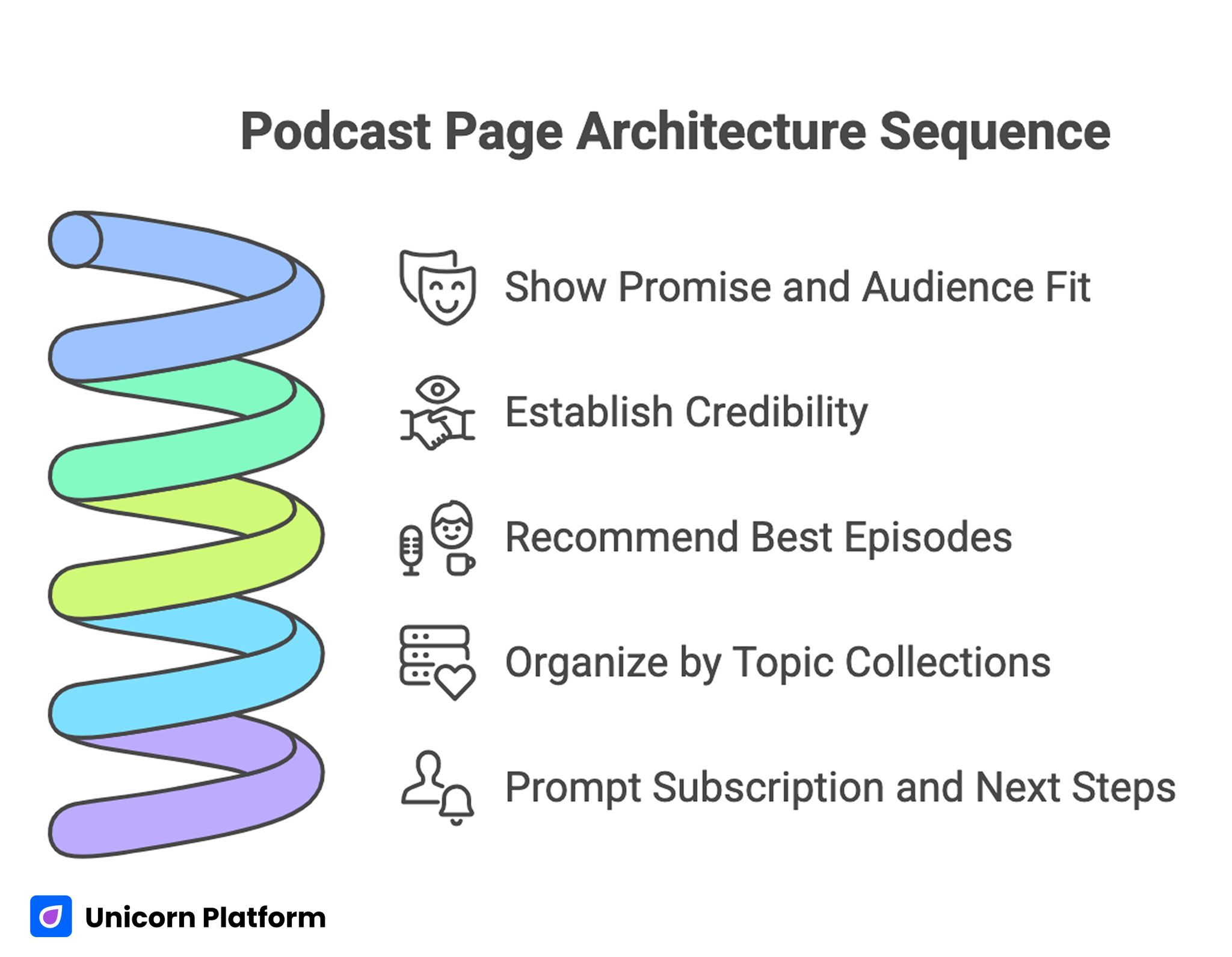
Podcast Page Architecture Sequence
After the first screen, page structure should guide users through a sequence: relevance, proof, exploration, then action. This sequence mirrors how new listeners evaluate unfamiliar shows.
A practical section order:
- Show promise and audience fit.
- Why the show is credible.
- Best episodes to start with.
- Topic collections by interest.
- Subscription and next-step prompt.
This format gives both fast scanners and deep evaluators a logical path. It also reduces the chance that strong content stays hidden below weak navigation.
Avoid long uninterrupted blocks of host biography or generic mission language near the top. New visitors need actionable context first, then deeper brand narrative.
Curate Episodes as Guided Entry Points
New listeners rarely start from episode one. They need a curated entry path that matches their intent and current knowledge level. Without curation, they may land on an episode that is too advanced, too broad, or off-topic for their needs.
Use three simple entry patterns:
- "Start here" episodes for first-time visitors.
- "Most practical" episodes for implementation-minded listeners.
- "Deep dives" for experienced audiences.
Each featured episode card should include a short value summary, not just a title and artwork. A concise summary helps users choose quickly and increases completion likelihood.
Curation is also useful for retention. Returning listeners often explore adjacent topics when they can see clear thematic pathways instead of a flat archive.
Set Subscription Hierarchy Without Clutter
Subscription design should be simple and intentional. Every major page needs one dominant subscription action, then optional platform alternatives in a lower-visual-priority block.
Common mistakes include presenting too many equal buttons, repeating subscription prompts with different wording, and placing primary actions next to unrelated monetization offers. These patterns usually create indecision at the exact moment users need a simple path.
A better model:
- Primary action: the one path you want most users to take.
- Secondary options: additional listening platforms for preference coverage.
- Supporting next step: newsletter, episode alerts, or resource hub.
If email is part of your retention strategy, integrate it contextually instead of stacking unrelated forms. The framework in the fastest way to build a newsletter subscription landing page is useful when designing opt-ins that complement, rather than compete with, audio subscription goals.
Subscription prompts should also explain expected value cadence, such as weekly tactical episodes or monthly deep dives. When cadence is explicit, subscribers are more likely to stay and return.
Use Trust Signals That Match Audio Brands
Trust for podcasts is earned through consistency, expertise clarity, and listener outcomes. Generic social proof helps less than contextual proof.
High-impact trust elements include:
- Host credibility tied to the show topic.
- Guest quality with clear relevance.
- Listener testimonials that reference practical outcomes.
- Publishing consistency and editorial standards.
If the show is new and listener testimonials are limited, focus on process credibility. Explain the editorial format, research approach, and release cadence. Reliability can build trust before scale arrives.
Place trust elements near conversion moments, not only in one distant section. Users should encounter reassurance where uncertainty naturally appears.
Build a Visual System for Episode Promotion
A repeatable visual system makes promotion faster and improves brand recognition. It also keeps message clarity stable as volume increases.
A useful system defines:
- Title pattern for episode cards.
- Topic tags for scanning.
- Host and guest hierarchy rules.
- Hook line format for social and page cards.
Consistency matters more than complexity. A predictable visual pattern helps users identify content quickly across channels.
Visual assets should always support comprehension. If a design element looks strong but weakens readability on mobile, prioritize clarity over style.
Plan Topic Coverage With Search Intent
Podcast growth becomes more predictable when editorial planning uses real intent patterns rather than intuition alone. Search data can reveal recurring questions and underserved angles in your niche.
Start by grouping listener questions into thematic clusters. Map each cluster to episodes, supporting summaries, and internal navigation paths. This creates discoverability pathways that continue working after launch week.
When your team needs a process for identifying high-leverage topic gaps, this guide on data-driven SEO strategies for content opportunities can support planning decisions.
Search intent should influence both episode titles and landing-page structure. If users search for tactical guidance, lead with actionable summaries instead of broad thought-leadership framing.
Build Episode Pages as Conversion Assets
Many teams optimize only the main show page. In practice, episode pages often become primary entry points through search, social shares, and newsletters. Each episode page should include clear context, relevance cues, and a subscription bridge.
A strong episode-page block can include:
- Who this episode is for.
- What problem it addresses.
- Key takeaways.
- One clear next action.
This structure helps one-time visitors become repeat listeners by showing where to go next. It also improves internal navigation depth, which can strengthen both engagement and discoverability.
Episode pages should link to related thematic episodes with intent-aware labeling. "More episodes" is weaker than "More episodes on onboarding analytics" because relevance is clearer.
Align Distribution Messaging Across Channels
Landing-page performance depends on consistency between channel messaging and on-page framing. If social clips promise one outcome but landing pages present a different angle, click quality declines.
Create a campaign message map per episode:
- Core hook.
- Practical payoff.
- Listener type.
- Action prompt.
Use the same map in social clips, email blurbs, and page copy. This keeps expectations aligned and improves downstream subscribe behavior.
Consistency also improves team speed. Designers, editors, and promotion owners can execute faster when each episode has one unified message source.
Optimize for Mobile Listening Journeys
Podcast audiences are heavily mobile, so mobile conversion flow deserves primary design attention. Small friction points, such as hidden buttons or slow embeds, can reduce subscription and listening starts significantly.
Mobile QA should include:
- First-screen readability without zooming.
- Easy platform selection and tapping.
- Fast render of essential show context.
- Stable layout during media load.
- Form and CTA behavior in low-bandwidth conditions.
Real-device testing is important because desktop previews can miss input friction and interaction delay that matter on handheld devices. This is especially true when media embeds and multi-button controls appear above the fold.
Teams should validate mobile behavior before scaling paid distribution or high-volume social campaigns. Buying traffic before resolving mobile friction usually increases wasted spend.
Measure Audience Quality, Not Just Volume
Subscriber counts alone can hide quality issues. A healthy growth program tracks signals that reflect listening depth and retention potential.
Useful quality metrics:
- Page-to-subscribe conversion rate by source.
- Episode completion trends from landing entry.
- Repeat listening rate after first subscribe.
- Click-through from episode pages to related topics.
- Newsletter opt-in quality from podcast pages.
Segment metrics by channel and topic cluster. A show may grow quickly in one channel while producing weak retention compared with another.
Use a monthly review to compare metric movement against major page changes. This creates cleaner decision loops and reduces reactive edits.
Add Monetization Paths Without Hurting Subscription Growth
As shows mature, pages often need to support sponsorships, premium products, consulting offers, or community memberships. These additions can reduce subscribe conversion if hierarchy is unclear.
Keep subscription as primary on discovery pages. Introduce monetization offers contextually after trust and relevance are established.
A practical layering approach:
- Discovery page: show value and subscribe action.
- Engagement page: deepen trust with curated episodes and resources.
- Monetization page: present offers aligned with known listener intent.
This protects top-of-funnel conversion while still supporting business outcomes. It also prevents early-page monetization from diluting core listener growth.
Quarterly audits should check whether monetization blocks are cannibalizing subscription flow. If conversion quality drops, simplify hierarchy before adding new offers.
Build a Repeatable Team Workflow
Consistent publishing quality requires clear ownership. Even small teams benefit from assigning roles for editorial, visual packaging, landing copy, and QA.
A lightweight weekly workflow:
- Confirm episode positioning and listener intent.
- Produce visual assets from a shared system.
- Update landing and episode pages with structured summaries.
- Validate mobile, links, and CTA logic.
- Launch with channel-aligned messaging.
- Review early signals and document changes.
Documentation should be short and operational. Record what changed, why it changed, and what result was expected. Over time, this creates a reusable playbook that improves decision quality.
30-60-90 Day Execution Plan
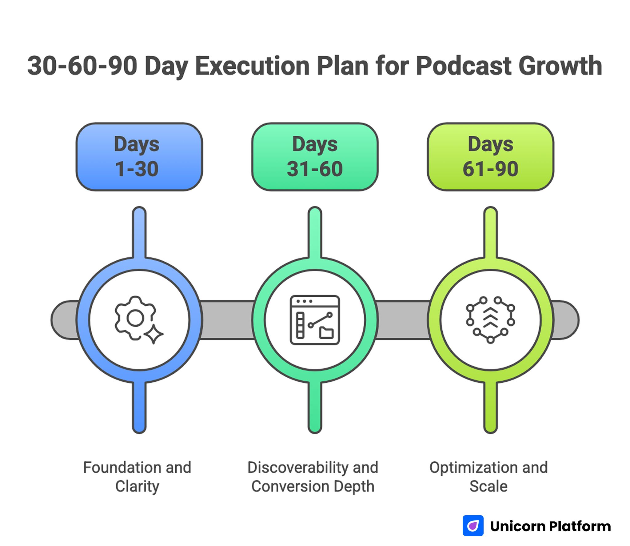
30-60-90 Day Execution Plan for Podcast Growth
Days 1-30: Foundation and Clarity
Lock positioning, rebuild first-screen hierarchy, and curate a clear "start here" episode path. Simplify subscription actions and remove CTA clutter.
By day 30, new visitors should understand fit and take action without confusion. This foundation makes later optimization cycles faster and cleaner.
Days 31-60: Discoverability and Conversion Depth
Create topic clusters, strengthen episode-page summaries, and improve channel-to-page message alignment. Validate mobile interaction under real conditions.
By day 60, subscription quality should improve and bounce from new entries should decline. Teams should also see stronger progression from episode entries into repeat listening.
Days 61-90: Optimization and Scale
Run controlled tests on headline framing, trust placement, and CTA hierarchy. Scale winning patterns across all major page templates.
By day 90, your podcast site should run as a repeatable growth system rather than a static archive. Decision-making should rely on recurring evidence rather than ad hoc edits.
Common Mistakes and Fast Fixes
Mistake: Unclear Show Promise
Visitors cannot determine relevance quickly, so they leave before exploring episodes. Rewrite first-screen positioning around audience, problem, and practical outcome so fit is obvious in seconds.
Mistake: Flat Episode Listings
Users see too many options with no guidance and postpone decisions. Add curated entry paths and concise episode value summaries so new listeners can choose a clear starting point.
Mistake: CTA Overload
Multiple equal actions reduce commitment and create friction at conversion moments. Establish one primary subscription action and visually demote secondary choices to preserve hierarchy.
Mistake: Social and Landing Message Mismatch
Clicks arrive with expectations that the page does not fulfill, which lowers trust quickly. Use one campaign message map across social, email, and page assets so promises stay consistent.
Mistake: Mobile Neglect
Desktop-optimized pages underperform on real listener devices where most first visits occur. Enforce mobile-first QA and lightweight media behavior checks before scaling distribution.
Mistake: Topic Planning Without Data
Editorial calendar drifts toward internal preferences and misses recurring listener demand. Map recurring intent to clusters and track performance by theme to keep coverage strategic.
Mistake: Monetization Added Too Early
Offers compete with subscription actions before trust and relevance are established. Preserve subscription-first hierarchy on discovery pages and layer monetization later in the journey.
FAQ: Podcast Show Pages in 2026
1) What should a podcast show page include first?
Lead with clear show positioning, audience fit, and one primary subscribe action. First-screen clarity has the highest impact on early conversion.
2) How many episodes should be featured on the main page?
Feature a curated set with clear entry logic. Too many undifferentiated cards can reduce decisions and increase bounce.
3) Should I prioritize audio embeds or written summaries?
Use both. Embeds support immediate listening, while summaries improve comprehension, scanning, and discoverability.
4) How often should I update the page?
Review key sections monthly and refresh curation whenever listener intent or show direction shifts. Regular updates prevent stale episode pathways from weakening conversion.
5) What is the best CTA for a podcast page?
The best CTA is the one aligned with your primary platform and audience behavior. Keep alternatives available but visually secondary.
6) Do topic clusters really matter for podcast growth?
Yes. Clustered organization improves discoverability and helps visitors navigate to relevant episodes faster.
7) How do I improve conversion from social clips?
Match clip hooks with landing-page framing and keep first-screen messaging consistent with promotional promises. Message consistency increases both click quality and subscribe intent.
8) Which metric should I monitor first?
Start with page-to-subscribe conversion by traffic source, then layer retention signals to evaluate audience quality. This sequencing helps teams avoid overreacting to surface-level traffic spikes.
9) Can monetization blocks hurt subscriber growth?
They can if introduced too aggressively on discovery pages. Preserve subscription-first hierarchy until trust is established.
10) What is the fastest improvement I can make this week?
Clarify first-screen positioning and curate a "start here" episode path. These two changes often produce immediate conversion gains.
Final Takeaway
Podcast show pages perform when they reduce uncertainty and guide decisions quickly. Clear positioning, curated episode pathways, structured subscription flow, and disciplined optimization create sustainable audience growth.
Run your page as an operating system, not a one-time asset. With consistent execution in Unicorn Platform, traffic quality improves, subscriber conversion stabilizes, and retention becomes more predictable.


