Table of Contents
- Start With Opportunity Intent, Not Aesthetic Preferences
- Choose the Right Site Model for Your Current Stage
- 30-60-90 Day Improvement Plan
- Common Mistakes and Fixes
- FAQ
A personal website can do far more than display your bio. At its best, it works as a decision environment where visitors quickly understand your expertise, your fit for their needs, and the next action they should take. At its worst, it becomes a static profile that looks polished but creates little business value.
The difference is usually not visual taste. The difference is execution discipline. High-performing personal websites connect positioning, proof, and conversion flow in a way that reduces uncertainty for the right audience. They do not try to impress everyone. They help the right people decide faster.
This guide gives you a full operating system for building and improving a personal brand site in Unicorn Platform. You will learn how to define audience-fit positioning, structure trust content, design high-clarity pages, and run optimization cycles that compound over time.
sbb-itb-bf47c9b
Quick Takeaways
Personal Website Best Practices
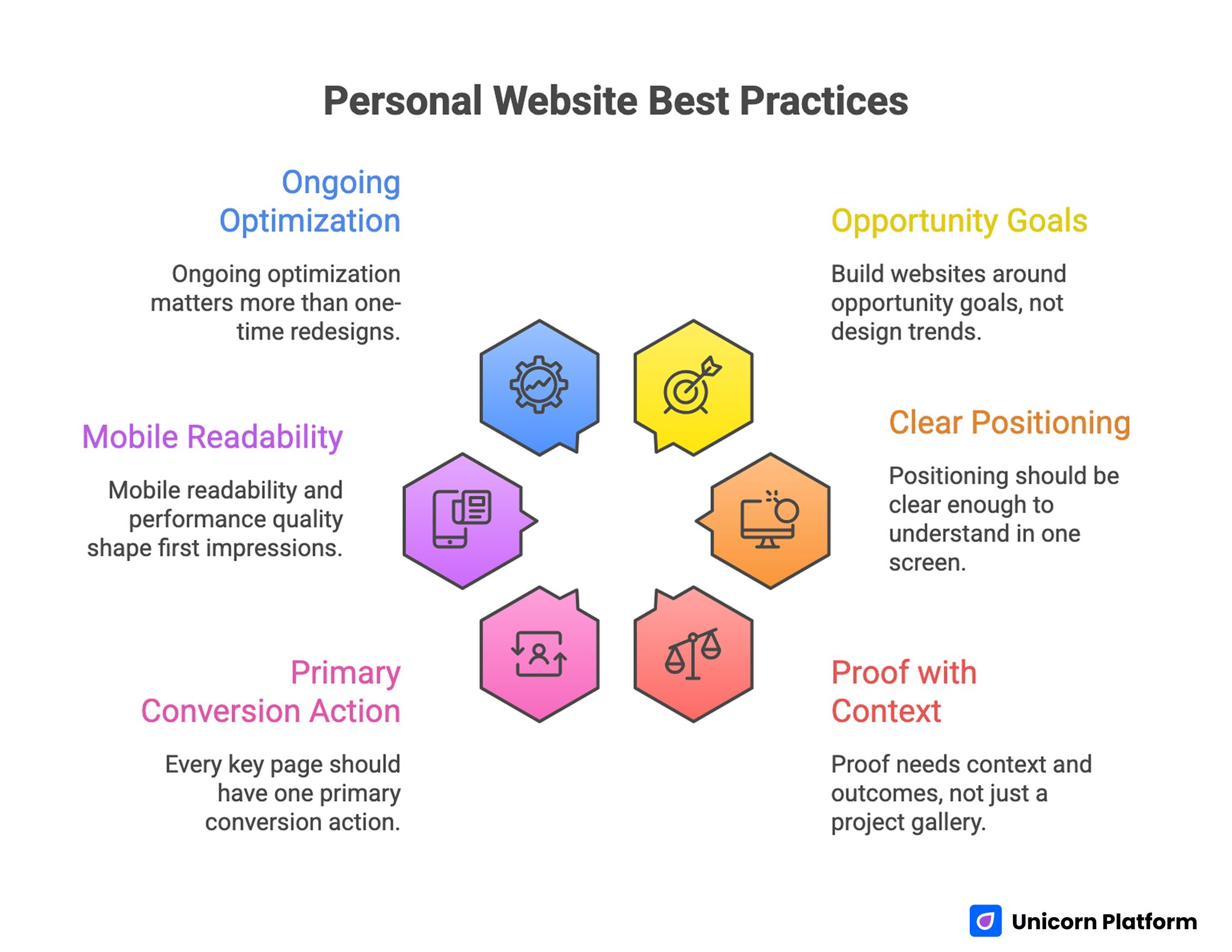
- Strong personal websites are built around opportunity goals, not design trends.
- Positioning should be clear enough to understand in one screen.
- Proof needs context and outcomes, not just a project gallery.
- Every key page should have one primary conversion action.
- Mobile readability and performance quality shape first impressions.
- Ongoing optimization matters more than one-time redesigns.
Start With Opportunity Intent, Not Aesthetic Preferences
Many personal sites fail because the owner starts with colors, templates, or section ideas before defining what opportunity the site should create. Without intent clarity, content gets broad, messaging gets generic, and calls to action compete with each other.
Begin with one core objective for the next 90 days. That objective can be client acquisition, hiring visibility, speaking invitations, consulting leads, or partnership inquiries. A focused objective gives your homepage and navigation a clear job.
Use this quick mapping model before writing any page copy. It keeps your planning anchored to one measurable opportunity path.
| Primary Goal | Ideal Visitor | Main Decision Question | Core Page Priority | Primary CTA |
| Client work | Buyer or team lead | "Can this person solve my problem?" | Services + proof | Book intro call |
| Hiring pipeline | Recruiter or hiring manager | "Is this candidate a strong fit?" | Portfolio + about | View resume/CV |
| Creator growth | Audience member | "Should I follow this creator?" | Content hub + story | Subscribe |
| Authority building | Event host or editor | "Is this person credible for this topic?" | Expertise + speaking | Request collaboration |
When objective and audience are explicit, nearly every content decision becomes easier. Teams also spend less time debating sections that do not support the main goal.
Define Positioning in One Sharp Statement
Positioning is the anchor of your entire site. Visitors should not have to decode what you do from scattered clues across multiple sections. Your first-screen message needs to communicate role, domain, and value in practical language.
A simple positioning format works well:
- Who you help
- What outcome you create
- How your approach is different
Example format:
"I help early-stage B2B teams turn product complexity into clear growth messaging through structured page systems and conversion-focused content strategy."
Strong positioning avoids vague phrases such as "passionate professional" or "creative thinker." Those labels are too broad to help decision-makers evaluate fit. Specificity builds credibility because it signals domain clarity and execution confidence.
Positioning should also align with the opportunities you want next, not only your historical work. Your site is a direction-setting asset, not just a retrospective archive.
Choose the Right Site Model for Your Current Stage
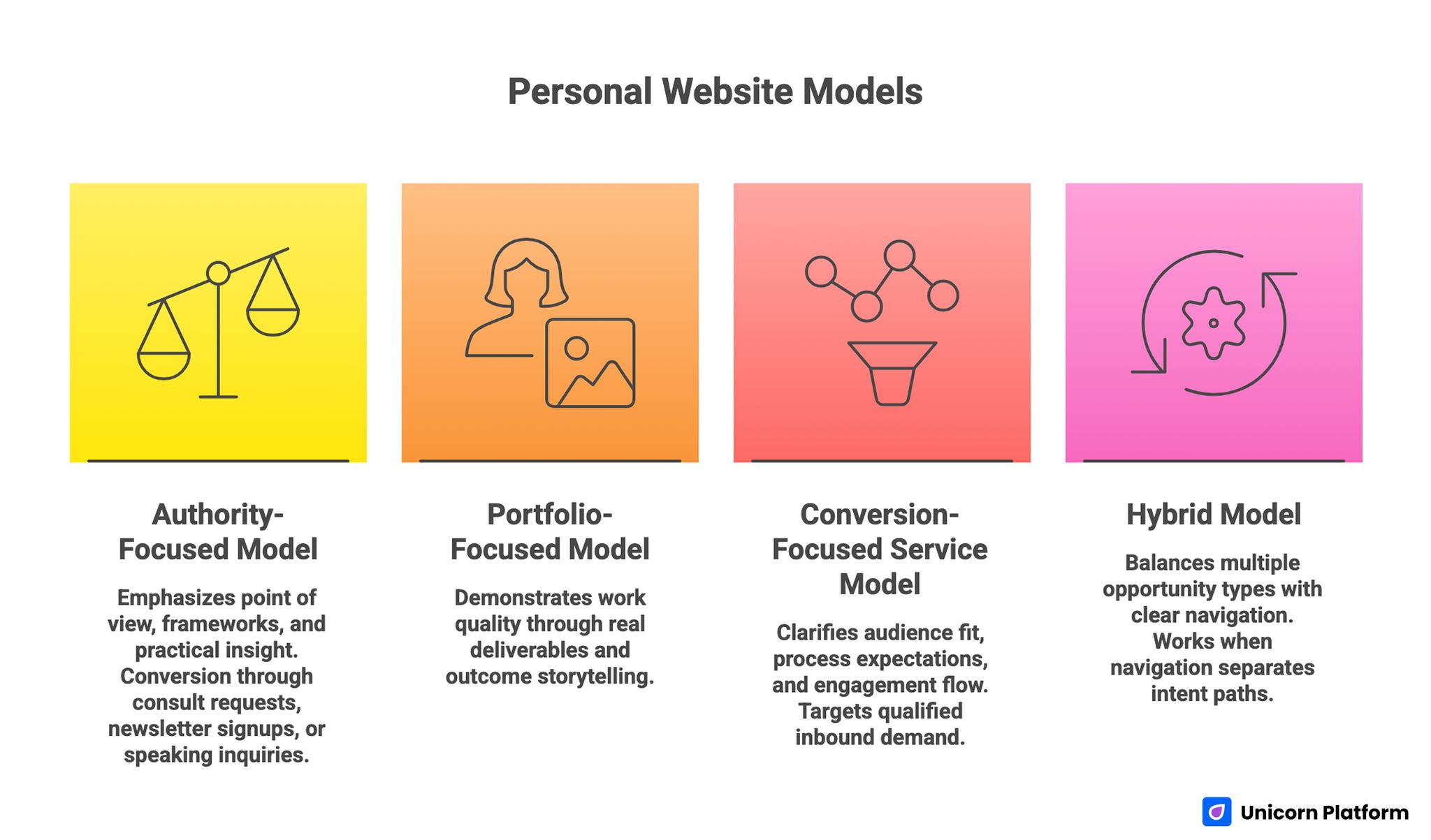
Personal Website Models
Not every personal website needs the same structure. The best model depends on your objective, audience maturity, and available proof assets.
Authority-Focused Model
Best for consultants, advisors, and operators building trust in a defined niche. This model emphasizes point of view, frameworks, and practical insight. Conversion often happens through consult requests, newsletter signups, or speaking inquiries.
Portfolio-Focused Model
Best for designers, developers, writers, and product professionals whose work quality is best demonstrated through real deliverables. The key is outcome storytelling, not screenshots alone.
Conversion-Focused Service Model
Best for freelancers and boutique teams targeting qualified inbound demand. Pages should clarify audience fit, process expectations, and engagement flow before asking for a call.
Hybrid Model
Best for professionals balancing multiple opportunity types. Hybrid structures work only when navigation and page hierarchy clearly separate each intent path.
Trying to combine all models at once often creates confusing experiences. Start with one primary model, then add targeted layers as evidence and audience needs evolve.
Build a First Screen That Earns the Next 30 Seconds
The first screen determines whether visitors continue or bounce. It should establish relevance, reduce uncertainty, and present a clear next step without overwhelming detail. Strong first screens usually include a concise positioning headline, one supporting proof cue, and one primary action.
If you are refining first-screen composition and interaction priorities, this guide on personal landing pages that make first impressions is useful for validating hero clarity and section order.
Avoid overloading the hero with long biographies, multiple CTAs, and dense visual effects. Visitors do not need your entire story at once. They need enough confidence to keep reading and enough direction to know what to do next.
A practical first-screen checklist:
- One headline with clear audience and value context.
- One short subhead that explains the practical outcome.
- One credibility cue, such as role context or recognizable work domain.
- One dominant CTA and one low-friction secondary option.
When this block is clear, the rest of the page performs better because visitors begin from a confident baseline. It also makes later proof and CTA sections feel coherent instead of abrupt.
Design Proof Blocks That Reduce Perceived Risk
Visitors evaluating a personal brand are making a risk decision: "Can this person deliver what they claim?" Proof blocks answer that question faster than brand language alone.
High-value proof usually includes:
- Outcome-focused case snippets.
- Testimonials with role and context.
- Credibility markers such as publications, talks, or known collaborations.
- Process clarity that explains how results are achieved.
Weak proof often looks polished but remains abstract. Statements like "great to work with" are less persuasive than concise descriptions of scope, collaboration style, and business impact. Context transforms praise into evidence.
Proof placement matters. Put relevant proof near key decision points, not in one isolated section at the bottom. Visitors should encounter reassurance exactly when uncertainty rises.
Turn Portfolio Items Into Decision Assets
A portfolio is not a gallery. It is a set of decision documents. Each item should help a visitor evaluate fit, depth, and execution style.
A strong portfolio entry can follow this structure:
- Starting context: situation and constraints.
- Objective: what success needed to look like.
- Approach: what you actually did.
- Outcome: what changed and why it mattered.
- Reflection: what you learned or would improve.
This format is useful across disciplines, including design, product, writing, development, and strategy work. It also makes your process legible to non-technical buyers and recruiters.
For additional examples of portfolio-oriented structuring patterns, the playbook in build your best personal website with these easy tips can help when refining section priorities.
Keep entries concise but specific. Clarity outperforms volume. A smaller set of high-signal projects is usually stronger than a large set of loosely explained work.
Build Conversion Paths for Different Visitor Intents
Personal websites typically serve mixed-intent traffic. Some visitors want to hire you. Others want to explore your ideas, collaborate, or follow your work. Conversion design should respect these different paths while preserving one primary page goal.
A common mistake is presenting too many equal-priority actions. When everything is emphasized, nothing stands out. Choose one primary CTA for each page and support it with one secondary option for lower-commitment visitors.
Example CTA logic by page type:
- Homepage: primary action tied to your core goal, secondary action for lower-friction engagement.
- Services page: primary inquiry action with clear expectation-setting.
- Portfolio page: primary action linked to relevant next step, such as project discussion.
- Content page: primary subscription or follow action with clear value promise.
Conversion friction should also be reduced after the click. If a visitor starts a form, clarify response timing, scope of the first interaction, and what happens next. This predictability increases conversion quality.
Write With Authority and Human Clarity
Brand voice on personal websites often swings between two extremes: overly formal corporate language or casual language with little precision. The strongest writing style balances confidence, clarity, and practical specificity.
A good editorial standard includes:
- Direct sentences with clear subject and outcome.
- Concrete nouns over vague abstractions.
- Practical framing instead of inflated claims.
- Consistent terminology across pages.
Replace self-focused statements with visitor-relevant framing. Instead of "I am passionate about helping businesses grow," explain the specific growth problem you solve and how you solve it. Readers trust clear operators more than broad self-descriptions.
Editing for clarity should happen at the section level, not only sentence level. Each
Mobile and Performance Standards That Protect First Impressions
A large share of personal-site traffic arrives from mobile social profiles, referral links, and messaging apps. If mobile experience quality is weak, first impressions collapse before your value story is seen.
When setting up or refining your site foundation, these practical steps for hosting your personal website with Unicorn Platform are useful for keeping launch setup simple while protecting performance basics.
Mobile QA should include more than responsive layout checks. Validate first-screen readability, CTA visibility, form usability, media behavior, and loading quality on slower networks. High-performing sites are designed for real conditions, not only ideal desktop previews.
Performance priorities should focus on conversion-critical pages first. Faster rendering on high-intent pages can improve progression quality more than broad
Build Discoverability With Clear Topic Signals
A personal site can support both direct referrals and search-led discovery when topic signals are explicit. Search visibility is usually stronger when your pages communicate clear expertise boundaries and answer real intent-led questions.
Use topic clusters that match your actual operating scope. If you are known for specific workflows, publish practical pages around those workflows instead of broad, unfocused thought pieces. Coherent clusters make your site easier to understand for both users and discovery systems.
On-page structure helps here. Use clear headings, concise definitions, and actionable subsections. Pages that are easy to scan tend to perform better for human readers and machine-mediated retrieval.
Metadata and structured context should align with page content. Avoid mismatch between titles, descriptions, and body claims. Consistency improves trust and reduces interpretation ambiguity.
Create a Content Engine, Not Isolated Updates
Personal brand momentum comes from steady publishing and iterative refinement, not occasional large redesigns. A simple content engine helps you convert day-to-day expertise into durable authority assets.
A practical monthly content rhythm:
- One deep practical guide tied to your core expertise.
- One case-based article with lessons and tradeoffs.
- One short perspective piece responding to industry shifts.
- One portfolio or process update to keep proof fresh.
Each new piece should support one of your core opportunity paths. If a topic does not reinforce your positioning or audience intent, it should not receive top priority.
Content reuse increases efficiency. Turn client questions, project retrospectives, and workshop notes into structured site content. This approach keeps writing grounded in real work, which improves authenticity and usefulness.
30-60-90 Day Improvement Plan
Days 1-30: Clarity and Foundations
Define your primary objective, ideal audience, and positioning statement. Audit current pages for message mismatch, weak proof, and conflicting calls to action. Simplify navigation and strengthen first-screen relevance.
At the end of this phase, you should have a clean structure with one dominant conversion path and clear section purpose. That clarity sets up more reliable testing in the next phase.
Days 31-60: Proof and Conversion Quality
Upgrade proof blocks with stronger context and outcome detail. Rewrite portfolio entries as decision assets. Improve form expectations and CTA clarity across high-intent pages.
During this phase, validate mobile behavior and tracking integrity so conversion observations remain reliable. Small instrumentation gaps are easier to fix before experiments scale.
Days 61-90: Optimization and Scale
Run focused tests on headline framing, proof sequencing, and CTA language. Keep test scopes controlled so results stay interpretable. Document what works and convert successful patterns into reusable standards.
By day 90, the key outcome should be a repeatable operating cadence, not just a prettier site. Durable process quality is what drives long-term gains.
Common Mistakes and Fixes
Mistake 1: Generic Positioning
Visitors leave because they cannot tell who you serve or what makes your approach distinctive. Ambiguity at this step usually lowers every downstream metric.
Fix: rewrite first-screen messaging around audience, outcome, and approach. Remove broad claims that could describe anyone.
Mistake 2: Portfolio Without Outcomes
Project galleries look polished but fail to build trust because context and results are unclear. Visual quality alone does not explain execution depth.
Fix: convert each featured item into a short decision narrative with objective, approach, and business relevance.
Mistake 3: Too Many Competing CTAs
Multiple equal-priority actions dilute conversion momentum.
Fix: assign one primary CTA per page and one secondary fallback action.
Mistake 4: Proof Is Isolated
Testimonials and credibility cues are buried in one section far from decision moments. Visitors need reassurance closer to their action decisions.
Fix: place proof near high-friction sections where visitors need reassurance.
Mistake 5: Mobile Experience Is Treated as Final QA
Desktop-first layouts often hide mobile friction until late.
Fix: review mobile behavior early in planning, especially first-screen clarity and form usability.
Mistake 6: Inconsistent Editorial Voice
Tone and terminology vary by page, making the brand feel fragmented. Inconsistent voice weakens authority even when design is strong.
Fix: define a style baseline and apply it across homepage, about page, portfolio, and service pages.
Mistake 7: No Ongoing Review Cadence
The site becomes stale, and opportunity quality declines gradually.
Fix: run a monthly review covering positioning accuracy, proof freshness, and CTA performance.
FAQ: Personal Brand Websites
1) Do I need a personal website if I already use social platforms?
Yes, because social profiles are rented channels with limited control. Your own site gives you full control over narrative, proof presentation, and conversion paths.
2) How many pages should a personal brand site have at launch?
Start lean. A strong homepage, focused about page, and proof-oriented portfolio or services page are enough for most launches. Expand only when each new page has a clear job.
3) What matters more first, design polish or message clarity?
Message clarity. Clean design helps, but visitors decide based on relevance, trust, and action clarity. Strong content structure should lead visual refinement.
4) How can I make testimonials more credible?
Use testimonials with role context and concrete outcomes. Brief, specific statements usually perform better than long general praise.
5) Should I show pricing on a personal website?
It depends on your business model and sales process. If transparent pricing reduces low-fit inquiries, it can improve efficiency. If work is highly custom, provide clear scoping guidance instead.
6) How often should I update my site?
Run monthly updates for proof freshness and quarterly structural reviews. Continuous small improvements usually outperform occasional full redesigns.
7) Can one site support both hiring and client opportunities?
Yes, but intent paths must be clearly separated. Navigation, section priorities, and CTAs should make each path obvious without creating messaging conflict.
8) What is the best CTA for a personal homepage?
The best CTA is the one aligned with your primary objective. Choose one action that matches your current opportunity goal and support it with a lower-friction alternative.
9) How do I know if my positioning is too broad?
If a visitor can read your first screen and still not identify your audience and outcome, positioning is too broad. Specificity should improve comprehension in seconds.
10) What is the fastest way to improve opportunity quality?
Clarify audience fit and strengthen proof near decision points. Better self-selection often improves inquiry quality faster than simply increasing traffic.
Final Takeaway
A personal brand website becomes valuable when it helps the right people make confident decisions. That requires clear positioning, contextual proof, disciplined conversion design, and consistent optimization.
Use this framework to turn your site into a compounding growth asset. Define intent first, build trust with specificity, simplify action paths, and improve continuously through focused review cycles.
