Table of Contents
- A 12-Play Optimization System That Works in Practice
- Scenario-Based Application
- A 30-Day Execution Blueprint
- Common Failure Patterns and Corrective Moves
- FAQ
Most landing pages do not fail because teams lack ideas. They fail because teams ship many edits without a system for deciding what should change first, how success will be measured, and which quality controls cannot be bypassed. In that environment, update velocity rises while learning quality drops.
A better model treats landing page work as an operating discipline. You diagnose behavior before editing, test one meaningful hypothesis at a time, and protect trust with non-negotiable review standards. This approach turns incremental improvements into compounding gains over months, not just temporary spikes.
Unicorn Platform works especially well for this style of optimization because it allows fast iteration while preserving repeatable section structures. Speed becomes an advantage only when it is paired with clear architecture, release gates, and rigorous post-launch analysis.
sbb-itb-bf47c9b
Quick Takeaways
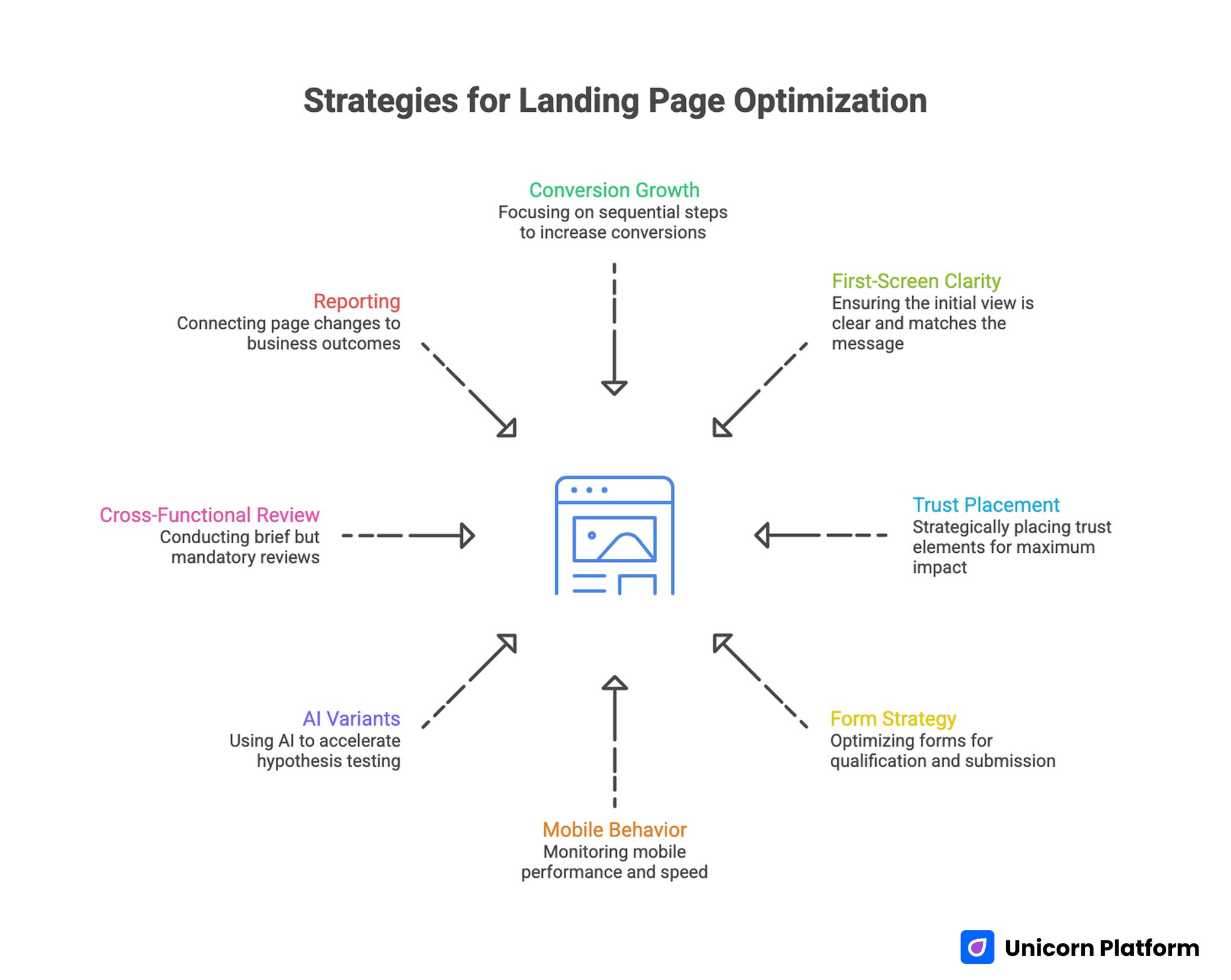
Strategies for Landing Page Optimization
- Conversion growth is usually a sequencing problem, not a creativity problem.
- First-screen clarity and message match often deliver the fastest measurable gains.
- Trust placement matters more than trust volume.
- Form strategy should optimize qualification flow, not raw submit counts.
- Mobile behavior and page speed must block release when quality falls below baseline.
- AI-generated variants are useful when they accelerate focused hypotheses, not random rewriting.
- Cross-functional review should remain short but mandatory.
- Reporting should connect page changes to downstream business outcomes.
Why Good Pages Plateau After Launch
A page can look polished and still underperform because clarity debt accumulates over time. Campaigns evolve, audience intent shifts, and acquisition channels change faster than many landing pages do. Without frequent recalibration, the promise users clicked in an ad starts to drift away from what they see on the page.
Trust timing is another common issue. Teams often add testimonials, logos, and proof blocks, but place them too late in the scroll path. If uncertainty is not addressed near the first major decision point, visitors exit before they ever reach the best evidence.
Operational habits also create plateaus. Many teams test headlines, CTAs, layout order, and form depth in one release window, then cannot explain results with confidence. Metric movement may look positive for a week, but the underlying learning is weak, so the next round starts from guesswork again.
Define Conversion Quality Before Editing Anything
High-performing teams define conversion quality in layers. Layer one tracks behavior, such as whether users engage with critical sections and progress toward action. Layer two tracks conversion events, such as form completions or booked demos. Layer three tracks downstream quality, including acceptance, activation, or pipeline impact.
This layered model prevents false wins. A page can increase submissions while lowering lead quality, which pushes hidden costs onto sales and success teams. Optimization should reduce friction for the right users, not simply increase top-of-funnel volume.
Before drafting new variants, lock a baseline period with consistent source tagging, device segmentation, and post-conversion tracking. If your team needs a practical behavioral lens to set that baseline, this behavior-driven landing page optimization guide is a useful framework for connecting interaction signals to real bottlenecks.
Start With Architecture, Not Surface Copy
Copy experiments work best when page architecture already supports user decisions. Without stable section order, even strong language can underperform because users are forced to reconstruct the narrative themselves. Most high-converting pages move through a predictable sequence: relevance, mechanism, confidence, and action.
A practical way to preserve structure is to define the job of each section before editing it. One section confirms audience fit, another explains how value is delivered, another addresses objections, and another drives the next action. This discipline keeps tests interpretable when multiple contributors are involved.
Teams using Unicorn Platform can lock these section jobs into reusable templates, then vary message emphasis by channel and intent stage. For deeper section-order strategy and hierarchy decisions, this high-converting landing page structure reference helps teams align quickly before launching new experiments.
A 12-Play Optimization System That Works in Practice
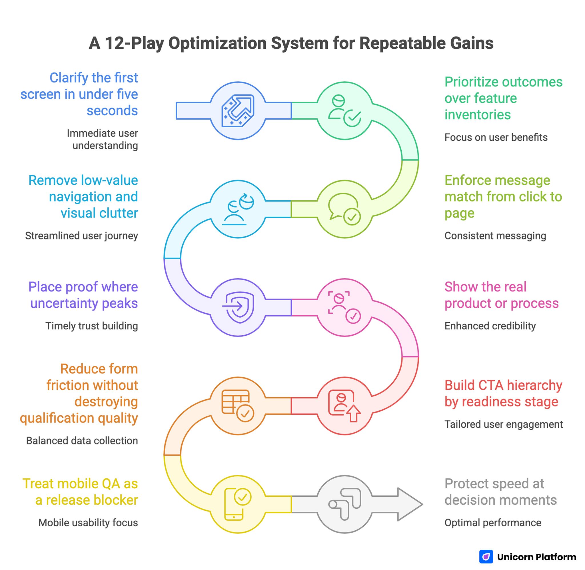
A 12-Play Optimization System for Repeatable Gains
The following playbook is designed for teams that want repeatable gains, not one-off redesign outcomes. Each play addresses a specific decision point in the visitor journey and includes a practical implementation lens.
Play 1: Clarify the first screen in under five seconds
The first viewport should answer three questions immediately: who the page is for, what outcome is available, and what action comes next. If any part is vague, users postpone evaluation and bounce rates rise. Clarity at this stage often matters more than visual complexity.
Strong first screens combine explicit value language with one dominant call to action. Supporting elements should reduce uncertainty rather than add noise. If a visitor cannot summarize the offer after a short glance, the section still needs work.
Play 2: Prioritize outcomes over feature inventories
Feature-heavy copy often reflects internal thinking rather than buyer motivation. Most visitors care first about improved outcomes, reduced risk, and lower effort. Feature details become useful only after users believe the offer is relevant.
Outcome framing should stay concrete. Instead of broad claims, use concise statements that explain what changes for the user and in what context. This makes later proof blocks easier to evaluate because expectations are explicit from the beginning.
Play 3: Enforce message match from click to page
Acquisition channels set expectations before visitors arrive. If ad or email language promises one thing and the landing page opens with another narrative, trust erodes instantly. Message continuity protects decision momentum.
Operationally, this means mapping each channel promise to a corresponding first-screen confirmation. Teams should maintain a source-to-page matrix that verifies wording, offer scope, and CTA consistency before launch. Message match is not a copy detail; it is a conversion reliability requirement.
Play 4: Remove low-value navigation and visual clutter
Landing pages should narrow decisions, not broaden them. Multiple competing paths can feel user-friendly but usually dilute intent. Every additional exit option increases the chance that visitors leave without taking the target action.
Clutter removal is easiest when each element must justify its presence. If a component does not support relevance, confidence, or action, it likely belongs elsewhere. This principle improves both readability and conversion focus.
Play 5: Place proof where uncertainty peaks
Proof effectiveness depends on timing and relevance. A long testimonial block near the footer cannot recover trust lost near pricing or form interaction. Evidence should appear at the same moment a user is evaluating risk.
Use proof types that match the objection being addressed. Role-specific testimonials, concise case outcomes, and concrete implementation notes usually outperform generic praise. Three highly relevant proof assets generally beat larger collections of broad quotes.
Play 6: Show the real product or process
Abstract visuals can make pages look modern while reducing credibility. Visitors who are evaluating a solution usually prefer seeing actual interfaces, workflows, or before-and-after evidence. Real visuals reduce cognitive effort and increase confidence.
Short demo snippets, authentic screenshots, and process diagrams often work better than decorative stock media. The objective is fast comprehension, not decoration. When users can see how the offer works, decision friction drops.
Play 7: Build CTA hierarchy by readiness stage
Calls to action should reflect the visitor’s current decision state. Early-stage visitors may need a lower-commitment progression step, while decision-ready visitors should see a direct commitment path. Forcing one intensity level on every user can reduce total quality conversions.
Each page variant should still keep one dominant CTA. Secondary actions can exist, but they should never compete equally for attention. Clear hierarchy helps visitors decide quickly and helps analysts interpret outcomes cleanly.
Play 8: Reduce form friction without destroying qualification quality
Shorter forms often increase completion rates, but aggressive field removal can hurt routing quality. The goal is balanced data collection: enough context to determine next steps, without forcing unnecessary effort at first touch.
A staged model usually performs well. Step one captures essentials, while deeper context is collected after initial commitment. This keeps first-step friction low while preserving downstream decision quality.
Play 9: Treat mobile QA as a release blocker
Responsive rendering does not guarantee mobile usability. Real-device testing frequently reveals tap-target issues, field interaction problems, and section-order distortions that desktop previews miss. These defects can quietly erase campaign efficiency.
Minimum mobile QA should include first-screen comprehension, thumb-friendly interactions, form keyboard behavior, and CTA visibility after dynamic content loads. Teams focused on mobile-first conversion execution can use this mobile app landing page optimization resource to strengthen device-specific review standards.
Play 10: Protect speed at decision moments
Page speed is most damaging when delays occur near high-intent actions. Slow render at the moment users try to interact with a form or CTA can negate strong copy and design work. Performance therefore belongs in conversion reviews, not only technical audits.
Define operational speed thresholds for meaningful content visibility, interactive CTA readiness, and form response behavior. Every release should be evaluated against the same thresholds so performance quality does not drift over time.
Play 11: Run disciplined experiments, not variant chaos
AI and modern builders can generate dozens of variants quickly, but testing too many options with limited traffic creates noisy outcomes. Reliable learning usually comes from smaller test sets with clear hypotheses and stable observation windows.
Each cycle should document one major variable, one primary metric, one guardrail metric, and one decision rule. This structure reduces subjective interpretation and helps teams build reusable optimization knowledge.
Play 12: Optimize the post-submit experience
Conversion quality is influenced by what happens after the form is submitted. If confirmation pages are vague or follow-up expectations are unclear, users lose confidence and downstream progression weakens. The conversion event is not the finish line.
Strong post-submit flows confirm next steps, response timing, and value continuity. They also provide relevant secondary actions that maintain momentum without distracting from the primary outcome.
Scenario-Based Application
Frameworks become more useful when mapped to real operating contexts. The same optimization play can produce different outcomes depending on motion, offer type, and acquisition mix.
Scenario A: SaaS trial page with high bounce from paid social
Paid social visitors often arrive with lower initial intent and short attention windows. In this context, first-screen specificity and proof timing usually outperform deep feature narratives. Teams should emphasize immediate relevance and low-friction trial progression.
A practical sequence is to tighten the headline around one concrete user outcome, reduce form fields at first touch, and move one high-credibility proof element above mid-scroll. Measure impact using trial quality and activation progression, not trial volume alone.
Scenario B: B2B demo page with low form completion
Low completion on demo pages often reflects mismatch between CTA commitment and visitor readiness. Early-stage evaluators may need validation content before booking intent. In these cases, trust architecture and CTA hierarchy should be revisited before large redesigns.
Test a two-path model where high-intent users can book directly while lower-intent users can access a structured evaluation asset. Keep proof adjacent to both paths and monitor whether qualification quality improves, not just completion rate.
Scenario C: Local services page with stable traffic but weak lead quality
Local services pages frequently over-index on generic urgency and under-index on practical confidence signals. Visitors want clear service scope, response expectations, and trust confirmation relevant to their specific problem.
Begin with stronger service-specific positioning, clearer next-step language, and concise proof tied to local context. Adjust form prompts to gather routing data that sales teams can use immediately, then compare close-rate impact rather than raw lead count.
Internal Linking and Topical Depth Without Link Dumping
Internal links are most valuable when they resolve a question that naturally appears in the paragraph. They should feel like optional depth for users who need implementation detail, not a mechanical SEO insertion. Link density is less important than contextual fit.
Spacing also matters. Consecutive paragraphs with links can feel forced and reduce reading flow. A cleaner pattern is to distribute links across distant sections where each one clearly extends the current idea.
When optimization work needs to stay aligned with broader growth objectives, this business-goal alignment framework for website optimization helps teams choose tests that matter beyond local page metrics. It is especially useful when multiple teams are competing for the same implementation capacity.
A 30-Day Execution Blueprint
This blueprint is designed for lean teams that need momentum and control at the same time. The cadence favors focused iterations, explicit quality gates, and documented learning transfer.
Week 1: Baseline and prioritization
Audit one priority page family by source, device, and conversion quality layers. Identify the two strongest friction points and select one as the first test target. Lock the control version and document baseline metrics before drafting any updates.
Week 2: Controlled rewrite and pre-launch QA
Draft section-level variants for the selected bottleneck. Keep architecture stable while testing message clarity, proof relevance, or CTA sequencing. Run editorial, trust, form, mobile, and performance checks before launch.
Week 3: Live test and measurement review
Run one primary variant against the control for a defined window. Monitor behavior and conversion signals together, then verify downstream lead quality before declaring outcomes. Avoid adding new major variables during this period.
Week 4: Standardization and next-cycle setup
Document what improved, what regressed, and what remains uncertain. Add validated patterns to your reusable playbook, retire weak variants, and choose the next bottleneck using the same prioritization logic.
A 90-Day Operating Model for Compounding Gains
Thirty days proves a process can work. Ninety days proves whether the process can scale without losing quality. The second and third months should focus on repeatability, contributor alignment, and signal integrity.
Month two usually expands winning patterns across additional traffic segments while preserving core structure. Changes should remain intentional and measurable, with one major hypothesis per cycle. Avoid large aesthetic overhauls unless data shows structural limits.
Month three should institutionalize knowledge. Create a shared library of approved claim patterns, proven CTA language by intent stage, and failed experiments worth avoiding. This reduces onboarding time for new contributors and improves quality consistency across campaigns.
Cross-Functional QA That Stays Fast
Optimization quality improves when marketing, sales, product, and support perspectives are integrated before release. Long review meetings are unnecessary; short, role-specific checks are enough when expectations are clear.
A concise cross-functional workflow can include the following review lanes. Each lane should have an owner and a fixed turnaround time so releases stay predictable.
- marketing review for message continuity and channel fit
- sales review for objection realism and lead handoff readiness
- product review for capability accuracy and promise boundaries
- support review for expectation clarity and implementation realism
Unicorn Platform teams can operationalize this by pairing template-based edits with a lightweight release checklist. Clear ownership prevents last-minute guesswork and lowers regression risk during high-volume publishing periods.
Metrics Dashboard Design: What Leadership Actually Needs
Leadership reporting should explain decisions, not just display percentage changes. Each update should connect the page change to the hypothesis behind it and the business implication of the observed result. This format builds trust in the optimization program.
A useful monthly dashboard includes a compact set of decision-grade indicators. Each metric should map to a concrete action, not just descriptive reporting.
- primary behavior movement by key section
- conversion event movement by source and device
- qualification trend versus previous baseline
- cost efficiency change where paid traffic is involved
- next decision based on current evidence
This structure keeps teams honest when results are mixed and avoids vanity storytelling around isolated metric spikes. It also makes it easier for leadership to approve or reject the next test cycle with confidence.
Common Failure Patterns and Corrective Moves
Pattern 1: Conversion rate rises, sales quality falls
This usually means CTA pressure increased without enough qualification context. Tighten promise precision, add role-relevant proof, and adjust form prompts to capture routing-critical data.
Pattern 2: Page looks stronger, but behavior metrics weaken
Visual upgrades can unintentionally increase cognitive load. Re-evaluate reading rhythm, heading clarity, and interaction density on mobile before introducing further copy complexity.
Pattern 3: Experiments run continuously, but confidence stays low
The test design likely includes too many concurrent variables or inconsistent evaluation windows. Narrow scope, predefine decision thresholds, and ensure stable control versions remain available.
Pattern 4: Teams disagree on what counts as success
Objectives were not aligned across functions before launch. Revisit conversion quality definitions and assign explicit owners for strategy, analytics, and release standards.
Pattern 5: Fast edits create trust and compliance risk
Generative output likely bypassed factual review. Reintroduce claim registries, approval routing, and mandatory evidence checks before any high-impact publish event.
FAQ: Landing Page Optimization
1. How often should landing pages be optimized?
Most teams benefit from weekly diagnostics and biweekly release windows on priority pages. The exact cadence depends on traffic volume and team capacity, but consistency matters more than frequency spikes.
2. Is it better to run many small tests or fewer larger tests?
Fewer, well-scoped tests usually produce stronger learning. Small tests are effective when each one targets a clear bottleneck and uses meaningful measurement windows.
3. Should every campaign have its own landing page?
Not always, but most paid or segmented campaigns should have dedicated variants. Reusing one generic page across distinct promises often weakens message match and conversion quality.
4. What is the biggest first fix for low-performing pages?
First-screen clarity is often the highest-return starting point. If users cannot quickly understand fit and outcome, deeper improvements rarely compensate.
5. How long should an optimization test run?
Run tests until you have enough qualified observations to evaluate both conversion and downstream quality. Ending early based on short-term spikes often creates false winners.
6. Can AI-generated copy replace human review?
AI can speed drafting and variant generation, but human review should still own positioning, claim safety, and final publish authority. Automation improves execution speed, not accountability requirements.
7. How much social proof should a landing page include?
Use as much proof as needed to resolve key objections at the right moments. Relevance and placement typically matter more than total volume.
8. What if mobile and desktop outcomes conflict?
Prioritize fixes at the stage causing the largest quality loss, then retest by source and device. Mixed outcomes usually indicate interaction or message-order issues rather than a single universal copy problem.
9. How should internal links be handled in long-form landing guidance?
Place links only where readers naturally need deeper implementation context. Spread them across distinct sections and keep each linked paragraph focused on one purpose.
10. What should be documented after every test cycle?
Document the hypothesis, change scope, metrics reviewed, outcome decision, and next action. This record prevents repeated mistakes and speeds future planning.
Final Takeaway
Landing page optimization becomes powerful when teams combine disciplined structure with consistent execution rhythm. Fast editing tools are valuable, but they create durable results only when paired with controlled hypotheses, clear QA gates, and honest measurement.
Teams using Unicorn Platform can translate these tactics into a repeatable operating system: diagnose behavior, ship focused updates, validate quality before release, and learn from each cycle with rigor. That is the path to compounding conversion improvements without sacrificing trust.