If you need a template for a hiring board, the most important question is not whether the page looks like a startup website. It is whether the structure helps both sides of the market act quickly. Candidates need to scan listings, trust the companies, and decide where to click. Employers need a clear route to post a job or get talent in front of the right audience. If either side of that flow is unclear, the board feels empty or frustrating even when the design looks polished.
This template is strongest when you treat it as a niche hiring board, especially for remote roles or curated job categories. The live version opens with a direct Discover Your Next Remote Job promise, then immediately splits users into two actions: Find Jobs and Post a Job. That is a strong decision pattern. It tells candidates what to do, but it also signals to employers that the board is meant to operate like a real marketplace instead of a static careers page.
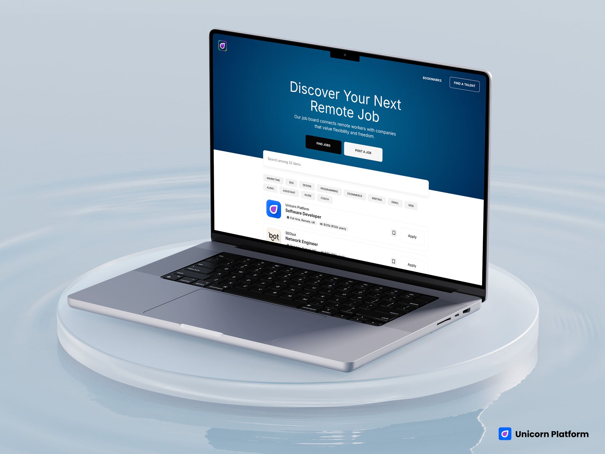
Hiring-board template with a strong hero, job-search CTA, post-a-job CTA, and searchable listings
Quick Answer
This template is a strong fit if you want to launch:
- a niche job board
- a remote-work board
- a curated hiring directory
- a community hiring page
- a lightweight talent marketplace
It is a weaker fit if you need:
- ATS-level workflow complexity
- deep recruiter dashboards
- multi-step candidate accounts
- advanced employer billing logic
- enterprise hiring operations
So the practical decision is simple: if you want a clear public hiring board that helps users browse jobs and helps companies post roles, this template makes sense. If you need a full recruiting product, it should be treated as a starting point, not the complete system.
sbb-itb-bf47c9b
At a Glance: What This Template Does Well
The template gets several important things right for a public-facing hiring site:
- it clearly frames the board around remote jobs
- it gives candidates and employers separate top-level actions
- it includes a searchable listings area
- it shows company logos, role titles, type, and salary-style metadata
- it supports bookmarking, which makes the board feel more product-like
Those details matter because job boards are judged on usefulness fast. People should not have to guess whether they can browse jobs, post jobs, or compare roles.
The biggest tradeoff is just as important:
- this template is best for lightweight or curated hiring boards, not complex recruiting infrastructure
That makes it very relevant for founders, communities, niche operators, and remote-work projects. It is less ideal for teams trying to replace a sophisticated hiring stack with one front-end template.
Who This Template Fits Best
This template is strongest for builders who want the site itself to act like a hiring destination.
The best-fit use cases are:
- Founders building a niche job board around one industry, region, or work style.
- Remote-first communities that want a cleaner place to publish openings.
- Operators launching a curated board for startups, agencies, creators, or technical roles.
- Small hiring-marketplace ideas that need a public-facing front end before the product grows more complex.
It is less ideal for companies that only need a simple corporate careers page. This template is more than that. It is built around discovery, multiple listings, and two-sided action.
How We Evaluated This Template
We evaluated the page like a hiring-board operator would, not like a design gallery browser.
The key questions were:
- Does the template help candidates find relevant jobs quickly?
- Does it make the employer route obvious?
- Does the listing layout create enough trust to click?
- Does it feel useful with multiple roles, not just one sample page?
- Where does it become too lightweight for more advanced hiring systems?
Those are the right questions because a job board succeeds when it reduces friction on both sides. If candidates cannot scan well or employers do not see a clear route to post roles, the board loses value quickly.
Template Walkthrough
Main Template Review
Remote hiring-board template with a strong hero, search-friendly listing layout, and two-sided user actions
- Best for: remote-job boards, niche hiring boards, community job directories, and curated talent marketplaces
- Style: clean, product-like, category-friendly, marketplace-influenced
- Strongest sections: hero, candidate/employer CTA split, searchable directory, listing cards
- Listing/discovery strength: high
- Employer/company trust strength: medium-high
- First customization priority: redefine the board niche and rewrite the hero around that audience
- Main limitation: not a substitute for a full recruiting platform or ATS
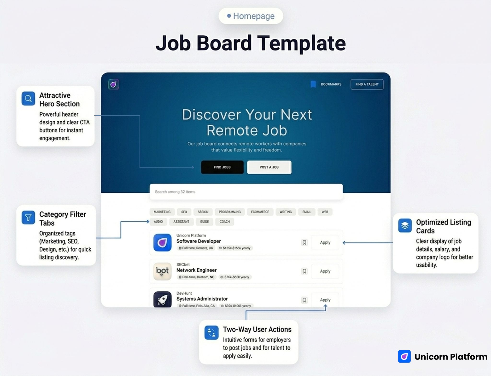
The hero is one of the clearest strengths. Discover Your Next Remote Job is direct and easy to understand. It avoids generic branding language and tells candidates exactly what the board is for. Just below that, the template offers two high-level actions: Find Jobs and Post a Job. That matters because strong job boards do not make employers hunt for the next step.
The listing area is also doing real work. The live template uses a searchable directory structure with job cards that surface:
- company logo
- company name
- role title
- work type
- salary cue
That combination helps the board feel practical immediately. It is not just a list of text links. It feels like a real hiring product surface.
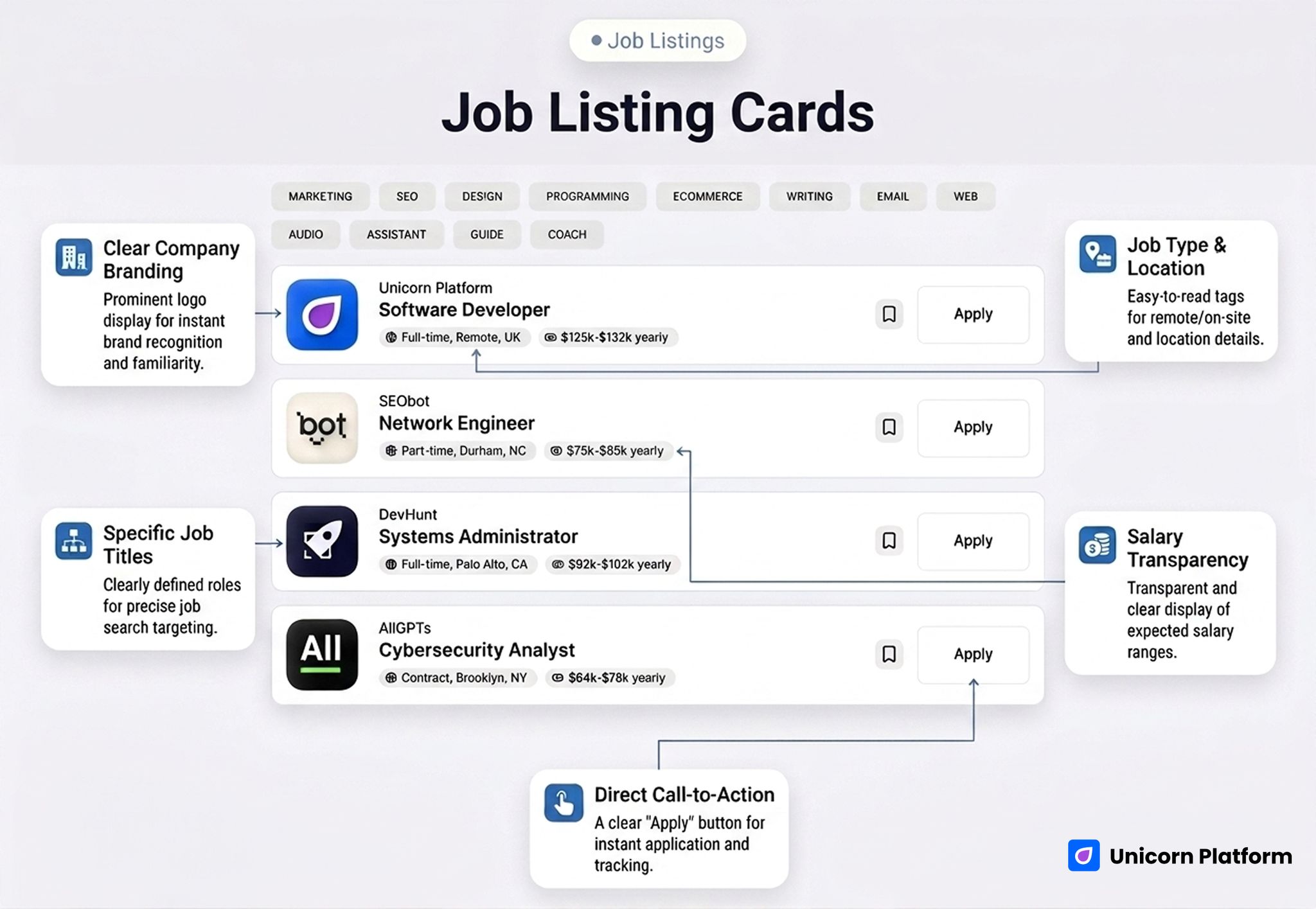
Job listing cards with company logos, role titles, work type, and salary metadata
Another useful detail is the bookmarking behavior. The live structure includes bookmarks, which is a small product signal but an important one. It helps the site feel more like a job board and less like a one-page brochure with a few sample positions.
The employer trust layer is simple but useful. Company logos and structured metadata already improve scan confidence. For many niche boards, that is enough to get version one live as long as the board has a clear promise and credible listings.
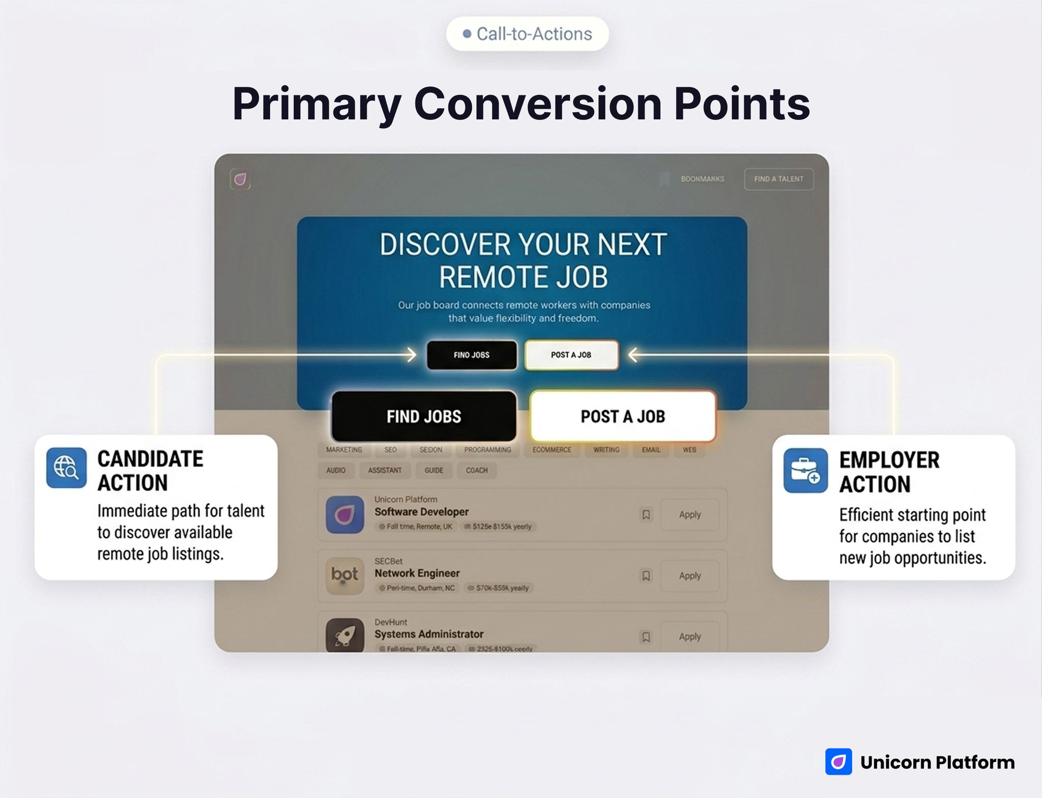
Primary actions for finding jobs or posting a job within the board template
What This Template Is Best At
The strongest thing about this template is that it understands the board as a public marketplace surface.
That shows up in three ways:
1. It supports fast listing discovery
Search plus structured cards create a much better browsing experience than a plain archive or generic blog-style grid.
2. It supports two-sided action
The Find Jobs and Post a Job split gives candidates and employers different paths without cluttering the page.
3. It feels useful even before heavy customization
This is important for founders or communities trying to validate a hiring concept. The template already behaves like a board, so you are not inventing the entire interaction model from scratch.
Best Fit by Use Case
1. Niche Job Board
This is probably the cleanest fit. If your board focuses on one audience, such as:
- remote designers
- startup operators
- AI engineers
- creator-economy roles
then this template gives you a strong base. The simpler the niche promise, the stronger the board can feel quickly.
2. Hiring Directory
This is also a good fit if the project is more curated than transactional. For example, a directory of selected openings from trusted companies can work very well with this structure because the card layout supports scan quality and brand recognition.
3. Curated Remote Board
The live template already leans in this direction, so the fit is natural. The copy, structure, and job-card behavior make remote-job positioning easy to maintain.
4. Community Hiring Page
If a community needs something stronger than a simple list of links but lighter than a full recruiting app, this template can work well. It gives jobs a real front-end home and makes the project feel more substantial.
What To Customize First
If you use this template, do not start with surface design changes. Start with the operating logic of the board.
1. Narrow the board promise
The template is strong when the audience is specific. Remote jobs is already clearer than jobs, but your strongest version will likely be narrower:
- remote startup jobs
- remote customer-success roles
- jobs in climate tech
- design roles for SaaS companies
Specificity improves both traffic quality and employer relevance.
2. Rework the listing metadata
Type and salary are useful, but some niches need additional signals:
- contract vs full-time
- region or timezone
- seniority
- async-friendly
- visa support
Those details often do more for scan quality than decorative design changes.
3. Clarify the employer route
The Post a Job action is good, but it should lead into a clear process. Employers need to know:
- what kind of roles are accepted
- who the audience is
- whether the board is curated
- what the posting process looks like
That clarity helps attract better listings.
4. Add trust around the companies or listings
The live layout already uses logos, which helps. You can strengthen trust further with:
- approved-company logic
- curated-board language
- posting standards
- audience quality notes
5. Decide whether the board is open or curated
This is one of the biggest strategic choices. A curated board should say so. An open board should explain the basic submission rules. That decision affects both CTR and conversion quality later.
Where This Template Falls Short
This is the part that matters most if the goal is relevant organic traffic, not vanity traffic.
This template is not automatically strong for:
- full recruiting suites
- ATS replacement workflows
- complex employer dashboards
- deep candidate profiles
- enterprise marketplace products
Its biggest limitation is back-end complexity. The front-end experience is good for discovery, but it does not mean the underlying product covers all hiring operations.
It also does not start with a heavy employer-branding or recruiting-agency story. That is fine for a board, but less ideal if the main goal is to sell recruiting services rather than publish jobs.
Comparison Framework: Where It Wins and Where It Needs Help
| Decision area | How this template performs | Why it matters |
|---|---|---|
| Job discovery | Strong | Search and structured cards help candidates browse quickly |
| Candidate action flow | Strong | Clear role cards and visible CTA routes reduce friction |
| Employer action clarity | Medium-high | The Post a Job path is visible, but the process should be customized |
| Company trust | Medium-high | Logos and metadata help, but some niches need stronger posting rules |
| Board scalability | Medium | Good for curated or niche boards, weaker for complex platform needs |
| Speed to launch | Strong | You can publish a real board concept quickly without inventing the whole structure |
What Makes a Good Hiring-Board Template
A good hiring-board template should help three things happen quickly:
- candidates understand what kind of jobs live on the board
- employers understand whether the board fits their hiring needs
- both sides can take action without confusion
That sounds simple, but many boards get it wrong. They either look too generic, bury the job list, or make employer participation feel secondary.
The best board templates also support growth. They should still feel usable when you have:
- more listings
- more categories
- more employers
- more discovery entry points from search and social
This template handles that better than a simple startup homepage because it already thinks in listings, not only branding.
When This Template Is Enough
This template is enough when:
- the board has one clear niche
- public job discovery is the main product
- employer posting flow can stay lightweight
- the front-end experience matters more than complex account systems
- you want to validate demand before building deeper product infrastructure
For many founders and community operators, that is exactly the right scope.
When You Need More Than This Template
You will likely need more architecture if:
- employers need advanced recruiting dashboards
- candidates need profiles, saved searches, or application tracking
- billing and sponsorship logic become more complex
- the board expands into a large hiring product
- your business depends on deep workflow automation
That does not make the template weak. It just means the template is strongest when the board is still focused, public-facing, and listing-driven.
Why Build This in Unicorn Platform
If your goal is to launch a job board quickly, Unicorn is useful because it gives you a front-end structure that already feels like a board. That matters when the main challenge is proving demand, shaping the niche, and giving users a clear public experience fast.
It is especially practical for curated boards, remote-job projects, or founder-led marketplaces that want to get live before committing to a full custom build.
If you want to explore the platform before choosing a template, start with the homepage or compare plans on pricing.
FAQ
Is this a good template for a niche job board?
Yes. That is one of the clearest use cases. The structure works well when the audience is specific and the listings are curated or targeted.
Does the template support searchable job discovery?
Yes. Search is one of the strongest parts of the live template because it makes the board feel genuinely useful right away.
Is it better for remote jobs than for general hiring?
Yes, at least in its default form. The hero and overall positioning already lean toward remote work, which makes the template especially natural for remote or distributed teams.
Can employers post jobs from this template?
Yes, the template includes a visible Post a Job path. You should still customize the actual posting process and qualification rules around your board model.
Is this enough for a recruiting platform?
Not by itself for most cases. It is better as a public-facing hiring board than as a complete recruiting product.
What should I customize first?
Start with the niche promise, the listing metadata, the employer route, and the trust rules for which jobs appear on the board.
Can this work for a community hiring page?
Yes. In fact, it is a strong option when a community wants something more useful than a plain links page but less complex than a large marketplace build.
Does it work better than a generic careers page?
Yes, if the project is meant to host multiple jobs and attract repeated discovery traffic. The template is much more useful because it treats listings as the main product.
Final Takeaway
If you want a template that helps candidates browse listings, helps employers see a clear posting path, and gives a niche hiring project a real public home, this Unicorn template is a strong starting point.
Its biggest advantage is not just that it looks modern. It is that it behaves like a board: clear hero promise, two-sided CTA structure, searchable listings, structured cards, and a more useful browsing flow than a generic startup page.
That is exactly why this page can attract more relevant organic traffic when it is positioned honestly.
If your project is a niche job board, curated remote-hiring board, or community job directory, this template makes sense.
If your project needs ATS-level complexity or a large recruiting platform architecture, you should treat it as a base, not a finished system.
If you want the fastest next step, open the template in Unicorn Platform and decide whether your hiring project needs a focused public board or a much deeper product stack.