Table of Contents
- Conversion Architecture for Delivery and Fast-Decision Offers
- 30-Day Execution Plan
- Common Mistakes and Practical Fixes
- FAQ
Food and restaurant teams often assume low conversion is a traffic issue. In most cases, it is a decision-friction issue. Visitors arrive with high intent, but the page delays the answers they need to act: service coverage, expected timing, fees, and confidence that the order will be right.
When those answers are not immediate, people hesitate and open competitor tabs. Paid traffic still generates clicks, but checkout starts stall and support requests rise. That pattern hurts both marketing efficiency and operations.
High-performing delivery pages solve this with clear structure. They present relevance first, trust second, logistics third, and action flow throughout. The page should feel like a guided order path, not a static brand document.
This guide gives a practical system for 2026. It covers architecture, copy design, mobile execution, proof placement, experimentation, and rollout workflows you can run consistently with Unicorn Platform.
sbb-itb-bf47c9b
Quick Strategic Takeaways
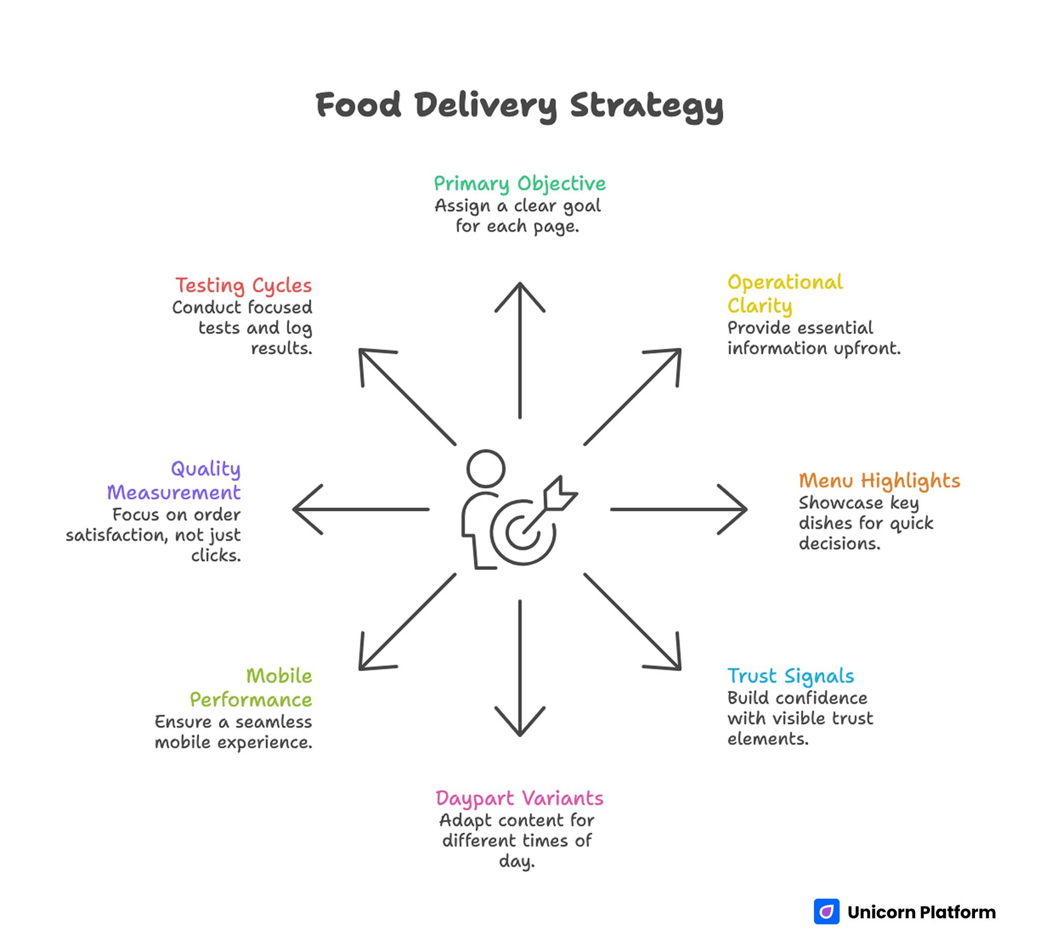
Food Delivery Strategy
- Assign one primary objective per page: direct order, reservation handoff, or campaign lead capture.
- Put operational clarity above the fold, including timing and service-area cues.
- Present menu highlights for decision speed before long storytelling sections.
- Place trust signals near commitment steps, not only at the bottom.
- Use daypart and location variants with shared structural modules.
- Treat mobile tap flow and speed performance as release requirements.
- Measure completion quality, not only click volume.
- Run one major variable per testing cycle and log decisions weekly.
Why Delivery Pages Underperform Even With Strong Visual Design
Most weak pages are not ugly. They are unclear at the wrong moment. A visitor who wants to order now should not need deep scrolling to confirm delivery radius or handoff time.
Another issue is objective overload. Pages often try to push delivery, bookings, catering, and newsletter signup with equal emphasis. Mixed priorities create hesitation because visitors cannot identify the fastest relevant next step. The importance of optimizing delivery pages continues to grow as online food ordering becomes a major revenue channel. Market research from Statista shows that online food delivery usage has expanded rapidly worldwide, with millions of consumers relying on digital ordering platforms each day. When campaign pages create friction, restaurants risk losing high-intent users during this critical ordering moment.
A third issue is sequence mismatch between ads and destination pages. Campaign copy promises immediacy, but the landing experience opens with broad brand messaging instead of practical ordering information. The trust gap appears instantly.
A durable fix starts with one operating rule. Every section should remove one concrete uncertainty and move users closer to completion.
Start With Intent Mapping Before You Touch Design
Define the page objective in one sentence before selecting components. Examples include same-day order capture, lunch-combo conversion, or weekend pre-order demand.
Once the objective is fixed, define the audience state. First-time visitors need reassurance and process clarity. Returning users usually need speed and familiar shortcuts.
Then map a simple commitment ladder. Early-stage users should see a low-friction action first, while higher-intent users should reach checkout quickly without redundant prompts.
Teams refining objective-specific flow can align early structure decisions with this reservation conversion blueprint when reservation handoff is part of the journey.
Intent mapping improves both conversion and analytics quality. It also prevents stakeholder edits from pulling the page in conflicting directions.
Conversion Architecture for Delivery and Fast-Decision Offers
A reliable 2026 architecture for delivery pages includes seven modules. The sequence is stable, while content details can vary by campaign.
- first-screen offer with immediate qualifier
- trust strip with current credibility signals
- featured products or bundles for quick comparison
- logistics block with service and timing rules
- objection-handling FAQ from real support questions
- primary action flow with minimal first-step friction
- fallback support path for unresolved edge cases
This order mirrors buyer behavior. Visitors confirm relevance, validate risk, check feasibility, and then commit.
In Unicorn Platform, this framework can be reused across districts and dayparts. Consistent structure lowers production overhead while preserving user familiarity.
First-Screen Formula for Faster Action
The first screen should answer four questions in seconds. What can be ordered, where service applies, when delivery is available, and what action to take now.
A practical formula is offer plus qualifier plus action. The qualifier should be operational, such as area, timing window, or cutoff guidance.
CTA wording should match commitment stage. For high-intent campaigns, direct action labels work better than vague “learn more” prompts. For exploratory traffic, a lightweight next step can improve progression quality.
Specificity beats slogans in this section. Concrete operational cues reduce hesitation before users reach deeper content.
Menu Presentation That Supports Decisions, Not Distraction
Visitors rarely need a full menu immediately. They need a short comparison layer that helps them decide whether to continue.
Use featured bundles, high-demand categories, and practical filters first. Keep product cards concise, with one value cue and one operational cue for each item.
Operational cues can include prep-time range, serving-size context, or availability notes. These cues reduce uncertainty and lower support load later.
If your team is optimizing app-first ordering paths, the implementation patterns in this food delivery app page guide are useful for improving CTA continuity and mobile scan speed.
Long descriptions should be progressive, not front-loaded. Give users clarity first, then optional depth.
Trust Design Where It Actually Changes Behavior
Trust content works best at commitment moments, not as a decorative block at the end. Visitors evaluate risk when they are about to share payment or booking details.
A high-impact trust stack combines customer proof, operational proof, and policy proof. Customer proof includes current ratings and relevant feedback context. Operational proof includes delivery reliability and support responsiveness. Policy proof includes correction and cancellation expectations.
Trust freshness matters. Outdated numbers or stale claims create more doubt than a smaller set of current, verifiable signals.
Placement discipline is critical. Put trust and policy cues near pricing, cart starts, and form submits so reassurance appears exactly when hesitation spikes.
Logistics Clarity as a Revenue Lever
Logistics clarity is often the fastest win in delivery conversion. Many abandonments happen because users cannot verify feasibility quickly.
Build one dedicated logistics module near the first major action section. Keep language plain and remove legal-style complexity where possible.
The module should cover service area boundaries, expected handoff times, minimum conditions, fee behavior, and exception rules. If these details are unclear, low-fit clicks increase and completion quality falls.
When logistics become explicit, teams usually see lower abandonment and fewer repetitive support questions. That improvement often beats more aggressive discounting.
Checkout Flow: Reduce Early Friction Without Losing Quality
Checkout flow should gather only commitment-critical information in step one. Overloading initial forms reduces completion without improving order quality.
Use staged capture. Collect essentials first, then request secondary preferences later in the process.
Error handling should be specific and actionable. Generic error text slows recovery and increases drop-off in mobile sessions.
For campaigns that also collect recurring-order intent, this lead generation landing page framework can help organize qualification fields without bloating first-step conversion.
Consistency matters as much as speed. Users should not relearn checkout logic every time a campaign variant changes.
Style and Brand Expression Without Conversion Loss
Visual identity matters in food categories because appetite is emotional and immediate. However, style should support the order path instead of competing with it.
A good creative rule is functional hierarchy first, expression second. Keep key actions and logistics readable before adding high-density decorative elements.
Use photography that answers buying questions. Show portion realism, packaged handoff quality, and context relevant to the current offer. Beautiful but ambiguous visuals may increase interest while lowering completion.
Brand storytelling still has value. Keep it concise and place it after primary action opportunities so motivated users can commit without delay.
Daypart and Location Variants That Scale
Delivery behavior changes by time window and neighborhood context. Lunch users often optimize for speed and value. Evening users may prioritize group fit and reliability. Late-night users prioritize availability and minimal friction.
Build variants from one structural baseline. Change first-screen qualifiers, featured bundles, and logistics details by daypart or location while keeping interaction patterns stable.
Location variants should reflect real operational differences, not cosmetic wording changes. Accurate local cues improve trust and reduce low-fit traffic.
Unicorn Platform supports this workflow through reusable sections and fast cloning. Teams can publish quickly without reintroducing structural errors each cycle.
Mobile and Speed Standards for 2026
Most ordering journeys start on mobile devices, so release quality should be judged on small screens first. Desktop polish does not compensate for mobile friction.
Set mandatory pre-launch checks for headline readability, tap target spacing, form usability, and payment handoff continuity. Validate these checks on real devices and variable network conditions.
Page speed should be treated as conversion infrastructure. Heavy scripts, oversized media, and late-loading controls create instant abandonment in fast-decision categories. Performance optimization is not only a usability improvement but also a measurable factor in user engagement. Research and performance guidelines from Google highlight that page speed and responsive interaction metrics significantly influence how users experience and complete tasks on modern websites. For fast-decision journeys like food ordering, slow-loading elements can immediately reduce completion rates.
A practical standard is to optimize for first meaningful action speed, not just visual load completion. Users should be able to start ordering before non-critical assets finish rendering.
Discovery Performance and AI Retrieval Readiness
Visibility now depends on both search behavior and retrieval systems that prioritize clear, useful, and complete answers. Thin campaign pages may attract clicks but struggle to sustain durable discovery.
Support discoverability with clear heading hierarchy, practical subtopic coverage, and explicit policy details. These elements improve readability for users and interpretability for retrieval systems.
Use internal links only where readers naturally need deeper implementation context. Contextual linking supports authority without interrupting decision flow.
For teams aligning restaurant-wide conversion systems with campaign pages, this restaurant landing page template guide helps maintain consistency across core and promotional experiences.
Measurement Framework That Protects Profitability
Track outcomes in four stages: engagement, initiation, completion, and quality. Engagement includes CTA interactions and section behavior. Initiation includes order starts. Completion includes confirmed transactions. Quality includes average order value, repeat signals, and support burden.
This layered model prevents false positives. A test that increases clicks but harms completion quality should not be considered a win.
Run one major variable per cycle for clean attribution. If multiple core variables change at once, teams cannot determine which decision produced the result.
Document every test with hypothesis, expected impact, measured impact, and next action. Weekly decision logs convert campaign work into compounding operational knowledge.
30-Day Execution Plan
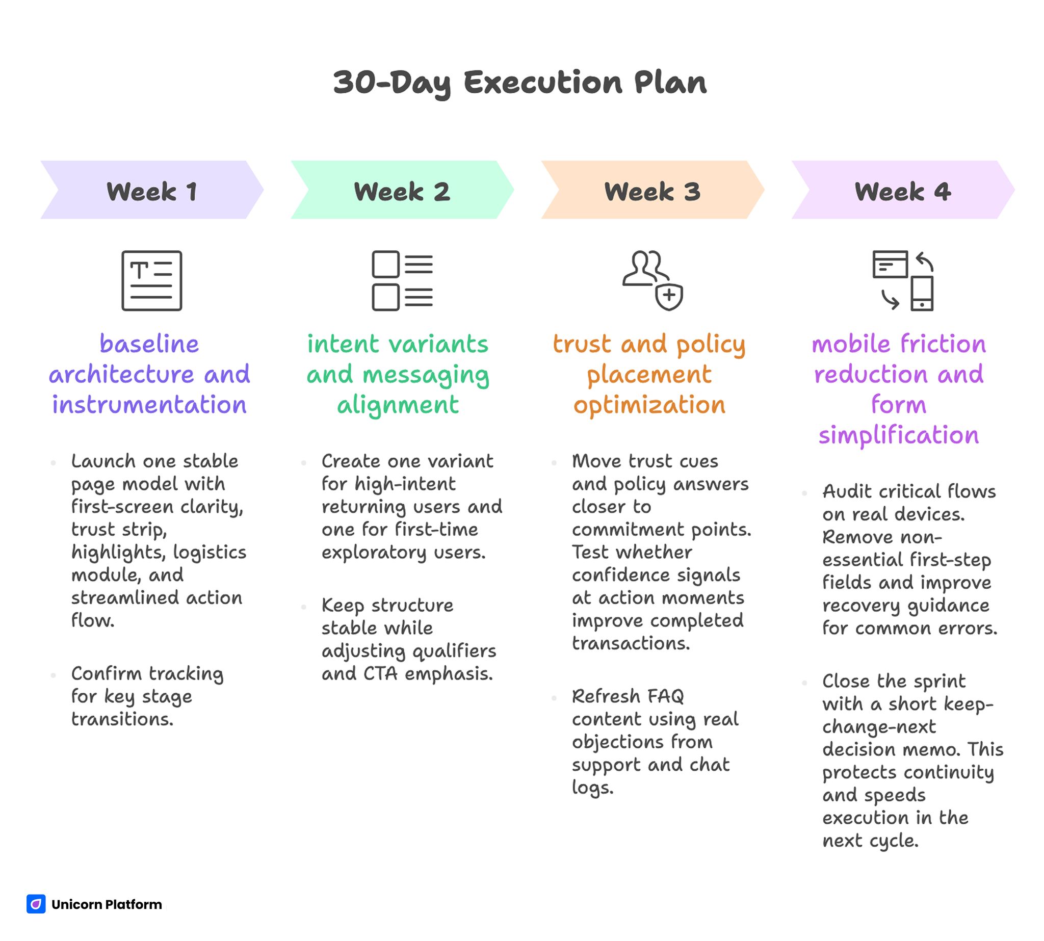
30-Day Execution Plan for Optimizing Delivery Campaign Pages
Week 1: baseline architecture and instrumentation
Launch one stable page model with first-screen clarity, trust strip, highlights, logistics module, and streamlined action flow. Confirm tracking for key stage transitions.
Capture baseline metrics for initiation rate, completion rate, and support-question volume. These baselines become the reference for future tests.
Week 2: intent variants and messaging alignment
Create one variant for high-intent returning users and one for first-time exploratory users. Keep structure stable while adjusting qualifiers and CTA emphasis.
Measure completion quality by variant rather than aggregate traffic performance. Segment-level clarity improves decision confidence.
Week 3: trust and policy placement optimization
Move trust cues and policy answers closer to commitment points. Test whether confidence signals at action moments improve completed transactions.
Refresh FAQ content using real objections from support and chat logs. This keeps on-page objection handling aligned with current behavior.
Week 4: mobile friction reduction and form simplification
Audit critical flows on real devices. Remove non-essential first-step fields and improve recovery guidance for common errors.
Close the sprint with a short keep-change-next decision memo. This protects continuity and speeds execution in the next cycle.
90-Day Scaling Model
Scale only after baseline quality is stable. Expanding spend on unstable conversion paths magnifies inefficiency.
Days 1-30 should stabilize structure and measurement. Days 31-60 should expand daypart and district variants with controlled hypotheses. Days 61-90 should consolidate winning modules into reusable templates and retire weak variants.
This approach balances speed and control. Teams ship quickly while maintaining consistent user experience and reliable attribution.
For restaurants running event-led traffic alongside delivery, the framework in this event registration landing page guide can help align short-window campaign pages with the same conversion discipline.
Common Mistakes and Practical Fixes
Mistake 1: combining too many objectives on one page
Fix by assigning one primary conversion objective and reducing competing actions. Focus improves both completion and measurement clarity.
Mistake 2: opening with brand narrative instead of practical qualifiers
Fix by placing service and timing cues in the first screen. Visitors should understand feasibility before reading long-form brand context.
Mistake 3: placing trust only in lower sections
Fix by moving proof and policy reassurance near commitment steps. Confidence should appear where decisions happen.
Mistake 4: hiding logistics in secondary pages or accordions
Fix by exposing core logistics details near the first action path. Operational answers should not require extra navigation.
Mistake 5: collecting too much data in step one
Fix by limiting early forms to critical fields and staging secondary capture later. Lower initial effort improves completion probability.
Mistake 6: treating mobile checks as optional polish
Fix by making mobile usability and speed checks mandatory release gates. Small-screen failures rapidly erase paid traffic efficiency.
Mistake 7: running noisy experiments without attribution control
Fix by testing one major variable per cycle with explicit hypotheses. Clean experiments drive better strategic decisions.
Mistake 8: shipping repeatedly without a documented learning loop
Fix by maintaining weekly test logs and updating reusable modules based on evidence. Documentation is what turns iteration into long-term performance growth.
Pre-Publish QA Checklist
Before each release, run a fast QA pass that verifies decision clarity and operational reliability. Keep the checklist short and enforce it consistently.
Checklist: Apply this list as a release gate before every major publish so critical details are not missed under campaign pressure. This quick gate keeps releases consistent across high-tempo campaign cycles.
- first-screen offer and qualifier are immediately clear
- primary action path matches campaign intent
- logistics answers are visible before commitment points
- trust and policy cues appear near CTAs
- highlighted items are scannable on mobile
- first-step form fields are minimal and clear
- speed and interaction checks pass on real devices
- tracking events confirm stage-level measurement
Teams that run this checklist on every publish cycle typically reduce rework and improve campaign stability. It also shortens feedback loops between marketing and operations.
FAQ: Delivery Campaign Pages
How long should a delivery conversion page be?
Length should match decision complexity. Fast-order campaigns can be concise, while mixed-intent or policy-heavy offers may need more depth.
Should delivery and reservations share the same page?
Usually no. Separate objectives generally produce clearer user decisions and more reliable analytics.
What should appear in the first screen?
Show the current offer, service qualifier, timing expectation, and immediate action. Practical clarity in these four areas prevents early drop-off.
How much menu detail is enough above the fold?
Use curated highlights and short qualifiers first. Full-depth menu exploration can follow after the first action opportunity.
Which trust signals are most useful?
Current ratings, relevant review context, service reliability cues, and clear correction policies usually provide the strongest reassurance. These signals are most effective when placed close to the main action buttons.
How often should we update campaign pages?
Weekly review cycles are practical for active teams, with immediate updates whenever operating conditions change. Frequent review keeps campaign copy aligned with real delivery capacity.
Which metric matters most after conversion rate?
Quality metrics such as repeat behavior, support burden, and average order value reveal whether performance gains are sustainable. They prevent teams from overvaluing short-term click spikes.
How can a small team scale variants without losing control?
Use one stable architecture, clone by daypart or district intent, and document every material test decision each week. This approach keeps variant growth manageable without losing consistency.
What if campaigns need aggressive visual changes?
Keep the conversion skeleton intact and change creative layers around it. Familiar interaction patterns protect completion.
What is a realistic experimentation pace?
One major variable per week is usually sustainable and produces cleaner insight than high-volume simultaneous testing. Controlled cadence usually outperforms aggressive but noisy test plans.
Final Takeaway
High-performing delivery campaign pages are operating systems, not static designs. Clear offer qualifiers, visible logistics, contextual trust, and low-friction action flow are what convert intent into completed orders.
Unicorn Platform makes this process practical by enabling fast iteration on a stable structural foundation. When teams combine disciplined architecture with weekly measurement and QA, conversion quality improves predictably across campaigns.