Table of Contents
- What Top Fashion Pages Consistently Do Better
- Build the Page Around Buyer Decision Stages
- Scenario Blueprints You Can Apply Immediately
- 30-Day Execution System for Fashion Teams
- Common Mistakes That Quietly Reduce Fashion Conversion
- FAQ
Fashion brands rarely have a traffic problem. Most teams have a confidence problem. Visitors can like the look, understand the style direction, and still leave because key buying questions are not answered early enough.
A high-performing page in this category does two jobs at the same time: it sells aspiration and removes operational uncertainty. Buyers need emotional resonance, but they also need practical clarity about fit, material feel, shipping windows, and return conditions.
The strongest competitors win because they make decisions easier, not because they add more visual effects. Their pages are structured like guided buying environments, with clear sequencing from relevance to proof to action.
This article gives a field-tested system you can use to improve fashion conversion quality while keeping brand standards high. It covers structure, copy hierarchy, luxury presentation signals, mobile behavior, performance, and analytics routines that make improvements repeatable.
sbb-itb-bf47c9b
Quick Takeaways
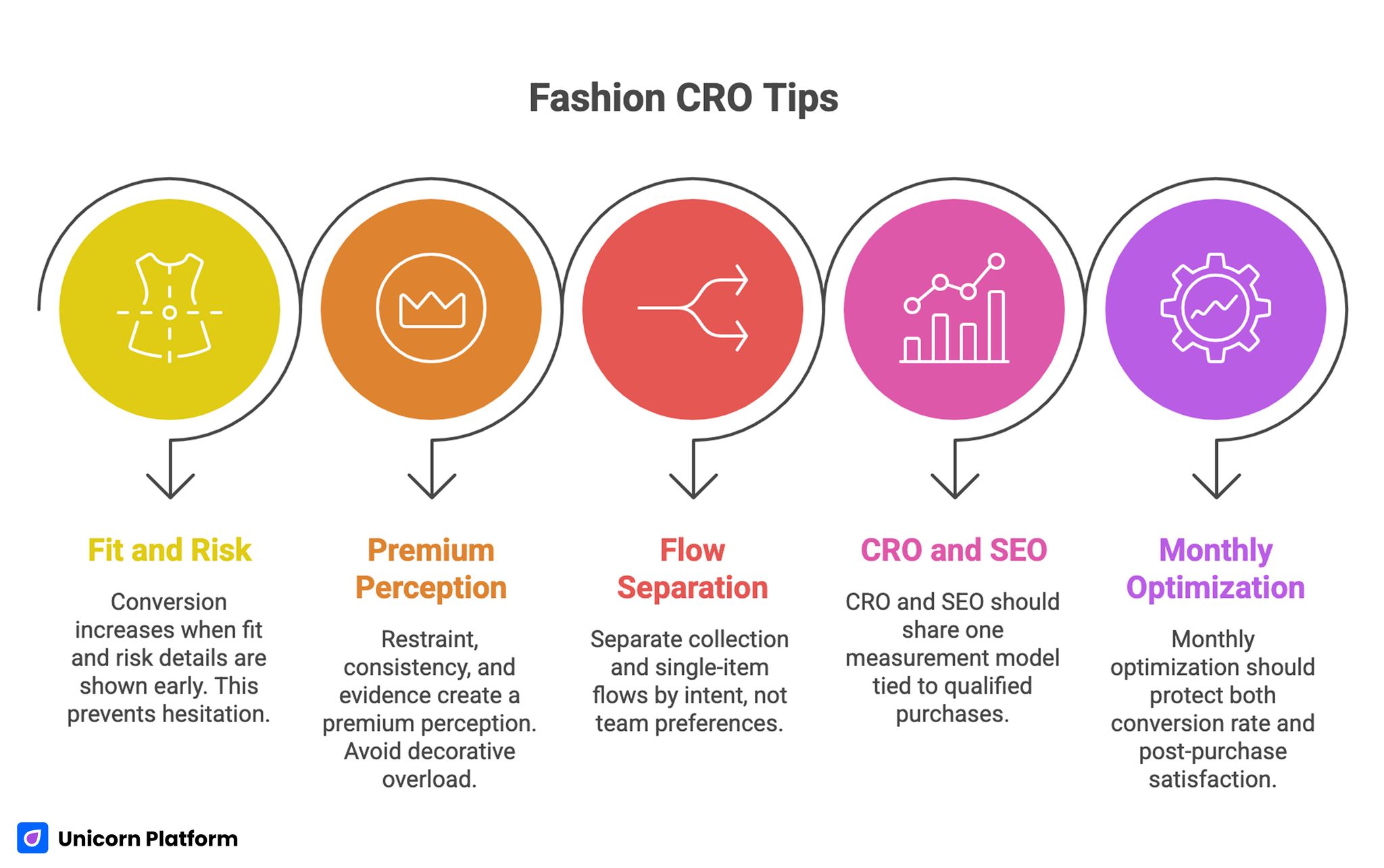
Fashion CRO Tips
- Conversion in fashion rises when fit and risk details appear before hesitation peaks.
- Premium perception is driven by restraint, consistency, and evidence, not decorative overload.
- Collection and single-item flows should be separated by intent, not by internal team preferences.
- CRO and SEO should share one measurement model tied to qualified purchases.
- Monthly optimization should protect both conversion rate and post-purchase satisfaction.
What Top Fashion Pages Consistently Do Better
The best-performing pages across this cluster reveal a consistent pattern: they combine editorial quality with strict buying clarity. Page design creates desire, while copy and structure reduce doubt at each decision step.
Another recurring signal is systemization. Teams do not start every launch from a blank canvas. They operate with repeatable templates and controlled variants so page quality stays stable across drops, campaigns, and seasonal refreshes.
A third pattern is channel-awareness. Strong pages are aligned to traffic intent. Broad inspiration campaigns route users into curated discovery flows, while high-intent campaigns land on focused product narratives with minimal distractions.
Pattern 1: Decision Compression
High-performing pages reduce the number of unresolved questions between first view and add-to-cart intent. They do this by surfacing the most consequential information early: who the product is for, why it is different, and how risk is managed.
Decision compression does not mean oversimplifying. It means presenting information in the sequence buyers actually use when they decide.
Pattern 2: Premium Signals With Functional Purpose
Luxury-style presentation is effective when it supports comprehension. Clean spacing, disciplined typography, and curated imagery improve confidence only if they also make details easier to process.
When visual treatment overwhelms hierarchy, users cannot quickly locate fit, policy, or price context. That tension lowers trust and often suppresses conversion.
Pattern 3: Template-Driven Execution at Campaign Speed
Competitive teams deploy pages quickly, but they avoid quality drift through modular templates. Each module has a conversion role: hero relevance, proof block, fit guidance, policy clarity, and action controls.
For teams improving module logic and section order, this guide on creating product pages that sell is a practical reference. It is most useful when you map each section to one conversion job before launch.
Template speed should still be paired with page-specific merchandising decisions. A reusable system must adapt to intent, product complexity, and brand positioning.
Build the Page Around Buyer Decision Stages
Fashion shoppers move through five micro-decisions before purchase intent becomes action. Structuring sections around these moments creates a smoother conversion path.
1) Relevance: Is this for me?
The first screen should answer audience and use-case immediately. Replace generic claims with clear context such as seasonality, silhouette, activity, occasion, or styling intent.
A short, concrete headline plus one supportive sentence outperforms broad brand language at this stage. Users need orientation before persuasion.
2) Differentiation: Why this item over alternatives?
Next, explain what makes the product distinct in functional and emotional terms. Material quality, cut behavior, durability, comfort profile, and styling range should be explicit.
Specificity matters. Buyers compare quickly across tabs, so vague adjectives lose to clear product truths.
3) Confidence: Can I buy without regret?
This stage is where many pages fail. Fit uncertainty, unclear shipping expectations, and hidden return terms create hesitation that interrupts momentum.
Place confidence elements before or near the primary action path. Users should not have to hunt for policy or fit interpretation to proceed.
4) Social Validation: Did it work for people like me?
Trust-building reviews should be filtered for decision relevance. Prioritize comments about fit accuracy, fabric behavior, comfort over time, and purchase satisfaction.
Evidence quality is more valuable than testimonial volume. Ten specific reviews can outperform a larger generic feed.
5) Action: What do I do now?
A single dominant CTA should remain visible and easy to understand. Supporting actions can exist, but hierarchy must stay clear so users do not bounce between competing next steps.
Premium Presentation Without Conversion Drag
Fashion teams often associate premium design with heavy media and layered effects. In practice, high-converting premium pages use restraint. They create perceived quality through consistency and clarity.
Visual Direction Rules That Support Sales
- Keep one dominant visual narrative per page.
- Use consistent art direction across product, model, and detail shots.
- Reserve animation for meaning, not decoration.
- Maintain whitespace that improves scan speed around key information.
Typography and Layout Discipline
A premium page should feel editorially intentional. Use a limited type scale and predictable spacing rhythm so users can scan sections quickly without cognitive fatigue.
Large expressive headlines can work well, but body copy must remain highly readable on mobile. If style costs readability, conversion friction rises.
Imagery Standards for Apparel and Accessories
Show the product in three perspectives: full look, detail texture, and use context. Buyers need both aesthetic and practical evidence before committing.
Include close-ups that answer material and finish questions. This is especially important for premium pricing where tactile confidence drives action.
Copy Strategy That Sells Without Sounding Promotional
Strong fashion copy is specific, concrete, and honest about what the product delivers. It helps users imagine real ownership conditions, not idealized outcomes.
A reliable framework is: audience fit, usage context, product truth, risk reduction, action prompt. This structure avoids hype while keeping momentum.
Headline and Subheading System
Lead with relevance and intent instead of abstract brand language. The subheading should add one practical layer, such as fit profile or seasonal function.
If the first two lines are clear, users are more likely to engage deeper sections instead of returning to search results. Early clarity also improves message continuity between ad copy and on-page content.
Benefit Language vs Feature Lists
Feature lists are necessary, but they should be translated into user outcomes. Material composition, construction, and care details become persuasive when connected to comfort, longevity, and styling flexibility.
Avoid stacking technical details without interpretation. Help buyers understand why each detail matters before the decision point.
Offer Framing
Discounts and urgency can improve short-term conversion, but credibility is the real multiplier. Terms must be explicit, time windows must be real, and exclusions must be easy to read.
Artificial urgency patterns may lift clicks while damaging trust and return rates. Sustainable performance comes from transparent merchandising logic.
Fit, Shipping, and Returns: The Core Confidence Layer
In fashion ecommerce, uncertainty about fit remains the largest direct barrier to purchase. A static size chart does not resolve enough doubt on its own.
High-performing pages pair chart data with interpretation cues: model measurements, fit notes, and guidance on whether an item runs narrow, relaxed, or oversized. This combination reduces guesswork and lowers size-related hesitation. This aligns with findings from the National Retail Federation, which highlights that unclear sizing and return policies are among the top reasons for cart abandonment and product returns in ecommerce apparel.
When teams run dedicated hero-SKU campaigns, this guide on single-product landing pages is useful for maintaining focus while keeping fit and policy details visible. It also helps protect narrative consistency when traffic intent is narrow.
Position return and exchange information close to sizing decisions, not only in footer policies. Shoppers need to see downside protection at the exact moment they commit to size selection.
Shipping communication also needs precision. Delivery windows, processing time, and regional differences should be clear enough to prevent surprise after purchase.
Mobile Behavior Is a Revenue Variable, Not a Design Detail
Most fashion journeys start on mobile, and many complete there. If mobile interaction feels heavy, confusing, or delayed, top-of-funnel demand leaks before checkout.
Prioritize these mobile behaviors first. Together, they keep users moving from discovery into committed action without friction:
- First-screen message clarity in under five seconds.
- Fast access to size and variant controls.
- Stable primary CTA without covering critical details.
- Easy return to proof blocks after variant changes.
- Smooth handoff from landing page to checkout start.
Performance and UX should be evaluated together. A visually rich page that loads slowly or shifts layout during interaction will underperform regardless of copy quality.
Collection vs Single-Item Routing by Intent
Routing decisions strongly influence conversion quality. The page type should match campaign promise and search intent.
Collection destinations work best when the acquisition message is exploratory. Single-item destinations work best when the message is precise and product-specific.
A hybrid model is often strongest: one curated discovery page for broad traffic and one focused conversion page for high-intent traffic. This protects both inspiration value and purchase momentum.
For broader benchmark patterns by funnel stage, this ecommerce landing page examples resource provides useful comparisons. Use those comparisons to separate exploratory traffic flows from high-intent conversion flows.
Consistency matters more than uniformity. Shared design tokens and content modules can coexist with intent-specific narrative and CTA strategy.
CRO and SEO Should Run as One Operating Model
Fashion teams frequently separate SEO and conversion optimization into different workflows. That split creates friction: one team optimizes for traffic growth, another for revenue outcomes, and page coherence declines.
A stronger model starts with shared intent mapping. Each page should have a primary intent class, supporting questions, and a defined conversion action.
From there, teams can align content depth and interaction design around the same user journey. Organic discovery and paid acquisition then reinforce each other instead of competing for structure.
When refining conversion friction after launch, this piece on ecommerce conversion mistakes to avoid helps prioritize fixes with real commercial impact. Apply those checks in post-launch reviews so quick wins do not hide structural issues.
Shared KPI Stack
Use a KPI model that combines acquisition and quality outcomes. This keeps optimization grounded in revenue quality rather than vanity improvements:
- Qualified session-to-product engagement rate.
- Add-to-cart and checkout-start progression.
- Purchase conversion by device and source.
- Return and exchange signals linked to page variants.
- Support tickets tied to fit or fulfillment confusion.
This stack prevents short-term wins from masking downstream quality losses. It also creates a shared language between acquisition, merchandising, and support teams.
Scenario Blueprints You Can Apply Immediately
Scenario A: High Traffic, Weak Add-to-Cart
Traffic quality looks acceptable, but add-to-cart stays below expectations. Review first-screen relevance and value differentiation first. Pages often rely on brand language while delaying product truth.
Fix by rewriting hero and first two sections around use-case fit, material value, and one immediate trust cue. Keep the first CTA visible only after those questions are answered.
Scenario B: Strong Add-to-Cart, Weak Checkout Start
Users show product interest but hesitate before checkout. The usual cause is late-stage risk visibility: shipping costs, return windows, or processing times are unclear.
Fix by moving policy clarity near CTA zones and presenting total purchase expectations earlier. This adjustment usually improves progression without relying on discounts.
Scenario C: Strong Conversion, Rising Returns
Sales look healthy, but returns increase due to fit mismatch or expectation gaps. This usually indicates persuasive copy is outrunning practical clarity.
Fix by adding fit interpretation, model context, and realistic wear guidance while preserving purchase momentum. Re-check post-purchase feedback after rollout to confirm that return causes decline.
30-Day Execution System for Fashion Teams
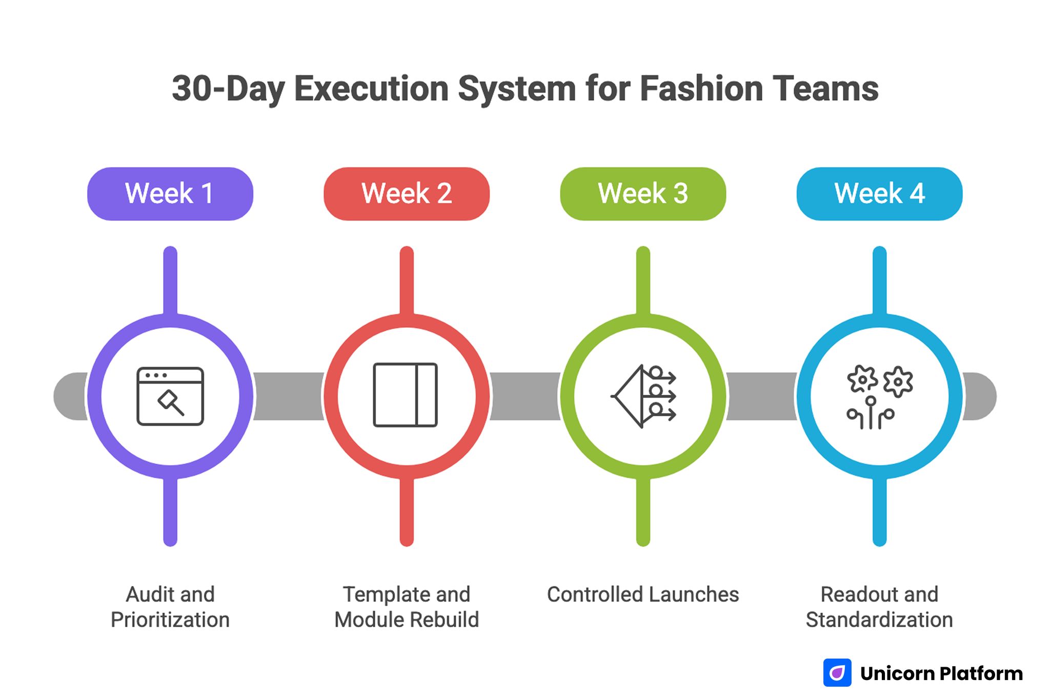
30-Day Execution System for Fashion Teams
Week 1: Audit and Prioritization
Audit top pages for relevance clarity, fit communication, trust signal placement, and mobile friction. Select one major bottleneck per page type and define a measurable hypothesis.
Week 2: Template and Module Rebuild
Rebuild templates with standardized modules for hero clarity, proof, fit guidance, policy confidence, and CTA hierarchy. Keep module names and usage rules explicit so teams ship consistently.
Week 3: Controlled Launches
Launch limited variants with stable traffic windows. Change one core variable at a time so results remain interpretable.
Week 4: Readout and Standardization
Compare outcomes using conversion plus quality guardrails. Promote winning patterns into default templates and archive losing variants with notes on why they failed.
Repeat this cycle monthly, especially during seasonal transitions and major campaign periods. Cadence matters because product mix and user expectations shift faster in fashion than in many other verticals.
Common Mistakes That Quietly Reduce Fashion Conversion
Mistake 1: Aesthetic-first hero sections with low information value
Fix by pairing strong visuals with immediate practical context about audience fit and product role. Preserve emotional tone, but make the buying context explicit from the start.
Mistake 2: Fit guidance hidden behind secondary interactions
Fix by surfacing fit interpretation and risk-reduction details near variant selection. Buyers should not need extra navigation to resolve core fit doubts.
Mistake 3: Policy details treated as legal copy only
Fix by translating shipping and returns into buyer-friendly summaries near conversion decisions. Keep full legal policy pages available, but do not force users to leave the decision flow.
Mistake 4: Review content shown without decision relevance
Fix by highlighting review snippets that answer common objections, not generic praise. Curate for clarity around fit, comfort, and delivery experience.
Mistake 5: Mobile CTA patterns that obscure critical details
Fix by validating sticky elements across real devices and ensuring key confidence content stays accessible. A control that improves visibility but hides policy context can still hurt conversion quality.
Mistake 6: Testing only for conversion lifts
Fix by adding return, support, and satisfaction guardrails to every experiment. A balanced scorecard prevents aggressive tests from degrading long-term performance.
FAQ: Fashion Ecommerce Landing Pages in 2026
1) What should a fashion landing page communicate first?
Start with audience-fit relevance and one concrete product benefit. Users should know within seconds whether the page matches their need.
2) How much fit detail is enough?
Provide chart data plus interpretation: model context, cut profile, and notes on size behavior. Interpretation is what reduces hesitation.
3) Where should return information appear?
Place a concise summary near sizing and CTA interactions, then link to full policy details for deeper reading. This gives users immediate confidence while preserving transparency.
4) Should premium brands avoid promotional offers?
Not necessarily. Offer framing can still work for premium brands if terms are transparent and brand tone remains consistent.
5) Are collection pages bad for conversion?
No. They work well for exploratory intent. Problems appear when high-intent traffic is sent to broad discovery pages with weak action hierarchy.
6) What mobile issue hurts conversion most often?
Delayed access to decision-critical information. Users abandon when fit, price context, or shipping expectations are hard to find.
7) How often should pages be refreshed?
Run monthly optimization reviews, plus immediate updates when inventory, offer terms, or recurring customer objections change. Frequent updates help maintain message accuracy across launches.
8) Which metric should teams prioritize first?
Track checkout progression quality from qualified sessions, then evaluate conversion together with return-related signals. That pairing helps teams protect both growth and customer satisfaction.
9) Can heavy interactive content improve results?
Only when performance remains strong and interaction supports buying decisions. Decorative complexity alone usually harms outcomes.
10) What is the fastest first improvement?
Tighten first-screen relevance and move fit plus policy confidence closer to the primary action path. Most teams can ship this change quickly without redesigning the full page.
Final Takeaway
Winning fashion landing pages balance desire and certainty. They create premium perception while making practical buying decisions easier at every step.
Teams that adopt a decision-first structure, strengthen confidence layers, and run disciplined monthly optimization will improve not only conversion rate, but also purchase quality and long-term brand trust. That combination produces more stable growth than chasing short-term conversion spikes.