Table of Contents
- Core Architecture for Fashion Campaign Pages
- 30-60-90 Day Implementation Plan
- Common Failure Modes and Fixes
- FAQ
Fashion brands are usually strong at generating attention. They run creator partnerships, paid social, email campaigns, and launch events that can drive large spikes in traffic in very short windows. The commercial gap usually appears later in the journey: visitors arrive with curiosity, but the page does not move them toward a confident next action quickly enough.
A high-performing fashion campaign page is not only a visual showcase. It is a decision system. It helps users answer practical buying questions in sequence: Is this for me, can I trust the product quality and fit, what is the value relative to alternatives, and is checkout simple enough right now. When those answers appear in the right order, conversion quality improves without sacrificing brand identity.
In Unicorn Platform, teams can operationalize this instead of reinventing pages for every launch. The goal is not to standardize creativity. The goal is to standardize conversion-critical structure so creative, merchandising, and growth teams can produce faster while keeping results predictable.
sbb-itb-bf47c9b
Quick Takeaways
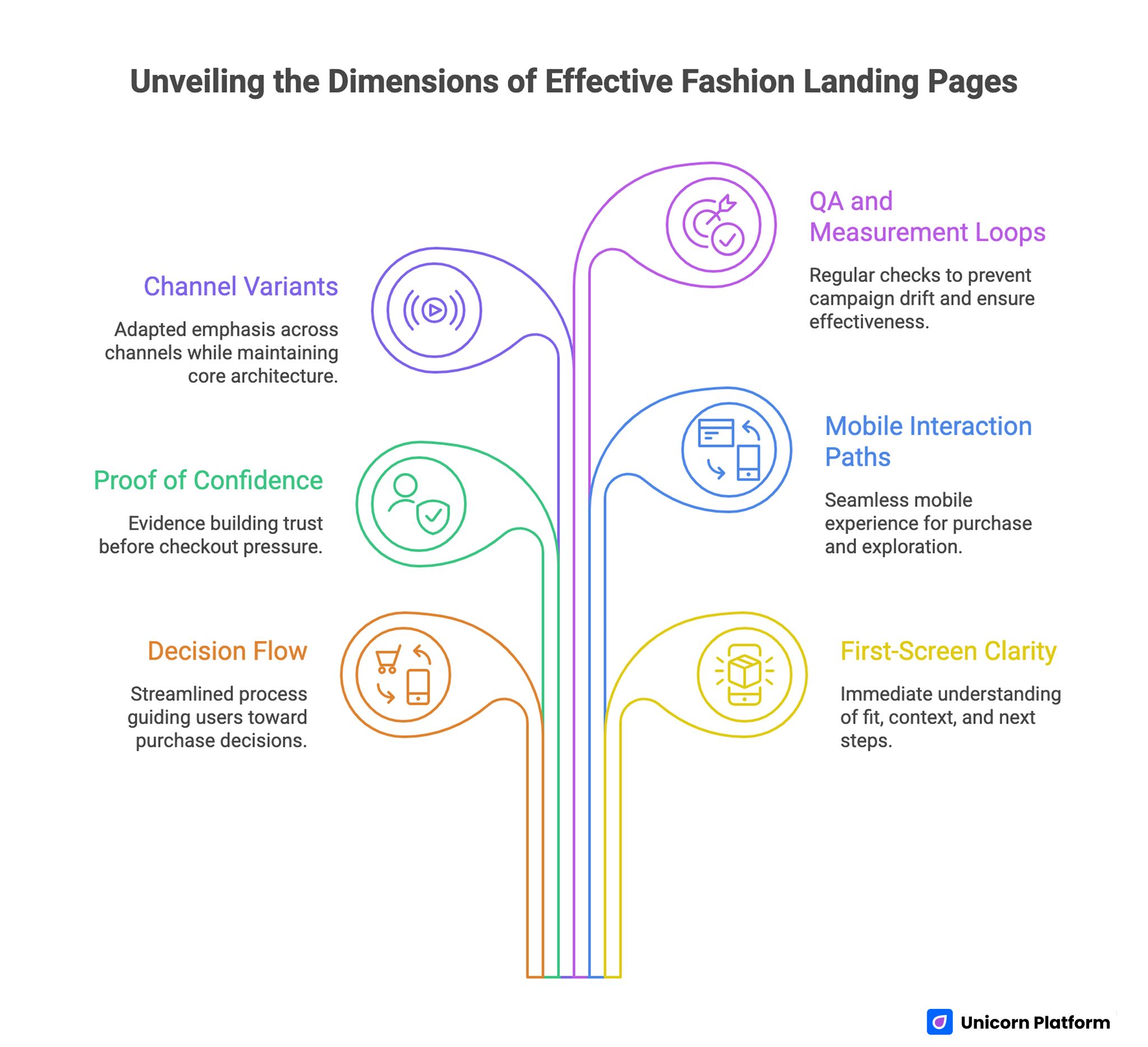
Unveiling the Dimensions of Effective Fashion Landing Pages
- Strong fashion pages prioritize decision flow, not visual density.
- First-screen clarity must establish fit, offer context, and next action.
- Proof for fit, quality, and policy confidence should appear before checkout pressure.
- Mobile interaction paths should support both fast purchase and low-friction exploration.
- Channel variants should adapt emphasis while preserving one core page architecture.
- Weekly QA and measurement loops are required to prevent campaign drift.
Why Fashion Traffic Often Fails to Monetize
The common problem is not low demand. It is weak translation from interest into intent. A visitor can like styling, color, and campaign mood while still feeling uncertain about fit, shipping confidence, or return flexibility. If these concerns are unresolved, the session ends in browsing rather than purchase.
Another issue is page-role confusion. Many brands expect one page to function as story canvas, full catalog, launch announcement, and conversion funnel simultaneously. That creates cognitive overload. Users struggle to identify the primary path, and every action feels optional.
The highest-performing teams define one page role per campaign objective. A drop page should prioritize discovery and rapid buying decisions around limited inventory. A category page should support comparison and confidence building. A retention page should reduce friction for returning buyers who already trust the brand.
Conversion Psychology for Fashion Purchases
Fashion decisions blend emotion and risk. Users buy identity expression, but they also evaluate practical downside: wrong size, fabric disappointment, delayed delivery, complicated returns, or mismatch with real-life use. Page structure should address both emotional pull and risk control.
Conversion grows when the emotional narrative and operational clarity reinforce each other. Visual storytelling attracts attention, while concrete buying guidance removes hesitation. If only one side is present, performance plateaus.
This is why campaign pages need explicit confidence signals before demanding commitment. Showing style inspiration without fit and policy clarity creates excitement but low checkout completion. Showing only operational details without aesthetic coherence feels transactional and weak for premium positioning.
Core Architecture for Fashion Campaign Pages
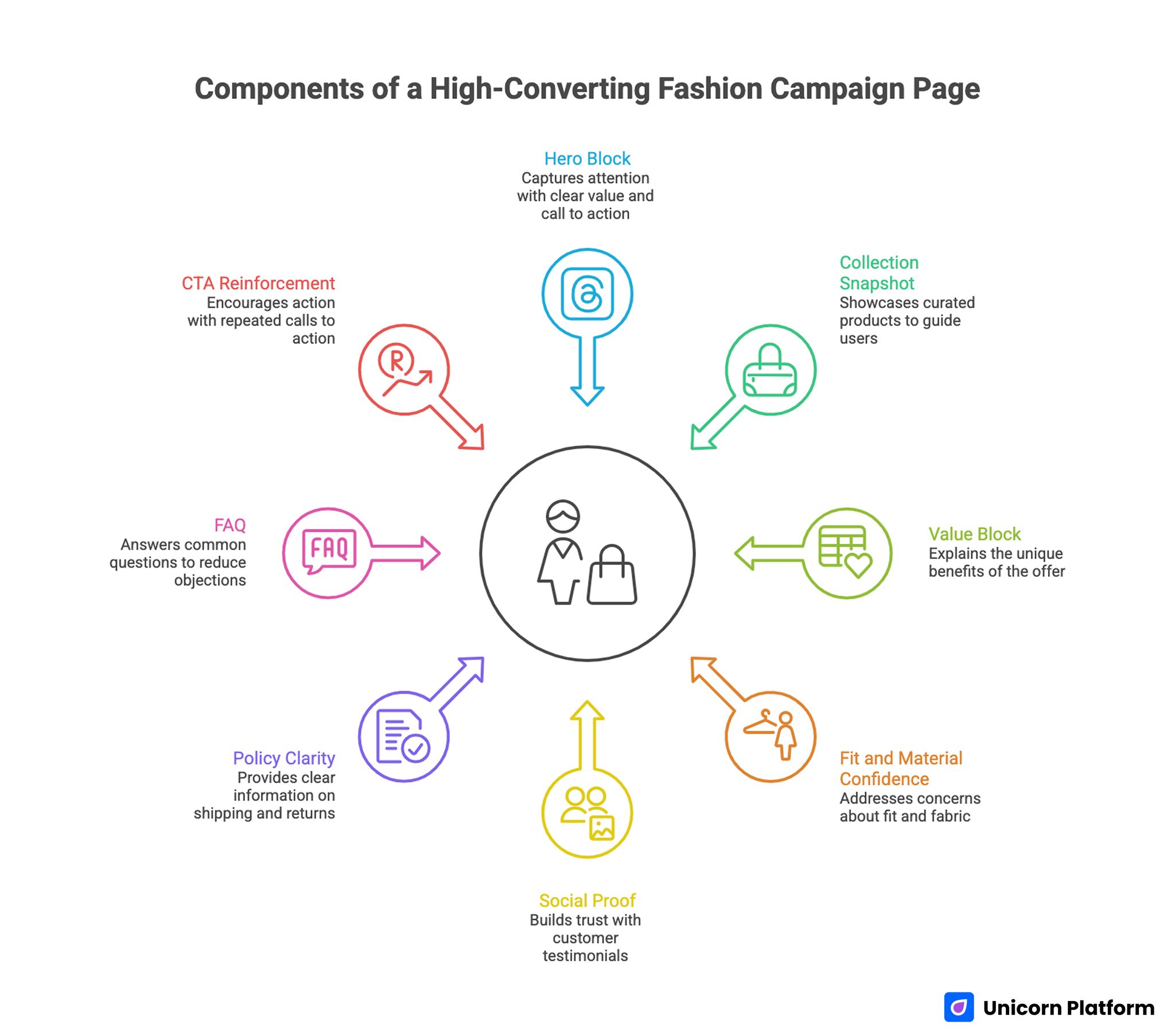
Components of a High-Converting Fashion Campaign Page
A practical architecture for 2026 includes: intent-focused hero, collection snapshot, value articulation, fit and material confidence block, social proof, policy clarity, FAQ for objections, and CTA reinforcement. This sequence aligns with how fashion buyers usually decide.
If your team is aligning new campaigns around one repeatable flow, this guide to high-converting landing page structure is useful for assigning a clear job to each section before design work starts.
The architecture should stay stable while content emphasis changes by audience and channel. Stability enables cleaner testing and faster production. Variation should happen in message priority, proof format, and offer framing, not in random structural changes each launch.
Hero Block: Fit and Intent in One Screen
The first screen should do three things without clutter. It should state who the collection is for, what value it offers, and what action to take next. This is not the place for abstract brand language that could fit any label.
Use specific context in the hero: season, use case, silhouette direction, or wardrobe problem solved. Pair that with one primary CTA and one secondary path. The primary path might be shop the capsule. The secondary path might be view fit details or explore styling pairs.
Collection Snapshot: Curated, Not Exhaustive
Early product exposure should feel intentional. Show a small curated set that represents the promise made in the hero. Avoid presenting too many SKUs before users understand product logic.
A focused snapshot improves clarity and speeds movement. Once users commit to exploring, they can access deeper browsing layers. Early-stage conversion benefits from guidance, not catalog overload.
Value Block: Why This Offer, Why Now
Fashion pages underperform when value is implied rather than stated. Clarify what makes the offer commercially meaningful: limited run, bundle value, material upgrade, restock rarity, or styling versatility.
Keep value statements concrete and user-centered. Instead of broad promotional claims, explain what outcome the buyer gets in practical terms, including wear context and purchase confidence.
Fit and Material Confidence Block
This block should reduce the biggest post-purchase anxieties. Include fit guidance principles, model context, fabric behavior, and care expectations. Keep language precise and easy to scan.
If your campaign includes hero products with strong unit economics, this product landing page guide can help refine message hierarchy from feature framing to action clarity.
Social Proof and Real-Use Context
Proof should reflect actual wear situations, not only polished campaign photography. Blend customer perspectives, detail shots, and concise commentary on fit or quality experience.
This section works best when proof ties directly to concerns already introduced earlier on the page. Generic praise detached from decision concerns has limited impact.
Policy Confidence and Checkout Readiness
Shipping windows, return expectations, and payment clarity are not footer material for fashion funnels. They are conversion-critical trust elements and should be visible near action zones.
Make policy language plain and brief. Buyers should not need to decode legal wording during a purchase decision. Digital transformation continues to reshape how consumers shop online — from mobile checkout convenience to AI‑powered recommendations. Industry data shows that 55% of consumers expect virtual try‑on experiences and personalized recommendations, and 60% prefer brands offering seamless mobile shopping experiences. These trends highlight why fashion landing pages must emphasize clarity, interaction flow, and trust signals to match user expectations in 2026.
Merchandising Logic That Improves Average Order Value
High-converting pages do more than push one item. They help users assemble coherent purchase decisions. Bundles, complementary recommendations, and use-case combinations can raise order value when they feel relevant rather than forced.
Start with anchor products tied to campaign promise, then introduce logical companions. For example, a tailored set can present matching layers or accessories based on styling utility, not random upsell rules.
Price communication should support confidence. Show value framing transparently: what is included, what is optional, and why pairings are useful. Hidden conditions reduce trust and increase abandonment.
Visual Direction Without Conversion Loss
Fashion brands often fear that conversion optimization will flatten aesthetics. In practice, the opposite is true when done well. Clear visual hierarchy can make creative direction feel stronger because attention is guided to the right moments.
Use consistent spacing, typographic rhythm, and CTA contrast so users can navigate quickly without losing brand mood. Motion and interactions should support orientation, not distract from shopping decisions.
Image strategy should reflect decision stage. Early blocks need strong overview visuals, while mid-page blocks need detail-rich images that answer quality and fit questions. This progression keeps both inspiration and practicality intact.
Channel-Specific Variants Without Brand Fragmentation
Different channels create different expectation states at entry. Paid social visitors may arrive with trend-level interest but lower practical certainty. Search visitors often arrive with stronger product intent and expect immediate specificity. Email audiences may already trust brand quality and simply need frictionless path-to-buy.
Channel-adapted pages should keep core design identity stable while adjusting section priority. For social, move proof and styling context higher. For search, move product detail and fit confidence earlier. For email, reduce discovery friction and increase checkout momentum.
When studying competitor positioning patterns for category-level performance, these ecommerce landing page examples can provide useful benchmarking ideas for structure and offer communication.
Lifecycle Segmentation: New vs Returning Buyers
New buyers and repeat buyers should not receive identical conversion framing. New buyers need stronger trust architecture, clear fit support, and policy confidence. Repeat buyers usually need speed, relevance, and quick re-entry to preferred categories.
Build lifecycle variants from one shared template. Keep brand language and visual identity consistent while adapting headline intent, proof emphasis, and CTA phrasing. This prevents operational complexity while improving relevance.
Retention-focused campaigns can also benefit from sharper message continuity between ad, email, and landing context. If acquisition promise and landing page narrative diverge, conversion decay appears quickly.
For teams balancing aesthetic storytelling with stricter conversion behavior, this fashion website launch playbook is helpful for structuring repeatable campaign workflows.
Mobile Experience as a Revenue Lever
Most fashion discovery and a large share of purchase decisions occur on mobile. Mobile issues are often treated as design polish tasks, but they directly influence revenue efficiency. Small delays, weak CTA visibility, or difficult variant selection can erase high-intent sessions.
Prioritize thumb-friendly interaction paths, strong contrast for action elements, and predictable transitions between gallery, fit guidance, and buy actions. Mobile users should never wonder where to go next.
Compress media intelligently and test real-device behavior before launch. Preview-mode confidence often hides production issues such as delayed image loading, sticky-element overlap, or awkward keyboard interactions during checkout.
For practical behavior-focused checks during optimization cycles, these user behavior tips for landing pages can help teams diagnose friction points quickly.
Search and AI Visibility Through Useful Depth
Fashion campaign pages should not rely on repetitive phrasing for visibility. Search performance and AI retrieval improve when pages provide coherent, useful depth around buyer decisions. That includes fit interpretation, material expectations, use-case framing, and policy transparency.
Structure content so each section answers a distinct intent question. This helps users and machine retrieval systems identify relevant passages faster. Thin copy built for short-term publishing velocity tends to underperform over time.
Internal links should be contextual and functional, guiding users to deeper material only when needed. Link placement is strongest when tied to a real decision step, not to arbitrary SEO placement logic.
Scenario: Mid-Stage DTC Brand Rebuilding Campaign Workflow
Consider a mid-stage DTC label running monthly collection drops. The team had strong creative output and active social channels but unstable checkout performance. Review sessions showed that users engaged with campaign visuals yet stalled before purchase.
The team rebuilt workflow in Unicorn Platform around one stable architecture with channel-specific variants. They introduced clear first-screen fit framing, moved material and sizing guidance earlier, simplified action hierarchy, and made shipping and return confidence visible before the final action zone.
They also assigned section ownership across teams. Creative owned visual narrative and image sequence. Merchandising owned offer and assortment logic. Growth owned test design and measurement. Operations owned QA and policy accuracy.
Within several cycles, performance became more predictable because each campaign reused a proven structural base. The key shift was operational discipline, not one isolated copy trick.
Measurement Framework That Supports Better Decisions
Page-level metrics like click-through rate are useful but insufficient alone. Fashion teams need a layered view: add-to-cart progression, checkout start behavior, completion quality, and post-purchase indicators that signal whether conversion quality is sustainable.
Track performance by channel, device type, and campaign intent. Without segmentation, teams often over-generalize from mixed traffic and make low-confidence changes.
A practical test cadence is one major variable per experiment with fixed measurement windows. For example, test fit-guidance placement while holding offer and creative constant. This keeps attribution clean and learning compounding.
Document each cycle in a short launch log: hypothesis, variant summary, primary metric, decision, and follow-up action. Institutional memory is a competitive advantage, especially during high-frequency launch calendars.
Operational Governance for Fast, Safe Publishing
Speed without governance creates expensive mistakes in fashion campaigns. SKU mismatches, outdated shipping promises, incorrect size language, and broken action routing can erase paid-media efficiency quickly.
Use a lightweight governance model with explicit owners. One owner validates product and inventory alignment. One owner validates offer and pricing communication. One owner validates proof freshness. One owner performs final QA on mobile and checkout path.
Before launch, run a fixed checklist against every variant. Confirm that ad and email claims match landing promises, policy details are current, and all CTA routes resolve correctly. Repetition here is not bureaucracy. It is quality control at scale.
30-60-90 Day Implementation Plan
Days 1-30: Establish Baseline Architecture
Create one core campaign template in Unicorn Platform with defined section jobs and visual hierarchy rules. Launch one primary campaign page and one channel-adapted variant. Capture baseline metrics for add-to-cart and checkout initiation.
Focus the first month on clarity corrections, not wholesale experimentation. Validate fit signals, policy visibility, and action hierarchy before introducing advanced offer tests.
Days 31-60: Introduce Controlled Variants
Add lifecycle-focused variants for new and returning buyers while preserving structure consistency. Start testing one major variable per cycle, such as proof placement or value articulation.
Integrate cross-team review loops so creative, merchandising, and growth evaluate outcomes together. This prevents fragmented optimization where each team changes sections independently.
Days 61-90: Scale Winning Components
Promote consistently successful blocks into default template standards. Expand campaign volume only after baseline QA and measurement discipline are stable. Build a component library for proof blocks, policy rows, and CTA modules so launches become faster and safer.
Use every cycle to improve both page performance and team workflow. Long-term gains come from repeatable execution quality, not occasional redesign spikes.
Common Failure Modes and Fixes
1) Visual Overload in the First Screen
Problem: Too many messages, products, or actions compete immediately. Fix: Reduce first-screen objective to fit clarity plus one primary action.
2) Policy and Trust Details Hidden Too Late
Problem: Users hesitate because shipping and returns are unclear. Fix: Surface policy confidence near early action zones.
3) One Page for Every Intent State
Problem: Social, search, and retention visitors receive identical prioritization. Fix: Keep one architecture but adapt section emphasis by channel and lifecycle.
4) Weak Fit Guidance
Problem: Buyers like products but cannot predict sizing or wear context. Fix: Add specific fit principles, model context, and material behavior guidance.
5) Multi-Variable Testing Chaos
Problem: Teams change headline, offer, proof, and layout at once. Fix: Test one major variable per cycle and log decisions systematically.
6) No Ownership Model
Problem: Launches ship with inconsistent accuracy and quality. Fix: Assign clear owners for product truth, offer logic, proof freshness, and final QA.
Pre-Publish QA Checklist for Fashion Campaign Pages
Confirm that campaign promise, product selection, and pricing language are aligned. Verify that fit and material guidance reflects current assortment reality. Validate shipping and return messaging for accuracy and readability.
Run mobile-first checks on real devices: first-screen clarity, action contrast, variant selection flow, and checkout path continuity. Confirm that media loads support fast orientation.
Review proof quality and freshness. Remove stale social proof or mismatched examples that no longer reflect campaign emphasis. Keep proof relevant to the promoted products.
Confirm internal links and navigation cues support user decisions rather than distracting from campaign objective. Every path should have a clear role in conversion flow.
Drop Operations Model for High-Frequency Fashion Launches
Teams with frequent drops usually lose performance in operations before they lose performance in creative quality. The most common issue is unstable launch process. Copy, pricing rules, policy details, and asset approvals change late, so pages ship with hidden inconsistencies that reduce conversion confidence.
A practical model is a two-phase launch cycle. Phase one is structural preparation: confirm section flow, define offer logic, assign ownership, and lock non-negotiable policy language. Phase two is launch adaptation: update campaign-specific visuals, featured products, timing windows, and channel messages without changing core conversion structure.
Set clear checkpoints across the week. Early checkpoint: campaign objective, audience intent, and primary CTA are approved. Mid checkpoint: product truth, inventory fit, and price communication are validated. Final checkpoint: mobile behavior, routing, and policy language are tested against the exact published state, not only staging assumptions.
This workflow lowers risk because it separates creative iteration from conversion-critical foundation. Teams can move fast on storytelling while preserving operational reliability in the parts users rely on most when deciding to buy.
Creative and Performance Handoff Without Friction
Fashion organizations often treat creative and growth as parallel tracks, which creates preventable launch conflicts. Creative teams optimize mood and narrative, while growth teams optimize action clarity and funnel efficiency. Both are necessary, but results break when handoff happens too late.
Use a shared planning brief before production starts. The brief should include campaign goal, intent segment, core product story, value proposition, and one primary conversion action. This keeps all contributors aligned on what the page must accomplish beyond visual direction.
Define section ownership explicitly. Creative owns storytelling assets and visual hierarchy. Merchandising owns product emphasis and offer framing. Growth owns experiment design and measurement quality. Operations owns QA, policy accuracy, and final routing validation. Clear ownership speeds review because each decision has a responsible owner.
At handoff, avoid subjective approval loops by using objective acceptance criteria. A section should pass only if it meets both brand and conversion requirements. For example, a hero block is approved when it communicates identity clearly and enables immediate user orientation around fit and action.
This model protects creativity because conversion constraints are defined early rather than imposed late. It also protects performance because testing starts from a coherent narrative foundation instead of patched-together assets.
Post-Purchase Signals That Improve the Next Campaign
Campaign pages should not be evaluated only by same-session behavior. Post-purchase signals often reveal whether conversion quality is durable. If early conversion rises but return-related dissatisfaction increases, the page may be overpromising or failing to clarify fit expectations.
Track practical feedback loops after launch. Review support questions about sizing, materials, shipping timing, and care. If the same concern appears repeatedly, that concern needs clearer treatment in the page sequence. This is one of the fastest ways to improve both conversion confidence and customer experience.
Use merchandising feedback as a content signal. If certain products convert well but produce low repeat engagement, review whether page framing attracted the wrong purchase intent. If products with slightly lower initial conversion drive stronger retention, study how confidence language and proof positioning supported better-fit decisions.
Build a closed loop between campaign teams and customer-facing teams. Weekly synthesis should convert top friction patterns into prioritized content updates for the next launch cycle. Over time, this creates a compounding advantage: each campaign becomes smarter because it carries forward real customer learning rather than only traffic metrics.
Editorial Depth Framework for Premium Fashion Positioning
Premium fashion positioning requires more than polished imagery. It requires content depth that supports higher-confidence decisions without making the page feel technical or heavy. A good depth framework balances inspiration, utility, and certainty in one continuous narrative.
Start with identity-led messaging that communicates point of view and product direction. Then move quickly into practical confidence information: fit interpretation, fabric behavior, and usage context. Finish each major segment with a clear decision step so readers know how to act on what they just learned.
Depth should be layered, not dumped. Users need fast orientation first, then optional detail where uncertainty is highest. This approach keeps the primary journey efficient while still serving users who need more information before purchase.
When teams apply this framework consistently, premium storytelling and conversion clarity stop competing with each other. The brand feels more coherent, and performance becomes more stable across different campaign types.
FAQ: Fashion Campaign Landing Pages
1) How long should a fashion campaign page be?
Length should match decision complexity. Keep sections only when they reduce uncertainty or improve confidence. Longer pages can outperform when they are structured around real buyer questions.
2) Should every campaign use a different page layout?
No. Use one consistent architecture and vary section emphasis by campaign intent. This increases speed, measurement reliability, and quality control.
3) What matters most above the fold?
Clear fit signal, clear value context, and clear next action. Without those three, traffic quality is wasted.
4) How can we improve checkout starts quickly?
Move fit and policy confidence earlier, simplify action hierarchy, and reduce distractions before the first meaningful CTA.
5) Do fashion pages need heavy storytelling to convert?
They need coherent storytelling, not heavy storytelling. Narrative should support buying decisions, not delay them.
6) How do we balance brand aesthetics with conversion clarity?
Use strong hierarchy rules. Keep visual identity expressive while ensuring CTA visibility, content sequence, and readability remain consistent.
7) Which metrics should guide optimization?
Track add-to-cart progression, checkout starts, completion quality, and segment-level performance by channel and device.
8) How often should campaign templates be updated?
Review after each launch cycle and promote only repeat winners into the default template. Avoid constant structural changes without evidence.
9) What is the most common source of conversion leakage?
Unresolved buyer uncertainty around fit, quality, or policy confidence before checkout intent is formed.
10) Can one team own everything for page optimization?
It is possible but rarely effective at scale. Shared ownership with clear lanes improves speed and lowers launch risk.
Final Takeaway
Fashion campaign pages win when they combine strong creative direction with disciplined decision architecture. Attention alone is not enough. Buyers need clear fit, clear confidence, and clear action.
With Unicorn Platform, teams can build repeatable systems that support fast launches without sacrificing conversion quality. Keep structure stable, vary emphasis intentionally, and run consistent QA so each campaign compounds performance over time.