Table of Contents
- Why Inspiration-Heavy Workflows Fail
- 30-Day Implementation Plan
- Common Failure Patterns and Fast Fixes
- FAQ
Collecting visual inspiration is easy. Turning that inspiration into predictable conversion outcomes is difficult. Most teams have boards full of strong references, but their live pages still underperform because design choices are not translated into decision logic.
The core issue is not creativity. It is workflow discipline. When teams borrow aesthetics without borrowing structure, pages look modern but fail to clarify relevance, establish confidence, and guide the next action.
A stronger model treats inspiration as input to a repeatable system. Teams define why a pattern works, where it belongs in the user journey, and how success should be measured after release.
Unicorn Platform is effective for this approach because reusable sections and fast publishing make controlled iteration realistic. The value is not just speed. The value is speed plus a stable framework that supports learning instead of noise.
sbb-itb-bf47c9b
Quick Takeaways
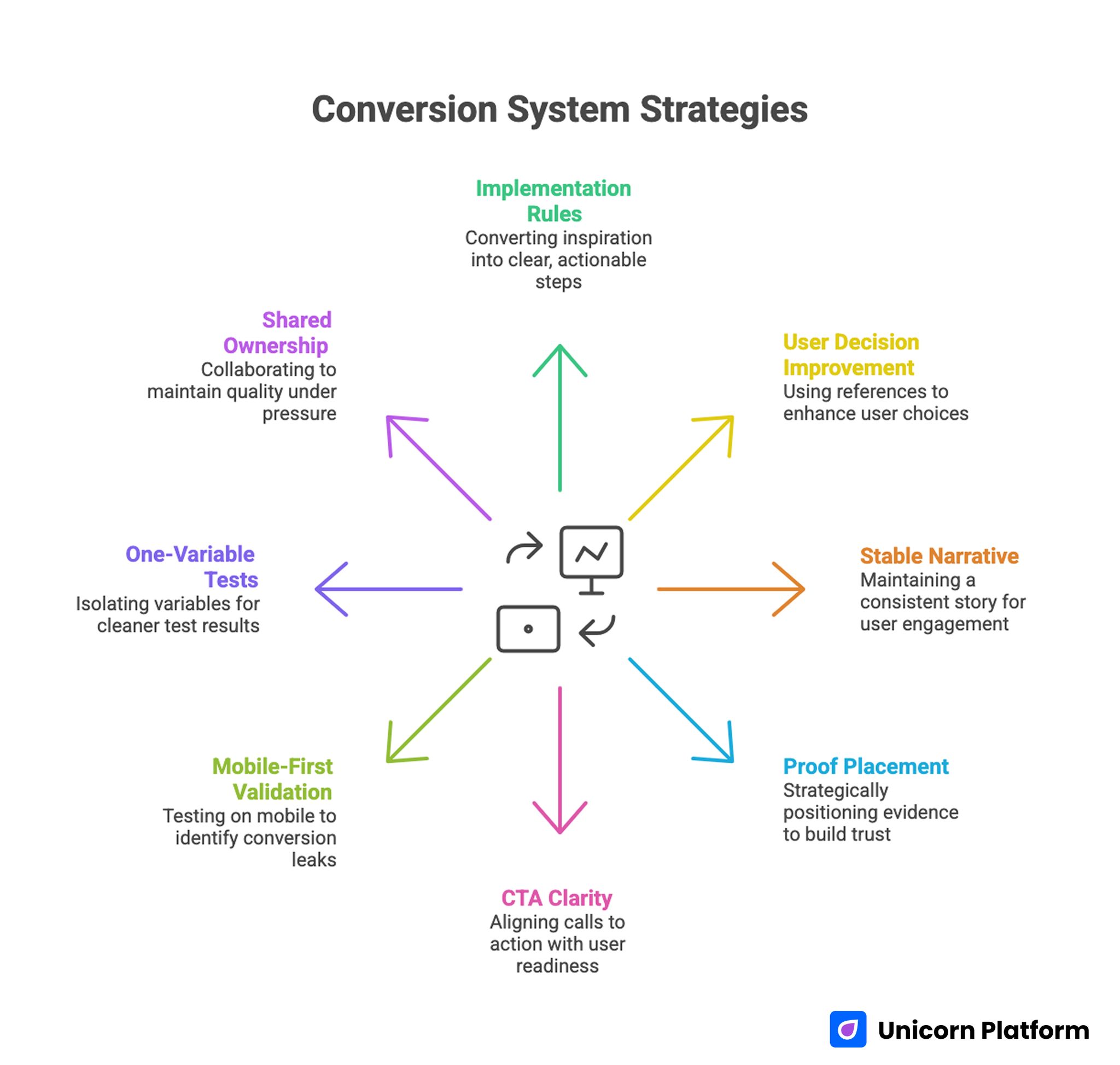
Conversion System Strategies
- Inspiration should be converted into explicit implementation rules.
- The most useful references improve user decisions, not only visual style.
- One stable narrative spine outperforms frequent structural changes.
- Proof placement matters as much as proof quality.
- CTA clarity should match user readiness, not team preference.
- Mobile-first validation catches many hidden conversion leaks.
- One-variable tests produce cleaner outcomes than broad redesign cycles.
- Shared ownership and release gates preserve quality under fast timelines.
Why Inspiration-Heavy Workflows Fail
Example-driven programs fail when references are used as decoration rather than decision support. Teams imitate layout patterns without understanding the problem those patterns were solving in the original context.
Another common failure is uncontrolled mixing. Designers combine multiple attractive components from different examples into one page. The result feels busy, and users struggle to identify priority.
The third failure is missing measurement intent. A visual change is shipped without a hypothesis, so even when metrics move, teams cannot determine what caused the change.
The fourth failure is operational drift. One campaign uses one interpretation of a pattern, the next campaign uses another, and soon there is no consistent baseline for comparison.
The Decision Spine That Makes Examples Actionable
Effective conversion pages usually follow one consistent sequence: relevance, mechanism, confidence, and action.
Relevance answers who this is for. Mechanism explains how value is delivered. Confidence reduces risk through context-rich proof. Action offers a clear next step.
When teams preserve this sequence, they can test visual and copy variations safely. When sequence is changed frequently, performance shifts become harder to interpret.
For teams that need a practical reference model for section sequencing, this high-converting page structure guide can help maintain decision flow while experimenting with style.
Pre-Build Analysis: Choosing the Right References
Before adopting any reference, teams should evaluate what conversion problem it solves. A strong example may solve clarity for one audience and fail for another.
A practical analysis method is to score each reference across five dimensions: clarity impact, trust impact, action impact, implementation cost, and testability.
This scoring step prevents random adoption of visually appealing patterns that do not support campaign objectives.
Reference Scoring Questions
- Does this pattern make value easier to understand quickly?
- Does it reduce uncertainty near a key decision point?
- Does it strengthen or weaken action hierarchy?
- Can it be implemented in the current sprint?
- Can its effect be measured in a clean test?
If the answer is weak on most questions, keep the pattern in inspiration archive but do not ship it.
Audience and Intent Mapping Before Design Decisions
References should be selected after audience and intent are defined, not before. Without this order, teams optimize for aesthetic preference instead of conversion relevance.
Audience mapping should include role context, urgency level, and expected decision depth. Intent mapping should identify whether traffic is discovering, evaluating, or deciding.
The same visual component can perform differently depending on intent stage. A strong discovery pattern may underperform for decision-stage traffic if it lacks depth.
For startup teams that need a lean way to define audience and execution scope, this startup-focused page creation guide provides a useful framework.
First-Screen Design: Convert in the First Glance
The first screen should communicate fit, value, and next step without requiring interpretation. Most conversion losses begin here when messaging is broad or fragmented.
Strong first-screen design is concise and specific. Weak first-screen design relies on vague claims, decorative visuals, or multiple competing CTAs.
A practical first-screen structure includes one audience signal, one outcome statement, one trust cue, and one dominant action.
First-Screen QA Prompt
- Can users identify whether this offer is for them immediately?
- Is the outcome practical rather than abstract?
- Is there a single obvious action?
- Is one confidence cue visible without deep scroll?
If any answer is no, revise first-screen architecture before touching lower sections.
Mechanism Communication: Show How Value Happens
Examples often emphasize hero styling and underemphasize mechanism clarity. Yet mechanism clarity is what helps users trust that the promised outcome is realistic.
A useful mechanism block explains process in three steps: starting state, change process, and expected result. This can be communicated with concise text and one supporting visual.
Mechanism detail should match intent stage. Discovery users need orientation. Evaluation users need practical confidence. Decision users need implementation certainty.
Teams should avoid overloading mechanism sections with technical detail that increases cognitive effort without improving confidence.
Trust System Design: Proof Placement and Context
Trust should be designed as a system, not a single section. Each major claim should have an adjacent confidence cue.
Context-rich proof performs better than generic praise. A brief outcome statement tied to role and timeframe is usually more persuasive than broad testimonials.
Placement matters. If proof appears late, users often exit before seeing the evidence that would have resolved hesitation.
For teams optimizing trust sequencing and behavior signals after launch, this behavior optimization playbook can help prioritize adjustments.
CTA Hierarchy and Interaction Priority
Action design is where many example-based pages drift. Teams replicate multiple stylish button patterns and unintentionally create action competition.
A clearer model is one dominant action per variant, one optional fallback, and no equal-priority alternatives.
CTA wording should describe user intent and next-step expectation. Generic labels reduce confidence because users cannot predict effort.
CTA Readiness Mapping
- discovery traffic: low-friction exploratory action
- evaluation traffic: comparison or validation action
- decision traffic: direct commitment action
This mapping helps teams align action intensity with user context.
Form Architecture: Qualification Without Friction Overload
Forms should collect enough context for routing while preserving completion quality. Over-collection at first step often reduces quality as well as volume.
Each required field should map to a downstream decision. If a field does not influence routing or follow-up, defer it.
A staged qualification model works well for most teams: essential fields first, deeper context after initial intent is confirmed.
Form Design Rules
- Keep first-step fields minimal and purposeful.
- Explain why higher-friction fields are requested.
- Validate inputs clearly and immediately.
- Ensure mobile keyboard flow does not obstruct completion.
These rules reduce hidden abandonment and improve downstream handoff quality.
Mobile-First Execution Standards
Many inspiration examples are reviewed on desktop but consumed on mobile. Mobile-first QA is essential for reliable performance.
Core checks include first-screen readability, proof visibility before deep scrolling, tap comfort, field usability, and load behavior on weaker connections.
Desktop approval alone is insufficient. Real-device verification should be required before traffic scale.
Teams should monitor mobile outcomes by source because friction patterns often differ across search, social, and email channels.
Source-Aware Variants Without Structural Chaos
One generic version for all traffic sources often underperforms because user intent differs by channel.
A strong variant model keeps one stable structural backbone and adjusts message emphasis, proof sequence, and CTA framing by source.
This preserves governance and improves attribution clarity because structural variables remain consistent.
Variant Governance Standards
- one hypothesis per variant release
- one major variable per cycle
- shared section order across sources
- documented expected behavior before launch
This standard supports faster learning and cleaner decision-making.
Example Library Operations: From Archive to System
Most teams store references but do not operationalize them. A useful library is organized by conversion purpose rather than visual style.
A practical taxonomy includes modules for orientation, mechanism, trust, objection handling, and action. Each module should include usage guidance and contraindications.
Promotion into the approved library should require repeated positive outcomes in different campaign contexts. One isolated win is not enough for standardization.
Library Lifecycle Model
- Draft: exploratory module for controlled tests
- Candidate: one positive cycle, pending validation
- Approved: repeatable performance across contexts
- Retired: low reliability or outdated relevance
This lifecycle keeps libraries clean and helps teams avoid repeated mistakes.
Measurement Framework for Example-Driven Programs
Top-line conversion rate can hide quality issues. Better measurement uses layered indicators tied to downstream outcomes.
Layer one tracks on-page actions. Layer two tracks quality indicators such as qualification and early engagement. Layer three tracks business outcomes such as accepted leads, activation, or revenue contribution.
Every release should define one primary metric and one guardrail metric. Guardrails protect teams from local improvements that damage broader performance.
Practical Metric Pairing
- lead campaign: primary qualified completions, guardrail low-fit rate
- trial campaign: primary trial starts, guardrail activation quality
- purchase campaign: primary conversions, guardrail refund or churn signal
Layered measurement increases decision confidence and forecasting reliability.
Tracking and Attribution Discipline
Attribution quality depends on release discipline. If teams change multiple elements simultaneously, measured shifts are difficult to interpret.
Stable event naming and funnel definitions are essential. Without them, weekly comparisons become unreliable.
Teams should log each release with scope, hypothesis, metric plan, and expected outcome. This log becomes a strategic asset over time.
Attribution Checklist
- event taxonomy stable across variants
- source and device dimensions on key events
- qualification markers tied to conversion events
- guardrail alerts configured before launch
These basics reduce analytical noise and speed up optimization cycles.
Release Gates and QA Operations
Quality checks should function as gates, not suggestions. Traffic should not scale until critical checks pass.
A practical release gate includes message clarity verification, proof relevance, CTA and form routing checks, mobile interaction checks, and analytics validation.
If one gate fails, release should pause. Teams that enforce this consistently reduce expensive regressions.
Ownership Model for Fast Teams
Speed without ownership creates drift. A lightweight role model helps teams ship quickly while preserving quality.
Define a messaging owner, proof owner, analytics owner, and QA owner. Each role should have explicit sign-off scope.
Ownership clarity also improves recovery speed when issues appear because accountability is already defined.
For teams running multiple campaign types, these action-oriented optimization practices can help owners prioritize updates without spreading effort too thin.
Collaboration Workflow Between Marketing and Sales
Conversion quality is shaped by both page performance and downstream response quality. If marketing and sales optimize different definitions of success, outcomes degrade.
Teams should align on qualification definitions, response SLAs, and context fields required for first outreach.
A short weekly sync focused on one friction point can close feedback loops quickly and keep page updates tied to real sales signals.
Collaboration Rituals
- weekly quality review on top-performing pages
- shared dashboard for primary and guardrail metrics
- sales feedback linked to specific page sections
- explicit owner assignment for next actions
This rhythm keeps collaboration operational rather than abstract.
Risk Controls and Recovery Playbooks
Fast programs need predefined response paths for performance drops. Without them, teams make reactive changes that increase noise.
Recovery playbooks should define trigger conditions, owner responsibilities, rollback thresholds, and retest steps.
A practical model includes anomaly detection, containment, root-cause validation, controlled rollback, and short learning capture.
Essential Risk Controls
- alerts for major guardrail decline
- alerts for form routing and integration failures
- rollback criteria by issue type
- post-incident review template for lessons learned
These controls protect velocity and confidence under pressure.
Scenario: Startup Team Turning Examples Into a System
A startup had a large reference archive but inconsistent page outcomes. Each launch borrowed different visual patterns with little structural consistency.
They moved to a stable decision spine in Unicorn Platform and introduced a module library with explicit usage rules.
They also enforced one-variable tests and weekly release logs. Over two months, qualified conversion improved and rework declined because each release produced usable insight.
Scenario: Agency Managing Multi-Channel Variants
An agency serving multiple clients used one generic page pattern across channels. Performance varied widely and optimization was slow.
They adopted source-aware variants with stable structure, strict release gates, and layered metrics.
After one quarter, campaign predictability improved and team throughput increased because winning modules were reused systematically.
30-Day Implementation Plan
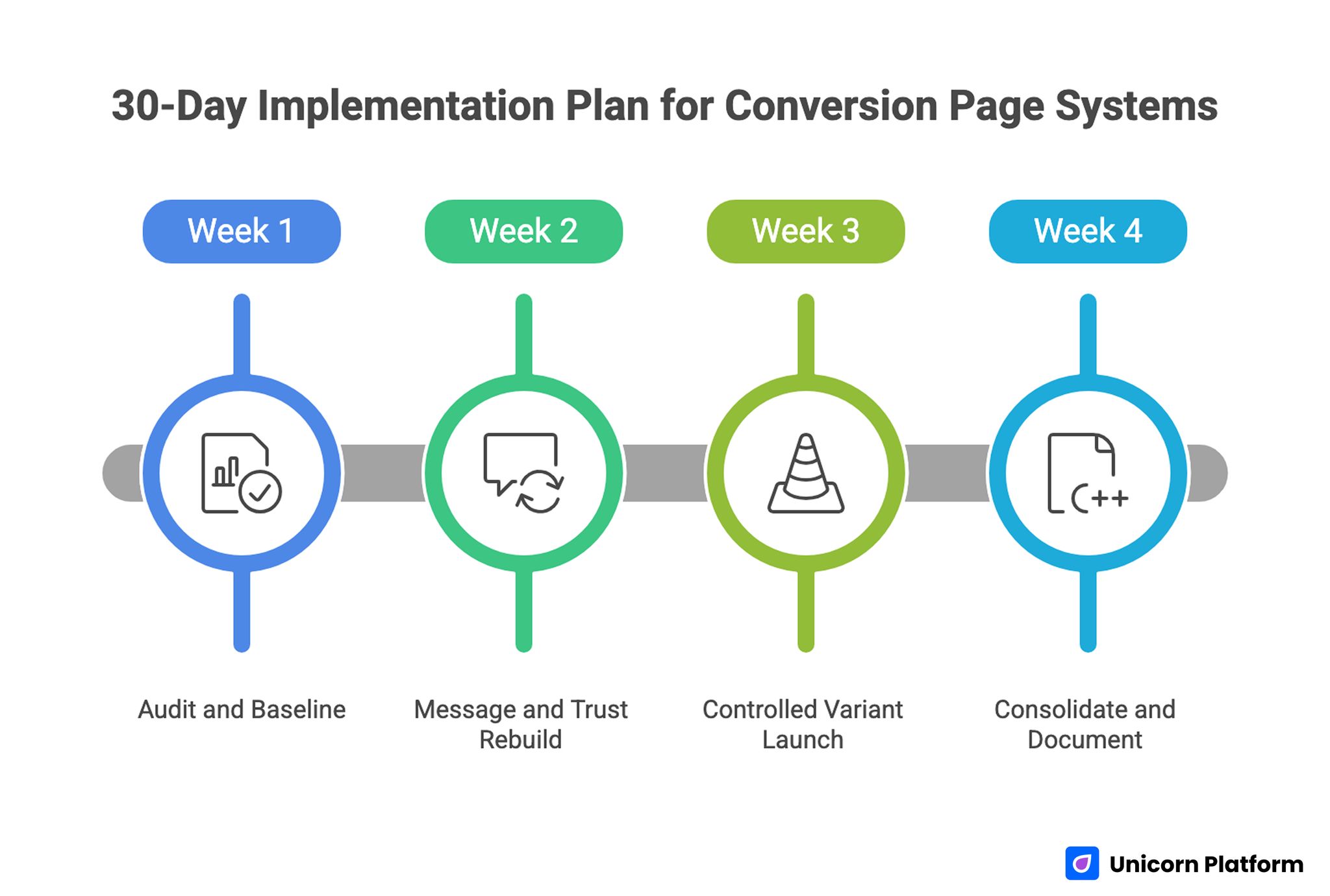
30-Day Implementation Plan for Conversion Page Systems
Week 1: Audit and Baseline
Evaluate one high-priority page against relevance, mechanism, confidence, and action sequence. Identify the largest leak by source and device.
Define one primary metric and one guardrail metric for the next cycle.
Week 2: Message and Trust Rebuild
Rewrite first-screen copy for audience fit and concrete value. Reposition proof near key claims.
Simplify CTA hierarchy and form inputs to essentials.
Week 3: Controlled Variant Launch
Release one source-specific variant with one major change. Keep structure stable.
Run full mobile QA and verify tracking before scaling.
Week 4: Consolidate and Document
Promote successful modules into the library. Archive weak sections and update decision logs.
Assign monthly proof refresh and next-cycle ownership.
90-Day Operating Roadmap
Month 2: Expand by Intent Stage
Build controlled variants for discovery, evaluation, and decision traffic while preserving structural consistency.
Add reusable modules by stage and document where each module is appropriate.
Month 3: Standardize Reliability
Formalize release gates, permission rules, and rollback thresholds.
Require decision logs for all high-impact changes so learning compounds across campaigns.
At this stage, scale should come from predictable operations, not constant redesign.
Common Failure Patterns and Fast Fixes
1) Visual Copying Without Structural Logic
Teams imitate style but not decision flow. Fix by mapping each adopted pattern to one conversion purpose. This keeps inspiration tied to measurable user outcomes instead of visual preference.
2) Ambiguous First Screen
Users cannot determine relevance quickly. Fix with role-specific outcomes and clearer context. Early clarity usually improves both engagement depth and conversion quality.
3) Delayed Trust Cues
Evidence appears after key decision points. Fix by placing proof adjacent to major claims. Users should see confidence signals before they face high-friction actions.
4) CTA Overlap
Multiple equal actions reduce confidence. Fix with one dominant route and one controlled fallback. Clear hierarchy helps users commit faster with less hesitation.
5) Form Over-Collection
First-step forms request too much data. Fix with staged qualification and clearer field purpose. Capture only what changes routing decisions at the first step.
6) Mobile QA Gaps
Desktop checks miss critical interaction issues. Fix with real-device release validation. Mobile friction often appears in keyboard flow, tap comfort, and validation behavior.
7) Source Mismatch
One message serves all traffic sources. Fix with source-aware framing on a stable template. This improves relevance while preserving clean attribution.
8) Weak Post-Submit Continuity
Users convert without clear next steps. Fix with immediate confirmation and expectation clarity. Continuity after conversion helps preserve momentum and trust.
9) Metric Narrowness
Top-line conversion improves while quality declines. Fix with layered metrics and guardrails. Guardrails protect downstream quality when traffic mix changes.
10) Ownership Drift
Rapid edits blur accountability. Fix with explicit roles and sign-off gates. Ownership clarity keeps release quality stable during fast cycles.
Pre-Launch QA Checklist
Confirm first-screen clarity, mechanism transparency, proof adjacency, and one dominant CTA route.
Validate form behavior, mobile interaction quality, and confirmation continuity across key devices.
Verify event instrumentation for primary and guardrail metrics before scaling. Require final QA sign-off.
FAQ: Example-Driven Conversion Page Systems
Should teams copy layouts from high-performing examples?
Copy the underlying decision logic, not the exact structure or wording. Adapt patterns to your audience and objective. This protects originality while preserving what actually drives outcomes.
What should teams optimize first?
Start with first-screen relevance and trust placement because they influence the largest share of decisions. These changes usually deliver the quickest quality gains.
How many CTAs should one version include?
One dominant action and one fallback option are usually sufficient. Additional equal-priority actions often reduce clarity and confidence.
How often should proof be refreshed?
Monthly for active pages and quarterly at template level. High-change campaigns may require faster proof updates.
Is one page enough for all sources?
Usually no. Use source-aware messaging while keeping structure stable. Channel context often changes what users need to see first.
How can teams reduce testing noise?
Change one major variable per cycle and document hypotheses before launch. Clean scope makes outcomes easier to interpret and reuse.
What is the most common trust mistake?
Making strong claims without adjacent contextual evidence. Claims should be supported exactly where skepticism is most likely.
Are mobile checks still critical for B2B pages?
Yes. Many B2B journeys begin or continue on mobile before final conversion. Weak mobile experience can reduce later desktop conversion quality.
Which metric matters most?
The primary metric depends on campaign objective, but it should always be paired with a quality guardrail. This prevents local wins from hiding downstream losses.
What creates compounding gains over time?
Stable architecture, disciplined testing, clear ownership, and reusable decision logs. Compounding performance comes from consistency, not constant reinvention.
Final Takeaway
Design inspiration becomes valuable when it is translated into a repeatable, measurable production system. Teams that pair creativity with structure improve faster and with less rework.
Unicorn Platform supports this model by enabling fast publication on stable architecture. Keep the decision spine consistent, test with discipline, and optimize for downstream quality so performance compounds predictably.
Related Blog Posts
- Build Stunning Landing Pages Without Coding: A Practical Guide for Fast Results in 2026
- Product Landing Page Strategy in 2026: How Teams Turn Interest Into Reliable Revenue
- Ebook Page Conversion Strategy in 2026: How Creators Turn Attention Into Qualified Action
- Landing Page Conversion Optimization in 2026: A Behavior-Driven Operating System for Consistent Growth