Table of Contents
- Stage-Based Diagnosis: The Fastest Way to Find High-Impact Fixes
- 30-60-90 Day Implementation Plan
- Common Failure Modes and Fixes
- FAQ
Most stores do not have a traffic problem. They have a conversion-quality problem. Buyers click ads, browse products, and even start checkout, but a large share never completes the order. The lost revenue is usually spread across many small friction points rather than one dramatic bug.
That is why strong optimization work should be treated as an operating system, not a single redesign project. Teams that improve page clarity, trust flow, and checkout reliability in a disciplined order tend to outperform teams that chase isolated tactics.
In Unicorn Platform, the biggest advantage is execution speed with structural control. You can improve high-impact modules quickly, preserve what already works, and keep campaigns consistent across channels without rebuilding every page from scratch.
sbb-itb-bf47c9b
Quick Takeaways
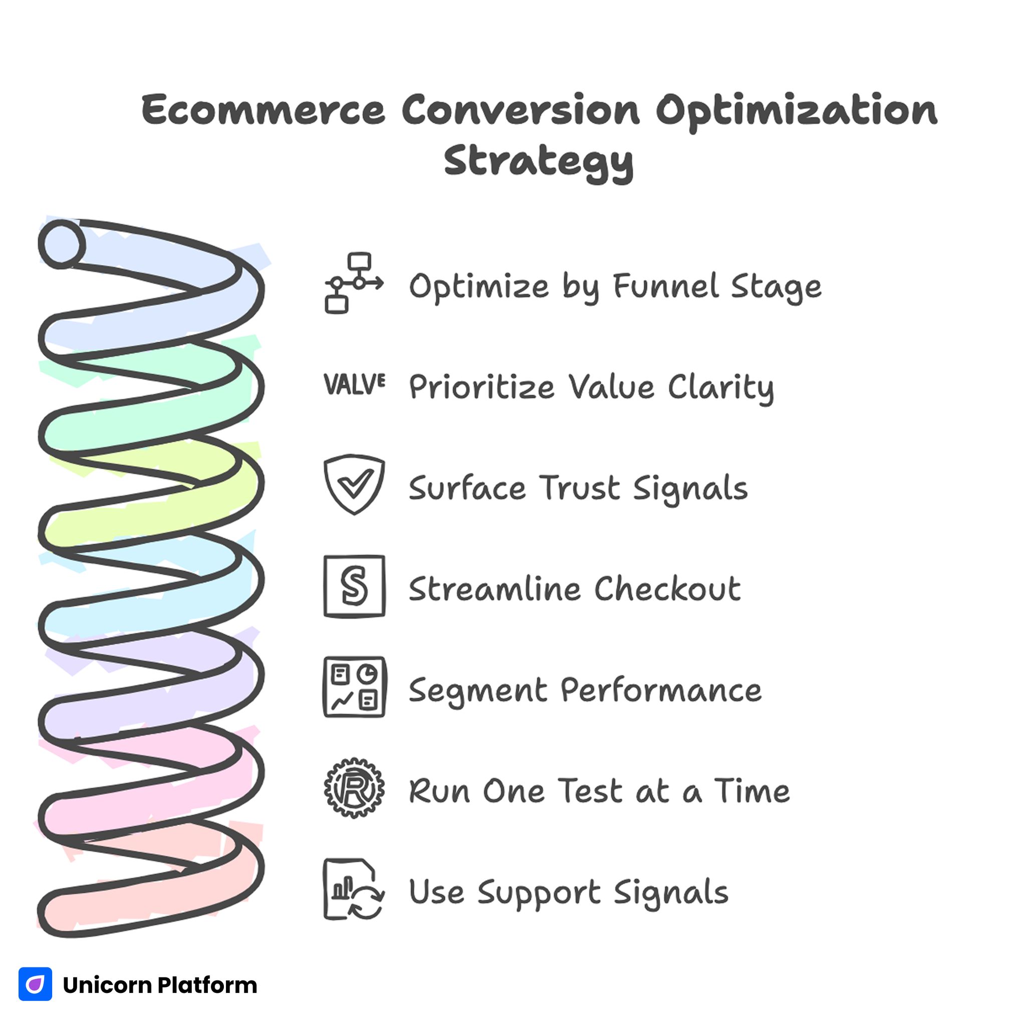
Ecommerce Conversion Optimization Strategy
- Optimize by funnel stage, not by random checklist.
- Put value clarity before visual complexity in the first screen.
- Surface trust and policy confidence near decision points.
- Reduce checkout fields and keep action flow predictable.
- Segment performance by source, device, and intent before deciding what to fix.
- Run one meaningful test at a time with one primary metric and one quality guardrail.
- Use support and return signals to improve pre-purchase messaging.
Why Revenue Leaks Persist in Otherwise Healthy Stores
Revenue leakage often survives because it is distributed. A weak hero line, slow media block, delayed trust cue, and confusing checkout microcopy may each seem minor. Together they create hesitation at the exact moment a visitor must decide whether to pay.
Industry research consistently shows how costly these small friction points can become. According to the Baymard Institute, the global average cart abandonment rate is around 70%, meaning that most users who add items to a cart never complete the purchase — often due to usability issues in the checkout flow.
Another reason is metric bias. Teams celebrate click-through and add-to-cart lifts while completion quality stays flat. If downstream metrics are not included in decisions, apparent wins can hide profitability declines.
The final reason is ownership drift. When offer messaging, policy text, proof freshness, and QA are owned by different people without clear process, pages become inconsistent across campaigns. Users experience that inconsistency as risk.
Stage-Based Diagnosis: The Fastest Way to Find High-Impact Fixes
A practical diagnosis model uses funnel stages. Stage one is orientation: does the user understand relevance and value quickly. Stage two is confidence: does the user trust product quality, support, and policy outcomes. Stage three is commitment: can the user complete purchase without avoidable friction.
This stage model prevents broad redesign debates. Instead of arguing whether a page "looks better," teams can ask a precise question: which stage has the largest measured drop and what single fix is most likely to improve it.
For teams standardizing section jobs before testing, this guide on high-converting landing page structure is useful as a template baseline.
Stage 1: Orientation and First-Screen Clarity
The first screen decides whether a session progresses or leaks. Visitors need immediate fit confirmation, practical value framing, and one obvious next action. Decorative complexity before clarity usually increases bounce and weak intent sessions.
A strong first-screen pattern has three components. First, a specific value statement tied to user context. Second, one supporting line that reduces likely uncertainty. Third, one primary CTA with clear action language.
When teams optimize this stage in Unicorn Platform, they should avoid stacking competing offers above the fold. One clear priority is better than many weak options.
Stage 2: Confidence Architecture Before Checkout
Confidence is built through specificity, not adjectives. Buyers need practical proof: product detail evidence, contextual social proof, shipping expectations, return policy clarity, and support responsiveness.
Trust signals should appear before heavy commitment asks. If confidence cues are buried below long promotional sections, users postpone decisions and continue comparison shopping elsewhere.
A useful pattern is layered confidence. Early layer: concise social validation. Mid layer: product-fit and quality evidence. Late layer: policy and payment confidence near checkout entry.
If your team is auditing behavior friction around these layers, this user behavior optimization guide can help prioritize sequence changes.
Stage 3: Commitment and Checkout Flow
Checkout abandonment often reflects cognitive load, not lack of intent. Repeated inputs, unclear progress, forced account creation, and ambiguous errors create avoidable drop-off.
The highest-leverage improvements are usually structural. Reduce required fields, keep step progression explicit, preserve context from product page promises, and ensure help options are visible without pulling users out of flow.
Checkout pages should maintain trust language consistency with the landing experience. If policy phrasing or pricing logic shifts unexpectedly, confidence drops right before payment.
Product Page Optimization Framework
A practical product-page framework should be repeatable across categories while allowing contextual variation. Start with one clear benefit statement, then present detail evidence that supports that benefit in real usage terms.
Follow with fit guidance and practical expectations. Buyers need help deciding whether the product is right for their context, not only whether it is attractive. Fit, compatibility, and outcomes should be easy to scan.
Then add confidence reinforcement before action: shipping timing clarity, return terms, and support availability. This order reduces uncertainty before cart commitment.
For product-first campaigns, this product landing page guide is useful for tightening section sequence and CTA logic.
Offer Design and Margin-Aware Merchandising
Offer design should improve conversion quality without destroying contribution margin. Broad discounting can increase orders while reducing profitability and attracting low-retention buyers.
A better model uses testable offer modules: bundle value, threshold shipping incentive, first-order confidence offer, and time-bounded launch framing with real constraints. Each module should communicate practical value clearly.
Run offer tests with explicit guardrails. A lift in early conversion is not useful if refund tendency, cancellation rate, or repeat behavior worsens.
Source-Aware Message Alignment
Different channels create different expectation states. Paid search users tend to arrive with specific intent and require fast specificity. Paid social users often need stronger context and proof. Email users usually need reduced friction and fast path to completion.
One shared architecture with source-aware emphasis usually outperforms either extreme of one page for all traffic or fully unique pages for every campaign. Keep structure stable while changing headline framing, proof order, and offer emphasis.
For campaign benchmarks and section inspiration, this ecommerce landing page examples guide is a useful planning reference.
Mobile Performance and Interaction Reliability
Mobile is the dominant environment for many ecommerce sessions. A page that is responsive but hard to use is still a low-converting page. Thumb reach, CTA visibility, media load sequencing, and input comfort are practical conversion factors.
Recent industry benchmarks also confirm the scale of this shift. Multiple ecommerce studies report that more than 60% of ecommerce traffic now comes from mobile devices, while mobile checkout conversion still trails desktop performance due to usability friction and slower interaction flows.
Test on real devices before release. Emulators often miss keyboard collisions, sticky-layer conflicts, and performance issues that appear only on real network conditions.
Set launch gates for mobile quality: first-screen orientation speed, stable action visibility, predictable scrolling behavior, and checkout continuity. Treat these as non-negotiable requirements, not polish tasks.
If you need a concise test backlog for iteration cycles, these actionable optimization tips can be adapted into weekly experiments.
Page Speed and Asset Strategy
Speed work should focus on revenue-critical surfaces first. Optimizing non-critical pages while core campaign pages remain heavy delivers little commercial impact.
Prioritize above-the-fold media compression, defer non-essential scripts, and simplify dependency chains that delay interaction readiness. Conversion gains from speed often appear through reduced bounce and better checkout continuation.
Track speed by template and traffic source, not only site-wide averages. Global metrics can hide serious issues in specific campaign paths.
Search, Navigation, and Discovery Friction
Even strong campaign pages can leak revenue if discovery paths are unclear. Users need fast orientation when they want to compare options, move across variants, or validate product compatibility.
Navigation should support intent rather than mimic internal team structure. Filters, category labels, and comparison cues should use language customers understand immediately.
On landing-led flows, limit exit paths that distract from primary objective. Provide useful alternatives without overwhelming the main conversion path.
Personalization Boundaries That Keep QA Manageable
Personalization is useful when controlled. Over-personalization creates variant sprawl, weak attribution, and frequent QA misses.
Use a bounded model. Keep one stable template and personalize only high-impact fields: headline priority, featured proof, and offer framing. Preserve checkout and policy consistency across all variants.
Define variant limits before launch and document intended differences. This makes results interpretable and reduces operational risk as campaign volume scales.
Tool Stack Principles for Fast Teams
The best tool stack is not the largest stack. It is the smallest set that supports reliable measurement, high-quality experimentation, and fast implementation.
At minimum, teams need analytics for stage-level visibility, behavior insight for friction diagnosis, and experiment infrastructure for controlled rollout decisions. Add tools only when they solve a specific recurring bottleneck.
In Unicorn Platform workflows, simplicity often increases execution quality because fewer moving parts means fewer integration failures and cleaner decision cycles.
Experiment Design: Clean Signals, Better Decisions
Many test programs underperform because hypotheses are vague and success criteria shift mid-cycle. Strong experiments begin with one clear question, one meaningful change, and one primary success metric.
Always pair the primary metric with one quality guardrail. For example, if checkout completion is primary, use refund tendency or support-contact rate as guardrail to protect long-term outcomes.
Keep observation windows consistent enough to reduce noise from day-level traffic volatility. Premature decisions are a common source of false winners.
Weekly Operating Rhythm for Conversion Work
A repeatable weekly cycle keeps optimization compounding. Monday: review stage-level metrics and support signals. Tuesday: define one test hypothesis and expected impact. Wednesday: build and QA in Unicorn Platform. Thursday: launch and monitor. Friday: document result quality and decision.
This cadence works when responsibilities are explicit. One owner for analytics interpretation, one for content and UX change, one for policy and trust validation, and one for final release decision.
Consistency beats intensity. Smaller, reliable cycles usually outperform occasional large redesign projects.
Using Post-Purchase Signals to Improve Pre-Purchase Conversion
Support tickets, return reasons, and delivery complaints contain high-value optimization signals. They expose expectation gaps that analytics alone cannot explain.
If customers repeatedly ask the same question after purchase, answer it earlier in the pre-purchase path. If return reasons indicate mismatch around fit or use case, strengthen compatibility and guidance sections before cart entry.
This loop improves revenue quality by reducing mismatched conversions. Better expectation setting often lowers both return pressure and support load.
Governance Model for Multi-Team Stores
As teams grow, optimization quality depends more on governance than on isolated tactics. Without explicit ownership, fast publishing turns into inconsistent publishing.
Use clear roles. Offer owner verifies pricing and promotion truth. Proof owner maintains freshness and relevance of social and product evidence. Policy owner validates shipping and return text. QA owner validates mobile and checkout reliability.
Before launch, require a short sign-off sequence tied to these roles. This preserves speed while preventing costly trust errors.
Scenario: Mid-Market Store Recovery Program
A mid-market store had stable traffic but flat revenue efficiency. Analysis showed friction at three points: unclear first-screen value, delayed policy confidence, and checkout field overload.
The team created a 12-week recovery program in Unicorn Platform. They standardized page structure, moved trust elements closer to action zones, simplified checkout entry, and limited tests to one major variable each cycle.
They also introduced a weekly support-feedback review and a shared experiment register. Within two months, completed orders improved, support contacts per order declined, and campaign volatility decreased.
The largest impact came from operational discipline rather than dramatic visual changes. Structure and process created the gains.
30-60-90 Day Implementation Plan
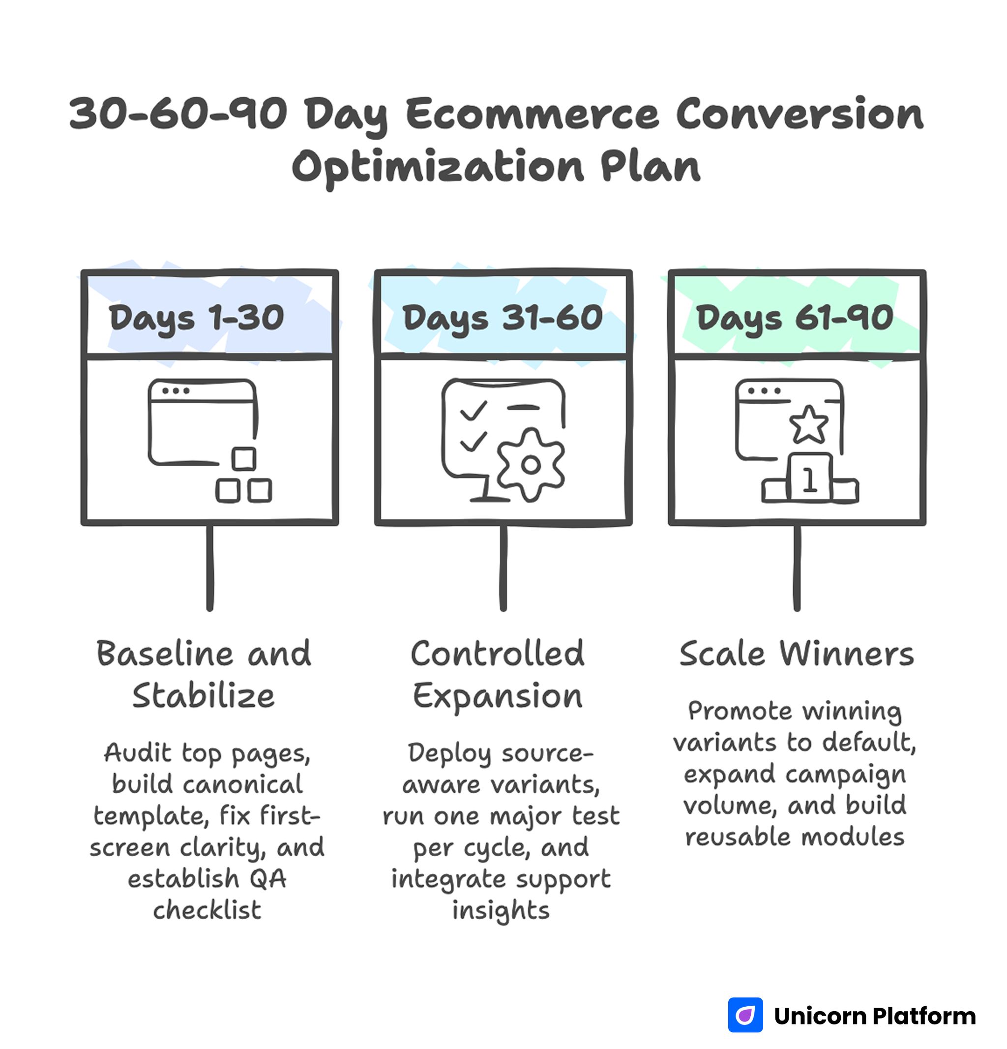
30-60-90 Day Ecommerce Conversion Optimization Plan
Days 1-30: Baseline and Stabilize
Audit top traffic pages by stage leakage and build one canonical template in Unicorn Platform with defined section jobs. Fix first-screen clarity, trust placement, and checkout entry friction before launching complex tests.
Introduce a mandatory pre-launch QA checklist for policy accuracy, mobile behavior, and checkout continuity. Establish baseline metrics for completion quality and profitability signals.
Days 31-60: Controlled Expansion
Deploy source-aware variants from the canonical template. Run one major test per cycle, with one primary metric and one guardrail. Start integrating support and return insights into pre-purchase messaging.
Document all tests in a shared register and retire unclear or low-impact experiment patterns.
Days 61-90: Scale Winners
Promote repeat winners into default template standards. Expand campaign volume only where QA and measurement reliability are strong. Build reusable modules for proof, policy, and offer components so launches stay fast and consistent.
At this stage, focus on compounding reliability rather than novelty. Predictable conversion quality outperforms frequent format changes.
Common Failure Modes and Fixes
1) Attractive But Unclear Hero
Problem: visual quality is high, value message is weak. Fix: rewrite first-screen copy around specific buyer outcome and one clear action.
2) Policy Confidence Hidden Late
Problem: shipping and returns are hard to find before checkout. Fix: place concise policy cues near product proof and key CTAs.
3) Proof Without Relevance
Problem: social proof exists but does not answer real objections. Fix: align proof format with buyer concerns such as fit, durability, and service reliability.
4) Checkout Cognitive Overload
Problem: too many inputs and unclear progression. Fix: reduce required fields and clarify step sequence with plain-language microcopy.
5) Variant Sprawl
Problem: too many page variants with unclear differences. Fix: enforce a bounded variant matrix with documented intent and ownership.
6) Metric Tunnel Vision
Problem: front-end lifts hide downstream quality decline. Fix: pair primary conversion metrics with profitability and post-purchase guardrails.
7) Missing Ownership
Problem: critical details drift across launches. Fix: assign explicit owners for offer truth, policy text, proof freshness, and QA.
Catalog Prioritization Framework: Where to Optimize First
Many stores try to optimize too many pages at once and end up improving none of them enough to move revenue. A stronger approach is catalog prioritization by commercial impact and friction severity. Start with pages that combine meaningful traffic and high leakage.
Use a simple priority score based on session volume, stage drop-off, and order-value potential. A high-volume page with moderate leakage can be more important than a low-volume page with severe leakage. This score keeps optimization effort tied to financial impact.
Then split pages into three operational tiers. Tier one gets weekly cycles and direct cross-functional attention. Tier two gets biweekly updates from proven tier-one modules. Tier three gets template-level maintenance until its traffic or margin importance rises.
This model protects focus and reduces optimization fatigue. Teams stop chasing edge cases and spend more time on pages that materially improve order quality.
KPI Tree for Faster Decisions
A KPI tree turns scattered metrics into a reliable decision system. Without hierarchy, teams overreact to front-end movement and miss downstream quality signals.
At the top, track completed profitable orders by source. Under that, track checkout completion, cart progression, and stage-level engagement quality. Under diagnostics, track policy interactions, error rates, and device-specific abandonment patterns.
Add guardrail thresholds. If completion improves but refund tendency rises above an agreed limit, the change is flagged for review rather than full rollout. This prevents short-term wins from degrading long-term outcomes.
When a metric moves, the KPI tree should point to likely causes and the next test decision in one step. That is the real value of the framework.
Checkout Error Taxonomy and Recovery Design
Checkout analysis often stops at abandonment rate, but abandonment is only an outcome. Teams need an error taxonomy that classifies failure points such as validation confusion, payment uncertainty, shipping-option ambiguity, and account-creation friction.
For each class, map observed behavior, probable cause, and planned fix. If validation confusion is common, simplify field labels and add inline guidance. If shipping ambiguity appears frequently, clarify delivery windows before payment actions.
Recovery design matters as much as prevention. Error states should provide plain-language explanations and immediate next actions. Generic error prompts increase anxiety and push users out of flow.
Track recovery effectiveness directly by measuring completion among users who encountered errors. This turns checkout reliability into a measurable optimization stream.
Lifecycle Messaging Strategy for Better Order Quality
New and returning buyers should not see the same emphasis. First-time buyers need stronger trust signals, fit guidance, and policy clarity. Returning buyers usually need faster path-to-purchase with relevant repeat-value framing.
The most stable model is structured variation. Keep page architecture constant and adapt only key message surfaces: hero framing, featured proof, and offer context. This protects QA and keeps attribution clean.
Use lifecycle outcomes to refine templates. If returning buyers consistently convert on shorter flows, build a retention-oriented template. If new buyers show repeated uncertainty, strengthen confidence modules in acquisition pages before scaling spend.
Lifecycle strategy improves both conversion and post-purchase quality because it aligns messaging with buyer readiness.
Governance Cadence for Multi-Region Teams
As stores expand across regions or multiple brands, messaging drift becomes a hidden conversion tax. Policy phrasing, offer language, and checkout norms diverge unless there is a clear governance cadence.
Set monthly architecture reviews and weekly launch reviews. Monthly reviews define shared standards and experiment priorities. Weekly reviews validate live variants against those standards and surface exceptions for escalation.
Maintain a change-control log for high-impact edits such as pricing framing, policy changes, and checkout-step modifications. Each entry should include owner, rationale, expected impact, and rollback criteria.
Regional flexibility should exist within approved boundaries. This balance preserves strategic consistency while allowing local nuance in language and timing.
Decision Log Template for Compounding Learning
Optimization programs slow down when insight disappears between campaigns. A decision log preserves context so teams can build on past work instead of repeating it.
Each entry should include hypothesis, audience segment, change summary, primary metric, guardrail metric, result confidence, and final decision. Keep entries short but complete.
Review the log every two weeks. Promote repeated winners into default templates, and archive repeated failures with clear rationale. This protects team memory as members and campaign priorities change.
A consistent decision log increases execution speed and result quality at the same time.
Benchmarking Without Blind Copying
Benchmarking works when it improves judgment, not when it drives imitation. High-performing competitors can reveal useful principles around message order, trust placement, and checkout flow, but direct replication usually fails because offer economics and audience expectations differ.
A practical benchmark process has three steps. First, map decision sequence: how quickly relevance, confidence, and action pathways are presented. Second, map uncertainty reduction: where fit guidance, policy clarity, and support cues appear. Third, map commitment flow: how checkout handoff and recovery states are handled.
After mapping, select one principle and adapt it to your own context. Test it with your own traffic segments and quality guardrails. This keeps optimization original while still learning from market patterns.
Teams that benchmark this way avoid both extremes: ignoring competitors entirely or copying them without strategic fit. The result is faster learning with stronger brand consistency.
Quarterly Conversion Review for Strategic Stability
Weekly cycles drive iteration speed, but teams also need a slower strategic review to prevent drift. A quarterly review aligns optimization priorities with changes in category mix, margin goals, fulfillment constraints, and regional behavior.
Bring growth, merchandising, operations, and support into one review. Start by summarizing what improved, what regressed, and which tests produced repeatable gains. Then identify the top three structural risks for the next quarter and assign ownership for each.
Common risks include rising mobile abandonment in specific regions, stale trust signals as products evolve, or checkout friction introduced by new payment options. Naming these risks early allows proactive testing instead of reactive redesign.
Close each quarterly review by confirming template standards, metric guardrails, and escalation rules. This gives weekly execution a stable strategic direction and reduces mid-cycle confusion about priorities.
Add one final review artifact: a quarterly risk map by funnel stage. For each stage, list the top risk, current confidence score, accountable owner, and planned mitigation in the next quarter. This makes strategy concrete and prevents broad goals from fading during busy campaign periods. When teams revisit this map each month, they can confirm whether mitigation work is actually reducing risk or only creating activity. Over time, the risk map becomes a practical bridge between leadership planning and weekly execution. It also helps onboard new contributors quickly, because they can see where the program is vulnerable and where standards are non-negotiable.
Pre-Launch QA Checklist
Confirm campaign promise, product availability, and pricing language are aligned. Verify that shipping and return details are accurate, visible, and consistent from landing to checkout.
Run mobile checks on real devices for first-screen clarity, action visibility, interaction stability, and checkout continuity. Validate that page performance supports fast orientation and action.
Review trust evidence for freshness and contextual relevance. Remove outdated testimonials, weak proof snippets, or images that conflict with current offer messaging.
Validate tracking readiness before launch so stage-level measurement is complete and experiment attribution remains reliable.
FAQ: Ecommerce CRO in 2026
1) Where should most teams start first?
Start with first-screen clarity and trust placement. These two areas usually produce the fastest measurable gains.
2) How many tests should run each week?
Fewer, clearer tests are better. One meaningful variable per cycle is usually enough for reliable learning.
3) Are discounts the best way to improve completion?
Not always. Better fit guidance and policy confidence often outperform deeper discounting while preserving margin.
4) How do we decide what to personalize?
Personalize only high-impact surfaces like headline emphasis, proof order, and offer framing while keeping structure stable.
5) Which metrics matter beyond conversion rate?
Track completed order quality, average order value quality, refund tendency, and repeat purchase indicators by source.
6) How important is mobile compared with desktop?
For many stores, mobile is the primary environment. Weak mobile reliability can erase otherwise strong campaign economics.
7) What is the most common checkout mistake?
Asking for too much information too early and presenting unclear progression steps.
8) How often should template architecture change?
Only after repeated evidence across multiple campaign contexts. Avoid structural churn without proof.
9) Can no-code workflows support serious optimization programs?
Yes, when paired with strict QA, clear ownership, and disciplined experiment design.
10) What creates sustainable gains over time?
Consistent stage-based diagnosis, controlled experiments, and strong operational governance.
Final Takeaway
Revenue growth from conversion work comes from systems, not hacks. Teams that sequence information correctly, reduce uncertainty early, and maintain operational discipline achieve better results with the same traffic.
Unicorn Platform gives teams the speed to execute this model without losing structure. Keep the framework stable, test intentionally, and feed real customer signals into every release cycle so gains compound over time.
Related Blog Posts
- Create a Custom E-Commerce Landing Page Design Without Coding: A Conversion-First 2026 Guide
- 10 Best Ecommerce Landing Page Examples to Boost Your Sales in 2026
- Create Custom Ecommerce Landing Page Design Without Coding: A 2026 Conversion Playbook
- Ecommerce Campaign Landing Pages in 2026: How Online Stores Turn Traffic Into Profitable Orders
