Table of Contents
- Why Pages Underperform Even When Traffic Looks Healthy
- Section-by-Section Blueprint for Repeatable Performance
- Scenario Playbooks
- A 30-Day Implementation Plan
- FAQ
Teams often assume weak conversion performance is caused by headline copy, button color, or traffic quality. Those factors matter, but the deeper issue is usually sequencing. When the right message appears at the wrong moment, users hesitate, scroll aimlessly, and leave without taking action.
High-performing pages work because they guide decisions in a predictable order. First, they establish relevance. Next, they reduce uncertainty with clear mechanism and proof. Then, they ask for one precise next step that matches user readiness. This order is what turns traffic into qualified outcomes.
Unicorn Platform is effective for this work because teams can iterate quickly without rebuilding from zero every cycle. Speed alone is not the advantage. Speed paired with a strong architectural model is what produces durable gains over time.
sbb-itb-bf47c9b
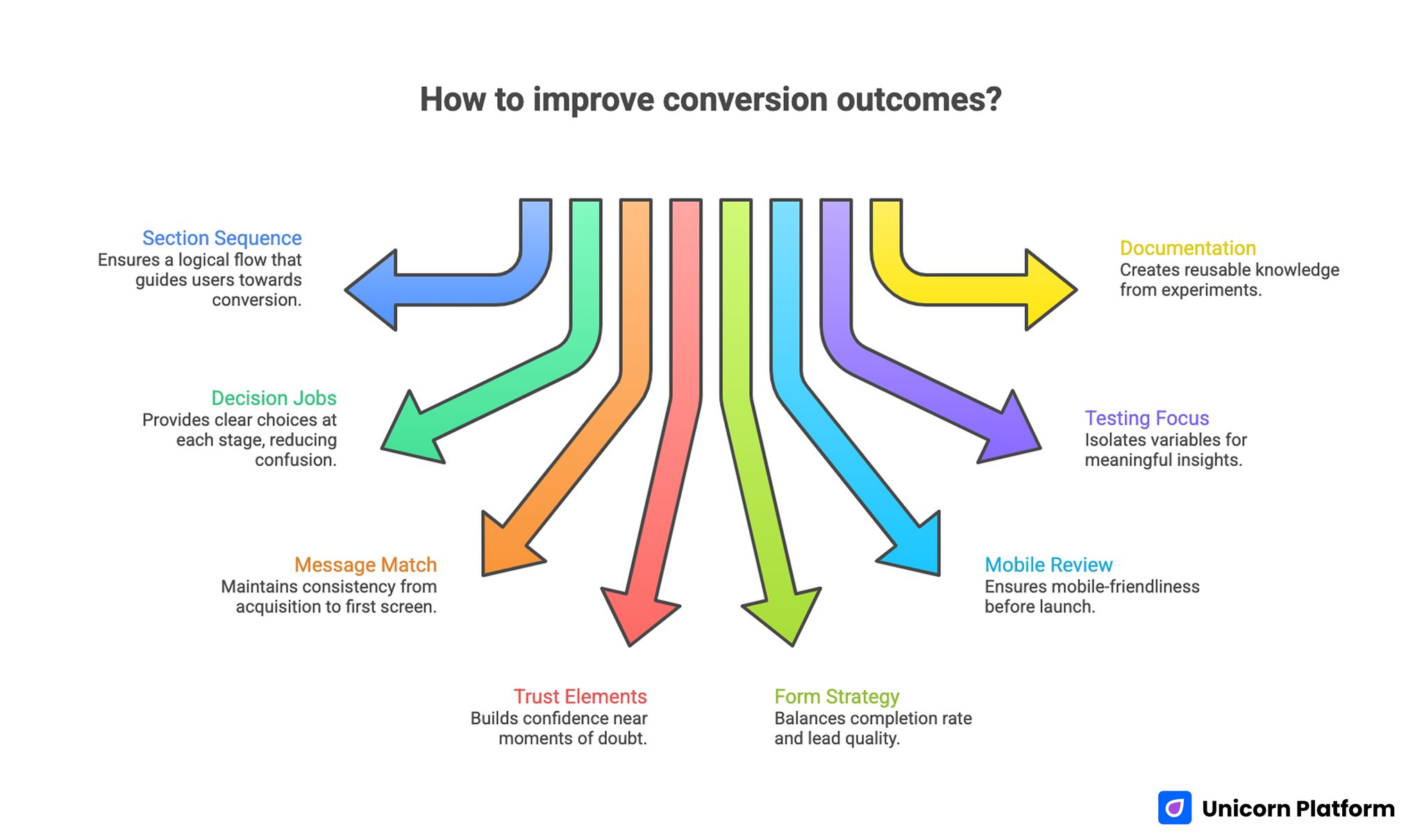
Quick Takeaways
Improving Сonversion Outcomes with Clear Page Structure
- Strong conversion outcomes depend on section sequence, not isolated copy tricks.
- Every section should have one explicit decision job.
- Message match from acquisition source to first screen is non-negotiable.
- Trust elements are most effective when placed near moments of doubt.
- Form strategy should protect both completion rate and lead quality.
- Mobile review should be a release gate, not a post-launch task.
- Testing should focus on one meaningful variable per cycle.
- Documentation turns experiments into reusable team knowledge.
Why Pages Underperform Even When Traffic Looks Healthy
A common failure pattern is promise drift. Ads, emails, and social posts create one expectation, while the destination page opens with broad or generic messaging. Users quickly sense mismatch and disengage before they evaluate the offer itself.
Another frequent issue is argument overload. Teams try to answer every question in one dense layout, so critical points are buried under less important details. Visitors are forced to find relevance on their own, which increases cognitive effort and reduces momentum.
Interaction design can also break otherwise strong narratives. If form fields appear before value is clear, or CTA labels feel ambiguous, users delay commitment. Conversion problems are often structural coordination problems, not simply writing problems.
Start With Intent Mapping Before Design Decisions
Before choosing section order, define who the page is for and what decision stage they are in. Discovery-stage visitors need fast orientation and clear relevance. Evaluation-stage visitors need mechanism depth and confidence signals. Decision-stage visitors need reduced friction and concrete next-step clarity.
This mapping process should include channel context. Paid search users behave differently from email subscribers and retargeted visitors. The opening section must confirm the exact promise each source made, otherwise every downstream section has to fight an avoidable trust deficit.
Behavioral baselining helps here. If your team needs a structured way to connect user behavior signals to page edits, this behavior-first optimization framework can help prioritize the right bottlenecks before any rewrite begins.
The Core Narrative Model: Relevance, Mechanism, Confidence, Action
A practical architectural model uses four layers. Relevance answers who the offer is for and why it matters now. Mechanism explains how value is produced in understandable terms. Confidence proves the claims with specific evidence. Action defines one clear next step.
When these layers stay in order, pages become easier to scan and easier to trust. When one layer is skipped or misplaced, users need extra effort to fill gaps, and conversion quality drops. This is why sequencing outperforms surface-level cosmetic changes.
Teams can adapt section depth by channel and audience while still preserving this narrative spine. The model is stable, but implementation remains flexible.
Section-by-Section Blueprint for Repeatable Performance
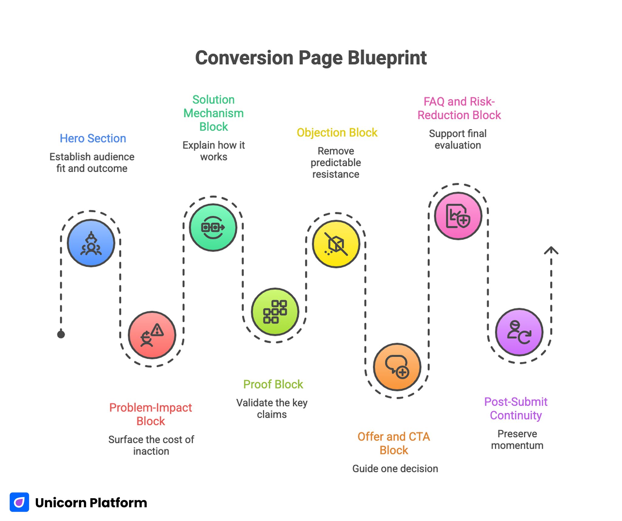
Conversion Page Blueprint
The following blueprint is designed for practical execution. Each section has one primary responsibility and one quality test.
1. Hero section: establish audience fit and outcome
The hero should tell visitors, within seconds, whether they are in the right place. Strong heroes pair a specific audience context with a specific outcome and one clear CTA.
Quality test: can a first-time visitor summarize the offer and next step without scrolling? If they cannot, refine the headline-subheadline pair before touching deeper sections.
2. Problem-impact block: surface the cost of inaction
This section should translate pain points into operational or financial consequences users already recognize. Avoid generic fear language. Use concise, realistic descriptions that match the target audience’s day-to-day friction.
Quality test: does the section make the problem feel concrete rather than abstract? Practical language should mirror how users actually describe the pain in calls and tickets.
3. Solution mechanism block: explain how it works
Users need to understand how the promised outcome is delivered. Keep mechanism language practical and avoid unnecessary jargon. If implementation is simple, show the sequence. If implementation is complex, show the path.
Quality test: can a skeptical reader explain the process after one pass? If not, the mechanism is still too vague for confident action.
4. Proof block: validate the key claims
Evidence works best when it appears immediately after high-stakes claims. Use concise case outcomes, role-relevant testimonials, and realistic constraints where appropriate.
Quality test: is each major promise followed by supporting proof nearby? Distance between claim and evidence should be minimized wherever uncertainty is highest.
5. Objection block: remove predictable resistance
Address the objections users are likely to hold at this scroll depth, such as time required, perceived risk, setup complexity, or team fit. Objection handling should be direct and specific.
Quality test: do the top two objections have explicit responses before the main commitment ask? If objections appear only in the FAQ, trust is arriving too late in the flow.
6. Offer and CTA block: guide one decision
Define one dominant action and one precise outcome of taking that action. Secondary options can exist, but they should never compete equally with the primary objective.
Quality test: is the next step clear enough that users do not need interpretation? CTA language should describe the actual outcome of clicking, not generic action verbs.
7. FAQ and risk-reduction block: support final evaluation
FAQ should handle final-stage uncertainties, not repeat earlier copy. Keep answers short, concrete, and tied to practical implementation concerns.
Quality test: do answers reduce hesitation or just add extra text? Each answer should remove one practical concern tied to commitment readiness.
8. Post-submit continuity: preserve momentum
The confirmation step should reinforce what happens next, when it happens, and what users should prepare. Poor post-submit communication can reduce quality even after successful form completion.
Quality test: does the user know exactly what to expect after submission? Confirmation copy should include timing, channel, and owner whenever possible.
Architecture Quality Checklist for Every Draft
Before publishing, teams should run a short architecture review. Keep this pass focused and binary so release decisions stay clear under deadline pressure.
- First-screen relevance is obvious without scrolling.
- Channel promise and on-page message are aligned.
- Mechanism explanation is practical and understandable.
- Proof is specific and close to high-value claims.
- CTA hierarchy is clear and non-competing.
- Form friction matches decision stage.
- Mobile behavior preserves section priority.
- Post-submit expectations are explicit.
This checklist works best when ownership is assigned. One person should be responsible for final architectural coherence before release.
Message Match Across Channels: Protecting Conversion Momentum
Visitors do not evaluate pages in isolation. They arrive with context from ads, outreach, newsletters, and social posts. If that context is ignored, trust declines before the value proposition is fully processed.
A practical system is to create a channel-message map. For each source, define the promise made upstream, the opening line that confirms it, and the CTA language that continues it. This map turns message consistency into an operational requirement instead of an informal preference.
Teams that align this map with reusable page templates tend to reduce bounce variance across channels and improve learning clarity in A/B tests. It also shortens debugging time when a campaign underperforms because upstream and on-page messaging are already documented.
Trust Architecture: Relevance Beats Volume
Many teams solve trust problems by adding more logos and testimonials. The better approach is trust targeting. Match each trust element to the precise doubt users are likely to feel at that stage.
For example, onboarding concerns require implementation proof, not generic brand badges. ROI concerns require measurable outcomes, not broad praise. Risk concerns require transparent boundaries, not hype language.
When teams need to align trust placement with broader conversion objectives, this strategic optimization alignment guide can help prioritize which confidence signals matter most for business outcomes. Use it to decide whether the next iteration should improve quality, efficiency, or downstream progression.
Form Design for Qualified Outcomes
Form optimization should not focus on completion volume alone. A page can increase submissions while reducing fit quality, which creates downstream friction for sales and onboarding teams.
Use staged data collection where possible. Ask only routing-critical fields at first touch, then collect deeper context later in the journey. This keeps friction low while preserving operational value.
Form microcopy also matters. Labels, helper text, and error messaging should reduce uncertainty and keep user intent stable through completion. The form is part of the narrative, not a separate utility component.
Mobile-First Hierarchy and Interaction Reliability
Desktop previews hide many structural problems. On smaller screens, section priority can collapse, proof can move too far below the fold, and forms can become difficult to complete under real-world conditions.
Mobile QA should include first-screen clarity, tap target comfort, reading rhythm, form keyboard behavior, and performance under constrained networks. Any critical failure in these checks should block release.
For teams refining mobile conversion behavior in detail, this mobile app landing page execution guide is useful for turning responsive layouts into conversion-reliable experiences. Treat those checks as publish blockers, not optional polish tasks.
Using AI to Accelerate Drafting Without Losing Structural Discipline
AI can reduce drafting time dramatically, but it should not dictate core sequence decisions. The architecture model should be defined first, then AI can be used to generate section-level alternatives within explicit boundaries.
A strong prompt packet defines audience, intent stage, section role, claim constraints, and desired output format. After generation, run a separate critique pass that checks specificity, evidence alignment, and CTA clarity before any publish decision.
When teams are operationalizing AI-assisted page creation at scale, this AI landing page workflow reference can support structured drafting without sacrificing decision quality. It is most effective when paired with fixed review ownership and a documented release checklist.
Experiment Design: Fewer Variables, Better Learning
Fast iteration tools can tempt teams into testing too many variables at once. That produces noisy data and weak conclusions. Reliable experimentation requires deliberate scope control.
Each test cycle should include one major hypothesis, one primary metric, and one downstream guardrail. This structure protects against local improvements that hurt broader funnel quality.
Document every cycle with the same template: what changed, why it changed, expected effect, observed outcome, and next decision. Over time, this creates an institutional memory that improves future execution speed and quality.
Scenario Playbooks
Scenario 1: SaaS demo page with strong clicks but weak meeting quality
This pattern often indicates CTA pressure without enough qualification context. Rebalance the page by tightening audience fit language, moving implementation proof earlier, and clarifying who benefits most.
Then compare booked-meeting quality, not just booking volume. Better alignment usually reduces low-fit meetings while improving pipeline efficiency.
Scenario 2: Webinar registration page with high bounce before form view
High bounce can indicate weak relevance framing in the first screen. Start with a sharper "who this is for" statement, then add one proof signal tied to speaker credibility or expected outcomes.
Place the registration form only after those two elements are clear. This sequence often increases both registrations and attendance quality.
Scenario 3: Lead magnet page with many submissions but low downstream engagement
This usually signals expectation mismatch. Clarify what users will receive, when they will receive it, and what follow-up communication will occur.
Simplify the page to one core promise and one action path. Remove unrelated product messaging that competes with the lead magnet intent.
Scenario 4: Multi-campaign program with inconsistent results across verticals
In this case, the issue is often template drift. Different contributors modify section order and proof emphasis without shared standards.
Reintroduce a locked architecture template, then allow only controlled variation in messaging and evidence modules. Consistency improves attribution and makes cross-vertical learning reusable.
A 30-Day Implementation Plan
Week 1: Diagnose and prioritize
Audit the top five traffic-driving pages. Identify the primary structural bottleneck on each and rank by business impact. Define control metrics and lock current versions.
Week 2: Rebuild one priority page with section-job discipline
Apply the blueprint to one high-impact page. Keep changes focused on sequence and clarity rather than visual novelty. Complete mobile and form QA before launch.
Week 3: Test one meaningful variable
Run one controlled comparison against the control version. Track both interaction signals and downstream quality signals to avoid false positives.
Week 4: Standardize and scale
Document the winning pattern, update templates, and choose the next bottleneck. Keep the same review cadence and ownership model.
A 90-Day Plan for Compounding Gains
Month two should expand validated patterns to adjacent campaigns while preserving core sequence. Do not introduce major aesthetic rewrites unless evidence shows structural limitations.
Month three should focus on system maturity: approved claim libraries, reusable proof modules, and standardized QA workflows by intent type. This reduces contributor variance and speeds future launches.
At ninety days, success should be evaluated by consistency of outcomes, not single-test spikes. The objective is a reliable conversion system that stays effective as campaigns scale.
FAQ: Conversion Page Architecture in 2026
1. How long should a conversion-focused page be?
Length should match decision complexity. Simpler offers can convert with shorter layouts, while higher-risk decisions need more context. Focus on section usefulness, not word count targets.
2. Should every campaign use a unique page?
Not always, but distinct promises should have distinct variants. Reusing one generic destination for multiple offers usually weakens message continuity.
3. What is the fastest structural fix for weak conversion?
Improve first-screen relevance and CTA clarity first. If users cannot immediately identify fit and next step, deeper improvements will have limited impact.
4. How many CTA buttons should a page include?
You can repeat the same primary CTA as needed on longer pages. The key is one dominant action path, not multiple competing asks.
5. Are long pages still effective?
Yes, when each section reduces a real decision barrier. Long pages fail when they add repetition without increasing confidence or clarity.
6. How should testimonials be selected?
Choose evidence that matches the target audience and objection type. Relevance and specificity outperform large generic testimonial collections.
7. What should be tested first?
Start with high-leverage elements: first-screen framing, proof placement, and CTA language. These often drive larger shifts than cosmetic changes.
8. How do we avoid over-testing?
Use a fixed testing cadence and limit major variables per cycle. Structured scope control improves both confidence and learning speed.
9. What role should sales teams play in page reviews?
Sales feedback is critical for objection realism and qualification quality. Include sales in review loops, especially for demo and consultation flows.
10. How do we maintain quality with multiple contributors?
Use locked templates, shared checklists, and explicit ownership for final release decisions. Standardization reduces drift without blocking productive variation.
Final Takeaway
Conversion performance improves when page architecture is treated as a system, not a collection of isolated components. The winning pattern is clear: define intent, sequence sections by decision job, validate trust where doubt appears, and ask for one aligned action.
With Unicorn Platform, teams can execute this model quickly and repeatedly. The compounding benefit comes from disciplined iteration: each cycle improves both page results and organizational learning quality.

