Table of Contents
- The One-Page Structure That Converts
- Building in Unicorn Platform: Fast Workflow
- 30-Day One-Page Optimization Plan
- Common Mistakes to Avoid
- FAQ
A one-page personal website can be your fastest path from invisible to credible. It removes navigation complexity, keeps attention focused, and helps visitors decide quickly whether they should contact you, hire you, or follow your work.
Most one-page websites fail for one reason: they are short, but not strategic. They have a headline, a few visuals, and a contact form, but no clear narrative that explains who the site is for and why the offer matters.
The good news is that you do not need a complicated build to fix this. A strong one-page site can be simple, readable, and conversion-focused when section order and messaging are intentional.
This guide gives you a practical framework to build your one-page personal website in minutes, then improve it through lightweight weekly updates. You will learn structure, copy, trust placement, and optimization rules that work for creators, consultants, freelancers, and professionals.
If you want a first-impression benchmark before building, this personal landing page framework is a useful reference for evaluating clarity and trust flow.
sbb-itb-bf47c9b
Quick Strategic Takeaways
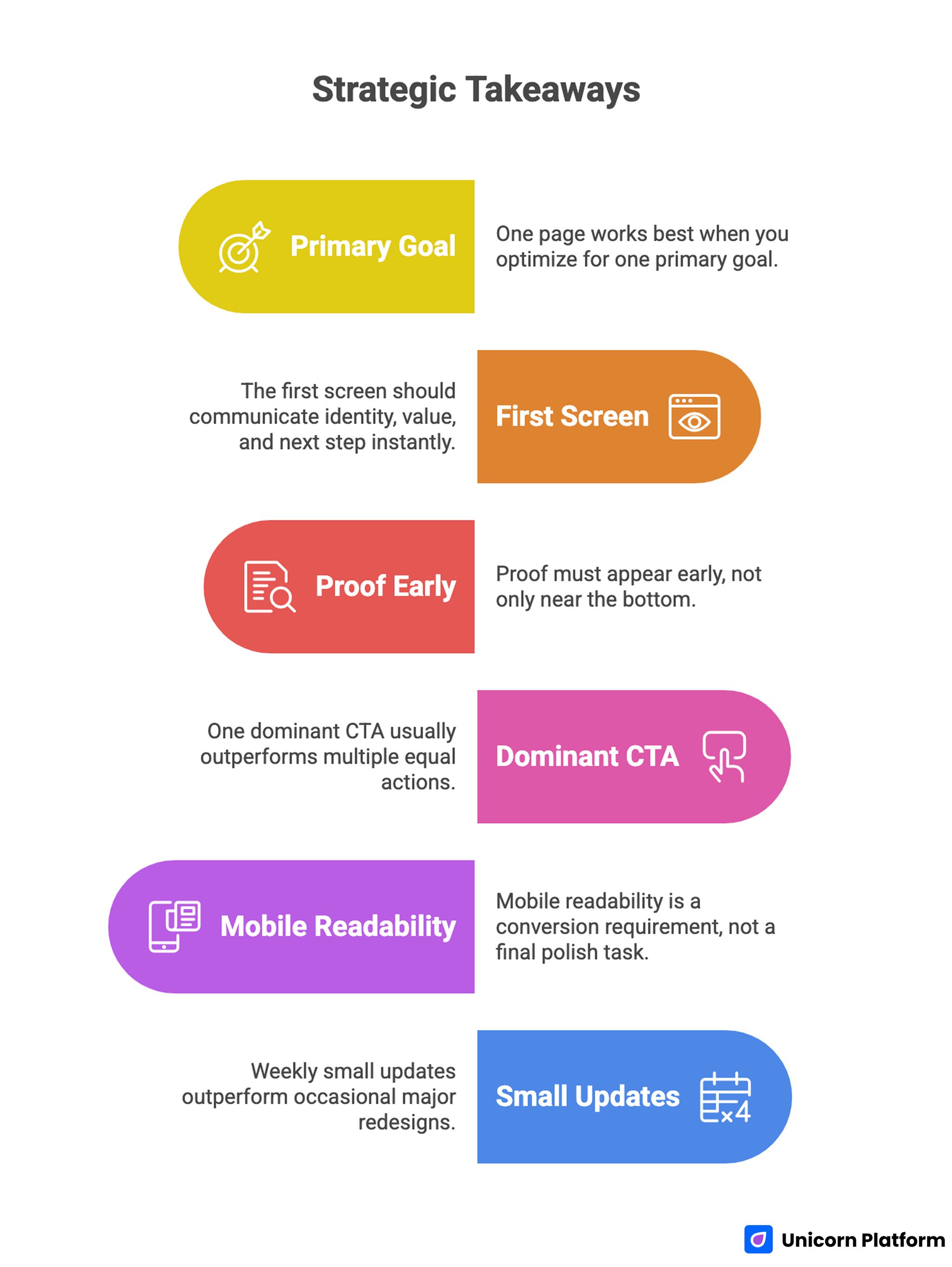
Essential Strategies for Creating a High-Converting One-Page Personal Website
- One page works best when you optimize for one primary goal.
- The first screen should communicate identity, value, and next step instantly.
- Proof must appear early, not only near the bottom.
- One dominant CTA usually outperforms multiple equal actions.
- Mobile readability is a conversion requirement, not a final polish task.
- Weekly small updates outperform occasional major redesigns.
Why One-Page Personal Websites Still Work
One-page sites perform well because they reduce decision friction. Visitors do not need to explore complex navigation to understand your offer, so they stay in one continuous flow from discovery to action.
This structure is especially effective for early-stage personal brands. You can launch quickly, test messaging fast, and improve outcomes without managing a large content system.
One-page formats also simplify maintenance. Instead of updating five separate core pages every week, you can focus effort on high-impact sections that directly affect trust and conversion.
The format is not limited to beginners. Experienced professionals also use one-page sites for campaign-specific goals, niche positioning, or focused consulting pathways.
Set the Goal Before You Build
Before choosing template styles, define one primary objective for this version of your site. If you skip this step, the page usually becomes generic and lower-converting. For expert guidance on portfolio strategy, see GitHub Guides.
Common one-page goals include the most frequent outcomes personal brands expect from focused pages. Picking one goal early improves every structural decision that follows:
- consulting inquiry generation
- hiring or recruiter visibility
- speaking and collaboration opportunities
- creator audience growth
- productized service conversion
Choose one primary goal and one priority audience. You can support secondary pathways later, but the first version should have one clear decision path.
If you are still comparing platforms, this beginner-focused website builder guide helps you evaluate tools by workflow quality instead of visual novelty.
The One-Page Structure That Converts
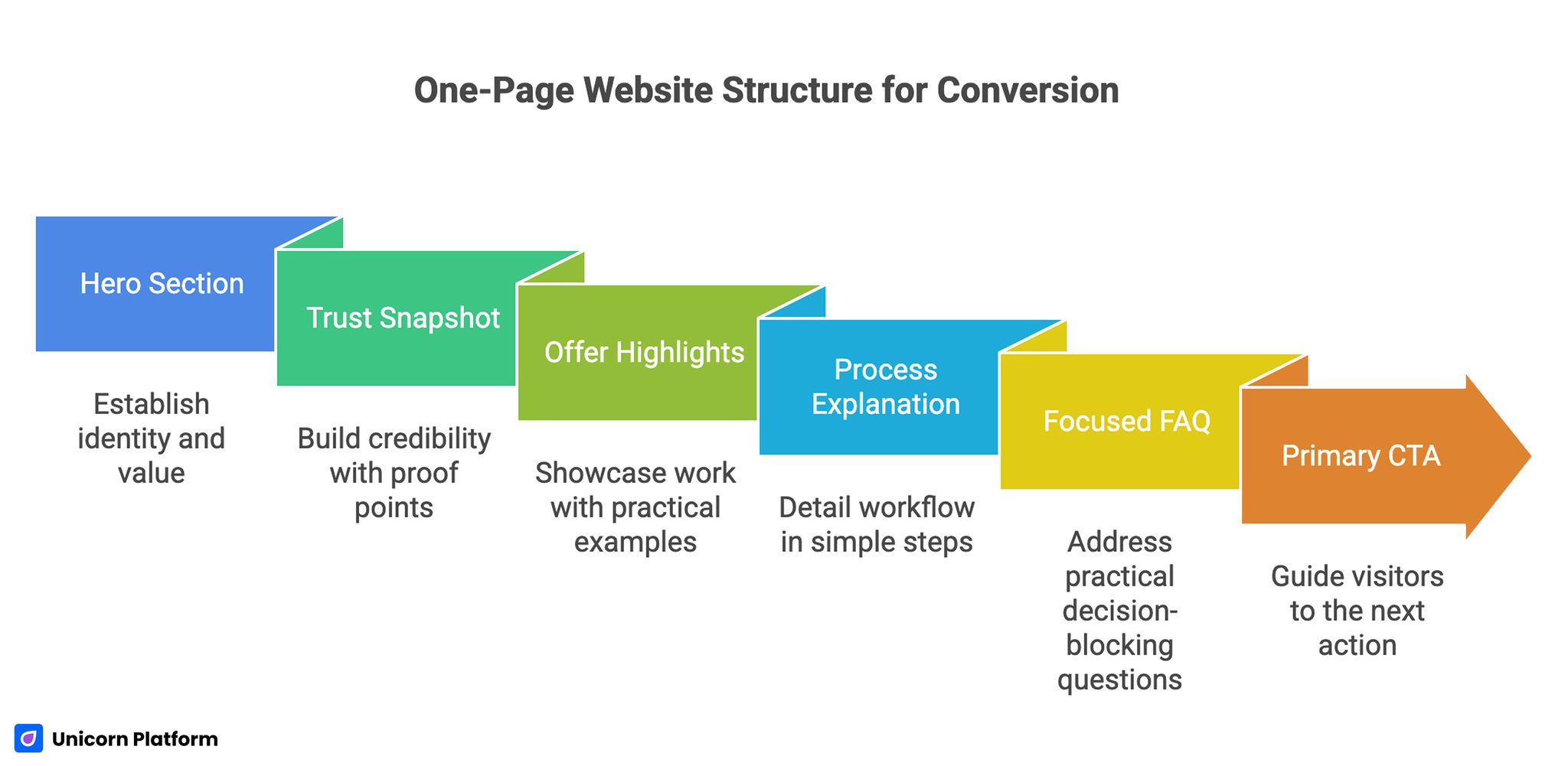
One-Page Website Structure for Conversion
The best one-page personal websites use section sequence as a decision system. Each section should answer one user question and move the visitor forward.
Section 1: Hero with clear identity and value
Your hero should explain who you help and what result you create. Avoid vague lines that sound professional but could describe anyone.
A practical hero formula is: role + audience + outcome. This is specific enough to build relevance quickly.
Section 2: Trust snapshot
Place concise credibility cues near the first action opportunity. This can include role context, key outcomes, selective testimonials, or recognition signals.
Early trust matters because visitors evaluate risk before they commit to contact. A single relevant proof point near the first CTA can materially improve continuation rates.
Section 3: Offer or work highlights
Show what you do through selected examples, not long lists. Each highlight should connect to a practical result and relevant audience need.
Curated proof increases clarity. Exhaustive proof often reduces readability.
Section 4: Process or approach
Explain how you work in simple steps. This helps visitors understand expectations and reduces uncertainty around what happens after they click.
Short process sections often improve inquiry quality because they pre-qualify fit. Visitors can quickly judge whether your workflow matches their needs.
Section 5: Focused FAQ
Answer the practical questions that repeatedly block decisions, such as timeline, scope, pricing model, or response speed. Direct operational clarity is often the final step before conversion.
A concise FAQ near the CTA can remove final hesitation without adding clutter. Keep answers short and specific so readers do not lose momentum.
Section 6: Primary CTA and contact
End with one dominant action path. Make it obvious what visitors should do next and what they can expect after submitting.
For broader personal-brand consistency while you scale from one-page to multi-page, these personal website quality tips are helpful for maintaining structure and trust as complexity grows.
Messaging Framework for One-Page Websites
Copy quality determines whether visitors keep scrolling. The page can look polished and still underperform if the message is broad or unclear.
Use this sequence for each core section to keep messaging coherent from top to bottom. Repeating this pattern across sections makes the page easier to scan:
- problem context your audience recognizes
- practical outcome you deliver
- concise proof the outcome is realistic
- clear invitation to act
Replace generic statements with concrete language. Specific words about audience and result improve fit and reduce low-quality inquiries.
Example rewrite pattern
Weak: "I help people grow online."
Strong: "I help solo consultants turn unclear offers into trust-focused pages that generate qualified inbound leads."
Specificity improves both conversion volume and conversion quality because visitors can self-identify quickly. Better fit at this stage usually means better inquiry relevance later.
Trust Placement Strategy Across the Scroll Journey
Trust should not be isolated in one section. One-page sites work best when proof appears at multiple decision moments. For more on trust architecture for web pages, see Smashing Magazine.
Use a three-point trust system so confidence is maintained throughout the page journey. This layered model keeps trust visible at key moments:
- early trust near hero
- mid-page trust near offer details
- final trust near CTA
This approach keeps confidence high throughout the scroll instead of asking visitors to remember one testimonial from far above. Distributed proof lowers friction at each decision point.
Trust content should be concise and relevant. One precise proof point often performs better than several generic endorsements.
For service-led professionals building stronger authority, this personal professional website guide can help map proof depth to conversion intent.
CTA Design Rules for One-Page Personal Sites
CTA strategy is one of the highest-impact elements on a one-page site. If CTA hierarchy is weak, even strong traffic can underperform.
Use one dominant CTA label tied to your primary objective, such as "Book a Call," "Start a Project," or "Get in Touch." Secondary actions can exist, but they should not compete for equal attention.
Place CTA blocks where intent is naturally highest: after value explanation, after trust reinforcement, and at the final section close. This timing reduces forced scrolling for ready visitors.
CTA support text should reduce uncertainty. Brief response expectations or process notes often increase form completion.
Contact Form Best Practices
A good one-page contact flow gathers enough context without creating friction. Balance clarity with brevity so completion remains fast.
Recommended form fields should stay minimal for first-contact conversion quality. Start with the essentials and expand only if needed:
- name
- inquiry type
- short message
Optional qualification fields can be added only if they improve response quality without reducing completion excessively. Measure completion impact before keeping extra fields.
Always include response timeline guidance. Clarity after submission increases perceived professionalism and reduces follow-up confusion.
Mobile and Performance Standards
A significant share of one-page traffic comes from mobile referrals and social shares. If mobile quality is weak, first impressions break before visitors reach your strongest proof.
Use this mobile baseline as a pre-promotion quality gate. If one area fails, fix it before distribution:
- concise hero copy
- visible CTA in early scroll
- tap-friendly button spacing
- readable text without zoom
- fast-loading media
Performance and readability are credibility signals. A fast, clear page suggests operational quality before any direct conversation happens.
SEO for One-Page Personal Websites
One-page sites can rank when structure is clean and messaging is intent-aligned. Search performance usually follows clarity and topical focus.
Start with these core technical and structural basics. They provide enough foundation for early discovery gains:
- descriptive page title and meta description
- clear H1 and logical H2 hierarchy
- natural language aligned to niche audience
- optimized assets and fast load behavior
Because one-page sites have limited space, focus on relevance and clarity rather than trying to cover every adjacent topic in one document. Depth is still possible when each section has a clear job.
Building in Unicorn Platform: Fast Workflow
Unicorn Platform is effective for one-page websites because it supports rapid publishing and iterative section updates without technical overhead. The workflow advantage is strongest when teams improve one element at a time.
Step 1: Set one objective and audience
Document these before selecting sections. This keeps the build focused.
Step 2: Assemble core section sequence
Build hero, trust, offer, process, FAQ, and CTA flow before decorative tuning. Structural clarity should always come before visual experimentation.
Step 3: Replace template defaults with specific copy
Template text should be treated as placeholder language. Rewrite everything around your actual audience and outcomes.
Step 4: Add context-rich proof
Insert selected testimonials, outcomes, or project highlights near decision points. Relevance matters more than testimonial volume.
Step 5: Configure clear contact pathway
Ensure the primary CTA path is visible and form behavior is reliable. Friction here can erase gains from strong messaging.
Step 6: Validate mobile behavior on real devices
Check readability, tap targets, and contact completion before promotion. Real-device testing reveals issues preview modes often miss.
Step 7: Launch with baseline tracking
Track CTA clicks, form completion, and inquiry quality notes. This gives enough signal to prioritize meaningful changes.
Step 8: Improve one element per week
Small focused updates create better learning than broad simultaneous changes. Clear attribution speeds up optimization cycles.
30-Day One-Page Optimization Plan
Week 1: Baseline launch
Publish the first version with clear identity, trust snapshot, and one dominant CTA. Validate links and form submissions.
Week 2: Messaging refinement
Test one hero variation and one supporting-line change. Keep layout stable so message impact is measurable.
Week 3: Trust and conversion tuning
Upgrade proof specificity and simplify any contact friction. Prioritize relevance over adding more visual content.
Week 4: Audience-fit adjustment
Refine positioning based on inquiry quality and traffic behavior. Adjust CTA language if fit is weak.
60-Day Growth Model for One-Page Sites
Days 1-20: Stabilize message and trust
Improve first-screen clarity and early proof relevance. Remove sections that do not support the primary objective.
Days 21-40: Improve conversion quality
Test CTA and form variants based on actual inquiry fit. Keep changes focused and documented.
Days 41-60: Expand strategic support
Add one supporting content asset or variant pathway for your highest-value audience segment. This expands depth without diluting one-page clarity.
This phased model helps keep momentum while avoiding unnecessary complexity. Each phase has one job, which keeps decisions practical.
Goal-Based One-Page Variants
One page can be adapted for different outcomes by changing emphasis, not rebuilding from scratch. Section reuse keeps maintenance fast.
Hiring-focused variant
Prioritize impact summaries, selected work, and role-fit clarity. Hiring visitors need quick evidence of relevance.
Consulting-focused variant
Prioritize problem-solution framing, scope clarity, and qualification-focused CTA. Consulting prospects respond best to immediate practical fit.
Creator-focused variant
Prioritize narrative identity, audience proof, and newsletter or collaboration path. Creator-focused visitors often convert through relationship pathways first.
Variant logic works best when core structure stays consistent and only high-impact messaging blocks change. This keeps brand consistency stable across audiences.
Monthly Review Metrics That Matter
Do not rely on page views alone. Track signals that reflect decision quality.
Use this monthly set as a lightweight performance dashboard for one-page optimization. It is enough to support strategic decisions without overengineering:
- CTA click-through rate
- contact form completion rate
- qualified inquiry share
- returning visitor trend
- source-level inquiry quality
Use the results to choose one high-leverage update for the next cycle. Focused decisions produce clearer outcomes.
Common Mistakes to Avoid
Mistake 1: Generic messaging without niche focus
Visitors cannot determine fit quickly, so they bounce. Rewrite first-screen copy around audience and practical outcome.
Mistake 2: Too many equal-priority CTAs
Action overload creates hesitation. Keep one dominant path and support it with secondary options only where needed.
Mistake 3: Weak proof context
General testimonials are easy to ignore. Use concise evidence tied to role-specific outcomes.
Mistake 4: Visual clutter
Overdesigned sections reduce readability and trust. Simplify spacing, hierarchy, and section purpose.
Mistake 5: No update routine
Even good pages decay without maintenance. Run weekly quality checks and monthly strategic reviews.
Mistake 6: Promotion before quality validation
Traffic amplification before clarity fixes wastes budget and attention. Validate core flow before scale.
Mistake 7: No documentation of changes
Without a log, teams repeat weak edits. Track change intent and outcomes to improve iteration quality.
FAQ: Building a One-Page Personal Website
Is a one-page personal website enough in 2026?
Yes, for many use cases. A one-page format can perform extremely well when goal, messaging, and CTA flow are clear.
Who should use a one-page personal site?
Creators, consultants, freelancers, and professionals who need focused conversion paths with low maintenance overhead often benefit most from this format. It allows fast updates while preserving clear decision flow.
What is the most important section above the fold?
A specific identity and value statement tied to audience outcome. Visitors should immediately understand relevance.
How many projects or proof items should I show?
Show a curated set of high-relevance proof points. Quality and context matter more than quantity.
How often should I update a one-page site?
Weekly light updates and monthly strategic reviews are a practical baseline. Consistency over time usually beats occasional large redesigns.
Should I include pricing on a one-page personal website?
Include pricing when it improves qualification and reduces uncertainty for your offer model. If pricing is variable, explain scope and process clearly.
Can one page support multiple audience types?
Yes, but one primary audience should lead. Add light variants or segment-specific blocks when data shows clear intent differences.
How do I improve inquiry quality, not just volume?
Strengthen positioning specificity, proof relevance, and CTA qualification language. These are typically the fastest levers for better inquiry quality.
Do one-page personal websites rank in search?
They can, when structure is clean, messaging matches intent, and performance quality is strong. Good structure compensates for smaller page depth.
What is the fastest high-impact improvement?
Rewrite first-screen messaging and upgrade proof specificity. These two changes often deliver immediate quality gains.
Final Takeaway
A one-page personal website works when it is treated as a focused conversion asset, not just a compressed biography. Clear messaging, layered trust, and one intentional action path are what create consistent results.
With Unicorn Platform, you can launch that system quickly and improve it continuously. When updates are focused and documented, your one-page site becomes a reliable opportunity engine instead of a static profile.