Table of Contents
Most agencies do not lose conversions because they lack traffic. They lose conversions because visitors cannot quickly answer four questions: who this offer is for, what business problem it solves, why this team can deliver, and what happens after the first contact. When those answers are unclear, even strong acquisition channels produce weak sales conversations.
This is why page architecture matters more than cosmetic polish. A clean visual style helps credibility, but sequence is what guides decisions. The highest-performing agency pages move visitors from relevance to confidence to action with minimal ambiguity at each step.
Unicorn Platform is valuable for this workflow because teams can ship updates quickly while preserving reusable structural patterns. The compounding advantage comes from disciplined iteration, not from publishing more versions without a framework.
sbb-itb-bf47c9b
Quick Takeaways

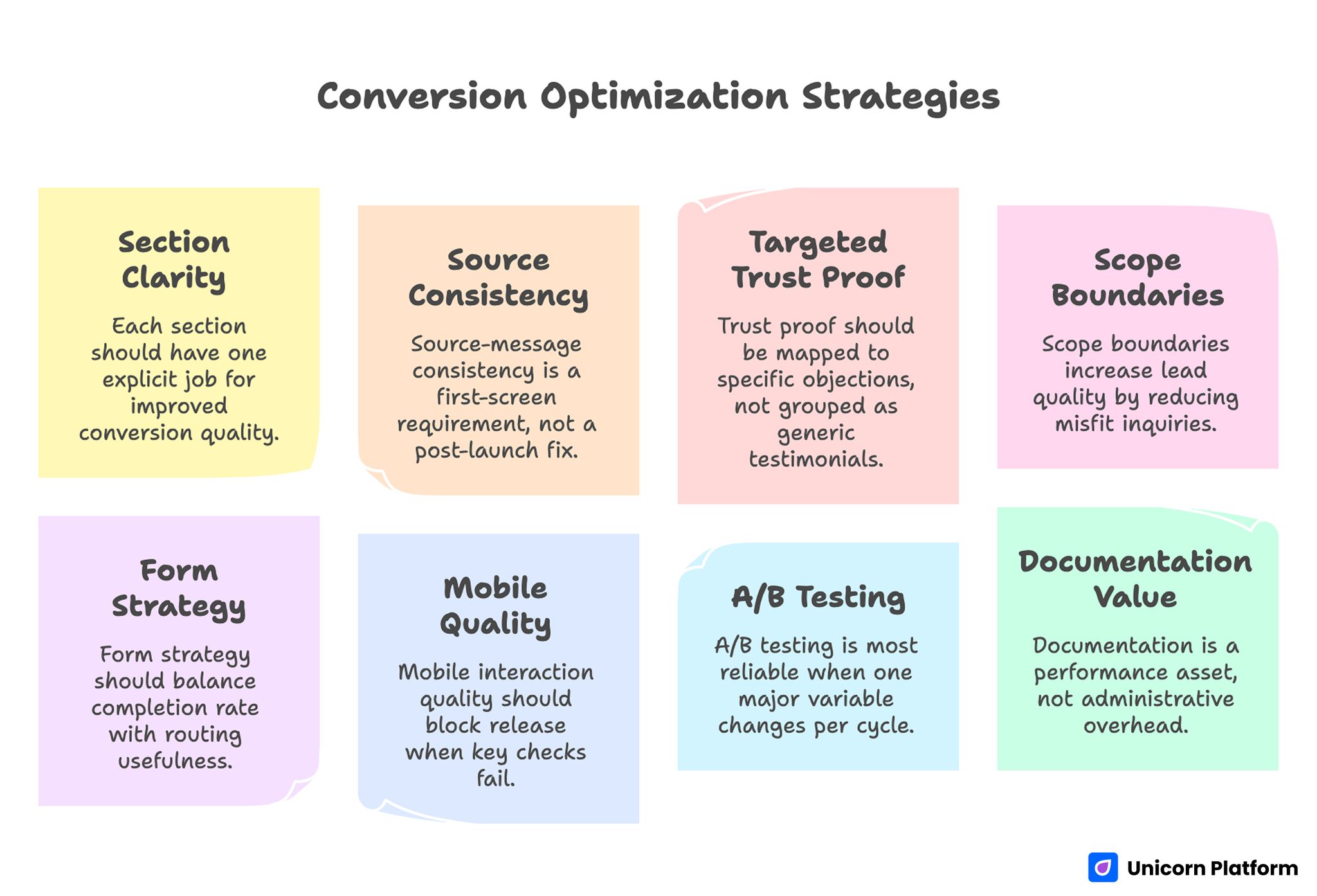
Conversion Optimization Strategies
- Conversion quality improves when each section has one explicit job.
- Source-message consistency is a first-screen requirement, not a post-launch fix.
- Trust proof should be mapped to specific objections, not grouped as generic testimonials.
- Scope boundaries increase lead quality by reducing misfit inquiries.
- Form strategy should balance completion rate with routing usefulness.
- Mobile interaction quality should block release when key checks fail.
- A/B testing is most reliable when one major variable changes per cycle.
- Documentation is a performance asset, not administrative overhead.
Why Agency Pages Underperform Even With Good Traffic
The first issue is positioning blur. Many pages describe broad capabilities but never define the exact buyer profile that gets the strongest outcome. Visitors who might be a strong fit cannot self-identify quickly, while lower-fit visitors still book calls, creating avoidable pipeline noise.
The second issue is proof mismatch. Agencies often include social proof, but the evidence does not resolve the right uncertainty. A buyer worried about implementation risk needs process and timeline proof, not a broad statement about creativity or responsiveness.
The third issue is action conflict. When the same page offers audit booking, newsletter signup, downloadable guides, and general contact actions with equal visual weight, user intent fragments. Action variety is useful only when hierarchy is clear.
Define Offer Intent Before Writing Any Section
Before drafting copy, define the core offer type and decision stage. A page inviting strategic discovery for a high-ticket engagement is not structurally identical to a page promoting a low-friction starter package. Intent must shape section order, proof type, and form depth.
A practical intent matrix usually includes three offer categories. This classification keeps design decisions tied to buyer behavior instead of internal assumptions.
- Service engagement offers: high consideration, stronger proof requirements, explicit scope boundaries.
- Content-led advisory offers: medium consideration, education plus trust transition.
- Training or course offers: skill-building intent, transformation clarity, and expectation setting.
This mapping prevents one common failure mode: using one generic template for fundamentally different buyer decisions. It also gives your team a shared language for prioritizing which page family should be optimized first.
The Conversion Sequence That Works for Agencies
A reliable agency page sequence has five stages: relevance, problem framing, method clarity, confidence, and commitment. Each stage should reduce uncertainty for one specific decision.
Relevance confirms audience fit immediately. Problem framing explains why current approaches fail. Method clarity explains how the agency works in practical terms. Confidence validates claims with evidence and boundaries. Commitment presents one clear next step with explicit expectations.
When this sequence is stable, teams can test copy and proof modules without destroying interpretability. If sequence changes every cycle, learning quality collapses because too many decision variables shift at once.
For teams refining section order in detail, this high-converting page structure guide is useful for keeping architecture consistent before testing message variations. Use it as a baseline so experiments modify signal-rich sections without breaking narrative flow.
Section Blueprint: What to Include and Why

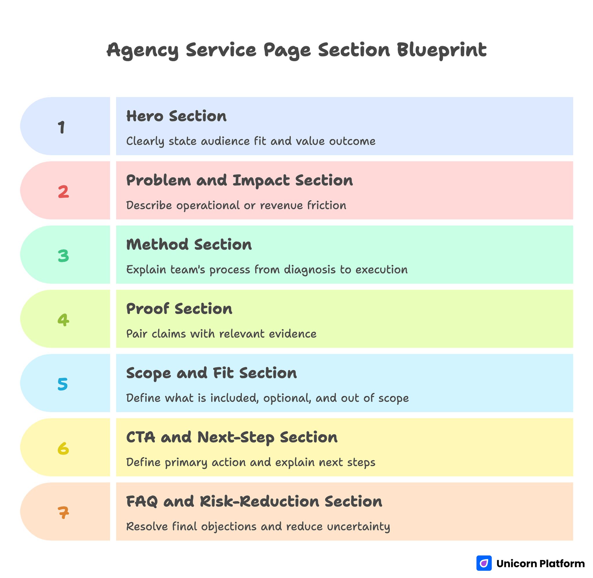
Agency Service Page Section Blueprint
Hero section
The hero must answer audience fit and value outcome in one scan. Use a direct statement of who the offer serves, what change the engagement delivers, and what next action is expected. Vague aspirational language weakens qualified interest.
Problem and impact section
Describe operational or revenue friction the target audience already feels. Focus on business consequences, not abstract pain narratives. This section should make visitors feel understood without exaggeration.
Method section
Explain how your team works from diagnosis to execution. Keep the process practical and transparent. Buyers evaluating services need operational confidence as much as strategic confidence.
Proof section
Pair each major claim with evidence close to that claim. Useful proof formats include short case narratives with context, time horizon, and measurable movement. Relevance beats volume.
Scope and fit section
State what is included, what is optional, and what is out of scope. Clear boundaries improve qualification quality and reduce downstream friction in sales calls.
CTA and next-step section
Define one primary action and explain what happens after that action. Ambiguity here is costly because it creates hesitation at the highest-intent moment.
FAQ and risk-reduction section
Resolve final objections around timeline, ownership, required client effort, and communication cadence. The goal is not to add text, but to remove decision uncertainty.
Positioning by Vertical and Buyer Role
Generalist copy usually underperforms because it asks buyers to map your capabilities to their context on their own. Stronger pages map context for them using role-aware framing and vertical-aware outcomes.
Role-specific framing can highlight different value dimensions. Founders often prioritize speed and risk management. Marketing leaders prioritize channel consistency and pipeline predictability. Revenue leaders prioritize qualified demand and sales efficiency.
Vertical-specific adaptation should stay disciplined. Keep the architectural backbone stable, then swap examples, objections, and proof that matter for each segment. This protects both scalability and clarity.
Proof Design: From Testimonials to Decision Evidence
Traditional testimonial blocks rarely fail because testimonials are bad. They fail because they are detached from the claim they should validate. Evidence should appear where uncertainty appears.
A practical evidence model for agencies uses three complementary proof types. Together they reduce uncertainty faster than a single testimonial cluster.
- capability proof: short case snapshot showing what changed and in what timeframe
- process proof: brief description of workflow, communication cadence, and responsibilities
- fit proof: explicit statement of where the offer performs best and where it does not
This model builds trust faster than large, unstructured social proof sections. Buyers evaluating premium services usually reward realism over hype.
Offer Packaging That Improves Lead Quality
Packaging clarity reduces both no-show calls and low-fit discovery requests. If visitors cannot determine what they are buying into, the page is generating friction that sales teams absorb later.
Define packaging with three layers and validate each one with your sales team. Packaging should make handoff easier, not just make the offer look comprehensive.
- primary engagement type and expected duration
- deliverables and decision checkpoints
- client-side inputs required for success
This structure sets realistic expectations and attracts prospects who are prepared for the engagement model you actually run. It also reduces discovery calls that stall because delivery expectations were never aligned.
Content-Led Demand Capture for Agency Growth
Many agencies generate significant traffic through educational content but fail to convert because the transition from learning to action is weak. Educational readers need a bridge, not a hard jump to a generic call booking form.
A strong bridge section summarizes how the educational topic connects to service outcomes, then offers a context-appropriate next step. The next step might be a scoped advisory call, diagnostic request, or strategic worksheet depending on intent depth.
If your acquisition model depends on educational assets, this content format strategy guide helps align article-to-offer pathways without diluting page focus. This is especially valuable when editorial traffic is high but inquiry quality remains inconsistent.
Course and Training Offers Without Funnel Confusion
Agencies that sell both services and training often mix both goals on one page and lose clarity. The better approach is parallel but connected pathways.
Service-oriented pages should optimize for implementation-seeking buyers. Training-oriented pages should optimize for skill-building intent and self-serve transformation. Cross-links can exist, but each page should keep one dominant conversion objective.
When building course-oriented pathways, this online course page framework can help structure outcomes, modules, and expectation language so enrollment quality improves. It can also reduce refund risk by clarifying learner fit before purchase.
CTA and Form Strategy for Better Qualification
A high-performing service page does not necessarily maximize form submissions. It maximizes useful submissions. Quality should be measured by progression, not just volume.
CTA language should describe the real next step, such as "Request a strategy assessment" or "Apply for a scoped discovery call," rather than generic verbs. Clear wording filters low-intent clicks and improves expectation quality.
Form fields should collect routing-critical information only. Requesting too much detail too early increases abandonment. Requesting too little detail increases downstream qualification friction. Balance should be informed by sales-process needs.
Mobile Conversion Reliability for Agency Buyers
Even enterprise buyers and B2B stakeholders frequently engage first on mobile. If first-screen clarity, proof visibility, or form usability degrades on smaller screens, qualified demand can leak before desktop follow-up ever happens.
Mobile review should include first-screen readability, tap-target spacing, scroll rhythm, form keyboard behavior, and load performance under typical network conditions. These checks should be mandatory gates before traffic scaling.
For teams working on behavior-level diagnosis of mobile drop-offs, this lead-quality optimization resource offers practical ways to connect conversion events with qualification outcomes. Use it to prevent mobile conversion gains that still produce weak downstream fit.
Experimentation Model That Produces Signal, Not Noise
Rapid page editing tools make it easy to run too many experiments at once. When multiple major elements change in one cycle, interpretation quality drops and teams cannot confidently identify winning decisions.
A stronger model uses one major hypothesis per cycle with one primary metric and one downstream guardrail metric. For example, if headline specificity is being tested, avoid simultaneous form redesign or major proof reshuffling.
Document each test in a fixed template so future iterations stay comparable. Consistent records make wins repeatable and failures easier to diagnose.
- hypothesis and target section
- expected behavior change
- success metric and guardrail metric
- decision criteria and observation window
- next action after review
This process improves learning continuity and reduces repetitive low-value testing. It also helps new contributors make safe changes without repeating past mistakes.
Scenario Playbooks
Scenario 1: High call volume, low proposal progression
This usually indicates early-stage CTA success with weak fit filtering. Tighten audience positioning in the hero, clarify scope boundaries, and adjust form prompts to collect routing-relevant context.
Evaluate success by proposal progression and close-path quality, not booking volume. This optimization toward commercial impact instead of vanity throughput.
Scenario 2: Strong educational traffic, weak service inquiries
The issue is often bridge failure between content and offer. Add a section that connects educational insights to measurable service outcomes and introduces one context-appropriate next step.
Track movement in qualified inquiry rate from educational sources. Rising volume without improved qualification should trigger another bridge-content review.
Scenario 3: Good conversion rate, poor onboarding quality
This pattern usually reflects over-promising language or unclear post-conversion expectations. Rework claims for precision, add fit constraints, and clarify how engagement starts.
Measure onboarding readiness and first-30-day retention quality. Early churn patterns often reveal expectation mismatches that the page can fix.
Scenario 4: Multi-vertical agency with inconsistent campaign outcomes
The likely problem is uncontrolled template drift across segments. Reintroduce a locked structural template and allow controlled variation only in proof, examples, and objection handling.
Compare results by vertical using a common metric framework for cleaner attribution. Shared measurement definitions prevent misleading comparisons between segments.
Cross-Functional Review for Page Quality
Page performance improves when strategy, delivery, sales, and operations contribute to review cycles. Each function sees different friction signals and can prevent avoidable conversion or quality issues.
A practical review cadence should be explicit and calendar-driven. Informal review cycles usually decay when campaign pressure increases.
- weekly: behavior and conversion signal check for active pages
- biweekly: priority edits for one major bottleneck per page
- monthly: quality review using sales-call and onboarding feedback
This cadence keeps pages aligned with real client concerns instead of static assumptions. Over time, it creates a strong feedback loop between delivery signals and messaging decisions.
30-Day Execution Plan
Week 1: Baseline and bottleneck selection
Audit top service pages by source, device, and qualification quality. Select one high-impact bottleneck for initial correction.
Week 2: Structural rewrite and QA
Apply the section blueprint to one priority page. Validate message match, proof placement, and CTA clarity across desktop and mobile.
Week 3: Controlled test launch
Run one major variable test against the control version. Track conversion behavior plus downstream quality signals.
Week 4: Standardize and scale
Document outcomes, update reusable templates, and apply winning patterns to the next priority page. Keep the change log concise but specific so decision history stays useful.
90-Day System for Compounding Gains
Month two should expand validated patterns across adjacent offers while preserving structure consistency. Keep test scope controlled and avoid broad redesigns without strong evidence.
Month three should institutionalize playbooks, including approved positioning frameworks, evidence modules, and QA checklists by offer type. This lowers contributor variance and improves launch confidence.
At 90 days, review should focus on consistency of qualified outcomes, not isolated conversion spikes. Sustainable agency growth depends on reliable quality, not occasional wins.
FAQ: Agency Service Page Strategy in 2026
1. How long should an agency service page be?
Length should follow decision complexity. Higher-risk offers need more context and proof. The correct length is the shortest version that removes the key uncertainties for a qualified buyer.
2. Should one page target multiple services?
Usually no for conversion-focused campaigns. Distinct service intents generally perform better with distinct pages that preserve message clarity and offer-specific proof.
3. What is the most important first optimization?
First-screen relevance and next-step clarity. If users cannot identify fit immediately, deeper sections will not recover most lost attention.
4. How many CTAs should a page have?
One dominant action path should lead. Repeated placement is fine on longer pages, but competing primary actions usually reduce commitment confidence.
5. What proof should appear earliest?
Proof that addresses the highest-likelihood objection for that audience. For many service offers, implementation realism and timeline clarity outperform generic praise.
6. How should agencies handle both course and service offers?
Use separate core pages with distinct conversion objectives. Connect them contextually, but avoid equal-priority competing paths in the hero.
7. What metrics matter beyond conversion rate?
Track qualified lead rate, proposal progression, show rate, close-path movement, and onboarding quality. These reveal whether conversion growth is commercially useful.
8. How often should pages be refreshed?
Run weekly micro-checks and monthly strategic updates. Proof modules and scope language should be reviewed at least quarterly to stay accurate and persuasive.
9. Can AI-generated copy replace human review?
AI can accelerate drafting and variant production, but human review should own positioning precision, claim safety, and release decisions. This balance keeps execution fast while preserving accountability for business-critical messaging.
10. What causes recurring inconsistency across pages?
Uncontrolled template drift and unclear ownership. Shared structural standards plus explicit review responsibility usually solve this issue quickly.
Final Takeaway
High-performing agency pages are built on sequencing discipline, not slogan density. Define intent clearly, structure sections by decision job, place trust where doubt appears, and present one confident next step.
With Unicorn Platform, teams can execute this model quickly and repeatedly. The real advantage appears when each cycle improves both conversion outcomes and the quality of leads moving through your pipeline.


