If you are choosing a coming soon page design, the real decision is not "which page looks nicest?" It is "what kind of prelaunch decision do I need the visitor to make?"
Some launches only need a short announcement and one clean email field. Others need a little more explanation before the signup feels credible. A few need the page to feel like an event, where the visual reveal itself carries part of the persuasion.
This page is built to answer that practical question. We reviewed the live Unicorn templates on July 14, 2026 and compared what is actually on the page now: the hero copy, CTA wording, section depth, information hierarchy, and how much rewriting each layout would need before it feels like a real launch asset instead of a placeholder.
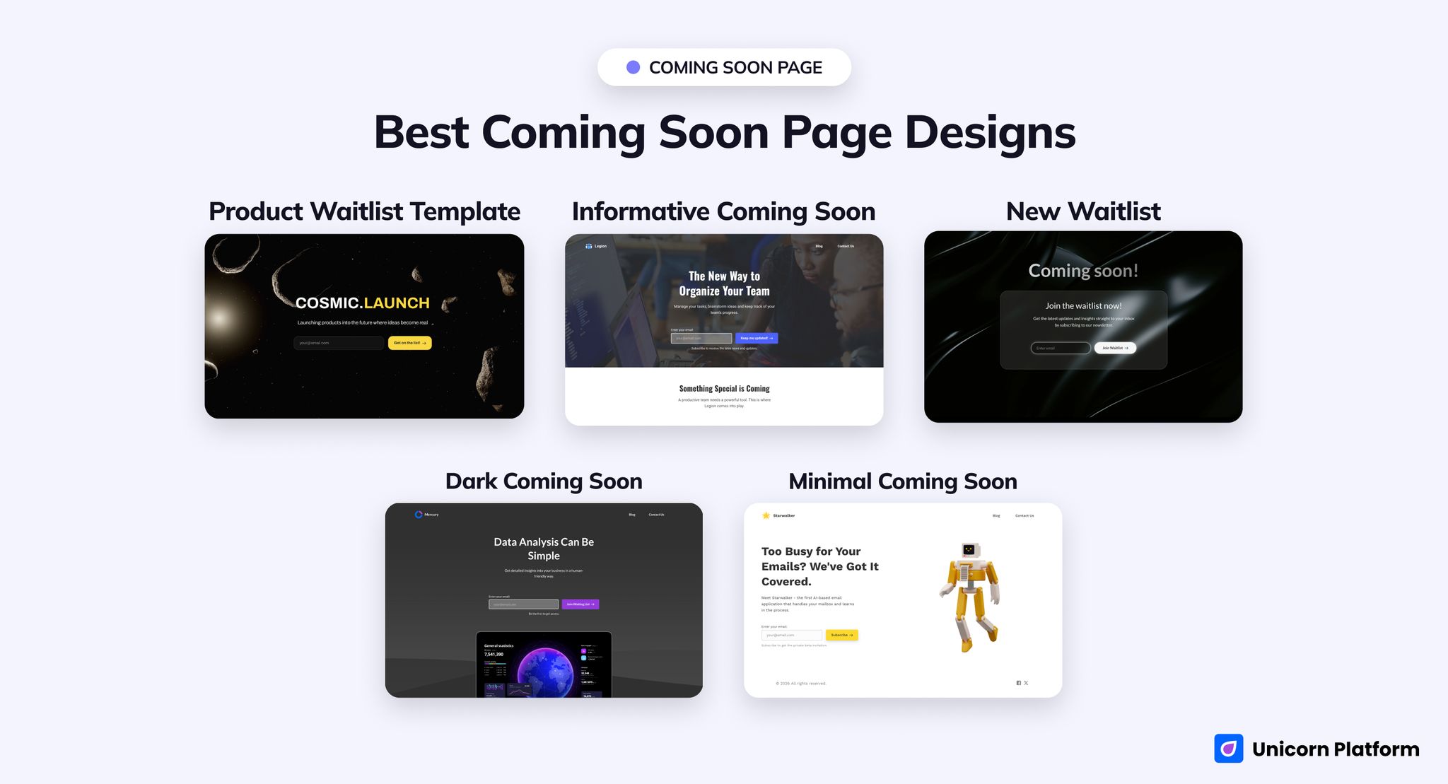
The best prelaunch layout depends on whether your page needs explanation, reveal energy, or the shortest possible path to signup.
Quick Answer
The best overall choice for most teams is Informative Coming Soon.
It wins because it already behaves like a fuller prelaunch page. In the live template, the hero sits above several explanation blocks and another signup point later on the page, so the layout can carry a launch story instead of only a headline and form. For products that need a little context before people subscribe, that structure is a much safer starting point.
The other four templates are still useful, but for narrower jobs:
-
Choose
Product Waitlistif you want a dramatic reveal page built around first-screen impact. -
Choose
Minimal Coming Soonif you need a calm private-beta signup page for software or an AI tool. -
Choose
Dark Coming Soonif your product can be explained in one line and should feel more serious than playful. -
Choose
New Waitlistif the page is really just an email-capture surface and speed matters more than announcement depth.
The simple rule is this: do not force the same structure to handle every prelaunch motion. A reveal page, a beta invite, and a waitlist-first page should not all be shaped the same way.
sbb-itb-bf47c9b
Who This Page Is For
This guide is for founders, marketers, and product teams that need a prelaunch page quickly but still want to choose the right structure before they start rewriting copy.
It is especially useful if you are deciding between:
- a fuller coming soon landing page with room for explanation
- a one-screen reveal page
- a software-style private-beta signup page
- a dark direct announcement page
- a waitlist-first page where signup flow matters more than storytelling
If your main question is launch strategy, follow-up systems, or post-signup operations, that is a different page type. Here, the job is narrower: pick the right starting design.
At a Glance: Best Picks by Scenario
Best overall structured prelaunch page
Informative Coming Soon
Best bold product reveal
Product Waitlist
Best minimalist software-beta teaser
Minimal Coming Soon
Best serious dark announcement page
Dark Coming Soon
Best fast waitlist-first alternative
New Waitlist
How We Evaluated These Templates
We reviewed these pages the way a startup team would review them before launch day, not the way a gallery site would review them for visual taste alone.
For each template, we looked at:
- what the first screen promises
- whether the CTA wording matches the page job
- how much real explanation the layout supports
- whether the page feels like a launch asset or just a placeholder
- how much customization work is needed before the page becomes believable
We also paid attention to exact on-page evidence. For example, does the live template already include repeated signup points, section headlines, beta framing, or a real product-story path? Or is it mostly one big mood shot plus an email field? That distinction matters much more than broad labels like "modern" or "clean."
The 5 Unicorn Picks
1. Informative Coming Soon
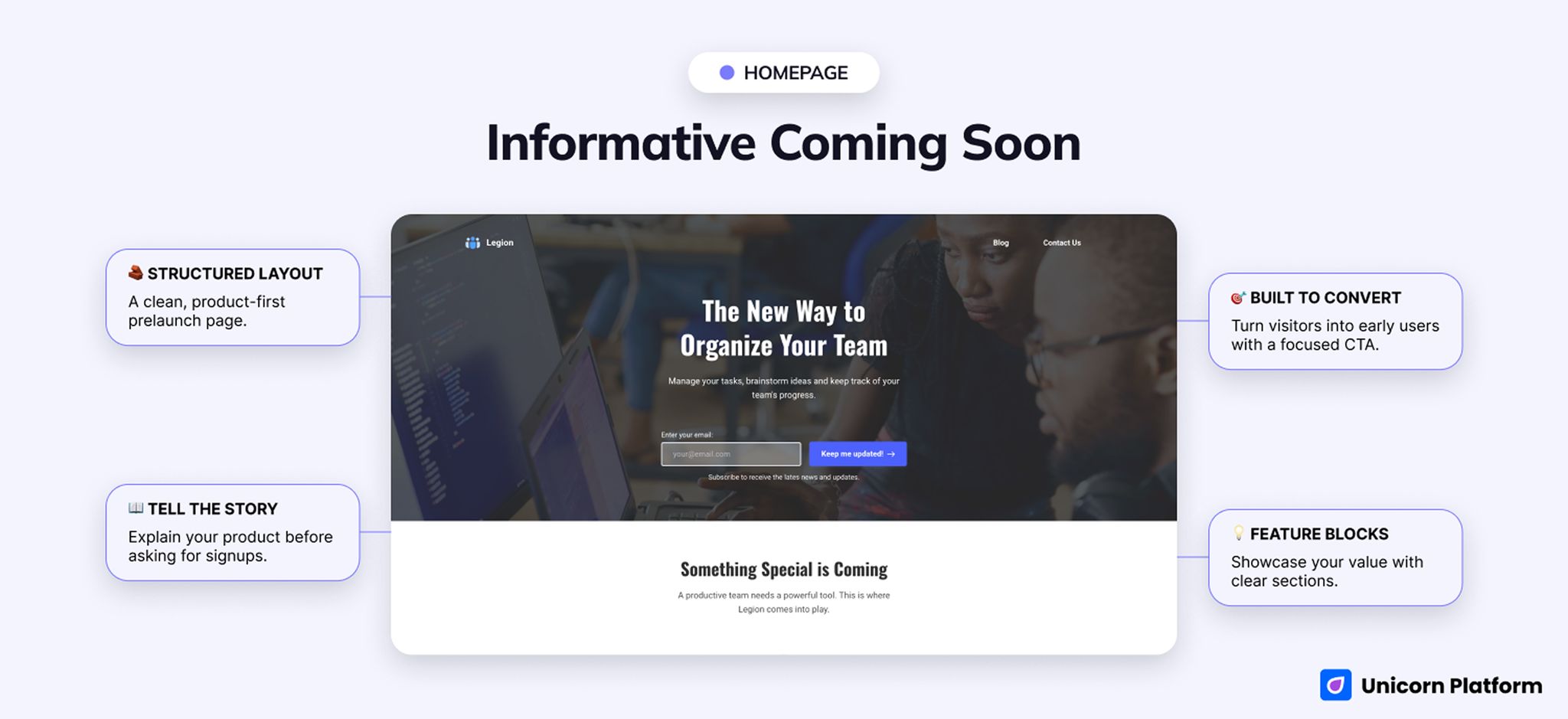
This is the best all-around option because it already supports a fuller launch story instead of just one announcement line.
- Best for: startup prelaunch pages, team-productivity teasers, launches that need explanation before signup
- Style: light, structured, product-led
- CTA style: keep me updated
- Strongest section: the explanation blocks below the hero
- First customization priority: replace the generic teamwork story with your actual product category and promise
- Biggest limitation: if you leave the default story untouched, the page feels polished but broad
This template earns the top spot because it already has enough structure to hold a real launch narrative. In the live version, the main headline is The New Way to Organize Your Team, and below it you immediately get supporting blocks labeled Collaborate, Brainstorm, and Organize. That is far more useful than a one-screen teaser when visitors need to understand what is being launched before they give you an email address.
For most startups, this is the easiest template to turn into a believable prelaunch page. You do not need to invent section order from scratch. You already have a hero, short explainer blocks, and repeated signup placement. That means the team can spend its effort on sharpening the promise instead of rebuilding the page architecture.
The main risk is not structural. It is positioning. The default copy is broad enough that many products could fit into it, so the page will feel generic unless you rewrite the category language fast. If you fix that early, this is the most dependable coming soon page design in the group.
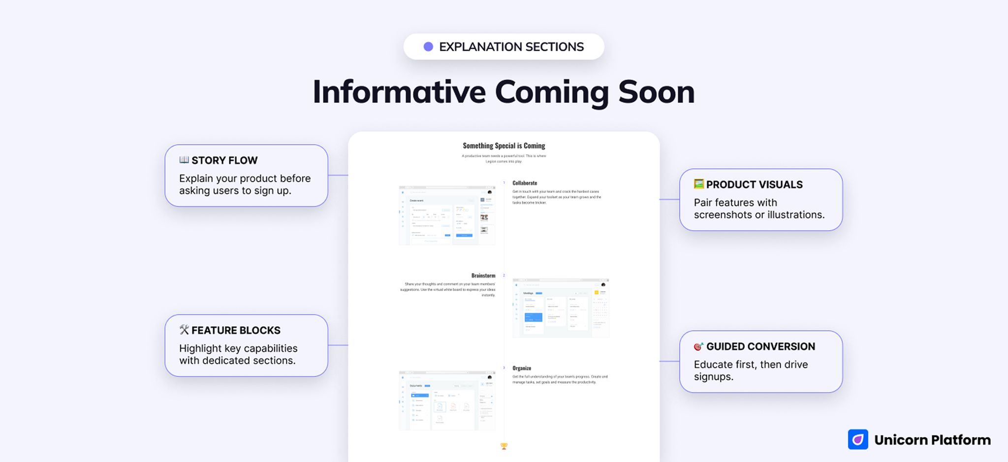
The built-in information hierarchy is the real advantage here. The template can explain the launch before asking again for commitment.
2. Product Waitlist
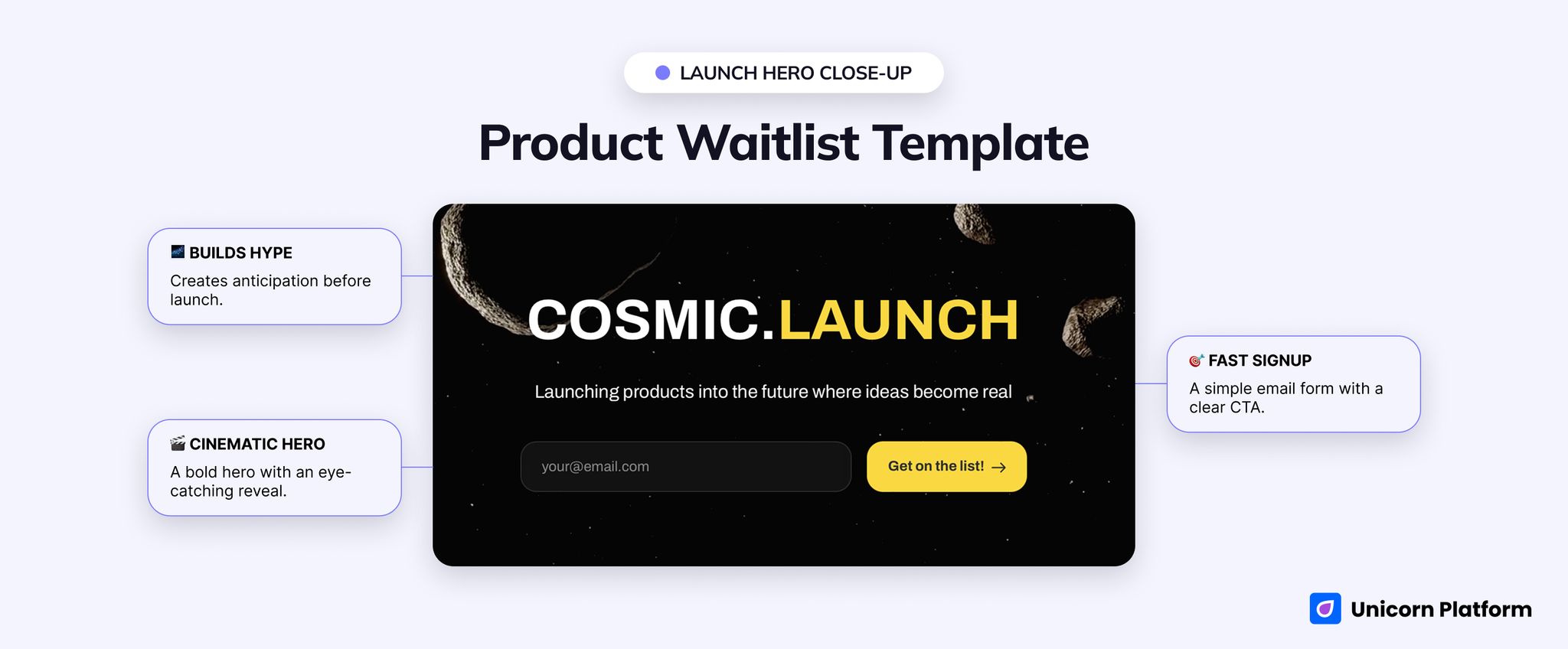
This is the strongest option when the launch should feel like a reveal, not a quiet announcement.
- Best for: product reveals, design-forward launches, bold prelaunch campaigns
- Style: futuristic, dark, cinematic, one-screen
- CTA style: get on the list
- Strongest section: first-screen launch energy
- First customization priority: replace the concept branding and add one credibility cue if buyers will be cautious
- Biggest limitation: there is very little room for proof, explanation, or objection handling
On the live page, the brand treatment does most of the work. The hero centers on Cosmic.Launch and the CTA reads Get on the list! The effect is immediate: this page feels like an unveiling.
This works best when the visual reveal is part of the conversion. Hardware concepts, design-led apps, and hype-driven startup announcements can benefit from a page that creates anticipation in seconds. If your audience is already warm, this layout can be enough.
What it does not do well is slower persuasion. There is not much built-in room for screenshots, operational detail, or trust-building language. So this template works best when curiosity is already high or when the product category is easy to grasp at a glance.
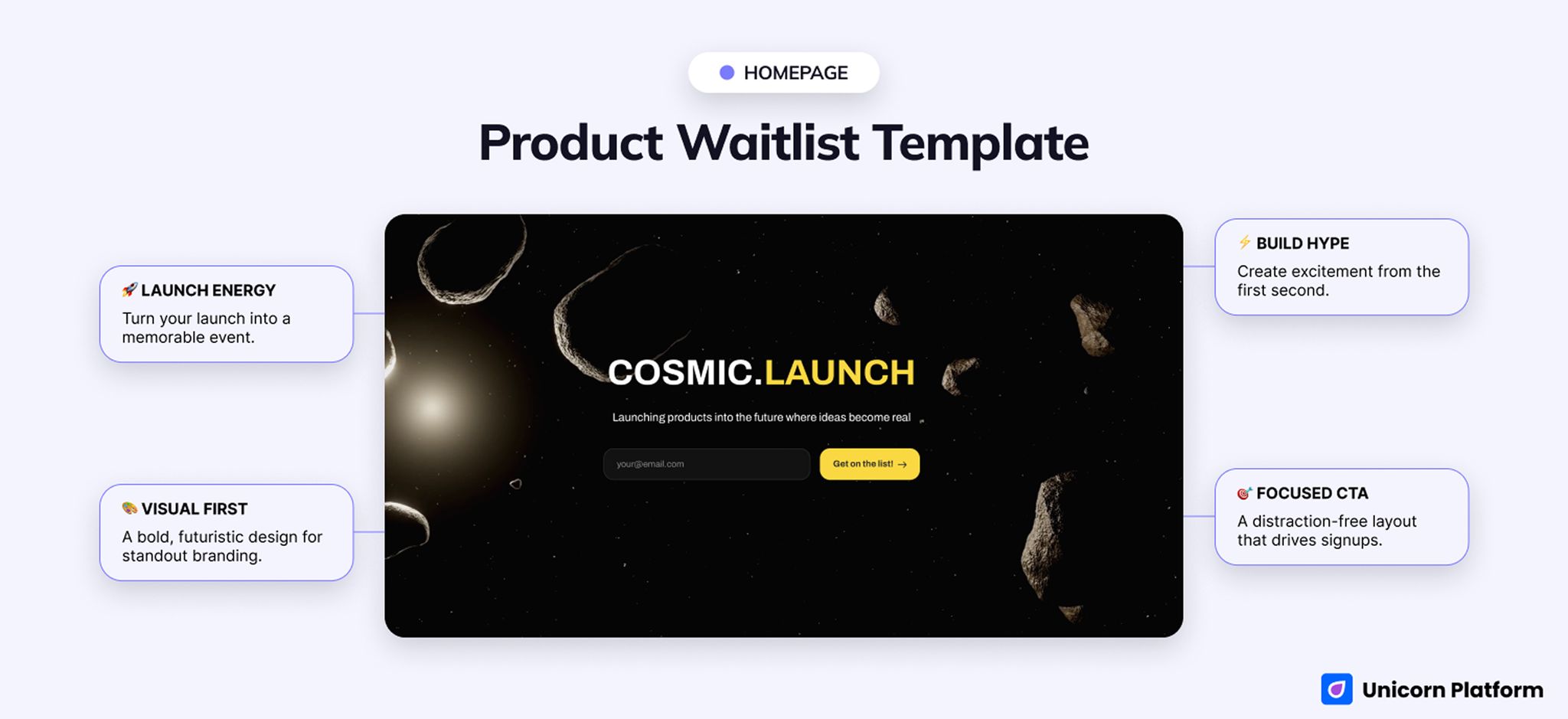
The page sells anticipation first. Use it when mood and launch energy are part of the pitch.
3. Minimal Coming Soon
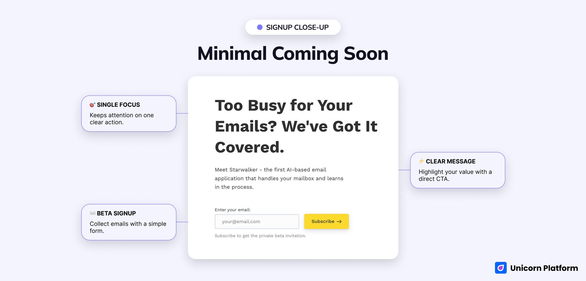
This is the cleanest fit for a software-style beta page that should stay short and controlled.
- Best for: software betas, AI tools, private-beta invites, simple prelaunch signup pages
- Style: minimal, clean, software-oriented, beta-led
- CTA style: subscribe for private beta
- Strongest section: the low-friction beta ask
- First customization priority: rewrite the email-product angle so the beta promise matches your real category
- Biggest limitation: there is not much room for proof or deeper context
This one behaves less like a broad announcement page and more like a disciplined beta invite. The live hero reads Too Busy for Your Emails? We've Got It Covered. and the CTA is Subscribe, which gives the page a clear software-beta frame right away.
That frame is useful if your product is simple to understand and the first ask is modest. AI tools, focused utilities, and lightweight SaaS launches often do not need a long prelaunch story. They need a clear promise, a calm interface, and a reason to join early.
The constraint becomes obvious as soon as you picture colder traffic. If people need reassurance, proof, or a more detailed picture of what is coming, this template runs out of room quickly. It is best when the offer can be explained in one clean sentence.
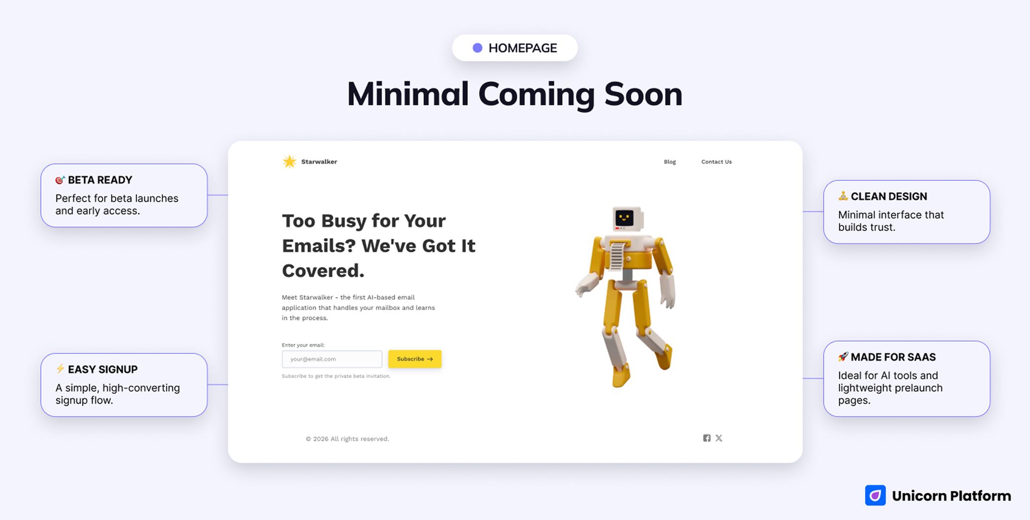
The strength here is discipline. The page stays focused on one beta action without adding extra noise.
4. Dark Coming Soon
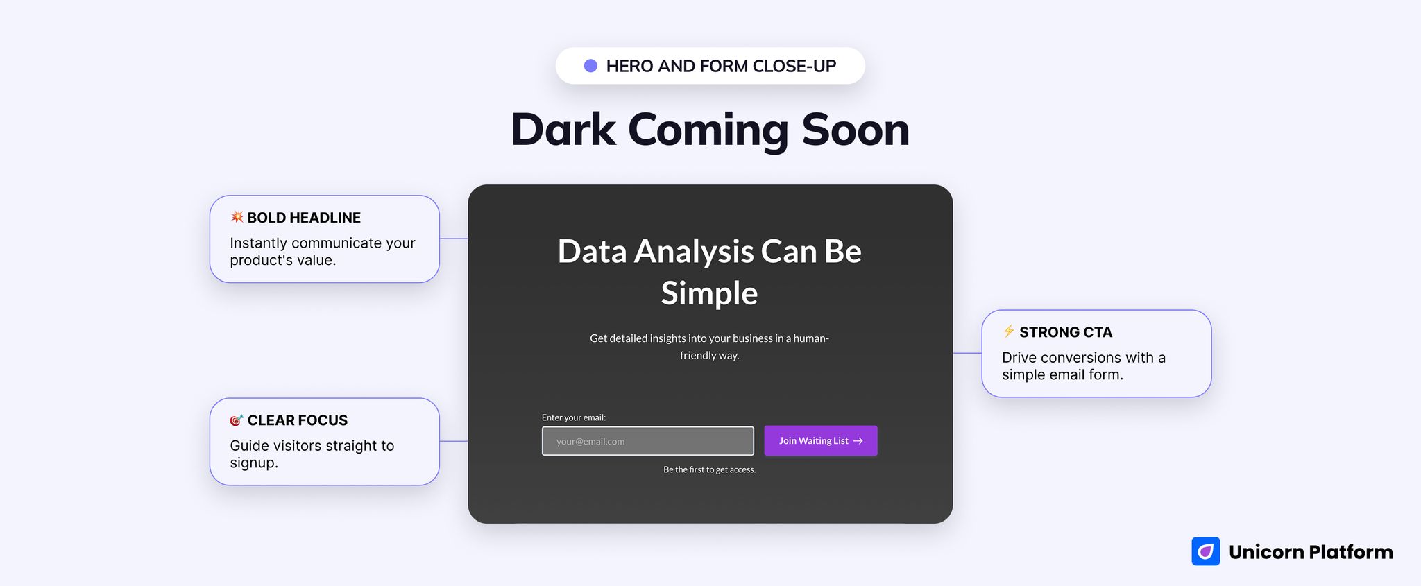
This template works when your announcement should feel direct, controlled, and a little more mature.
- Best for: lightweight B2B teasers, analytics tools, quick product announcements, simple startup launch pages
- Style: dark, direct, serious, announcement-led
- CTA style: join waiting list
- Strongest section: the direct hero plus form combination
- First customization priority: replace the generic category statement and add one proof cue near the form
- Biggest limitation: sparse by default for launches that need more than one reason to believe
What stands out in the live version is how little it tries to do. The headline is Data Analysis Can Be Simple, and the form CTA is Join Waiting List. There is almost no friction between the value statement and the next action.
It is a practical fit for straightforward B2B launches where the message is already tight. If your page only needs to say what the product does, who it helps, and how to get updates, this layout keeps the path clear.
The problem is not the visual style. It is the lack of depth. Without a screenshot, trust cue, or short expectation block, the page can feel too light for careful buyers. Use it when simplicity is a strength, not when your launch needs a lot of education.
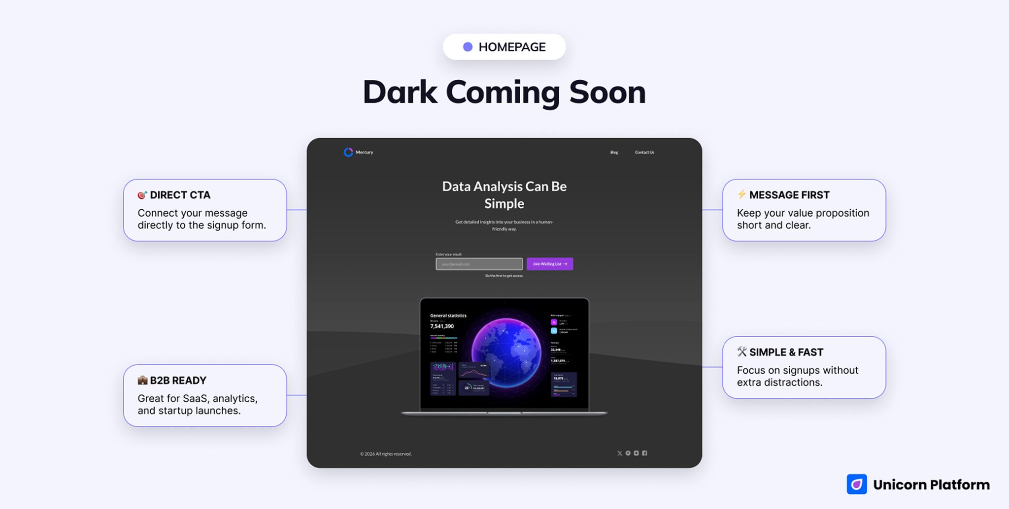
The main advantage is focus. This layout gets visitors from message to action with almost no detour.
5. New Waitlist
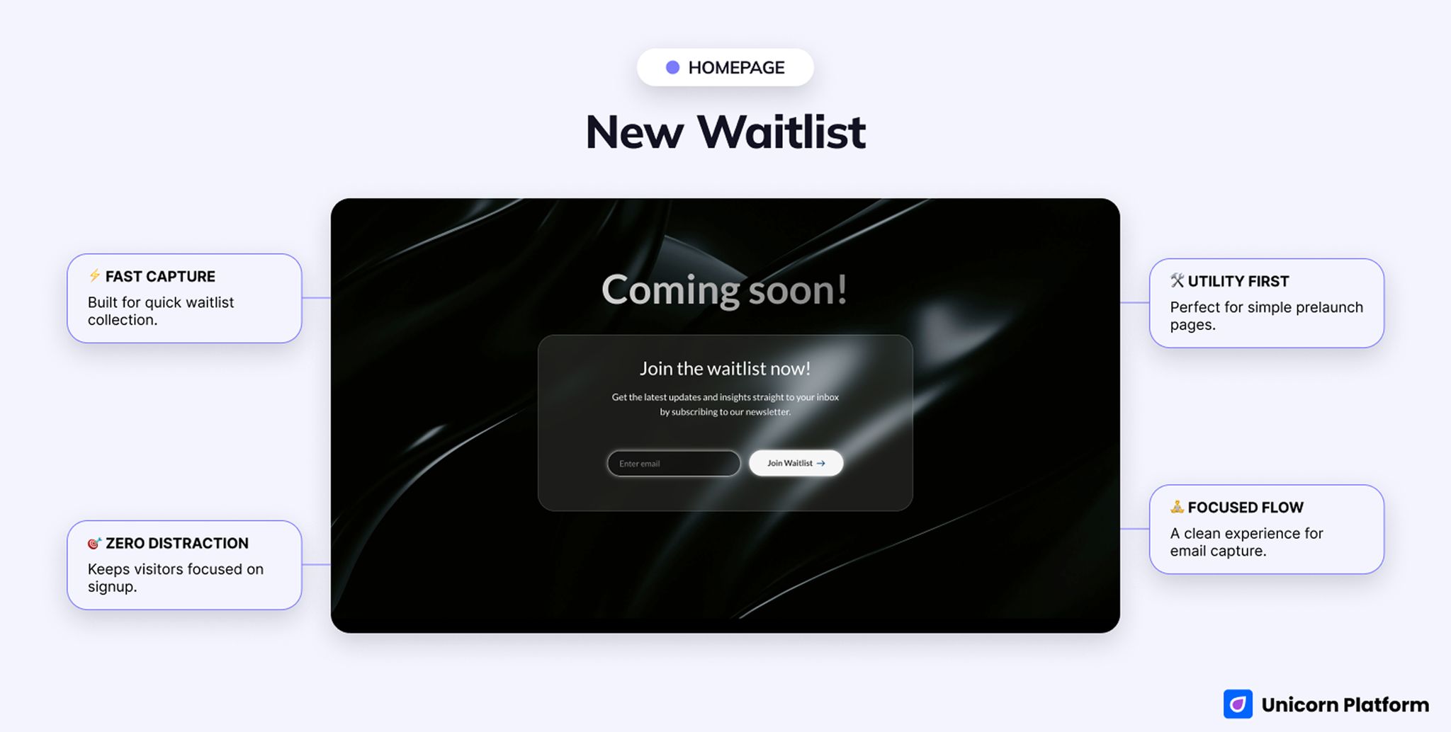
This is the fastest route to list capture, but it behaves more like a waitlist page than a broad announcement page.
- Best for: bare-minimum launch pages, direct waitlist capture, one-screen prelaunch forms
- Style: ultra-minimal, utility-first, list-focused
- CTA style: join waitlist
- Strongest section: zero-distraction signup flow
- First customization priority: add one line of real launch context so the page does not feel empty
- Biggest limitation: it is too narrow for most explanation-heavy launches
If you strip the job down to "collect interested emails fast," this template makes sense. The live headline is simply Join the waitlist now! and the whole page is built around that one action.
There are situations where that is exactly the right answer. Founder betas, small experiments, and fast validation tests do not always need a fuller announcement page. Sometimes the team just needs a clean, low-friction list-capture surface.
Still, this is the easiest template here to undercook. Without one line of category context or a concrete reason to join, the page can feel like an unfinished draft. It is best used deliberately, not because the team ran out of time.
Side-by-Side Comparison Table
| Template | Best for | Style | Strongest section | Notable gap | Launch speed |
|---|---|---|---|---|---|
| Informative Coming Soon | Startup prelaunch pages that need explanation | Structured and product-led | Multi-section product story plus repeated signup points | Needs sharper positioning to avoid feeling generic | Medium-fast |
| Product Waitlist | Bold launch reveals and design-forward campaigns | Futuristic and cinematic | First-screen reveal energy | Too thin for cautious or detail-heavy launches | Fast |
| Minimal Coming Soon | Software betas and AI-tool teasers | Minimal and software-oriented | Headline plus private-beta ask | Limited room for proof or objections | Fast |
| Dark Coming Soon | Direct business-style announcements | Dark and serious | Hero plus low-friction form | Sparse for explanation-heavy launches | Fast |
| New Waitlist | Pure list capture with minimal storytelling | Ultra-minimal and utility-first | Zero-distraction signup flow | More waitlist page than broad coming soon design | Fastest |
Best for Specific Prelaunch Goals
Best when visitors need a little explanation before they sign up
Choose Informative Coming Soon.
It is the only option in this group that already includes enough content structure to support a real product-story path.
Best for a launch that should feel like a reveal
Choose Product Waitlist.
Its live presentation is closer to a cinematic announcement than to a conventional landing page, which is exactly why it works for hype-led launches.
Best for a calm software beta invite
Choose Minimal Coming Soon.
This is the cleanest page when your main goal is to collect interest for a private beta without adding a lot of extra explanation.
Best for a direct serious announcement
Choose Dark Coming Soon.
If your message is already tight and business-like, this template gives it a cleaner frame than the brighter or more reveal-driven options.
Best when signups matter more than announcement design
Choose New Waitlist.
If the page only needs to capture interest and route people into follow-up, it is often smarter to use the shortest structure on purpose.
What a Strong Coming Soon Page Design Needs
After reviewing these five pages, the strongest prelaunch layouts consistently do five jobs well:
- tell visitors what is launching and who it is for
- make the next action obvious within a few seconds
- give enough context to make signup feel rational
- place trust or expectation cues near the form
- stay readable and low-friction on mobile
That is why the best pages here do not win on style alone. They win when the structure matches the actual job of the page.
Coming Soon Page Design vs Waitlist-First Page
A broader coming soon landing page usually has a wider role than a waitlist-first page. It can carry launch atmosphere, a little more category framing, and some product explanation before the form.
A waitlist-first page is tighter by design. Its main job is to capture signups and set early-access expectations with minimal distraction. If that is what your page really needs, use this deeper waitlist templates page instead of stretching a broader announcement layout into the wrong job.
The easiest rule is simple: if the page mainly needs to announce something that is coming, start with a coming-soon structure. If the page mainly needs to move people onto a list fast, a waitlist-first structure is usually better.
What to Customize First Before Launch
No matter which design you choose, start with the changes that improve clarity fastest.
- Rewrite the headline so it names the real product category and audience.
- Replace the default story with your actual launch angle.
- Tighten the CTA copy so visitors know what happens after signup.
- Add one screenshot, trust cue, or expectation block near the form.
- Remove sections that do not support the one action you want.
- Make the thank-you state explain timing and next steps clearly.
If you need a deeper process after the design choice is made, use this coming soon page strategy guide to connect the layout with follow-up and launch operations.
When This Type of Template Is the Wrong Fit
These templates are not the right starting point when:
- you need a full product marketing site with several stakeholder paths
- the page is really a docs, demo-booking, or onboarding surface
- buyers need detailed pricing or procurement information before signing up
- the product story is still too vague to explain in one page
- the audience needs heavy education before a prelaunch form can convert
In those cases, a fuller software site, documentation page, or tighter waitlist page usually saves more time than forcing a coming soon layout to do the wrong job.
Why Build This in Unicorn Platform
Unicorn Platform is a good fit for this page type because teams can test very different launch motions without rebuilding from zero each time. You can try a structured explainer page, a one-screen reveal page, or a minimal signup surface while keeping the production workload low.
That matters in prelaunch because positioning often changes quickly. The best workflow is usually to pick the right page shape first, then refine message, visuals, and CTA language inside that structure as the launch gets closer.
Final Recommendation
If you are unsure where to start, begin with Informative Coming Soon. It is the safest default because it gives most teams enough room to explain the launch before asking for commitment.
Move to Product Waitlist only when reveal energy is a core part of the pitch. Pick Minimal Coming Soon if you are launching a software beta with a very clear promise. Use Dark Coming Soon when the message is direct and B2B-leaning. Choose New Waitlist only when the page is truly about fast list capture and little else.
The best coming soon page design is not the fanciest one. It is the one whose structure already matches the decision you are asking the visitor to make.