Table of Contents
- The Conversion Flow Framework: From Click to Qualified Activation
- A Practical Build Workflow for Small Teams
- Scenario Playbooks
- Common Mistakes and Their Fixes
- 30-Day Optimization Plan
- FAQ
Traffic is rarely the hardest part of app growth. Teams can run ads, publish social campaigns, launch creator partnerships, and drive visits at scale. The challenge appears one step later: many visitors click with intent, land on a page, and leave without installing, signing up, or understanding why the product matters.
That drop-off is usually not caused by one dramatic mistake. It comes from smaller compounding issues: unclear first-screen value, vague proof, mixed calls to action, weak transition to app-store context, and promises that do not match onboarding reality. When those issues stack together, acquisition becomes expensive and lead quality declines.
A strong landing experience for a mobile product does not need complex design tricks. It needs message clarity, trust signals, and a flow that helps people make one confident decision. When those foundations are in place, design and channel optimization become far easier to scale.
This guide focuses on execution. It shows how to structure the page, choose proof, reduce friction, align messaging with activation quality, and run a repeatable optimization cycle.
sbb-itb-bf47c9b
Key Takeaways
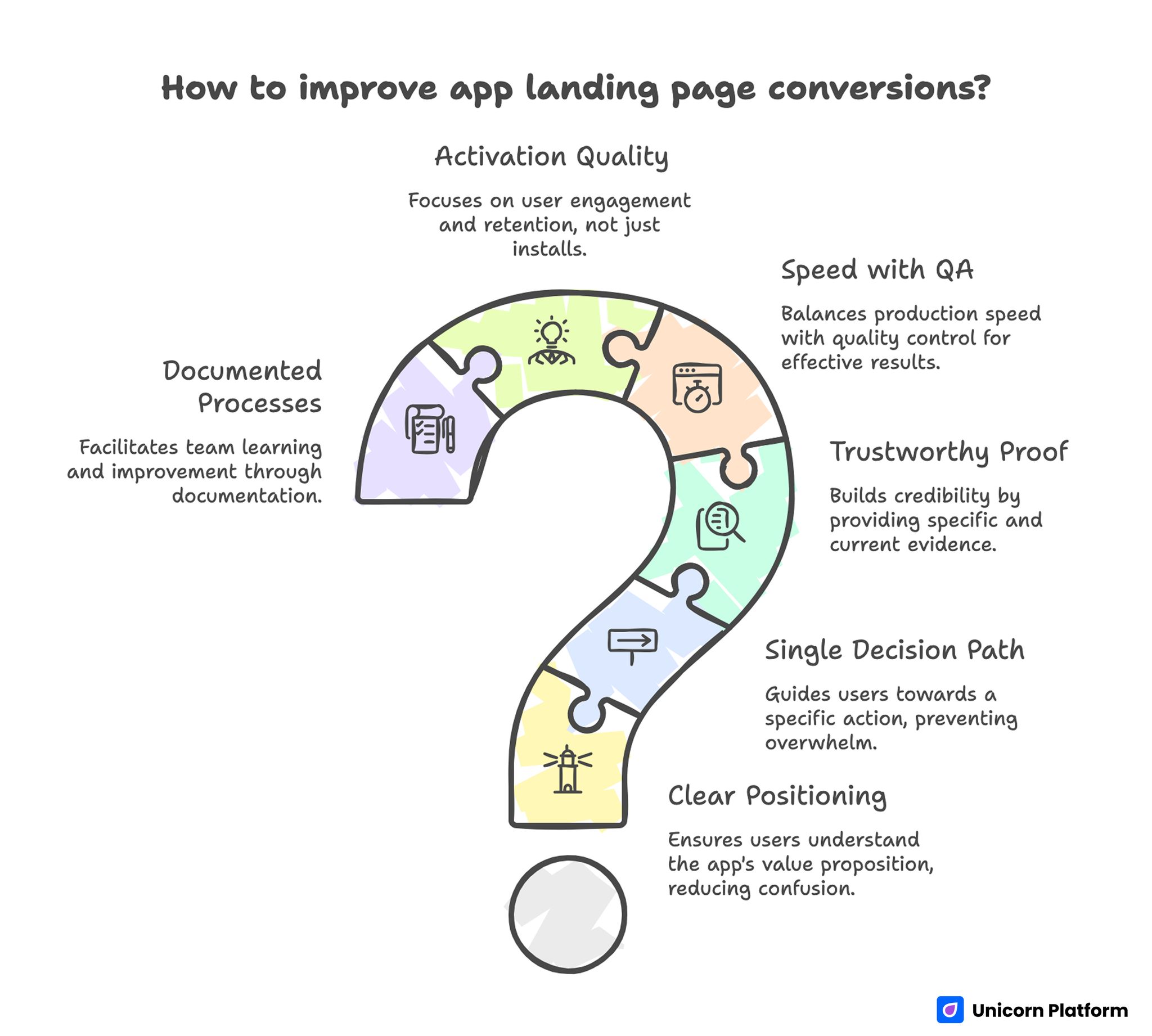
Key Takeaways for Improving App Landing Page Conversion
- Most conversion problems start with unclear positioning, not weak design aesthetics.
- A page should guide one decision path, not present five competing actions.
- Proof must be close to claims, specific in language, and current enough to trust.
- Speed of production matters only when paired with strict editorial QA.
- Install volume is not enough; activation quality should guide optimization.
- Teams improve faster when prompts, tests, and decisions are documented.
Why App Landing Pages Underperform
Many teams treat the page as an ad extension instead of a decision environment. The ad sets an expectation, but the page then shifts tone, introduces broader messaging, or asks users to act before explaining value. That mismatch creates immediate hesitation.
Another common issue is feature overload. Pages list every capability while skipping user outcomes, so visitors cannot quickly answer the question that matters most: "Will this help me solve my problem in a realistic timeframe?"
Trust structure is also often weak. Teams place testimonials too far from claims, hide onboarding details, and avoid practical constraints. Users then assume hidden complexity and postpone action.
The fix is not more content for the sake of length. The fix is better content architecture that reduces cognitive load and increases confidence at each step.
The Conversion Flow Framework: From Click to Qualified Activation
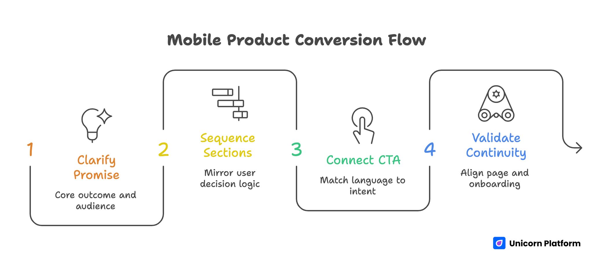
Mobile Product Conversion Flow
For mobile products, good page performance should be evaluated as a chain. This keeps teams from celebrating shallow wins that do not improve retained usage.
- Click-to-page arrival quality.
- First-screen comprehension.
- CTA interaction intent.
- Install or signup completion.
- Early activation behavior.
If you optimize only the first link in that chain, growth appears strong while retention and monetization suffer. A practical operating model aligns copy decisions with downstream behavior signals.
Step 1: Clarify the First-Screen Promise
The headline should communicate one core outcome and one clear audience context. Avoid broad phrases like "smart automation for everyone." Users should immediately recognize who the product is for and what result they can expect.
Subhead text should explain mechanism, not repeat the headline in different words. A useful formula is: problem context, workflow benefit, and time-to-value expectation.
Step 2: Sequence Sections by Decision Risk
Users do not evaluate information in random order. They typically ask:
- Is this relevant to me?
- Does it actually work?
- Is setup realistic?
- Is there risk in trying it?
Your section order should mirror that logic. A common high-performing sequence is relevance, mechanism, proof, onboarding clarity, pricing context, and action.
For teams refining page architecture in more depth, this guide on high-converting landing page structure is a useful blueprint. Use it to validate section order before investing time in copy polish.
Step 3: Connect CTA Language to Intent Stage
A top-of-funnel visitor often prefers low-commitment actions such as seeing a demo, previewing workflows, or testing a lightweight feature. A decision-stage visitor may accept install or signup directly.
Choose one primary action per page state. Secondary links can exist, but the visual hierarchy should make the main path obvious.
Step 4: Validate Promise-to-Onboarding Continuity
If the page promises fast setup, onboarding must support that claim. If the page promises ease, the first in-product steps should confirm it. Teams lose trust when page messaging and activation experience diverge.
Consistency across ad text, page copy, and store listing improves decision confidence and reduces abandoned installs. Message continuity is one of the simplest levers for improving conversion quality without increasing traffic spend.
Message Design for AI-Enabled Mobile Apps
AI-related claims can increase attention, but they also increase skepticism. Users have seen too many broad claims without practical explanation. The strongest pages describe where automation helps, where user control remains, and what outcomes are realistic.
A clear message pattern includes the elements below. Each element reduces ambiguity and helps users evaluate fit faster.
- Job-to-be-done context.
- Specific AI-assisted workflow.
- Human oversight or correction path.
- Expected result and boundaries.
That structure signals credibility. It also helps users decide whether the product fits their workflow before installation.
When teams need a deeper framework for positioning AI functionality in app narratives, this AI app development overview provides useful context for planning. The key is translating strategy into page sections that guide one clear decision path.
Pricing Context Without Conversion Friction
Hiding all pricing information is rarely a trust strategy. Users do not always need full plan tables on the first screen, but they do need expectation anchors.
Useful pricing context can include the signals below. Together they reduce uncertainty without turning the page into a full pricing table.
- Who the product is best for at each tier.
- What triggers an upgrade.
- What is included during trial.
- Which constraints apply before paid commitment.
This approach filters unqualified traffic early and improves the quality of downstream conversations. It also lowers support friction because users arrive with more realistic expectations.
If your app includes AI-heavy workflows and teams ask cost questions early, this breakdown of AI app development cost drivers helps frame transparent communication. Use that context to shape your pricing explanation in plain language rather than technical jargon.
Designing for Mobile Behavior, Not Desktop Habits
Pages for app acquisition should be reviewed on real devices first. Desktop previews are useful, but many conversion breaks only appear on smaller screens.
High-impact checks include the list below. These checks catch friction that is easy to miss on desktop previews.
- Above-the-fold clarity without dense text blocks.
- Tap target size and spacing for primary actions.
- Proof readability without pinching or zooming.
- Fast media loading under variable network conditions.
- Smooth transition to store or signup flow.
Micro-friction on mobile compounds quickly. A small layout issue can erase gains from otherwise strong messaging.
Teams launching quickly for iOS campaigns can use this no-code iOS page setup guide as a practical implementation reference. It is most valuable when paired with a strict QA pass before scale.
Proof Strategy That Increases Confidence
Proof should be selected by user objection, not by available assets. Different visitors need different reassurance.
A practical proof stack often includes the evidence types below. Choosing proof by objection makes each section more persuasive.
- Outcome evidence: what changed for similar users.
- Reliability evidence: stability, support responsiveness, or known constraints.
- Usability evidence: setup time and adoption curve.
- Trust evidence: security language, clear policy links, and realistic claims.
Place proof near the claims it supports. Do not move all testimonials to one isolated block at the bottom.
Avoid vanity proof like raw install counts without context. A smaller but specific evidence point usually builds more trust than a large generic number.
A Practical Build Workflow for Small Teams
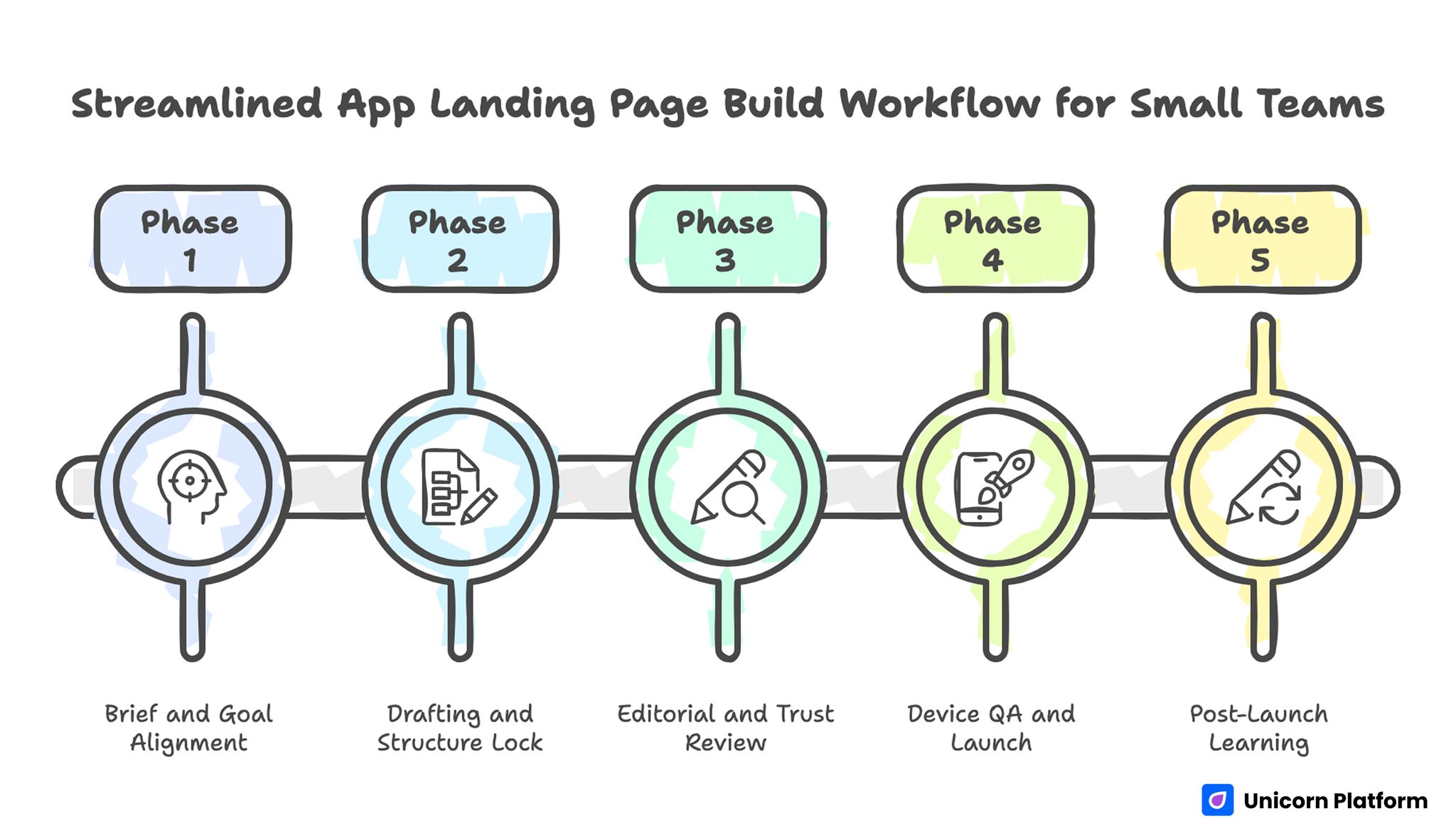
Streamlined App Landing Page Workflow for Small Teams
Most startup teams need a system they can run weekly without adding process weight. A lean workflow can still produce strong results when responsibilities are explicit.
Phase 1: Brief and Goal Alignment
Define one audience segment, one page objective, and one quality metric beyond click-through rate. This keeps the page focused and the test interpretable.
Phase 2: Drafting and Structure Lock
Create two or three variants for first-screen copy and section order. Pick one structure before polishing wording. Structural drift during copy editing wastes time.
Phase 3: Editorial and Trust Review
Review claims for precision, remove vague hype language, and ensure each major claim has a nearby proof element. This step protects trust and reduces the risk of overpromising.
Phase 4: Device QA and Launch
Test on iOS and Android devices, verify CTA path continuity, and launch with event tracking enabled. Track failures immediately so launch-day fixes are based on evidence.
Phase 5: Post-Launch Learning
Review behavior by section, not only page-level conversion. Update one high-impact section per cycle.
For fast experimentation workflows, this walkthrough on creating app-focused pages with Unicorn Platform can complement the framework above. Apply it as an execution reference, then adapt section logic to your own audience and funnel stage.
Scenario Playbooks
Scenario 1: Consumer Productivity App With High Clicks, Low Retention
Ad creative performs well and install volume looks healthy, but day-1 usage remains weak. In many cases the page overpromises automation speed and underexplains setup effort, so users install with inflated expectations and disengage quickly. The fix is to reduce hype language, add realistic onboarding steps, and place a short "what happens after install" section before the primary CTA. The expected result is fewer low-intent installs and better early activation quality.
Scenario 2: B2B Mobile Tool With Long Sales Cycles
Signup volume looks healthy, but qualified pipeline stays weak after handoff. This usually happens when the page attracts broad interest without clarifying fit constraints, user role, or deployment expectations. Add role-specific use cases, plan-fit guidance, and a concise "best for" block in early sections so visitors can self-qualify. The outcome is often lower raw signup volume but higher quality leads and shorter sales qualification cycles.
Scenario 3: Startup Launching New Feature Campaigns Weekly
Publishing pace is fast, but learning does not accumulate across releases. The root cause is usually undocumented tests, inconsistent section edits, and unclear ownership of decisions. Keep a variant log with hypothesis, changed section, launch date, and measured impact so each experiment informs the next one. This creates compounding improvement and reduces repeated experimentation.
Common Mistakes and Their Fixes
Mistake 1: Asking for action before relevance is clear
Fix: ensure the first-screen copy answers who the product helps and what concrete result users can expect. If a visitor cannot explain your value in one sentence after five seconds, the page needs revision.
Mistake 2: Treating AI as a credibility shortcut
Fix: explain practical workflow improvements, boundaries, and user control points instead of broad intelligence claims. Credibility grows when you describe realistic outcomes and limits together.
Mistake 3: Stacking multiple primary CTAs on one screen
Fix: choose one main action and support it with contextual secondary paths only when necessary. Too many equal CTAs dilute user attention and weaken intent signals.
Mistake 4: Hiding onboarding complexity
Fix: show setup expectations honestly, including time, prerequisites, and first-success milestone. Transparent onboarding details reduce regret-driven churn after install.
Mistake 5: Optimizing for installs only
Fix: evaluate page changes against activation and retained-usage signals, not volume alone. Install spikes without quality indicators often hide message mismatch problems.
Mistake 6: Running design changes without measurement context
Fix: predefine event mapping and review windows before launch so results are actionable. Measurement discipline is what turns creative edits into reliable growth decisions.
Mistake 7: Publishing fast without a review gate
Fix: add a mandatory editorial pass for factual accuracy, claim quality, and readability. This protects brand trust while the team increases publishing speed.
30-Day Optimization Plan
Week 1: Diagnose
Audit current pages using five lenses: relevance clarity, proof placement, CTA logic, onboarding transparency, and mobile usability. Identify one primary conversion bottleneck.
Week 2: Rebuild Core Sections
Rewrite first-screen messaging, restructure page flow by decision risk, and refresh proof assets. Keep one objective per variant.
Week 3: Launch Controlled Tests
Run one structural test and one message test. Use stable traffic windows and avoid overlapping experiments that obscure causality.
Week 4: Consolidate Learning
Promote the winner into default template, document why it won, and schedule one follow-up test tied to downstream activation. Repeat this cycle monthly so improvements compound instead of resetting with each campaign.
Channel-Specific Variant Strategy
One page rarely performs equally well across paid search, social, creator campaigns, and partner traffic. Visitors arrive with different intent and context, so using one static narrative often reduces relevance. A better approach is to keep a shared page backbone while adapting first-screen framing, proof order, and CTA language by channel.
For paid search, users usually respond to clarity and speed. Keep the opening specific, place practical proof early, and reduce visual distraction around the primary action. For social and creator traffic, users often need stronger narrative context and use-case explanation before committing to install or signup. In partner channels, trust transfer matters more, so role-fit language and integration cues should appear earlier.
This does not require full redesign for every campaign. Maintain one core template with modular sections that can be swapped without breaking analytics continuity. If you change too many variables at once, interpretation becomes difficult and iteration slows. Focus on one variant objective per channel cycle and compare performance against downstream quality metrics, not only click-to-install rate.
Over time, channel-specific variants reveal message patterns that can be promoted into the default template. That is where compounding value appears: each experiment improves both short-term conversion and long-term editorial clarity.
Editorial QA Checklist Before Scaling Traffic
Use this checklist as a release gate. Running the same checks before every launch keeps quality stable at higher publishing speed.
- First-screen value statement is specific and audience-matched.
- Main CTA aligns with user intent stage.
- Core claims have nearby proof.
- Setup and onboarding expectations are realistic.
- Pricing context reduces uncertainty without overload.
- Mobile layout is tested on real devices.
- Event tracking covers section behavior and conversion path.
- Final copy avoids vague superlatives and unsupported promises.
A consistent QA gate protects conversion quality when teams scale publishing speed. It also reduces debate because release decisions are tied to explicit criteria.
FAQ: App Landing Pages for Mobile Products
1. How long should an app landing page be?
Length should match decision complexity. Simple utility apps may convert with concise pages, while higher-consideration products need deeper sections on proof, setup, and fit. A better rule than word count is whether users can resolve their top objections before the CTA.
2. Should I send paid traffic directly to an app-store listing?
Usually no. A focused pre-store page improves message control, addresses objections, and qualifies users before install. Direct-to-store traffic can work for branded demand, but cold traffic often needs more context first.
3. What is the best primary CTA for first-time visitors?
Use a low-friction action when intent is early, such as previewing workflows or starting a guided trial. Move to install-focused actions when relevance is established.
4. How do I write AI-related copy without sounding generic?
Describe practical tasks the system improves, where human input remains, and what outcomes users should expect in normal conditions. This approach reduces skepticism because it sounds operational rather than promotional.
5. How much pricing detail is needed on the page?
Enough to reduce uncertainty. Users need plan-fit clarity and expectation anchors, even if full pricing tables appear later in the flow.
6. What metrics matter beyond click-through rate?
Track install completion, first-session success, day-1 retention, and qualified conversion behavior by traffic source. Reviewing those metrics together helps teams avoid optimizing one stage at the expense of another.
7. How often should I update landing-page copy?
Review high-traffic pages at least monthly and update sooner when product changes, pricing changes, or performance drops significantly. Fast refresh cycles are especially important for campaign-heavy products.
8. Can one page serve all audience segments?
It can introduce the product, but high performance usually requires intent-specific or segment-specific variants for stronger relevance. Variant strategy improves fit without forcing a full rebuild each time.
9. What causes the biggest trust drop before install?
Mismatch between promise and reality. If onboarding effort or value timeline differs from page claims, users abandon quickly.
10. Is no-code suitable for serious acquisition pages?
Yes, when teams pair rapid production with strict QA, measurement discipline, and ongoing optimization. No-code speed is an advantage only when quality controls are part of the workflow.
Final Takeaway
High-performing app acquisition pages are built through disciplined execution, not creative luck. Clear positioning, credible proof, realistic onboarding expectations, and strong mobile UX create the foundation. Measurement and iteration then turn that foundation into repeatable growth.
When teams run this process consistently, they do more than increase clicks. They attract better-fit users, improve activation quality, and build a system that gets stronger every release cycle.
