Table of Contents
- A Practical Definition of High-Quality Conversion
- Form Design: Quality Routing Without Excess Friction
- 30-Day Execution Plan
- Common Failure Modes and Fast Fixes
- FAQ
Most teams do not lack ideas for improving conversion pages. They lack a reliable system for deciding which ideas deserve implementation first. Without that system, updates become a sequence of isolated edits that produce activity but not durable progress.
A stronger model treats conversion improvement as an operating system. Every change should have a clear user-behavior rationale, a measurable expected outcome, and a defined guardrail that protects downstream quality.
This matters because page metrics can be misleading in isolation. Submission volume can rise while lead quality falls. Click-through can rise while activation declines. If teams optimize only for visible top-of-funnel signals, long-term performance drifts.
Unicorn Platform is effective for structured optimization because it enables fast iteration without forcing teams to rebuild from scratch each cycle. Speed is useful, but only when paired with stable architecture, clear ownership, and measurement discipline.
sbb-itb-bf47c9b
Quick Takeaways

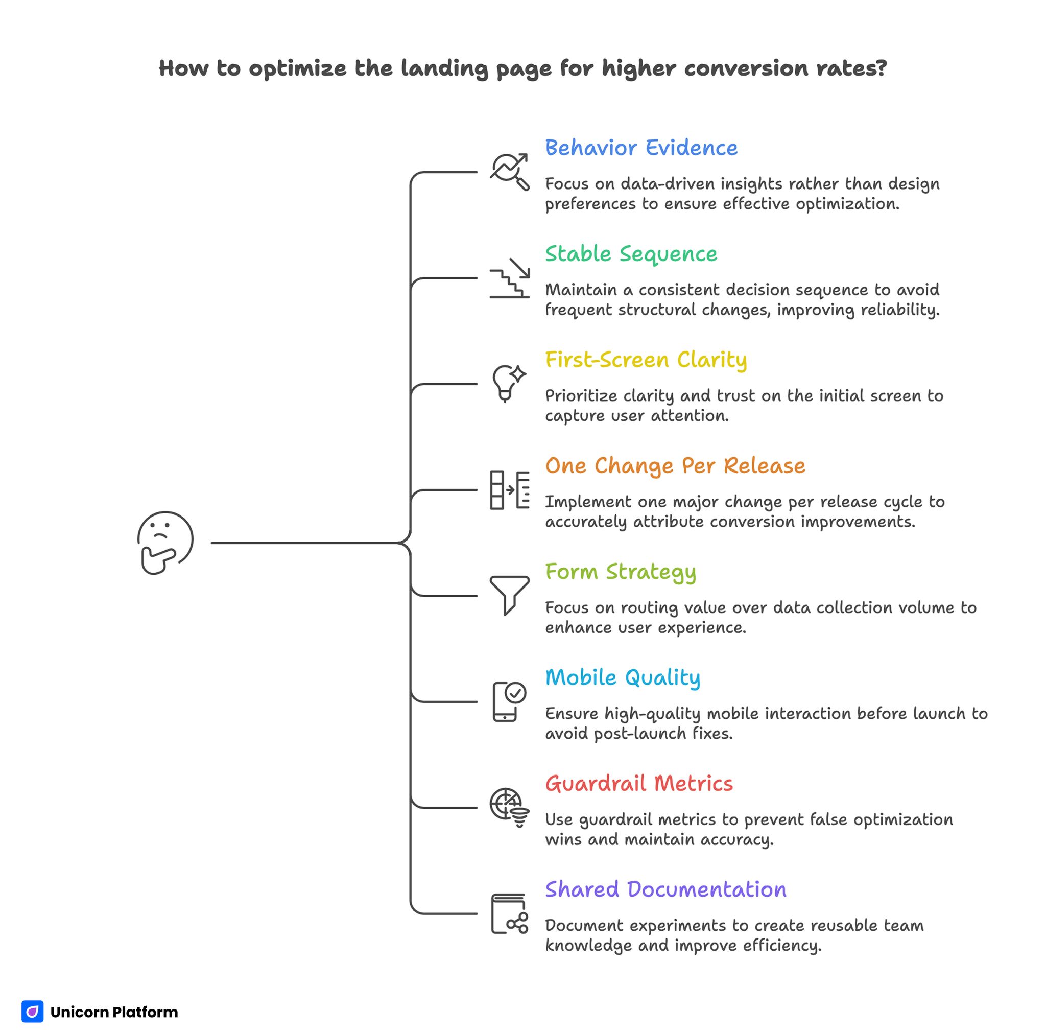
Landing Page Quick Takeaways With Conversion Optimization Tips
- High-quality optimization starts with behavior evidence, not design preference.
- A stable decision sequence outperforms frequent structural rewrites.
- First-screen clarity and trust timing are usually the highest-impact levers.
- One major change per release cycle improves attribution quality.
- Form strategy should prioritize routing value over data collection volume.
- Mobile interaction quality should be a release gate, not a post-launch fix.
- Guardrail metrics are essential to prevent false optimization wins.
- Shared documentation turns experiments into reusable team knowledge.
Why Conversion Programs Stall Even With Active Testing
Most stalled programs suffer from test noise. Teams change headline language, layout order, CTA style, and form depth in the same release. Metrics move, but no one can explain which change drove the movement.
The second issue is objective ambiguity. Teams say they want better conversion, but they do not specify whether conversion means form completion, qualified lead progression, meeting attendance, activation, or revenue contribution.
The third issue is weak behavioral diagnosis. Changes are proposed before teams map where users hesitate, where trust drops, and where intent transitions from interest to commitment.
The fourth issue is poor release governance. Rapid publishing without clear sign-off roles leads to message drift and inconsistent quality.
A Practical Definition of High-Quality Conversion

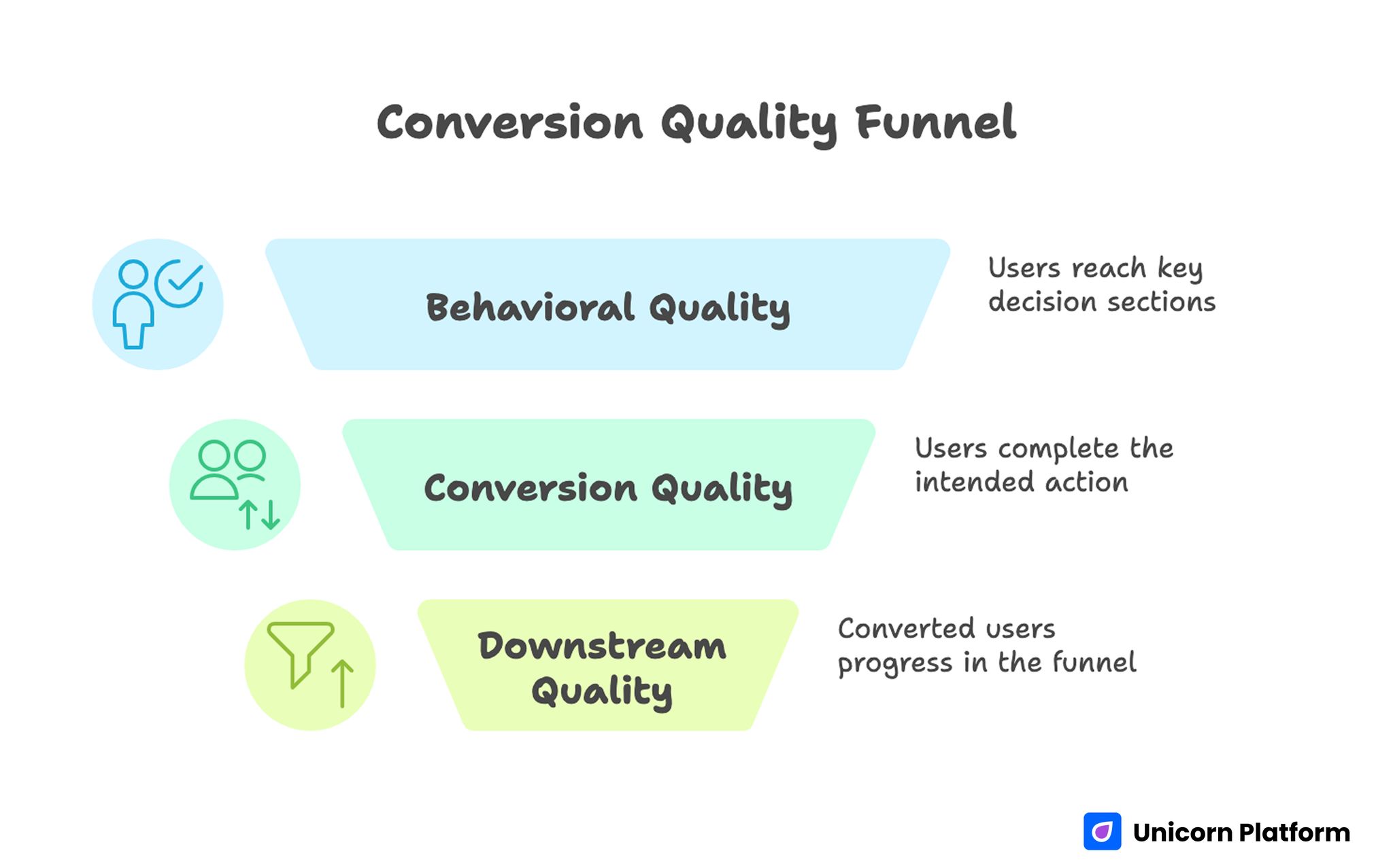
Conversion Quality Funnel
A strong conversion outcome is not only an action event. It is an action event that leads to meaningful downstream progression.
This distinction is critical. If a page collects many low-fit submissions, the top line looks positive while sales, onboarding, or success teams absorb the cost.
Teams should define conversion quality using three layers:
- behavioral quality: did users reach and engage with key decision sections
- conversion quality: did users complete the intended action with relevant context
- downstream quality: did converted users progress in the business funnel
This layered definition improves prioritization and reduces optimization blind spots.
The Decision Sequence That Improves Outcomes
High-performing conversion pages usually follow one stable sequence: relevance, mechanism, confidence, and action.
Relevance tells users whether the page is meant for their situation. Mechanism explains how the offer creates value. Confidence provides evidence and risk clarity. Action gives one clear next step.
When this sequence is preserved, teams can test copy and design variations safely. When sequence is unstable, pages may look better but perform less predictably.
For teams that need a practical structural baseline, this high-converting landing page structure guide can help lock sequence before running experiments.
Behavior Instrumentation Before Any Rewrite
Before changing content, teams should instrument behavior signals that reveal real friction points. Without this baseline, optimization decisions are often opinion-driven.
Useful instrumentation should track first-screen engagement, section-depth progression, CTA interaction order, form field abandonment, and post-submit continuity.
Behavior instrumentation should be segmented by source and device. A page can look healthy in aggregate while hiding severe friction for one high-value segment.
Minimum Behavior Dataset
- entry source and campaign context
- first meaningful interaction timestamp
- scroll depth at key trust and CTA sections
- field-level drop-off for form steps
- confirmation and follow-up engagement events
This dataset is enough to identify where the page loses decision momentum.
Intent Segmentation: One Page Cannot Speak Equally to Everyone
Visitors from paid search, social promotion, email, and retargeting arrive with different intent states. A single unadapted message usually underperforms for at least one source.
Intent segmentation does not require fully separate page architectures. It requires controlled message variation on a stable structural template.
Discovery intent needs quick relevance and low-friction progression. Evaluation intent needs mechanism and proof depth. Decision intent needs risk clarity and direct action confidence.
Teams should map source traffic to intent stage before drafting variants. This simple step often improves both conversion quality and experiment clarity.
First-Screen Optimization: Fix the Most Important 5 Seconds
Most conversion loss happens before users read deep content. First-screen clarity determines whether users commit attention to the rest of the page.
A reliable first-screen model includes:
- audience context signal
- concrete outcome statement
- one confidence cue
- one dominant action
If a first screen has multiple equal messages or vague value language, users postpone evaluation and drop-off rises.
First-Screen Review Questions
- Is audience fit obvious without scrolling?
- Is promised value specific enough to evaluate quickly?
- Is there one primary action with clear intent?
- Is at least one trust cue visible early?
If one answer is weak, resolve first-screen issues before testing lower sections.
Mechanism Clarity: Explain How Value Is Produced
Users often hesitate when offers sound attractive but process logic is unclear. Mechanism clarity reduces this uncertainty.
A strong mechanism block explains what users do, what the system does, and what outcome appears if implementation is successful.
Mechanism detail should scale by intent. Early-stage users need a concise overview. Higher-intent users need deeper operational confidence.
Overly technical mechanism sections can increase cognitive load. Teams should optimize for comprehension speed, not terminology density.
Trust Architecture: Timing, Context, and Density
Trust is not a single section. It is a sequence of confidence signals distributed across decision points. UX research supports this approach. Users evaluate credibility based on multiple small signals across a page, including transparency, clarity, and consistency, rather than relying on a single proof element.
Useful trust elements include contextual outcomes, role-specific proof, process transparency, and expectation clarity for what happens after conversion.
Trust density should be balanced. Too little proof increases skepticism. Too much proof can overwhelm and delay action.
Placement is more important than volume. Evidence should appear near the claim it validates and near the action it supports.
For teams that want practical post-launch tactics, these actionable landing-page improvement tips can help prioritize high-impact trust adjustments.
CTA Strategy by Readiness, Not by Style
Calls to action should reflect user readiness stage. Styling alone cannot compensate for intent mismatch.
A simple readiness model works well:
- exploration stage: low-commitment action
- evaluation stage: validation action
- decision stage: commitment action
Each variant should have one dominant action and one controlled fallback. More equal-priority actions usually reduce confidence.
CTA language should describe expected next step clearly. Ambiguous verbs increase friction at the moment commitment should feel easiest.
Form Design: Quality Routing Without Excess Friction
Forms should collect enough context for routing decisions, but not so much that first-step completion collapses.
Each required field should answer one question: does this change what happens next. If not, defer the field to later interaction stages.
A staged model often performs best. First step captures minimal essentials. Subsequent steps collect deeper context after intent is confirmed.
Form Optimization Checks
- field purpose is explicit to users
- mobile keyboard behavior is stable
- validation feedback is immediate and clear
- post-submit expectation is visible before conversion
These checks reduce abandonment and improve downstream qualification quality.
Mobile Conversion Engineering
Mobile traffic is frequently the first decision environment, even for B2B offers. Weak mobile behavior can silently reduce later-stage conversions.
Mobile QA should include readability, tap comfort, section order integrity, field interaction stability, and network-sensitive loading behavior.
Teams should compare mobile outcomes by source. A single source with high mobile friction can depress overall results while remaining hidden in aggregate reporting.
Mobile performance should be treated as part of conversion logic, not a separate technical concern.
Performance Budgeting for Decision Speed
Loading speed matters most when it affects decision clarity. Users should see value and next action before non-critical assets complete rendering.
Teams should prioritize time-to-meaningful-content and time-to-action, not only total page load metrics.
A practical speed budget includes maximum thresholds for first content visibility, interactive CTA readiness, and form response timing.
Performance updates should be evaluated together with conversion quality to avoid speed improvements that degrade message context.
Experiment Design: One Major Variable Per Cycle
The fastest path to reliable learning is controlled scope. Each release should test one major variable tied to one explicit hypothesis.
When scope expands beyond one major variable, result interpretation weakens and iteration quality drops.
Teams should log hypothesis, expected effect, primary metric, guardrail metric, and decision criteria before launch.
High-Impact Test Types
- headline specificity versus emotional framing
- mechanism placement and depth
- proof proximity to major claims
- CTA wording by readiness stage
- first-step form depth
These tests produce meaningful insight when run with stable structure.
Measurement Hierarchy for Reliable Decisions
Top-level conversion metrics are useful but incomplete. Teams should use a layered hierarchy to evaluate both quantity and quality.
Layer one: behavior metrics, such as engagement and progression through decision sections.
Layer two: conversion metrics, such as completed actions with qualification context.
Layer three: outcome metrics, such as accepted leads, activation quality, and revenue progression.
Each release should include one primary metric from the relevant layer and one guardrail metric from a downstream layer.
For teams aligning measurement with broader business objectives, this strategic optimization alignment guide can help prioritize the right metric pairs.
Documentation and Experiment Memory
Without documentation, teams repeat tests and lose learning continuity. Fast programs need short but consistent logging.
A practical experiment log should include objective, audience context, change scope, metrics, observed result, and decision outcome.
Logs should also record unresolved questions. This keeps future cycles focused and avoids random rediscovery of known issues.
Shared documentation is one of the strongest predictors of sustained performance in high-velocity teams.
Component Library Strategy
Reusable modules improve both speed and consistency. Teams should maintain approved modules by decision stage rather than by visual theme.
Recommended module categories:
- orientation modules for relevance
- mechanism modules for clarity
- trust modules for confidence
- action modules for commitment
Module promotion should require repeated performance evidence in more than one campaign context.
Library Governance Cadence
- weekly review of recent test outcomes
- monthly promotion or retirement of modules
- quarterly cleanup of outdated patterns
This cadence keeps libraries practical and avoids clutter-driven drift.
Cross-Functional Alignment
Page optimization quality depends on downstream team alignment. If marketing, sales, and product teams define quality differently, page strategy fragments.
Teams should agree on qualification definitions, response SLAs, and required conversion context for next-step handoff.
A short weekly quality sync focused on one page family and one friction point can keep teams aligned without process overhead.
Alignment Rituals
- weekly 20-minute conversion-quality review
- shared dashboard for primary and guardrail metrics
- sales feedback tied to page sections
- explicit owner assignment for next actions
These rituals create fast, actionable feedback loops.
Risk Controls and Recovery Playbooks
Fast optimization programs need predefined recovery paths for performance drops. Without them, teams react with broad edits that increase noise.
Recovery playbooks should define trigger conditions, owner roles, rollback thresholds, and retest procedures.
A practical incident model: detect anomaly, contain impact, validate cause, execute controlled rollback, capture learning.
Essential Risk Controls
- alerts on major guardrail decline
- form routing and integration failure alerts
- predefined rollback criteria by issue type
- post-incident review template
These controls protect both campaign performance and team confidence.
Scenario: SaaS Team With High Traffic, Low Lead Quality
A SaaS team had healthy campaign traffic but weak sales-qualified progression. Their page looked modern, yet users dropped before trust sections and low-fit submissions were high.
The team rebuilt in Unicorn Platform with stronger first-screen specificity, earlier proof placement, and staged qualification.
They then moved to one-variable weekly releases with explicit guardrails. Over eight weeks, qualified progression improved while form volume remained stable.
The biggest gain came from clarity and trust timing, not visual redesign.
Scenario: Agency With Multi-Client Variation Pressure
An agency running campaigns across channels used one generic template for all contexts. Performance volatility made optimization difficult.
They adopted intent-based variants with shared structure, channel-specific message framing, and standardized release logs.
Within one quarter, performance became more predictable and rework dropped because tested modules were reusable across accounts.
30-Day Execution Plan

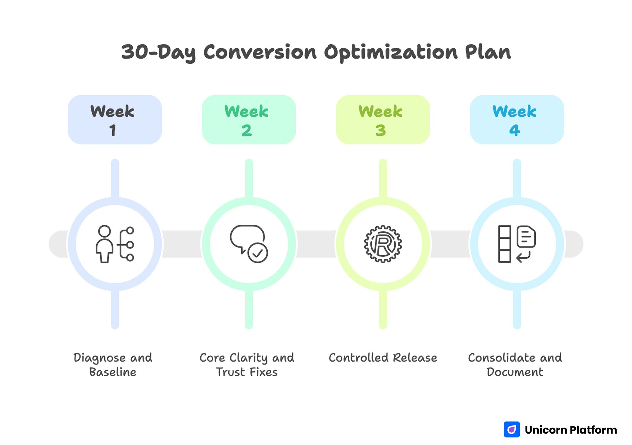
30-day Conversion Optimization Plan with Key Actions
Week 1: Diagnose and Baseline
Map user behavior friction by section and source. Identify the largest leak in decision flow.
Define one primary metric and one downstream guardrail metric for the next cycle.
Week 2: Core Clarity and Trust Fixes
Rewrite first-screen messaging for relevance and outcome clarity. Move proof near major claims and key actions.
Simplify CTA hierarchy and trim first-step form friction.
Week 3: Controlled Release
Launch one source-specific variant with one major change. Keep other components stable.
Run full mobile and event QA before scaling traffic.
Week 4: Consolidate and Document
Promote validated improvements to the base template. Archive weak variants and update experiment logs.
Assign ownership for monthly proof refresh and next-cycle hypotheses.
90-Day Optimization Roadmap
Month 2: Expand by Intent Stage
Develop controlled variants for exploration, evaluation, and decision traffic while preserving a shared structural template.
Build reusable modules for each decision stage and document usage rules.
Month 3: Operationalize Reliability
Formalize release gates, role permissions, and rollback triggers.
Require decision logs for all high-impact changes so learning compounds across campaigns.
At this stage, scale should come from predictable operating habits rather than constant redesign.
Common Failure Modes and Fast Fixes
1) Ambiguous Opening Message
Users cannot determine fit quickly. Replace broad language with context-specific outcomes.
2) Mechanism Uncertainty
Users do not understand how value is delivered. Add concise process explanation with clear boundaries.
3) Delayed Trust Signals
Confidence cues appear too late. Move evidence closer to major claims and actions.
4) CTA Competition
Multiple equal actions dilute commitment. Keep one primary route and one fallback option.
5) Form Overload
Too many first-step fields reduce quality. Capture essentials first and defer deeper qualification.
6) Mobile Friction Neglect
Desktop approval hides key interaction issues. Enforce real-device QA before every release.
7) Source Intent Mismatch
One message serves all channels. Adapt framing by source while keeping structure stable.
8) Weak Post-Submit Continuity
Users convert without clear next steps. Add immediate confirmation and expectation clarity.
9) Narrow Metric Focus
Top-line conversion rises while quality declines. Use layered metrics with guardrails.
10) Ownership Drift
Rapid edits blur accountability. Define explicit roles and sign-off boundaries.
Pre-Launch QA Checklist
Confirm first-screen relevance, mechanism clarity, trust proximity, and one dominant action path.
Validate form interaction, mobile behavior, and confirmation continuity across key devices.
Verify event instrumentation for primary and guardrail metrics before traffic scale. Require final QA sign-off.
FAQ: Landing Page Conversion Optimization
What should teams improve first?
Start with first-screen specificity and trust placement. These usually drive the fastest quality gains because they influence early decision confidence.
Is high test volume always better?
Not if test quality is weak. Controlled single-variable cycles produce more reliable learning than frequent multi-variable changes.
How many CTAs should one variant have?
One dominant action and one fallback option are usually enough for clear routing.
Should forms be minimal in all cases?
First-step forms should be minimal but purposeful. Additional context can be gathered after intent is established.
Is mobile optimization essential for B2B funnels?
Yes. Many B2B journeys begin on mobile even if final conversion occurs on desktop.
How often should proof be refreshed?
Monthly for active campaigns and quarterly at template level. Faster-moving offers may need more frequent updates.
What is the biggest trust mistake?
Making strong claims without nearby, contextual evidence.
Which metric should guard quality?
Use a downstream quality indicator such as accepted lead rate, activation quality, or meeting attendance stability.
How should teams respond to sudden performance drops?
Use predefined rollback criteria, isolate the last major change, and retest with controlled scope.
What creates compounding optimization gains?
Stable structure, disciplined testing, clear ownership, and reusable experiment documentation.
Final Takeaway
Sustained conversion improvement comes from system quality, not isolated tactics. Teams that combine behavior evidence, structural discipline, and operational governance improve both speed and reliability.
Unicorn Platform enables this model when teams keep architecture stable, test with intent, and optimize for downstream quality rather than superficial volume.

