Table of Contents
- 21 Creative Agency Website Examples To Explore
- What the Best Creative Agency Websites Have in Common
- Strong Homepage Layouts for Creative Agency Websites
- Common Mistakes on Creative Agency Websites
- FAQ
The best creative agency websites do more than look polished. They make positioning clear, show proof fast, and guide visitors toward the next step without making the site feel sales-heavy. That balance is what makes this topic so useful to study through examples instead of theory alone.
If you are researching creative agency websites, you usually want three things at once. You want design inspiration, you want to understand what strong agency positioning looks like, and you want to see how real studios present case studies, services, and contact paths. A good example gallery should help with all three.
This guide starts with creative agency website examples first, because that is the fastest way to spot patterns worth borrowing. After the examples, you will find the homepage structures, case-study formats, and CTA approaches that show up again and again on the strongest agency sites.
sbb-itb-bf47c9b
Quick Takeaways
- Strong agency websites make their niche or style obvious in the first screen.
- The best examples balance visual identity with business clarity.
- Great portfolio sites treat case studies like decision tools, not image dumps.
- Agency CTAs work better when they fit buyer intent, such as Book a discovery call or Start a project conversation.
- You do not need a massive site to look credible. A small number of sharp case studies usually beats a giant undifferentiated portfolio.
-
Homepage structure matters as much as visual style.
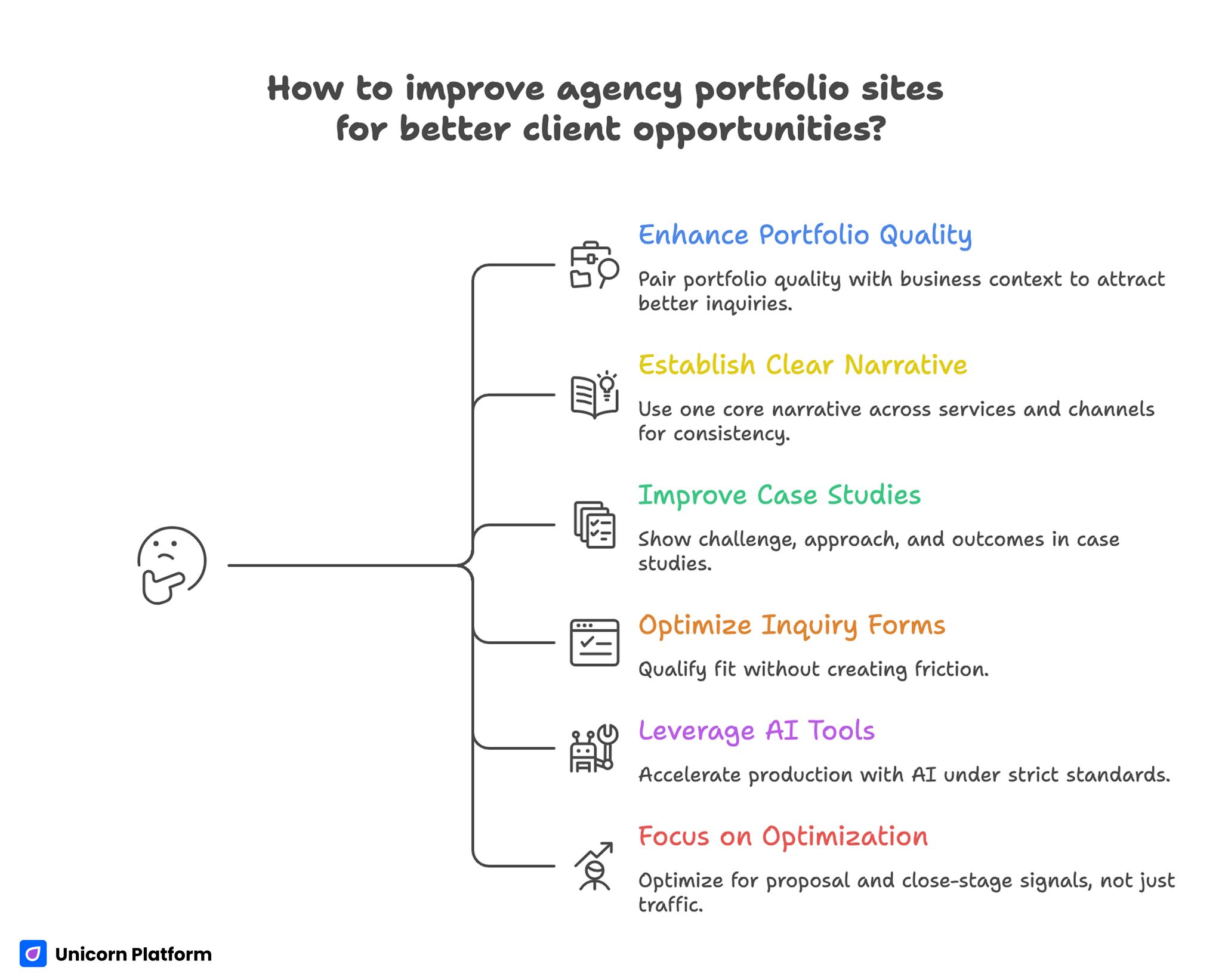
How to Improve Agency Portfolio Sites for Better Client Opportunities
21 Creative Agency Website Examples To Explore
The examples below are useful because they show different ways agencies solve the same problem: attract attention, prove their taste, and still make it easy for a potential client to take the next step.
Brand-Led Creative Studios
1. &Walsh
&Walsh is a strong example of a brand-led agency website that feels expressive without losing control. The site makes its visual personality obvious immediately, but the work still stays central.
Lesson to borrow:
- let your design language support your agency point of view
- keep the navigation simple enough that the identity does not overpower usability
2. COLLINS
COLLINS shows how a design-driven agency can feel premium while still presenting work in a way clients can evaluate. The site gives projects enough space to feel editorial instead of rushed.
Lesson to borrow:
- present fewer projects with more confidence instead of overwhelming people with volume
- make project storytelling feel deliberate, not stacked randomly
3. Porto Rocha
Porto Rocha is a good reminder that a creative site can be bold and still readable. The overall direction is distinct, but the work is organized clearly enough that visitors can understand what kind of studio they are looking at.
Lesson to borrow:
- creative energy should increase memorability, not confusion
- use category and layout decisions to keep expressive work easy to scan
4. Koto
Koto uses a clean, confident approach that makes brand work look strategic rather than decorative. The website feels carefully art-directed, but the positioning is still easy to follow.
Lesson to borrow:
- use restraint when your work already carries visual power
- pair polished visuals with short, clear business framing
5. Mucho
Mucho demonstrates how a creative studio can feel contemporary and refined without relying on complexity everywhere. The visual rhythm feels intentional, and the portfolio stays easy to explore.
Lesson to borrow:
- spacing, pacing, and selection matter as much as motion or effects
- when the work is strong, cleaner framing can make it look even better
Digital Product and Experience Agencies
6. Work & Co
Work & Co is a useful example of a digital product agency that makes capability feel credible through structure. The site keeps the work central, but the business context is strong enough that decision-makers can quickly understand fit.
Lesson to borrow:
- show the kind of problems you solve, not only the final screens
- product agencies need to make execution and thinking visible together
7. Fantasy
Fantasy is often referenced because it shows how to present ambitious digital work without flattening it into generic case-study layouts. The site feels elevated while still signaling seriousness.
Lesson to borrow:
- premium presentation works best when it is backed by clear project framing
- big visuals should still lead toward understanding, not just admiration
8. Clay
Clay is a strong example of an agency site that balances branding, product design, and conversion-oriented clarity. The site feels current, but the visitor still gets a quick sense of what the studio actually offers.
Lesson to borrow:
- if your agency spans several service areas, organize them around one clear narrative
- breadth only works when the site still feels focused
9. Ramotion
Ramotion shows how a design and development agency can keep its website polished and commercially understandable at the same time. The work is visible, but the service intent is not hidden behind portfolio aesthetics.
Lesson to borrow:
- if you sell both design and execution, make the transition between the two feel natural
- make sure the service model is visible before a buyer has to hunt for it
10. Instrument
Instrument is a good example of how a larger digital agency can make scale feel coherent online. The work has breadth, but the presentation still feels curated instead of bloated.
Lesson to borrow:
- when your portfolio is large, curation becomes part of the trust signal
- group work so visitors can find relevance quickly
Interactive and Motion-Heavy Agencies
11. Active Theory
Active Theory shows how an agency can use interactive presentation as part of the brand itself. The site feels immersive, but it still communicates enough context for the right audience.
Lesson to borrow:
- if interactivity is part of your offer, let the site demonstrate it early
- do not let experimentation block core information such as services, proof, or contact
12. Resn
Resn is a classic example of a site that leans hard into creative confidence. It works because the site experience feels intentional and aligned with the kind of experimental work the agency is known for.
Lesson to borrow:
- unusual presentation works when it matches the type of client you want
- high-creativity sites still need escape routes into practical information
13. Stink Studios
Stink Studios presents digital craft with a strong point of view, but the site still feels grounded enough for business buyers. It does not try to choose between portfolio inspiration and commercial clarity.
Lesson to borrow:
- creative agencies do not need to sound corporate to feel credible
- pair expressive work with enough framing that clients can imagine a project relationship
14. dogstudio / DEPT
This type of agency site is useful to study because it shows how strong visual work can still support larger organizational clarity. The portfolio remains important, but the visitor can still understand where to go next.
Lesson to borrow:
- if your brand has grown or changed, your site architecture needs to grow with it
- strong visuals cannot replace navigation discipline
Boutique Studios With Sharp Positioning
15. Bakken & Baeck
Bakken & Baeck shows the value of sharp positioning. The site feels modern and capable, but also specific enough that the studio does not disappear into a sea of generalist agencies.
Lesson to borrow:
- if you have a clearer niche, say it early and confidently
- stronger fit language often improves lead quality more than prettier layouts
16. Build in Amsterdam
Build in Amsterdam is a good example of a boutique agency site that feels premium without becoming hard to parse. The work is presented in a way that supports both inspiration and commercial trust.
Lesson to borrow:
- premium tone comes from consistency, not decoration alone
- when the audience is high-consideration, slower and more deliberate storytelling can work well
17. Locomotive
Locomotive shows how a studio can keep a recognizable aesthetic while still making the work feel accessible. The site supports browsing without flattening the brand into something generic.
Lesson to borrow:
- keep category and browsing choices simple even when the design language is rich
- a memorable brand should make exploration easier, not harder
18. WONDR
WONDR is useful because it shows how a smaller agency can use energy and clarity together. The site does not rely on size or volume to feel credible.
Lesson to borrow:
- you do not need a huge portfolio to make a strong impression
- clear structure helps smaller agencies look more mature and focused
Studios That Balance Portfolio and Sales Clarity Well
19. HUEMOR
HUEMOR is a strong example of an agency site that does not hide business intent. The site still feels creative, but it is more explicit about services, fit, and the reasons a client should get in touch.
Lesson to borrow:
- if your agency is growth-oriented, be direct about what you do and who it is for
- a creative website can still sell clearly without feeling pushy
20. Huge
Huge shows how a well-known agency can make complex capabilities feel understandable online. Even when the organization is broad, the site still uses structure to reduce ambiguity.
Lesson to borrow:
- broad capability needs strong editorial organization
- use page hierarchy to make scale feel clear instead of overwhelming
21. Code and Theory
Code and Theory is useful because it shows how strategic messaging and creative credibility can live together on one site. The agency does not rely on visuals alone to create authority.
Lesson to borrow:
- agency authority grows when positioning and proof support each other
- strategy language works better when it is anchored in visible work
What the Best Creative Agency Websites Have in Common
The strongest examples above look very different, but they repeat the same structural ideas.
They make the agency type obvious quickly
Visitors should not need to decode whether the studio focuses on branding, digital products, marketing, ecommerce, motion, or something else. Strong agency sites make the answer visible in the first screen.
They use featured work as proof, not decoration
Good creative agency websites do not simply stack pretty projects. They frame featured work so a potential client can understand why it matters.
They make taste and trust work together
Visual quality gets attention. Trust architecture keeps the visitor moving. That usually means some combination of client proof, project context, service clarity, and a low-friction next step.
They avoid saying everything at once
Many weak agency sites try to list every service, every vertical, and every project type immediately. The best ones choose what to emphasize and let the site breathe.
Strong Homepage Layouts for Creative Agency Websites
If you are rebuilding your own agency site, these homepage patterns are the most reusable.
Pattern 1: Positioning-led homepage
This layout starts with a sharp statement about who the agency helps and what it does best. It works especially well for boutique studios that want better-fit leads.
Good first-screen ingredients:
- a clear positioning line
- one supporting sentence about outcomes or specialty
- one primary CTA
- one proof cue such as featured clients, industries, or a flagship case study
Pattern 2: Portfolio-led homepage
This layout works when the work itself is the strongest trust signal. The key is not to let the visuals float without context.
Make sure the homepage still includes:
- a short positioning layer above or near the work
- a clear path into case studies
- a visible contact or discovery CTA
Pattern 3: Case-study-led homepage
This is often the best option for agencies selling higher-ticket work. Instead of presenting many projects equally, the homepage pushes one or two flagship examples early.
This works well when:
- your agency is niche or strategic
- the sales cycle is considered
- buyers need confidence in depth, not just style
Case-Study Patterns That Make Agency Sites Better
Strong creative agency websites usually treat case studies as sales assets, not portfolio filler. The best case studies answer practical questions quickly.
Show the problem before the visuals
A prospective client should know what challenge the project addressed before they admire the visual direction. That context helps the work feel relevant instead of merely attractive.
Explain what changed
Case studies do not need inflated numbers to be useful. But they should make some type of change visible. That can be clearer positioning, stronger product narrative, better onboarding, a more memorable launch, or a smoother ecommerce experience.
Use a repeatable structure
A useful case-study structure often looks like this:
- client context
- challenge
- approach
- selected work
- outcome
- next step or CTA
Consistency matters. It helps visitors compare projects and helps your own team publish new work faster.
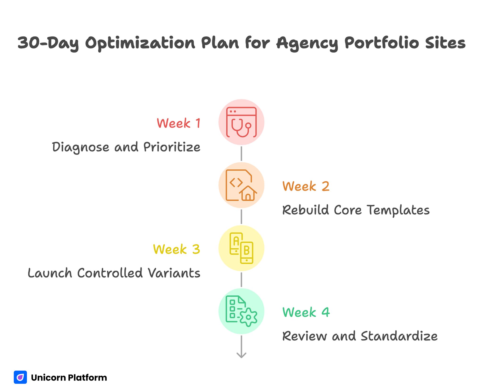
30-Day Optimization Plan for Agency Portfolio Sites
CTAs That Fit Agency Buyers Better
Agency CTAs usually underperform for one simple reason: they are too vague.
Let's talk is not always wrong, but it rarely does enough work on its own. The best agency websites make the action feel matched to buyer intent.
Examples of stronger CTA directions:
- Book a discovery call
- Start a project conversation
- Tell us about your brand
- See selected case studies
- Explore our approach
A strong CTA system often includes one primary CTA for ready buyers and one secondary CTA for people who still want proof first.
If you want stronger CTA structure across your pages, this guide to web page design fundamentals is a useful companion because it helps simplify hierarchy before you add more content.
Common Mistakes on Creative Agency Websites
Mistake 1: The site looks impressive but says very little
Fix: add one clear positioning line and one visible proof layer near the top of the homepage.
Mistake 2: Every case study feels like a gallery
Fix: add challenge, approach, and outcome framing so visitors can understand why the work matters.
Mistake 3: The agency sounds broad to the point of being generic
Fix: say who the agency helps best, what kind of work it is strongest at, or what kind of engagement it is built for.
Mistake 4: CTAs are too soft or too early
Fix: pair the primary CTA with enough proof and context that taking action feels reasonable.
Mistake 5: The homepage tries to do everything at once
Fix: choose one page job first. Usually that is either clarify positioning or move people into the portfolio.
How To Apply This in Unicorn Platform
Unicorn Platform works well for agency sites because the strongest agency websites usually do not need overbuilt structure. They need clear positioning, reusable case-study sections, and a homepage that can be updated quickly as the studio evolves.
A practical setup inside Unicorn Platform looks like this:
- one homepage with strong positioning and selected work
- one portfolio or case-study index page
- a repeatable case-study template
- one contact page with a better-fit CTA
- optional landing pages for niche offers or industries
If you are also working on CTA clarity and user flow, this guide on landing page structure can help tighten how sections lead from proof to action.
FAQ: Creative Agency Website
What makes a good creative agency website?
A good creative agency website makes its positioning clear, showcases strong work, and gives visitors an obvious next step.
What should a creative agency put on its homepage?
At minimum: positioning, proof, selected work, and a clear CTA.
How many portfolio projects should an agency show?
Usually fewer, stronger case studies work better than a very large unfocused gallery.
Do creative agency websites need case studies?
Yes. Case studies help clients understand the thinking behind the work, not just the visuals.
What is the best CTA for an agency website?
The best CTA depends on sales intent, but Book a discovery call and Start a project conversation are usually stronger than generic asks.
Should an agency website be minimal or expressive?
Either can work. The better question is whether the style supports understanding and trust.
How often should an agency update its website?
Update it whenever positioning changes, services evolve, or a new project deserves to become part of the main proof set.
What do the best agency portfolio sites have in common?
They combine distinctive taste with clear structure, business context, and strong browsing flow.
Can a small agency have a strong website without many projects?
Yes. A smaller set of sharp examples with clear positioning often performs better than a bigger but less focused portfolio.
Is Unicorn Platform good for agency websites?
Yes, especially for agencies that want to launch or refresh portfolio-driven pages quickly without building a heavy custom stack for every update.
Final Takeaway
The best creative agency websites are not only beautiful. They are easy to understand, easy to trust, and easy to act on. That is why the strongest examples feel intentional at every layer: homepage message, project selection, case-study structure, and CTA flow.
If you are improving your own agency site, start with three moves: sharpen the positioning, feature stronger case studies earlier, and make the next step clearer. Once those pieces are working, visual polish becomes much more valuable because it supports a site that already knows what it wants to do.