Table of Contents
- Quick Summary for Busy Teams
- Build an Iteration Cadence Instead of Waiting for Redesigns
- Common Failure Modes and Practical Fixes
- A 30-Day Execution Plan
- FAQ
Most low-performing pages fail for one of three reasons: they are unclear about who they are for, they bury decision-critical information, or they ask for action before trust is established. Visual polish cannot fix those structural mistakes. If a visitor has to decode what the page is offering, scroll too far to find proof, or guess what happens after the call to action, conversion quality drops.
Strong page design starts with decision support. Each section should reduce uncertainty and move the reader toward a confident next step. This is why high-performing teams treat page building as an operating process, not a one-time creative task. They define intent, map section order to user questions, and improve the page in short cycles using real behavior signals.
Unicorn Platform works well for this approach because teams can publish quickly without waiting on heavy development queues. That speed matters only when paired with clear standards. Publishing faster should mean faster learning, not faster accumulation of weak pages.
sbb-itb-bf47c9b
Quick Summary for Busy Teams
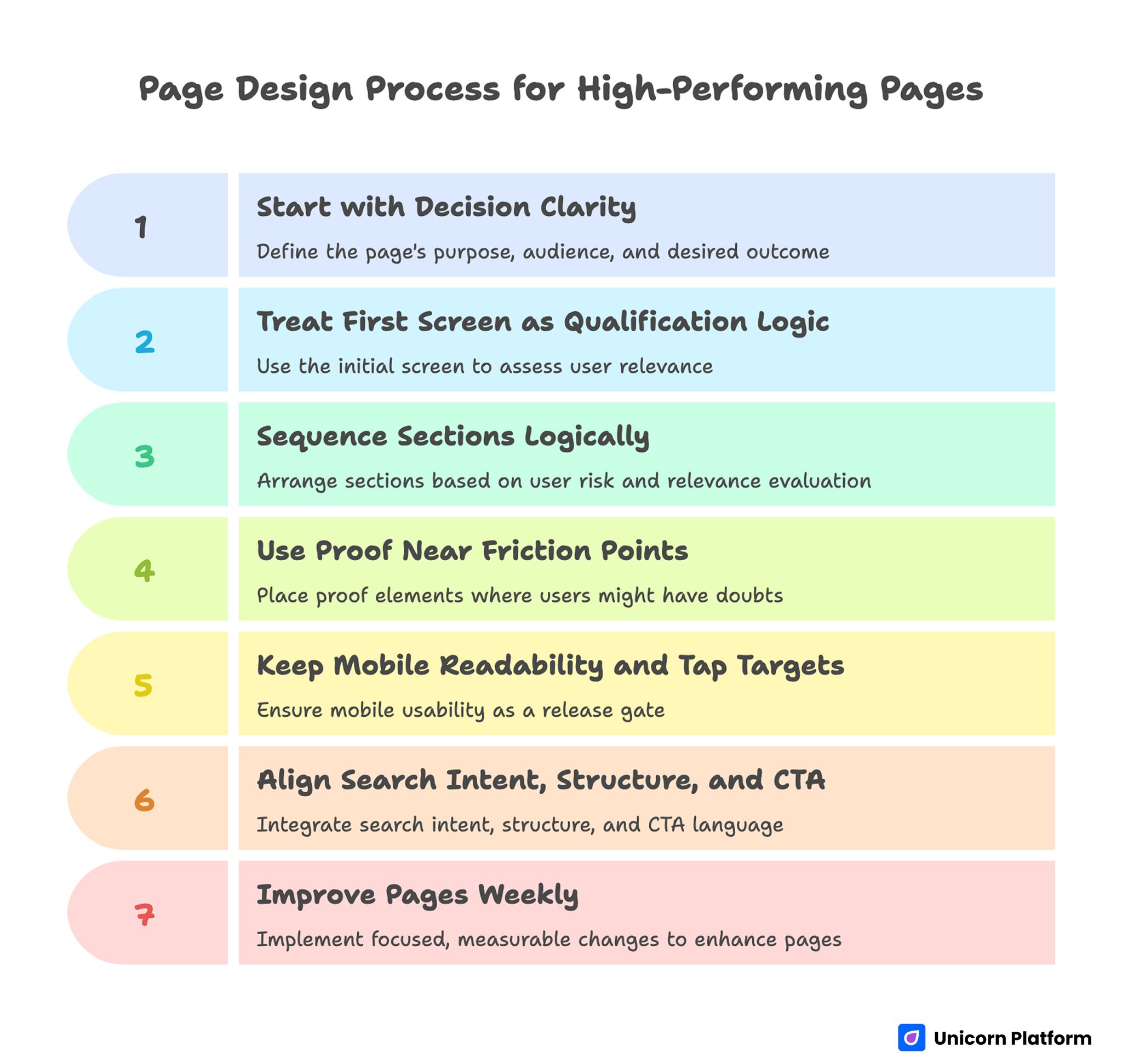
Page Design Process for High-Performing Pages
- Start with decision clarity: who this page is for, what outcome it promises, and what action to take.
- Treat the first screen as qualification logic, not decoration.
- Sequence sections in the order users actually evaluate risk and relevance.
- Use proof near friction points, not at the bottom by habit.
- Keep mobile readability and tap targets as release gates.
- Align search intent, structure, and CTA language in one workflow.
- Improve pages every week with focused, measurable changes.
Define the Page Job Before You Touch Layout
Every effective page has a primary job. It might be to book demos, generate trial signups, qualify leads, or move a visitor into deeper product education. Problems begin when teams try to make one page do every job at once.
Before writing headlines or choosing visuals, define four items in plain language: audience segment, desired action, top objections, and proof needed to resolve those objections. This one-page brief becomes your decision filter. If a section does not help the visitor move forward, it does not belong.
A common failure pattern is describing the business instead of solving the visitor’s immediate decision problem. Replace company-first phrasing with outcome-first framing. The user does not need your origin story first; they need to know whether this page can solve the problem that brought them here.
First-Screen Clarity Decides Whether the Scroll Happens
The first screen carries disproportionate weight. Visitors should understand relevance in seconds, not after multiple paragraphs. That requires a clear value promise, a short context line, and one primary action.
Effective first-screen structure is simple and repeatable. Use this sequence to keep decisions clear under time pressure:
- Outcome-focused headline tied to a specific user intent.
- Support sentence that clarifies scope, audience, or implementation speed.
- Primary CTA with concrete expectation.
- Optional trust cue near the CTA, such as customer logos or proof snippet.
Avoid two frequent mistakes. First, do not use abstract hero copy that sounds premium but explains nothing. Second, do not place competing CTAs at the top unless the audience is already segmented by intent.
When teams want more advanced first-screen patterns, this guide on building advanced page layouts quickly is useful for balancing visual complexity with decision clarity. It also helps teams scale a consistent section system across multiple campaigns.
Section Sequencing Should Mirror User Questions
Most pages are ordered by internal preference, not buyer logic. That creates friction because users ask questions in a predictable sequence: Is this relevant? Can I trust it? Is it better than alternatives? What happens next?
A practical section order for many commercial pages looks like this. Adapt the emphasis based on user risk and buying stage:
- Problem and outcome framing.
- Offer explanation in plain language.
- Proof and credibility.
- How it works.
- Objection handling.
- CTA with clear next-step expectations.
This order is not a rigid template. It is a decision path. For a technical product, “how it works” may need to appear earlier. For high-ticket services, trust proof may need to show up immediately after the hero. What matters is alignment with the visitor’s risk profile, not adherence to a generic format.
Visual Hierarchy Is a Conversion Lever, Not Decoration
Visitors scan before they read. If hierarchy is weak, even strong copy gets ignored. Typography, spacing, contrast, and section rhythm should guide attention toward priority actions.
Use a hierarchy system that can be applied consistently across pages. Consistency lowers cognitive load and speeds up scanning:
- One dominant H1 with specific meaning.
- H2s that describe decisions or tasks, not vague themes.
- Paragraphs that stay short enough for scanning on mobile.
- Visual spacing that separates ideas and prevents cognitive overload.
Color should support interaction logic. Reserve highest contrast for key actions and critical information. If everything is loud, nothing is important. The fastest way to weaken a page is to compete with your own CTA through decorative emphasis.
Copy Must Reduce Risk, Not Just Sound Good
Persuasive copy is risk management in plain language. Visitors need certainty about outcome, effort, timeline, and downside. Pages that only describe features leave those risks unresolved.
Write section copy using this progression. Keep each step explicit so readers do not need to infer missing context:
- Name the problem state.
- Describe the desired end state.
- Explain the mechanism in simple terms.
- Provide proof.
- Present a concrete next action.
Microcopy matters as much as the main narrative. Button labels, form hints, and confirmation states influence conversion rates because they shape user confidence at critical points. “Submit” is weaker than “Get my plan” when the action promise is specific.
Proof Placement Matters More Than Proof Volume
Many pages include proof but place it too late. Users who are unsure will leave before reaching the testimonial block if uncertainty is not addressed earlier.
Use proof close to decision friction. For example, if pricing feels risky, place a result-focused case snippet near pricing context. If implementation anxiety is high, place onboarding proof near the “how it works” section. This makes credibility functional instead of ornamental.
High-trust proof types include the following formats. Choose proof that matches the objection in that section:
- Measurable outcome statements with context.
- Before/after snapshots with timeframe.
- Specific customer quotes tied to concrete concerns.
- Transparent process visuals that show what happens after signup.
Avoid generic testimonial walls with no specificity. Quantity cannot replace relevance.
Mobile Quality Should Be a Publish Gate
Desktop review alone hides serious conversion leaks. Many teams publish pages that look acceptable on large screens but break decision flow on mobile with long text walls, cramped spacing, and weak CTA visibility.
Set mobile gates before launch. This prevents late QA surprises and weak post-launch fixes:
- Primary message must be clear in the first viewport.
- CTA must be visible and tappable without precision effort.
- Line length and spacing must support fast scanning.
- Proof modules should remain readable without zoom.
- Forms should ask only what is necessary for the next step.
A useful discipline is mobile-first QA in real devices, not only browser simulation. Real taps expose friction that desktop review rarely catches.
Speed, Stability, and Interaction Reliability Are Part of UX
Users experience slow pages as low trust. Performance issues reduce both rankings and conversions because they signal poor product quality before a single sentence is read.
Technical quality belongs inside design ownership. Prioritize lean media, predictable layout loading, and script discipline. Remove decorative assets that delay first contentful rendering. Keep interaction dependencies minimal where possible.
Reliability includes forms and post-submit states. If form behavior is unclear or delayed, users assume failure and abandon. Confirmations should be immediate and explicit about what happens next.
Accessibility Improves Usability for Everyone
Accessibility is often framed as a compliance task, but its practical effect is broader usability. Clear headings, semantic structure, contrast discipline, and keyboard-friendly controls improve comprehension for all users, not only assistive technology users.
A simple accessibility checklist for page teams keeps reviews consistent. Use it in every publish cycle:
- Heading structure reflects real content hierarchy.
- Buttons and links have descriptive labels.
- Color contrast remains readable in all critical UI states.
- Form errors are specific and actionable.
- Interactive elements are reachable and operable without a mouse.
Teams that enforce these basics early avoid expensive retrofits later. They also ship faster because fewer issues return during final QA.
Integrate SEO and UX in One Workflow
Search visibility and conversion quality are not separate projects. A page wins when intent mapping, section hierarchy, and interaction design reinforce each other.
Use this combined workflow as a shared planning routine. It keeps search and conversion decisions aligned from draft to launch:
- Map target intents by stage: discovery, evaluation, decision.
- Translate each intent into section-level questions.
- Build headings that answer those questions clearly.
- Match CTA language to user readiness, not internal sales goals.
- Validate with behavior data and search performance together.
When SEO and design teams need a shared operating model, this resource on design and SEO partnership workflows helps align ownership across planning and execution. Use it to reduce fragmented handoffs between research, writing, and page builds.
Build an Iteration Cadence Instead of Waiting for Redesigns
Big redesigns often mask weak operating habits. High-performing teams improve pages continuously with small, high-signal changes. This approach reduces risk and compounds gains.
A weekly cycle can be enough for measurable progress. Keep each cycle narrow so changes are easy to attribute:
- Week 1: first-screen clarity and CTA expectation test.
- Week 2: proof placement and objection handling improvements.
- Week 3: mobile friction audit and form simplification.
- Week 4: intent-specific variant for top traffic source.
Track quality metrics, not only raw conversion rate. Lead quality, qualification accuracy, and downstream conversion are better indicators than top-of-funnel volume alone.
Scenario: Fixing a High-Traffic Page That Underconverts
Imagine a B2B services page with strong traffic but weak demo quality. The original version uses broad hero copy, places case studies near the bottom, and presents a generic “Contact us” form with six required fields.
The first fix is message precision. Replace abstract positioning with a clear promise tied to audience and outcome. The second fix is trust timing. Move specific proof near the first decision point where visitors evaluate risk. The third fix is action design. Replace the generic form with a narrower CTA and fewer required inputs.
After launch, measure not only form submissions but meeting fit rate and pipeline progression. This shift from volume metrics to quality metrics often reveals real page performance faster than surface conversion data.
If your team needs a tighter build workflow for these kinds of revisions, this walkthrough on learning page-building workflows in Unicorn Platform is a practical reference for reducing handoff delays. It is especially useful when content and growth teams publish without full-time developer support.
Common Failure Modes and Practical Fixes
Failure: Polished visuals, weak relevance
Symptoms include low engagement from qualified traffic and high bounce in the first screen. These signals usually mean the promise is broad or mismatched to intent.
Fix: rewrite headline and support copy around user outcome and segment-specific intent. Remove broad claims that could describe any product.
Failure: Too many CTAs too early
Symptoms include scattered click behavior and low completion rates. Visitors are being asked to choose paths before understanding the main one.
Fix: assign one primary action per page goal. Secondary links can exist, but they should not compete with the main decision path.
Failure: Proof buried too late
Symptoms include healthy scroll depth but weak conversion outcomes. Readers are interested, but confidence is not building at the right moments.
Fix: move one high-relevance proof element directly adjacent to the first major objection. This shortens the gap between doubt and evidence.
Failure: Desktop-first layout breaks on mobile
Symptoms include weak mobile conversion despite strong desktop numbers. The decision path likely breaks on smaller screens before action is taken.
Fix: prioritize first-viewport clarity, larger touch targets, shorter paragraphs, and lower form friction on smaller screens. Test on real phones to catch hidden interaction issues.
Failure: SEO and content teams optimize for query coverage, not intent clarity
Symptoms include rising impressions while conversion quality remains flat. The page may match query language without matching decision intent.
Fix: tie each section to a concrete question the user needs answered before acting. This reconnects visibility with business outcomes.
A 30-Day Execution Plan
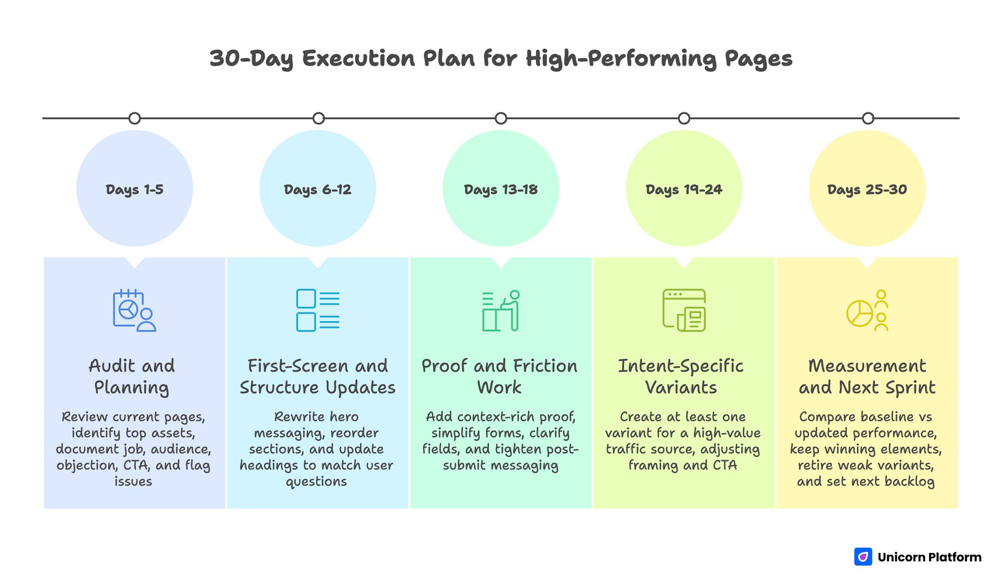
A 30-Day Execution Plan for High-Performing Pages
Days 1-5: Audit and planning
Review current page set and identify the top five assets by traffic and business impact. Document each page’s job, audience segment, primary objection, and current CTA. Flag mobile and speed issues that block decision flow.
Days 6-12: First-screen and structure updates
Rewrite hero messaging for precision, then reorder sections to match visitor evaluation sequence. Update headings to reflect user questions rather than brand categories.
Days 13-18: Proof and friction work
Add context-rich proof where users hesitate. Simplify forms, clarify field purpose, and tighten post-submit messaging so users know what happens next.
Days 19-24: Intent-specific variants
Create at least one variant for a high-value traffic source, such as paid search or partner referrals. Keep layout familiar but adjust framing and CTA language to match intent state.
Days 25-30: Measurement and next sprint
Compare baseline vs updated performance across conversion rate, lead quality, and step-two completion. Keep the winning elements, retire weak variants, and set the next iteration backlog.
FAQ: Page Design Principles
What is the biggest mistake teams make when building a new page?
Most teams begin with visual style and postpone decision logic. Start with audience, outcome, objections, and action path first. Design then becomes a tool for clarity instead of a cosmetic layer.
How long should a high-converting page be?
There is no universal length target. Use enough depth to resolve risk for your audience and offer type. High-consideration decisions usually require more proof and process detail.
Should every page have the same layout template?
Shared components are useful, but strict uniformity can hurt performance. Discovery pages and decision-stage pages answer different questions and should differ in section priority.
How many CTAs should a page include?
One primary CTA is usually best for focus. Supporting actions can appear, but they should not dilute the main path or fragment intent.
Where should testimonials be placed?
Place proof close to the decision moments where doubt appears. For many pages, one early proof snippet and one deeper evidence section work better than a single testimonial block at the bottom.
Is mobile-first still necessary in 2026?
Yes. Mobile traffic remains dominant for many acquisition channels, and mobile friction can quietly erase gains from otherwise strong content and design.
How do we align SEO with conversion goals?
Map user intent first, then build sections that answer intent-specific questions and end with readiness-matched actions. Rankings without decision support usually create low-quality conversions.
What metrics should we track beyond conversion rate?
Track lead quality, qualified meeting rate, pipeline progression, and churn signals where available. Raw conversion volume can hide costly mismatches.
How frequently should we refresh page content?
Use a monthly health check for clarity, proof freshness, and technical reliability, plus a quarterly strategic refresh for messaging and positioning updates. Keep ownership explicit so updates do not stall between teams.
Can small teams run this process without dedicated developers?
Yes. Small teams can execute this model with no-code workflows if they maintain strict standards for structure, mobile QA, and iteration discipline.
Final Takeaway
Great pages are built through disciplined decisions, not one-time inspiration. Clear messaging, evidence-aware sequencing, mobile reliability, and continuous iteration consistently outperform flashy but unstructured design.
Teams using Unicorn Platform can move quickly without sacrificing quality when they treat page building as a repeatable system. Define the page job, align structure with user questions, test improvements in short cycles, and let performance data guide the next revision.
