Table of Contents
- Use a Decision-First Page Architecture
- Scenario Playbooks
- 30-Day Optimization Cycle
- Common Mistakes and Practical Fixes
- FAQ
Food ordering decisions happen quickly, but trust forms slowly. People may arrive with strong intent to buy, yet they still leave if your page does not answer practical questions in the first few seconds.
The highest-performing pages in this category do not depend on visual style alone. They reduce uncertainty fast by clarifying menu fit, service zone, pricing logic, delivery timing, and what happens after checkout.
This guide explains how to build that experience in a repeatable way. It focuses on conversion quality, not only first-order volume, because long-term growth in this category depends on repeat behavior.
sbb-itb-bf47c9b
Key Takeaways
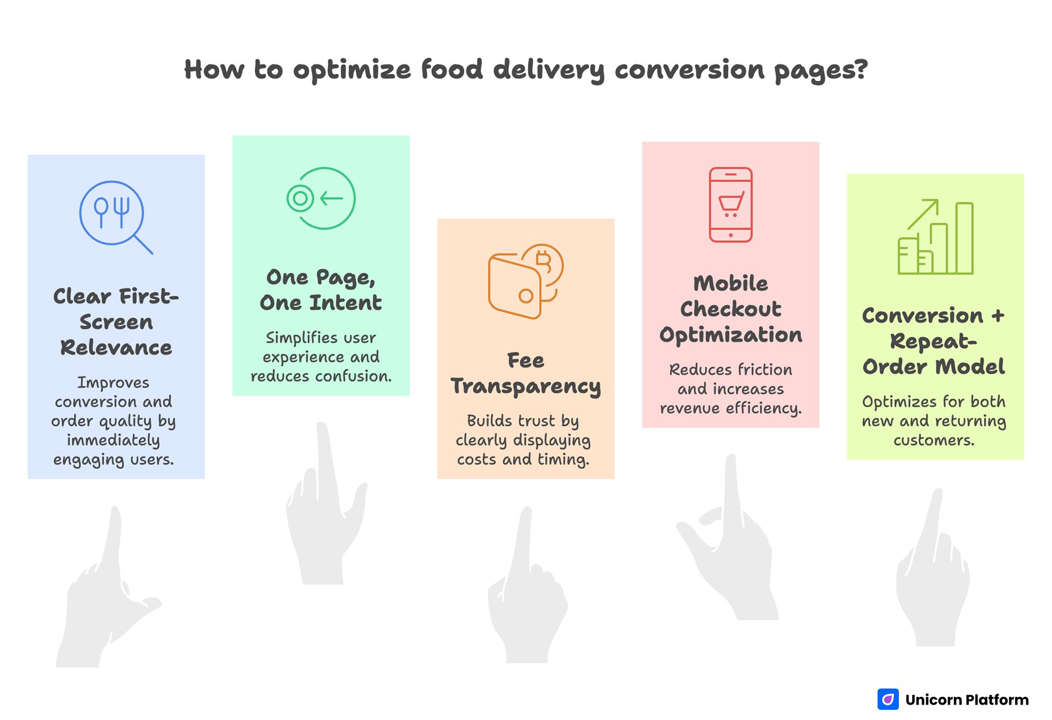
Key Takeaways for Optimizing Food Delivery Conversion Page
- Clear first-screen relevance improves both conversion and order quality.
- One page should support one primary ordering intent and one primary action.
- Fee transparency and timing clarity are major trust levers in this category.
- Mobile checkout friction has outsized impact on revenue efficiency.
- The best optimization model pairs conversion metrics with repeat-order signals.
Why Most Food Ordering Pages Underperform
The first failure point is weak relevance framing. Many pages open with brand language while delaying what buyers need most: cuisine fit, delivery range, and speed expectations.
The second failure point is trust ambiguity. Users often hesitate because they cannot quickly confirm final cost factors, expected ETA, substitution policy, or support access.
The third failure point is mobile friction. Ordering often happens while users are multitasking, so small UX problems such as dense layouts, heavy images, and confusing cart steps can sharply reduce completion.
A final issue appears after conversion. Pages may generate orders but still attract low-fit demand when delivery constraints or offer terms are unclear, which increases support load and weakens repeat rate.
What Top Competitor Pages Do Better
Across strong pages in this cluster, one pattern is consistent: decision order is explicit. Users can evaluate fit, trust, and action quickly without hunting for critical details.
Another pattern is modular structure. Teams use reusable sections for service scope, proof, offer details, and checkout path while adapting messaging to campaign intent.
The best pages also avoid overpromising language. They balance appetite-driven imagery with operational clarity, so conversion lifts do not come at the cost of post-order dissatisfaction.
Use a Decision-First Page Architecture
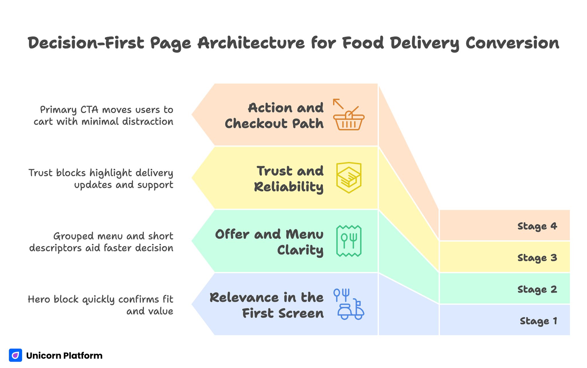
Decision-First Page Architecture for Food Delivery Conversion
A reliable structure should follow how buyers decide under time pressure. When sections are mapped to decision stages, conversion improves because cognitive load is lower.
Stage 1: Relevance in the First Screen
Open with what you serve, where you serve, and why your offer is worth choosing now. If a buyer cannot confirm fit immediately, they return to search and compare alternatives.
A focused hero block works best when it combines one concrete value claim with one practical qualifier such as delivery area or prep window. That combination helps users decide quickly without scanning the full page.
Stage 2: Offer and Menu Clarity
After relevance, show what users can order and how choices are organized. Grouping by intent, such as quick lunch, family meals, or high-protein options, helps users decide faster than internal category labels.
Short descriptors with visible price context reduce the need for extra clicks. Faster evaluation usually means better cart progression.
Stage 3: Trust and Reliability
Trust blocks should explain what happens when reality changes, not only when everything goes as planned. Delivery updates, substitution handling, and support access are often stronger confidence signals than generic testimonials.
If your operation is dependable, the page should make that operational discipline visible before checkout. Reliability should feel demonstrable, not implied.
Stage 4: Action and Checkout Path
The primary CTA should map to the main intent of the page. For a direct-order page, the CTA should move users into cart with minimal distraction.
Secondary actions can exist, but hierarchy must remain clear. Equal-weight options near checkout usually increase hesitation and delay completion.
Separate Intent Paths: Delivery, Pickup, and Product Shipping
Many brands try to serve all intents on one path and lose conversion quality as a result. Delivery, pickup, and packaged product buyers have different urgency and information needs.
Delivery buyers prioritize speed and service coverage. Pickup buyers care about collection timing and customization controls. Product-shipping buyers care most about taste confidence, ingredient clarity, and shipment reliability.
Intent-specific routing improves both conversion and user satisfaction because each path can prioritize relevant details. It also reduces support tickets caused by mismatched user expectations.
For teams building restaurant-focused variants, this restaurant landing template guide is useful for structuring faster intent-specific launches. Use it to keep section order consistent while adapting message emphasis by channel.
Fee Transparency and Timing Confidence
Price uncertainty is one of the fastest trust breakers in this category. You do not need to show every variable at once, but users should understand the core pricing model before committing.
Explain delivery fees, minimum thresholds, and zone-based differences in plain language. If surge or distance adjustments exist, set expectation early.
Timing also needs precision. Estimated prep and arrival ranges should be realistic, and update logic should be easy to understand. Clear expectation-setting is critical in service transactions, as highlighted by the Federal Trade Commission (FTC), which emphasizes transparent pricing and delivery disclosures as key factors in maintaining consumer trust and reducing post-purchase dissatisfaction.
Handling Delays Without Losing Trust
No operation is perfect every day, so trust should not depend on perfect execution claims. Pages convert better when they explain how delays are communicated and how issues are resolved.
A concise policy summary near CTA zones can reduce abandoned carts from risk-averse buyers. It gives uncertain users a reason to continue instead of postponing the purchase.
Menu and Product Presentation for Faster Decisions
A great photo can trigger appetite, but structure converts intent. Users should find preferred items quickly, compare options clearly, and move to cart without navigation friction.
Use compact menu cards with practical tags such as vegetarian, spicy, high-protein, family-size, or ready in under 30 minutes. These tags work as decision shortcuts.
For packaged food offers, include details buyers scan before purchase: ingredients, allergen notes, serving size, storage rules, and preparation method. These details accelerate trust for first-time buyers.
For category-specific promotions, this pizza campaign page framework helps sharpen offer-to-order flow while keeping messaging concise. It is especially useful for time-limited campaigns that need fast iteration.
App Install Pages vs Direct Order Pages
App-growth campaigns need a different structure from direct web-order campaigns. Install pages should emphasize practical reasons to keep ordering through the app, such as faster reorders, live updates, and loyalty benefits.
Direct order pages should minimize friction and keep purchase path front and center. Mixing both objectives equally on one page often weakens both outcomes.
When install intent is primary, this food app launch guide can help align first-screen value with first-order behavior. The goal is to connect app acquisition to transaction outcomes.
Bridge Install to First Order
An install event is not the business outcome. Conversion quality improves when the page previews first-order flow and expected timeline before the user leaves for app store steps.
Clear handoff messaging reduces install-only users who never place an order. It also improves attribution quality for paid campaigns.
Mobile-First Ordering UX
Short-session mobile behavior defines performance in this vertical. Users often browse while commuting, working, or deciding with friends, so every extra tap has a cost.
Prioritize tap-friendly controls, stable layout, and readable hierarchy. Menu exploration, cart editing, and checkout progression should feel predictable on small screens.
Form design should be progressive. Ask only essential fields early, then collect optional preferences later when commitment is higher.
Speed and Stability Requirements
Media quality matters, but load reliability matters more. Heavy imagery, slow first paint, and layout shifts can erase demand even when offer messaging is strong.
A practical performance baseline should be part of every campaign launch checklist. Teams that skip this step often mistake speed problems for messaging problems.
Trust Proof That Supports Repeat Orders
In food and delivery contexts, conversion and retention are tightly connected. If users trust what they receive, repeat behavior improves and acquisition spend becomes more efficient.
Proof blocks should include context-rich feedback, not only star ratings. Useful signals include consistency of portion quality, ETA reliability, and support responsiveness.
If your brand has quality standards or sourcing discipline, explain what that means in customer terms. Generic credibility claims rarely influence checkout behavior.
For product-led capture pages that need stronger intent qualification before checkout, this lead generation page framework can help design better pre-order flows. It works well when you need to reduce low-intent checkout attempts.
Local Search and Service-Zone Strategy
Local discovery remains a major revenue source, especially for repeat-friendly categories. Area-specific pages can perform well when they include meaningful differentiation.
Useful local elements include realistic delivery windows by area, popular item mix, and availability constraints. Thin location pages with only city-name swaps usually underperform.
Support transactional pages with practical local content such as ordering tips during peak times, pickup best practices, and menu recommendations by context. Useful local depth improves both visibility and conversion confidence.
Scenario Playbooks
Scenario A: High Traffic, Weak Cart Starts
Users reach the page but do not begin ordering. This usually indicates weak first-screen relevance or unclear menu structure.
A practical fix is to tighten opening copy around cuisine fit and service zone, then simplify menu entry paths. This usually improves cart starts without a full redesign.
Scenario B: Strong Cart Starts, Weak Checkout Completion
Users add items but abandon before payment. This pattern often points to fee confusion, unclear timing, or complex form steps.
A practical fix is to surface price logic earlier, simplify checkout fields, and make ETA expectations explicit. Buyers complete checkout more often when cost and timing feel predictable.
Scenario C: Good First Orders, Weak Repeat Rate
Initial conversion looks healthy, but repeat behavior remains low. This usually means promise-to-experience mismatch or weak post-order confidence.
A practical fix is to align page claims with actual delivery experience and make reliability policies visible before checkout. Expectation alignment is one of the strongest drivers of repeat behavior.
30-Day Optimization Cycle
Week 1: Diagnose Friction
Audit top pages for first-screen clarity, service coverage visibility, fee transparency, and mobile usability. Select one high-impact bottleneck per page type.
Week 2: Rebuild Core Modules
Standardize reusable modules for relevance, menu clarity, trust, and checkout progression. Keep module job definitions explicit so execution stays consistent.
Week 3: Launch Controlled Variants
Deploy variants with one major change at a time and stable traffic windows. This keeps test interpretation reliable.
Week 4: Review and Promote Winners
Evaluate outcomes across conversion and quality metrics, then roll winning patterns into default templates. Archive losing variants with short notes to preserve learning.
Repeat monthly so gains compound instead of resetting with each campaign. Consistent cadence keeps pages aligned with real operational changes.
Metrics That Predict Revenue Quality
Top-line orders are only one part of performance. Durable growth depends on order quality and repeat behavior.
Track a balanced metric set. Combining these indicators gives a clearer view of growth quality:
- cart-start rate by source,
- checkout completion,
- average delivery-time variance,
- repeat order within 30 days,
- support contact themes by page variant.
This model helps teams identify whether problems come from message mismatch, operational friction, or weak trust communication. That diagnosis shortens the path from insight to fix.
Team Governance for Fast Updates
Rapid publishing can become a competitive advantage only when ownership is clear. Assign one owner for positioning, one for offer accuracy, one for analytics interpretation, and one for QA.
Each major update should include a short note: hypothesis, change, result, and next action. Lightweight documentation prevents repeated low-value tests.
When governance is consistent, teams ship quickly while improving quality over time. Speed then becomes a strategic advantage rather than a quality risk.
Common Mistakes and Practical Fixes
Mistake 1: Brand-heavy hero with unclear order value
Fix by leading with cuisine fit, service area, and one practical reason to order now. This change improves relevance for cold visitors.
Mistake 2: Menu structure based on internal terminology
Fix by grouping items around customer decision patterns and usage context. Better grouping reduces decision fatigue.
Mistake 3: Price details revealed too late
Fix by clarifying core fee logic and threshold conditions before checkout commitment. Clear price expectations lower last-step abandonment.
Mistake 4: CTA overload near purchase sections
Fix by keeping one dominant action and moving secondary actions to lower-priority positions. Strong hierarchy speeds up decisions on mobile.
Mistake 5: Mobile flow tested only on desktop previews
Fix by validating cart and checkout on real devices and average network conditions. Desktop emulation alone misses critical usability issues.
Mistake 6: Optimizing for first order only
Fix by pairing conversion work with repeat-rate and support-quality indicators. This prevents short-term wins from hiding long-term losses.
FAQ: Food Delivery Conversion Pages in 2026
1) What should a food ordering page communicate first?
Start with what you offer, where you deliver, and how quickly users can expect service. Immediate clarity is the fastest trust builder in this category.
2) How many CTAs should appear on one page?
Use one dominant CTA for the primary intent and limit secondary actions to supportive roles. Keep the action hierarchy visible throughout the page.
3) Should delivery and pickup share one flow?
They can share design foundation, but decision paths and details should be separated by intent. Intent-specific copy prevents confusion and improves completion.
4) How much fee detail is necessary before checkout?
Provide enough context to avoid surprise at payment stage, especially thresholds and zone-based costs. Late pricing surprises are a common reason for abandonment.
5) What type of proof drives better order confidence?
Context-rich proof about reliability, quality consistency, and support resolution usually performs best. Generic ratings are weaker without practical context.
6) How often should these pages be updated?
Review monthly and update immediately when menu availability, zones, or policy terms change. Fast updates preserve trust during operational shifts.
7) What is the fastest high-impact change?
Rewrite the first screen around fit and service clarity, then simplify cart entry steps. This is often the highest-impact fix with the lowest implementation cost.
8) Which metric should teams monitor first?
Track cart-start and checkout completion together to detect early funnel friction quickly. The pair reveals where users lose confidence.
9) How can teams improve repeat orders from landing traffic?
Align page promises with real delivery experience and highlight reliability cues before purchase. Better alignment increases repeat order probability.
10) Do local pages still matter for conversion?
Yes, when they include real area-specific value rather than duplicated generic copy. Useful local detail helps users choose faster and trust delivery accuracy.
Final Takeaway
Winning food conversion pages combine appetite appeal with operational clarity. Clear relevance, transparent offer logic, and low-friction checkout paths produce better first orders and stronger repeat behavior.
When teams treat page structure, trust messaging, and metrics as one system, growth becomes more stable and easier to scale. The strongest gains come from consistent iteration, not one-time redesigns.
