Table of Contents
- What a Strong Personal Website Should Include
- Essential tools
- Performance Optimization Checklist
- Common Mistakes and How to Fix Them
- 30-Day Build Plan
- Complete Personal Site Blueprint (Section by Section)
- SEO and Discoverability Beyond Basics
- FAQ
Building a personal website with raw HTML is still one of the best ways to understand how the web actually works. Even if you eventually move to faster no-code or AI-assisted workflows, learning the fundamentals gives you control over structure, performance, and long-term maintainability.
A lot of beginners get stuck because tutorials either stay too basic or jump too quickly into advanced tooling. You end up with a page that technically loads, but it is hard to style, not mobile-friendly, and difficult to update.
This guide is built to solve that gap. You will get a practical path from blank folder to live personal site, plus a decision framework for when to stay with raw HTML and when to use Unicorn Platform for faster publishing.
Key Takeaways
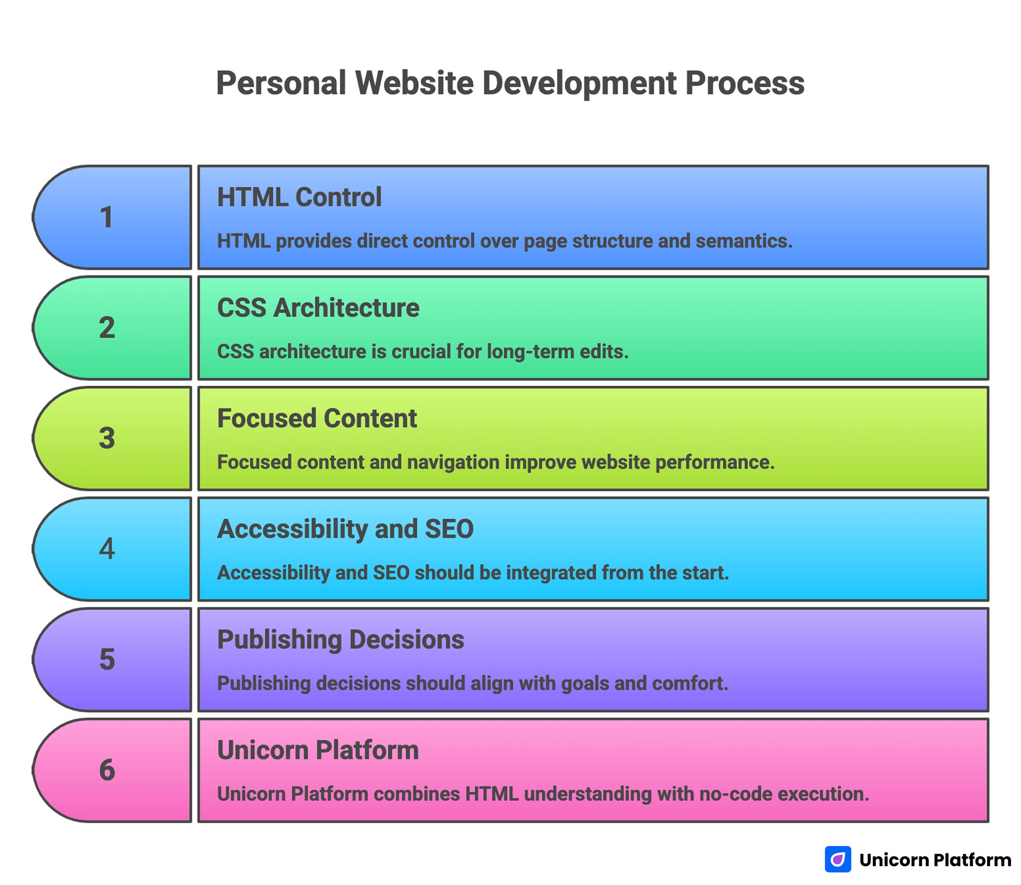
Personal Website Development Process
- HTML gives you direct control over page structure and semantics.
- CSS architecture matters as much as visual taste for long-term edits.
- Personal websites perform better when content and navigation stay focused.
- Accessibility and SEO should be built in from day one, not added later.
- Publishing decisions should match your goals, technical comfort, and update frequency.
- Unicorn Platform users can combine HTML understanding with faster no-code execution for better outcomes.
sbb-itb-bf47c9b
Why Build With HTML in 2026
Modern website builders are powerful, but HTML fundamentals still matter because every visual layer depends on structure. If you understand structure, you can debug faster, customize smarter, and evaluate tools more critically.
HTML-first learning is especially useful for personal sites where your content, portfolio, and positioning may evolve frequently. You can decide exactly how pages are arranged and what elements deserve emphasis.
Another advantage is performance. Lightweight HTML and CSS pages can be fast, stable, and easy to host. For portfolios, resumes, and personal brand pages, that speed contributes to first-impression quality.
What a Strong Personal Website Should Include
Before writing code, define what your site needs to do. A personal website that tries to be everything usually becomes confusing.
Most successful personal sites include:
- A clear introduction section.
- A focused summary of expertise or goals.
- Selected projects or case studies.
- Contact options.
- Optional writing section for deeper credibility.
This is enough for most creators, developers, freelancers, founders, and operators.
Pick one primary goal
Your website should have one primary conversion goal.
Examples:
- Get contacted for freelance work.
- Attract job opportunities.
- Build authority in a niche.
- Capture newsletter signups.
When this goal is clear, every design and content decision becomes easier.
Define your audience early
Write for a real audience, not a generic internet user. Hiring managers, founders, collaborators, and clients evaluate portfolios differently.
Audience clarity affects tone, section order, and project details. It also helps you avoid unnecessary content blocks that add noise without improving outcomes.
Project Setup: Start Clean and Simple
A stable folder structure will save time as your site grows.
Use a basic setup first:
- index.html
- styles.css
- images/
- pages/ for additional pages
- scripts/ if you add JavaScript later
Keep naming consistent and predictable. Clean structure improves maintainability and reduces path errors during deployment.
Essential tools
You only need three things to begin:
- A code editor.
- A modern browser.
- A local folder for your site.
Optional improvements:
- Live preview extension.
- Version control with Git.
- Image optimization tool.
Start minimal and add tooling when it solves a real workflow issue.
Step 1: Build the Base HTML Document
Every page should start with a valid document skeleton. Keep semantics correct from the beginning so accessibility and SEO are easier later.
A strong base includes:
- <!doctype html> declaration.
- Language attribute on <html>.
- Meta charset and viewport.
- Meaningful page title and description.
Then build a semantic body structure:
- <header> for top identity and nav.
- <main> for core content.
- <section> blocks for distinct topics.
- <footer> for secondary links and contact reminders.
Semantic structure improves readability for users, search engines, and assistive technologies.
Step 2: Create Scannable Content Sections
A personal site should be easy to scan in under one minute. Long dense paragraphs can reduce clarity and hide your strengths.
A practical section sequence:
- Hero intro with role and value.
- About summary with current focus.
- Project highlights with outcomes.
- Skills or tools used.
- Contact or action section.
Write project descriptions like mini case studies
Instead of listing tools only, describe each project with context:
- Problem or goal.
- Your contribution.
- Result or impact.
This gives visitors decision-quality information quickly.
Keep navigation lightweight
Top navigation should include only high-value destinations. Too many links increase cognitive load and reduce action focus.
For a single-page site, anchor links often work well. For multi-page portfolios, use concise labels and consistent hierarchy.
Step 3: Add CSS for Structure and Identity
Visual design should support content clarity, not hide it. Start with layout fundamentals before decorative styling.
Set a consistent spacing system
Use a small spacing scale and apply it consistently across sections. This creates visual rhythm and makes editing easier.
Inconsistent spacing is one of the fastest ways a site starts to look unfinished.
Define a type scale
Set readable defaults for body text and clear hierarchy for headings. Personal websites are often content-heavy, so typography decisions have direct impact on engagement.
Test text sizes on both desktop and mobile before finalizing.
Use a restrained color palette
You do not need many colors. A neutral base with one strong accent is often enough for personal sites.
Reserve accent color for links, buttons, and small highlights so interactive elements remain obvious.
Make layout responsive early
Do not postpone mobile work. Build responsive behavior as you style each section.
Use flexible widths, stack layouts where needed, and validate readability on small screens throughout development.
Step 4: Optional JavaScript for Practical Enhancements
You can launch without JavaScript, but small enhancements can improve usability.
Useful low-risk additions:
- Mobile menu toggle.
- Theme switch (light/dark) if relevant.
- Form validation helpers.
- Smooth scroll for anchor navigation.
Avoid adding scripts that do not support your primary goal. Performance and reliability matter more than visual novelty on personal sites.
Step 5: Accessibility Essentials You Should Not Skip
Accessibility improves usability for everyone, not only for specific user groups.
Core checks:
- High enough contrast for text and buttons.
- Meaningful heading hierarchy.
- Alt text for informative images.
- Keyboard-accessible navigation.
- Clear focus styles for interactive elements.
These basics can be implemented quickly and improve quality significantly.
Write descriptive link labels
Links like "click here" reduce context. Use labels that describe destination or action clearly.
Descriptive links improve scanning and accessibility while making your page feel more professional.
Step 6: SEO Basics for Personal Websites
Personal websites do not need aggressive SEO tactics, but they do need foundational clarity.
Key elements:
- Unique page titles.
- Useful meta descriptions.
- One clear H1 per page.
- Logical heading order.
- Clean URL naming on multi-page sites.
Add internal links thoughtfully so visitors and search engines can navigate your content paths easily.
Publish content that matches your audience questions
If you maintain a blog or notes section, write around practical questions your audience asks. This is often more effective than broad generic posts.
Focused content builds authority and supports long-term discoverability.
Step 7: Hosting and Publishing Options
You have several ways to publish an HTML site.
Option A: Static hosting platforms
Good for fast deployment and low complexity. Suitable for portfolios and simple personal pages.
Option B: Traditional shared or VPS hosting
Useful when you need more control over server behavior. Usually more operational overhead.
Option C: Builder-based hosting
Useful when you want integrated page editing, hosting, and publishing workflows without manual deployment steps.
Choose based on update frequency and technical comfort, not ideology.
HTML vs Builder Workflows: How to Decide
You do not have to pick one approach forever. Many creators start with HTML fundamentals, then move to faster publishing workflows as content volume grows.
A practical decision model:
- Use raw HTML when learning, experimenting, or needing fine-grained control.
- Use a builder when speed, consistency, and frequent updates matter most.
Hybrid thinking usually works best: understand HTML deeply, then use higher-level tools where they reduce low-value repetition.
How to Apply This in Unicorn Platform
For Unicorn Platform users, the best strategy is to use HTML knowledge to improve content and structure decisions while letting the platform handle repetitive production tasks.
Start by creating a personal-site system with three pages:
- Main profile page.
- Projects page.
- Writing or insights page.
This keeps navigation clean and lets each page serve a distinct purpose.
Build reusable sections
Create reusable section patterns for:
- Intro block.
- Project card layout.
- Social proof or achievements.
- Contact CTA.
Reusable sections reduce style drift and make updates faster.
Keep one content owner
Even if multiple people provide input, one owner should approve final copy and hierarchy decisions. This keeps voice consistent and prevents contradictory positioning.
Add a monthly update cycle
Review your pages monthly for:
- Outdated project details.
- Broken links.
- Messaging drift.
- New proof points you can add.
Small monthly updates preserve relevance better than occasional full rewrites.
If you want to speed up first drafts for new sections, Unicorn Platform’s article on how to generate a landing page with AI in minutes is a useful workflow reference.
Performance Optimization Checklist
Fast pages improve experience and retention.
Image optimization
Compress images before upload and use appropriate dimensions for display size. Oversized media is a common performance bottleneck.
CSS and script discipline
Keep styles organized and avoid loading unnecessary scripts. Every extra dependency should justify its impact.
Content prioritization
Place high-value content early in the page structure. This improves perceived speed and ensures key messaging appears quickly.
Test on real devices
Desktop previews are not enough. Validate load speed and readability on mobile networks where many visitors first discover your site.
Security and Reliability Basics
Even simple personal sites should follow basic security habits.
Use HTTPS
Secure transport is standard expectation and improves trust.
Keep dependencies minimal
Fewer external scripts mean lower attack surface and lower failure risk.
Monitor forms and contact flows
If you use forms, test them regularly and protect against spam abuse where possible.
Backup important content
Store your source files in version control or reliable backup storage. Recovery readiness matters if you update frequently.
Common Mistakes and How to Fix Them
Mistake 1: Starting with design effects instead of structure
Fix: define content hierarchy first, then style.
Mistake 2: Overloading the homepage
Fix: keep the homepage focused and route deeper details to secondary pages.
Mistake 3: Inconsistent spacing and typography
Fix: define simple design rules and apply them everywhere.
Mistake 4: Ignoring mobile layout until launch day
Fix: test responsiveness throughout the build process.
Mistake 5: Weak project descriptions
Fix: describe problem, contribution, and measurable outcome in each project summary.
Mistake 6: Missing clear call-to-action
Fix: choose one primary action and make it obvious.
Mistake 7: Publishing once and never updating
Fix: adopt a recurring review cycle with small monthly improvements.
30-Day Build Plan
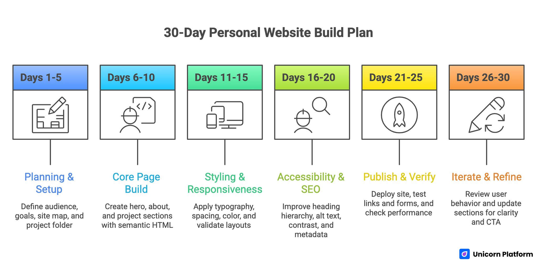
30-Day Personal Website Build Plan
Days 1-5: Planning and setup
Define audience, page goals, and site map. Set up your project folder and base HTML structure.
Days 6-10: Core page build
Create hero, about, and project sections with semantic HTML. Write first draft content.
Days 11-15: Styling and responsiveness
Apply typography, spacing, and color system. Validate desktop and mobile layouts.
Days 16-20: Accessibility and SEO pass
Improve heading hierarchy, alt text, contrast, and metadata.
Days 21-25: Publish and verify
Deploy site, test links and forms, and check performance.
Days 26-30: Iterate with feedback
Review user behavior and update sections for clarity and stronger CTA alignment.
Advanced Growth Additions After Launch
Once your foundation is stable, you can expand with targeted features.
Add a writing section
Publishing practical notes can strengthen discoverability and credibility over time.
Add lightweight analytics
Track high-value actions such as contact clicks or project-page visits to improve content decisions.
Add case-study depth gradually
Expand top projects into richer pages with process and outcome detail. This can improve conversion quality for professional opportunities.
Add lead capture only when relevant
If your goal includes audience building, add a simple newsletter form with clear value proposition. Otherwise, keep the page lean.
Complete Personal Site Blueprint (Section by Section)
If you want a reliable starting architecture, the blueprint below works for most personal websites.
Section 1: Intro block
This is where visitors decide whether to keep reading. Keep the first lines clear and specific.
Include:
- Your name and role.
- Your current focus area.
- One short value statement.
- One primary CTA.
Avoid writing a long autobiography in this section. Your goal is orientation, not full biography.
Section 2: Credibility snapshot
Add a concise credibility strip after the intro. This can include selected achievements, years of experience, notable projects, or published work references.
The purpose is to reduce uncertainty quickly without forcing users to scroll through long narrative text first.
Section 3: About summary
Your About section should clarify what you do, how you work, and what kind of opportunities you prefer.
Keep this section human but practical. Personality helps, but clarity should stay primary.
Section 4: Project highlights
Choose three to six projects and prioritize relevance over quantity. Each project card should include:
- Project name.
- Context and problem.
- Your contribution.
- Outcome or measurable result.
If you have many projects, link to a separate archive page instead of overloading the homepage.
Section 5: Skills and tools
Present skills as capabilities, not keyword lists. Group skills by domain, such as frontend, backend, product design, analytics, or writing.
This structure helps visitors evaluate fit faster than long ungrouped tool lists.
Section 6: Writing or insights
Optional but valuable. Even a short insights section can improve trust by showing your thinking process.
Choose a few relevant posts instead of showing every article by default.
Section 7: Contact and action
End with a single clear action. For example:
- Book a call.
- Send a message.
- Download resume.
- View project deck.
Keep the action tied to your primary site goal.
HTML Structure Example You Can Adapt
The following minimal structure is intentionally simple. It is enough to launch and easy to extend.
<!doctype html>
<html lang=\"en\">
<head>
<meta charset=\"utf-8\" />
<meta name=\"viewport\" content=\"width=device-width, initial-scale=1\" />
<title>Your Name | Personal Website</title>
<meta name=\"description\" content=\"Portfolio and writing by Your Name.\" />
<link rel=\"stylesheet\" href=\"styles.css\" />
</head>
<body>
<header class=\"site-header\">
<nav class=\"nav\">
<a href=\"#about\">About</a>
<a href=\"#projects\">Projects</a>
<a href=\"#contact\">Contact</a>
</nav>
</header>
<main>
<section class=\"hero\">
<h1>Your Name</h1>
<p>Frontend engineer building fast, usable product experiences.</p>
<a class=\"btn\" href=\"#contact\">Let’s Work Together</a>
</section>
<section id=\"about\">
<h2>About</h2>
<p>Short practical summary of your work and current focus.</p>
</section>
<section id=\"projects\">
<h2>Selected Projects</h2>
<article class=\"project\">...</article>
<article class=\"project\">...</article>
</section>
<section id=\"contact\">
<h2>Contact</h2>
<p>Email: hello@example.com</p>
</section>
</main>
<footer>
<small>© 2026 Your Name</small>
</footer>
</body>
</html>
This baseline is intentionally semantic. Good semantics make styling, accessibility, and SEO easier later.
CSS Starter Strategy That Scales
Beginners often write CSS that works for the first version, then becomes hard to manage. A lightweight system prevents that.
Use design tokens
Define spacing, colors, and type scale in one place near the top of your stylesheet. This allows fast global updates.
Example approach:
:root {
--bg: #f7f8fb;
--surface: #ffffff;
--text: #1f2937;
--muted: #5b6472;
--accent: #2563eb;
--space-1: 8px;
--space-2: 16px;
--space-3: 24px;
--space-4: 40px;
}
Tokens reduce random styling decisions and keep visual rhythm stable.
Build layout primitives first
Before styling individual sections, define reusable layout classes for containers, grids, and stacks. This gives you predictable spacing behavior across the whole site.
A consistent container width and section padding scheme dramatically improves visual quality.
Add component styles second
After layout primitives, style components such as buttons, cards, and nav links. Component-first styling helps you reuse patterns and avoid copy-paste CSS.
Add page-specific tweaks last
Keep page-specific rules minimal. Most styles should come from reusable primitives and components.
This structure keeps CSS maintainable as your site grows.
Responsive Design Playbook for Personal Sites
Responsive design should not be an afterthought. Most personal sites are discovered first on mobile devices.
Start with mobile defaults
Write base styles for small screens first, then progressively add larger breakpoints. This approach often produces cleaner CSS and fewer layout bugs.
Use breakpoint decisions based on content
Do not choose breakpoints by device labels alone. Choose breakpoints where your layout actually starts to break.
Keep tap targets comfortable
Buttons and links should be easy to tap without precision. Tight spacing around interactive elements causes frustration on mobile.
Test with realistic content lengths
Long names, long project titles, and longer paragraph text can break layouts that looked fine with placeholder content. Always test with real copy.
Personal Website Content Frameworks That Convert Better
Good structure is not enough if copy is vague. Your words should help the right people decide quickly.
Framework 1: Who, what, why now
Use this for your hero:
- Who you help.
- What you help them achieve.
- Why your approach matters now.
This keeps intros focused and practical.
Framework 2: Problem, approach, result
Use this for project cards and case studies:
- Problem context.
- Approach you applied.
- Result achieved.
This format turns project sections into proof instead of decorative galleries.
Framework 3: Fit filter
Add one short section describing what opportunities are a good fit and what are not. This improves inbound quality and reduces mismatched requests.
SEO and Discoverability Beyond Basics
After foundation-level SEO, you can improve discoverability with focused content strategy.
Build topical clusters around your expertise
If your site includes writing, organize posts into a few thematic areas tied to your audience interests. Thematic consistency helps both readers and search engines understand your focus.
Add internal link paths intentionally
Internal links should guide readers from high-level ideas to deeper examples. Random linking weakens navigation value.
Maintain metadata hygiene
Review titles and descriptions quarterly to keep them aligned with your current positioning and content priorities.
Create one evergreen cornerstone page
A strong evergreen page can serve as your main authority entry point. Keep it updated and link to it from related posts.
Debugging and Troubleshooting Guide
Everyone hits bugs while building from scratch. A clear debugging workflow saves hours.
If styles are not applying
Check:
- CSS file path.
- Selector specificity conflicts.
- Browser cache.
- Typo in class names.
Use browser developer tools to inspect computed styles and confirm which rules are active.
If layout breaks on mobile
Check:
- Fixed widths on containers.
- Oversized images without max-width control.
- Long strings without wrap handling.
- Margin/padding accumulation in nested elements.
Small layout issues usually come from one or two rules, not the entire file.
If links or assets fail after publishing
Check:
- Relative vs absolute paths.
- Case-sensitive filename mismatches.
- Missing uploaded files.
Local previews can hide these problems if your local filesystem behavior differs from hosting behavior.
If page loads slowly
Check:
- Image file sizes.
- Unused JavaScript.
- Blocking third-party scripts.
Performance improvements often come from removing unnecessary assets, not adding optimizers first.
Publishing Workflow Options Compared
Choosing a publishing workflow affects how quickly you can update your site later.
Static hosting workflow
Best for developers or technical creators who want lightweight deployment and predictable performance.
Pros:
- Fast loading.
- Low operational complexity.
- Strong version-control compatibility.
Tradeoff:
- Manual edits for every content update unless automated.
CMS workflow
Best for heavy publishing cadence where non-technical editing matters.
Pros:
- Easier content updates.
- Editorial-friendly interfaces.
- Plugin ecosystem for extensions.
Tradeoff:
- More maintenance overhead and plugin risk.
Unicorn Platform workflow
Best for fast launch cycles with clear visual consistency requirements and lower engineering overhead.
Pros:
- Faster page creation.
- Reusable blocks.
- Streamlined hosting and publishing.
Tradeoff:
- Less raw low-level control than hand-coded environments for specialized edge cases.
Long-Term Maintenance System
A personal website is most useful when it stays current. Maintenance should be lightweight and repeatable.
Monthly review tasks
- Update project outcomes and links.
- Remove stale claims.
- Refresh About section for current focus.
- Validate contact pathways.
Monthly light maintenance keeps your site credible without large rewrite cycles.
Quarterly deep review tasks
- Reassess positioning and audience fit.
- Improve top-performing sections with better examples.
- Audit accessibility and performance again.
- Archive outdated projects.
Quarterly reviews help your site evolve with your work.
Version control for safer updates
Use Git or equivalent versioning for every meaningful update. Version history lets you roll back quickly if a change causes issues.
This also makes your editing process more intentional.
HTML vs CMS vs Unicorn Platform: Practical Decision Matrix
Many people ask which path is "best." The useful answer depends on your operating constraints.
Choose raw HTML when
- You want full structural control.
- You are learning web fundamentals.
- Your site changes are infrequent.
- You value lightweight performance and minimal dependencies.
Raw HTML is a strong long-term skill investment, especially for technical professionals and creators who want precise control.
Choose a CMS workflow when
- You publish content very frequently.
- Multiple non-technical contributors need editing access.
- You rely on plugin-based workflows for specific needs.
A CMS can accelerate editorial operations, but it introduces more maintenance tasks and plugin governance requirements.
Choose Unicorn Platform when
- You need faster launch cycles with less technical overhead.
- You want reusable sections and visual consistency.
- You want to focus on content and conversion rather than server operations.
For many personal brand and portfolio cases, this balance of speed and structure is practical.
Hybrid model that works well
A strong hybrid pattern is:
- Learn and prototype with HTML.
- Define your messaging and section architecture.
- Move production workflows to Unicorn Platform for faster updates.
- Keep HTML literacy for QA and advanced customization decisions.
This model captures both depth and speed.
Project Case Study Template You Can Reuse
Most personal websites lose impact because project descriptions are too vague. A reusable case-study template helps maintain quality.
Template structure
Use this sequence for each project:
- Project context.
- Problem definition.
- Constraints.
- Your approach.
- Outcome and learning.
This structure creates narrative clarity and demonstrates decision-making skill.
Example prompt for writing project entries
Ask yourself:
- What was the core challenge?
- What decision did I make and why?
- What changed because of that decision?
- What would I improve in a second iteration?
Answers to these questions produce stronger portfolio copy than generic feature lists.
Keep project entries concise but specific
A practical target is 120 to 250 words per project card with a link to deeper detail when available.
This length is enough to communicate value while preserving scan speed.
Personal Website QA Checklist Before Publishing
Use this checklist before every meaningful update.
Content QA
- Is the homepage value proposition clear in the first screen?
- Are project descriptions specific and current?
- Is there one primary action per page state?
- Are outdated tools, dates, or claims removed?
UX QA
- Is navigation consistent on all pages?
- Does the layout hold on mobile breakpoints?
- Are buttons and links visually clear?
- Is whitespace and section spacing consistent?
Accessibility QA
- Is heading hierarchy logical?
- Is color contrast sufficient for text and controls?
- Are form fields labeled clearly?
- Is keyboard navigation usable?
Technical QA
- Are all links and assets loading correctly?
- Are page titles and meta descriptions present?
- Are image file sizes reasonable?
- Is page load speed acceptable on mobile?
Running this checklist takes little time and prevents many avoidable quality regressions.
Building a Content Engine on Top of Your Personal Site
Once your base site is stable, a lightweight content engine can improve discoverability and inbound quality.
Pick three core themes
Choose three repeatable themes aligned to your expertise. For example:
- Technical implementation notes.
- Product decision frameworks.
- Career or creator workflow lessons.
Theme consistency helps readers understand your domain authority faster.
Publish on a manageable cadence
A sustainable cadence is better than an ambitious one you cannot maintain. For many individuals, one useful article every two to four weeks is enough.
Consistency beats bursts.
Repurpose intelligently
Turn one article into:
- A short social thread.
- A project note update.
- A newsletter snippet.
- A resource link in your contact follow-up.
Repurposing increases return on writing effort and keeps your website connected to your broader communication channels.
Link content to opportunities
Each article should have one logical next action. That could be viewing a project, contacting you, or reading a related guide.
Without a next-step path, content traffic may not translate into meaningful outcomes.
Freelance and Job-Seeking Variants
Your site structure should reflect your current opportunity goal.
If you are freelance-focused
Prioritize:
- Service clarity.
- Pricing approach or engagement model.
- Fast consultation CTA.
- Case studies with business outcomes.
Freelance pages should make buying decisions easy.
If you are job-seeking
Prioritize:
- Role alignment.
- Selected relevant projects.
- Resume and contact visibility.
- Writing samples that show thinking quality.
Job-focused pages should make evaluation efficient for hiring teams.
If you are founder or operator-focused
Prioritize:
- Product narrative.
- Growth and execution evidence.
- Partnership context.
- Strategic writing samples.
Founder-focused pages should balance vision and operational credibility.
Building a Personal Site as a Career Asset
A personal website is not only a portfolio. It can be a long-term career operating asset.
Use it for opportunity filtering
By making your focus explicit, you attract better-fit opportunities and reduce low-value outreach.
Use it for credibility compounding
Each quality project write-up and practical article compounds over time. This creates a credibility layer independent of third-party platforms.
Use it for narrative control
Your site lets you define your own story rather than relying on fragmented social profiles. That control is valuable across hiring, client acquisition, and partnership contexts.
Team and Client Workflows: Applying HTML Knowledge in Practice
Even if you primarily use builders, HTML literacy improves collaboration quality.
Better communication with designers and developers
Knowing semantic structure and CSS behavior helps you discuss tradeoffs precisely. This reduces misunderstandings and shortens feedback loops.
Stronger QA reviews
You can catch structural and accessibility issues earlier when you understand underlying markup.
Faster iteration decisions
With technical literacy, you can choose the right tool for each update rather than forcing all updates through one workflow.
90-Day Improvement Roadmap After Launch
If you want sustained progress, use a 90-day cycle.
Phase 1 (Days 1-30): Stability and clarity
- Launch base pages.
- Fix immediate bugs.
- Improve CTA clarity.
- Validate mobile behavior.
Phase 2 (Days 31-60): Authority building
- Publish one or two practical articles.
- Expand top project case studies.
- Strengthen internal linking and metadata quality.
Phase 3 (Days 61-90): Conversion quality
- Refine contact flow.
- Improve proof sections.
- Test one messaging variation in hero and CTA.
- Document what improves inbound quality.
This roadmap keeps momentum structured and measurable.
FAQ: Build an HTML Personal Website From Scratch
1. Do I need JavaScript to build a personal website?
No. HTML and CSS are enough for many personal sites. JavaScript can be added later for specific enhancements.
2. Is HTML still worth learning if I use no-code tools?
Yes. HTML understanding improves structure quality, debugging ability, and tool selection decisions.
3. How many pages should a personal website have?
Most people can start with one to three focused pages.
4. Should I build one long page or multiple pages?
A single page can work for simple profiles. Multiple pages work better when you have deeper project or writing content.
5. What is the best hosting option for beginners?
Static hosting and integrated builder hosting are both strong beginner options depending on workflow preference.
6. How often should I update my personal website?
Monthly updates are a practical baseline for most creators and professionals.
7. What should I highlight first on the homepage?
Lead with your role, value proposition, and one clear next action.
8. How do I make my site look professional without advanced design skills?
Use consistent spacing, strong typography, simple color rules, and clear content hierarchy.
9. Is WordPress better than HTML for personal sites?
It depends on your goals. HTML offers direct control, while CMS and builder tools can speed content workflows.
10. What is the biggest mistake beginners make?
Building too much before clarifying audience and page purpose.
Final Takeaway
Building a personal website from scratch with HTML is a strong technical and strategic skill. It gives you direct understanding of structure, styling, and web publishing fundamentals that remain valuable no matter which tools you use later.
For Unicorn Platform users, the highest leverage comes from combining that foundation with efficient no-code workflows. Understand the web deeply, publish quickly, and iterate consistently around real audience goals.