Table of Contents
- Why B2B Landing Pages Need a Different Playbook
- 30-Day Execution Plan for B2B Teams
- Common Mistakes and How to Fix Them
- FAQ
B2B landing pages rarely fail because teams did not work hard enough. They fail because the page tries to sell before it proves relevance, and it asks for conversion before trust is established. Decision-makers land on the page, skim the first screen, and leave when they cannot quickly connect the message to their actual operational problem.
That problem compounds across the entire funnel. Paid traffic becomes expensive, sales teams receive lower-quality leads, and internal stakeholders lose confidence in campaign performance. When the page quality is weak, even strong products struggle to convert at sustainable cost.
A better B2B landing page approach is built on decision clarity. The page should identify a specific audience, frame a concrete problem, present a credible solution path, and make the next step feel safe and useful. This guide walks through exactly how to build that system, from strategy and structure to measurement and ongoing optimization.
sbb-itb-bf47c9b
Key Takeaways
B2B Page Optimization
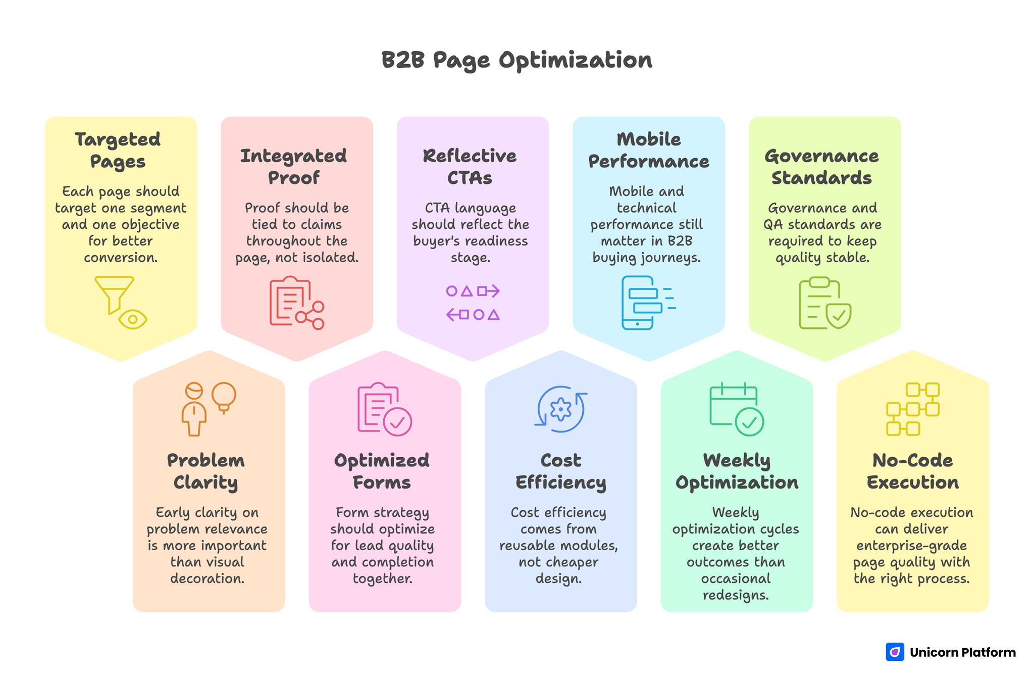
- B2B pages convert better when each page targets one segment and one objective.
- Early clarity on problem relevance is more important than visual decoration.
- Proof should be tied to claims throughout the page, not isolated in one section.
- Form strategy should optimize for lead quality and completion together.
- CTA language should reflect buyer readiness stage.
- Cost efficiency comes from reusable modules, not cheaper design decisions.
- Mobile and technical performance still matter in B2B buying journeys.
- Weekly optimization cycles create better outcomes than occasional redesigns.
- Governance and QA standards are required to keep quality stable at scale.
- No-code execution can deliver enterprise-grade page quality with the right process.
Why B2B Landing Pages Need a Different Playbook
B2B buyers evaluate risk through a wider lens than most B2C buyers. They are not only asking whether the offer looks attractive. They are asking whether implementation is realistic, whether results are credible, and whether internal approval is likely if they share the page with colleagues.
A single visitor can represent multiple hidden stakeholders, including operations, finance, and leadership teams that will never see your ad but may still influence the final decision. Because of that, page content should be structured for both immediate conversion and internal forwarding value. Clarity and credibility need to hold up even when someone reads the page out of original campaign context.
Longer sales cycles also change conversion logic. Instead of one impulsive action, B2B pages usually support staged progression toward trust, qualification, and eventual buying conversation. A high-performing page accepts this reality and designs conversion points that match buyer readiness instead of forcing premature commitment.
According to a Gartner report on B2B buying behavior, modern business buyers invest significant time in research and require multiple touchpoints to gain confidence before committing, which underscores the importance of staged conversion logic and proof placement throughout the landing page.
Strategy Foundation Before You Design Anything
Most weak pages begin with template selection before strategy definition. That order feels productive, but it creates generic pages that look polished and convert poorly. Starting with strategy first usually saves time because every later decision becomes easier and more consistent.
The first strategic task is segment definition. A page designed for "all mid-market companies" is almost always too broad to feel relevant. Strong teams define one specific segment, one urgent use case, and one measurable outcome that matters in that context.
The second task is objective alignment. Choose one primary action that reflects campaign intent, such as demo request, strategy call, trial start, or qualified lead form. Secondary actions may exist, but one path should dominate the experience so users do not face avoidable decision friction.
The third task is objection mapping. Before copywriting starts, list likely blockers such as implementation complexity, integration fit, pricing uncertainty, data risk, and resource commitment. These blockers should shape section sequence and FAQ design so objections are addressed before users exit.
Core Architecture of a High-Converting B2B Page
A clear architecture reduces cognitive load and helps users progress naturally from relevance to confidence to action. If your team needs a detailed baseline to standardize section order, the framework in a step-by-step guide to a high-converting landing page structure is a strong reference point.
The hero section should establish who the offer is for, what business problem it solves, and why the solution is practical now. Generic brand statements are rarely enough in B2B contexts because users need immediate fit confirmation before they continue scanning.
A context section should follow quickly, framing the cost of the current status quo in operational language. This is where teams can clarify delays, inefficiencies, compliance risk, revenue leakage, or team coordination problems that the audience already recognizes.
Solution framing then translates capabilities into outcomes. Feature lists alone often feel abstract, so each capability block should connect clearly to measurable business impact. The more concrete the outcome, the easier it is for readers to evaluate value against effort.
Proof sections should not be treated as decorative trust blocks. They should validate the exact claims made in nearby copy, using role-specific testimonials, case outcomes, and implementation realism that reduce uncertainty at the moment it appears.
Offer and conversion sections should explain what happens after submission. Response timing, call format, onboarding expectations, and next-step clarity can lift conversion quality significantly because they reduce ambiguity around commitment.
Messaging Frameworks That Improve B2B Conversion
Messaging quality usually determines whether the page feels credible enough to earn action. B2B copy performs best when it is specific, operational, and easy to map to real business outcomes.
A reliable writing flow is Problem, Outcome, Evidence, Next Step. Problem language should mirror friction users already experience. Outcome language should define practical change in clear terms. Evidence should support credibility with context. Next-step language should set expectations for what happens after action.
Ambiguous phrases like "transform your business" or "next-level growth" often weaken trust because they do not help readers evaluate fit. Stronger alternatives reference concrete results such as shorter cycle time, fewer handoff errors, improved reporting visibility, or better lead qualification.
Headline development deserves dedicated testing. In many B2B funnels, the first screen drives the largest share of conversion variance, so focused headline iteration can produce outsized gains without full page redesign.
Subheadlines should add useful detail rather than repeat headline language. Good subheads often clarify mechanism, implementation speed, or audience scope in one short line that lowers skepticism quickly.
Proof Strategy for Multi-Stakeholder B2B Decisions
B2B proof is most effective when it is distributed and contextual. A single logo strip or generic testimonial quote may look credible, but it often fails to answer stakeholder-specific concerns.
Early proof should establish baseline legitimacy with recognizable customer categories or concise outcome markers. Mid-page proof should validate core claims with stronger detail, such as role context, implementation effort, and measurable impact.
Near conversion points, trust reinforcement should reduce final hesitation. Practical reassurance around onboarding support, response expectations, and delivery process can increase form quality because users feel less risk at the decision edge.
Case snippets perform especially well when they are concise and structured. A useful mini-case format includes initial challenge, intervention approach, and observed result over a clear time period.
Compliance and security language should be clear but not overwhelming. Overly legal framing can interrupt narrative flow, while under-explained claims can create doubt. Balance comes from plain-language summaries with optional deeper references.
Research from the Stanford Web Credibility Project shows that users often judge a website’s credibility within seconds based on visual clarity and trust signals, reinforcing the article’s point that proof and reassurance should appear close to decision points throughout the page.
Form and CTA Design for Qualified Pipeline Growth
Form strategy in B2B should not be measured only by completion rate. A form that generates many low-fit submissions can still reduce overall pipeline efficiency and increase sales workload.
High-performing teams use staged qualification logic. The first step captures essential details and intent signal, while deeper qualification happens during follow-up or secondary workflow. This keeps initial friction manageable without sacrificing lead quality standards.
Field clarity matters as much as field count. Labels should be explicit, and any required fields should feel justified. Confusing forms increase drop-off even when users are interested in the offer.
CTA language should align with stage readiness. Early-stage audiences often respond to exploratory actions like "See how it works," while later-stage audiences may prefer "Request implementation plan" or "Book strategy call." Matching this language to campaign context improves both conversion and lead fit.
Conversion sections should always set expectation. Users should know what response timeline to expect and what the next interaction will include. Predictability reduces anxiety and improves completion confidence.
Cost Planning: Building Better Pages Without Waste
B2B landing page cost is often treated as a design budget decision, but actual cost efficiency depends more on process maturity. Teams overspend when they rebuild structure repeatedly, run untracked experiments, or produce assets without clear testing priorities.
A cost-smart process starts with reusable modules. Hero formats, proof cards, form components, and FAQ structures can be standardized and adapted across segments. This reduces production time while preserving conversion quality.
The second driver is experiment discipline. Pages improve faster and cheaper when tests are isolated and outcomes are documented. Random multi-variable redesigns create expensive ambiguity and weak learning velocity.
The third driver is collaboration clarity. Clear ownership across messaging, design, analytics, and launch QA reduces revision loops and shortens delivery cycles.
No-code workflows can significantly improve cost control when these process elements are in place. Without them, even simple tools can produce inefficient iteration patterns.
B2B Landing Page Cost Model in Practice
Most teams estimate landing page cost as a one-time production number, then get surprised by iteration expense. A more accurate approach is to model cost across the full lifecycle: build, validation, optimization, and maintenance.
Start with four buckets. The build bucket includes strategy alignment, copy drafting, and first-page implementation. The validation bucket covers proof collection, QA, and tracking verification before scaling traffic. The optimization bucket includes planned tests and analytical review. The maintenance bucket covers periodic updates to messaging, proof, and technical configuration as campaigns evolve.
This lifecycle view helps leadership understand that a landing page is a performance asset, not a static deliverable. It also improves planning because teams can decide in advance which activities are mandatory and which are optional in each cycle.
A practical planning worksheet can include:
- expected monthly traffic by source and intent stage
- current conversion rate and target range
- average value of a qualified opportunity
- estimated effort hours per optimization cycle
- expected number of major tests per month
Once these variables are visible, ROI conversations become clearer. Teams can compare whether additional traffic spend or additional page optimization effort is more likely to improve qualified pipeline at lower marginal cost.
Cost quality also improves when teams treat each successful test as reusable IP. A winning proof block, form format, or CTA structure can be reused across multiple pages, reducing future build effort while preserving conversion logic. Over several campaign cycles, this reuse effect is often one of the largest contributors to no-code efficiency.
Mobile and Technical Performance in B2B Contexts
B2B teams still underestimate mobile influence, especially in early research stages. Decision-makers often first encounter landing pages from mobile email, community links, or social distribution before returning on desktop for deeper evaluation.
Mobile quality should therefore be treated as primary readiness, not secondary polish. First-screen readability, tap-target comfort, fast loading behavior, and clear CTA visibility are all necessary for preserving early intent.
Technical reliability also affects trust perception. Slow or unstable pages can create subconscious concerns about execution quality, especially when the offer requires operational confidence.
Instrumentation should be part of technical readiness. Event tracking for scroll milestones, CTA progression, and form behavior allows teams to identify precise friction points instead of making subjective assumptions.
SEO Layer for B2B Landing Programs
Landing pages can support organic acquisition when intent mapping is clear and content architecture reflects real decision questions. B2B SEO performs best when it is integrated with conversion strategy from the beginning.
Each page should center on one primary intent with supporting subtopics that answer likely objections and comparison questions. This improves both discoverability and conversion confidence because users find relevant depth without losing narrative flow.
Internal linking should support progression, not clutter. Strategic links to deeper resources can improve user outcomes when placed contextually and spaced naturally through the article.
For teams prioritizing post-launch improvements by behavior, user behavior tips to optimize landing pages offers a practical framework for connecting interaction signals to concrete content changes.
Avoid over-optimizing for exact phrases at the expense of readability. Natural language with strong topical coverage usually creates more durable performance and better reader trust.
30-Day Execution Plan for B2B Teams
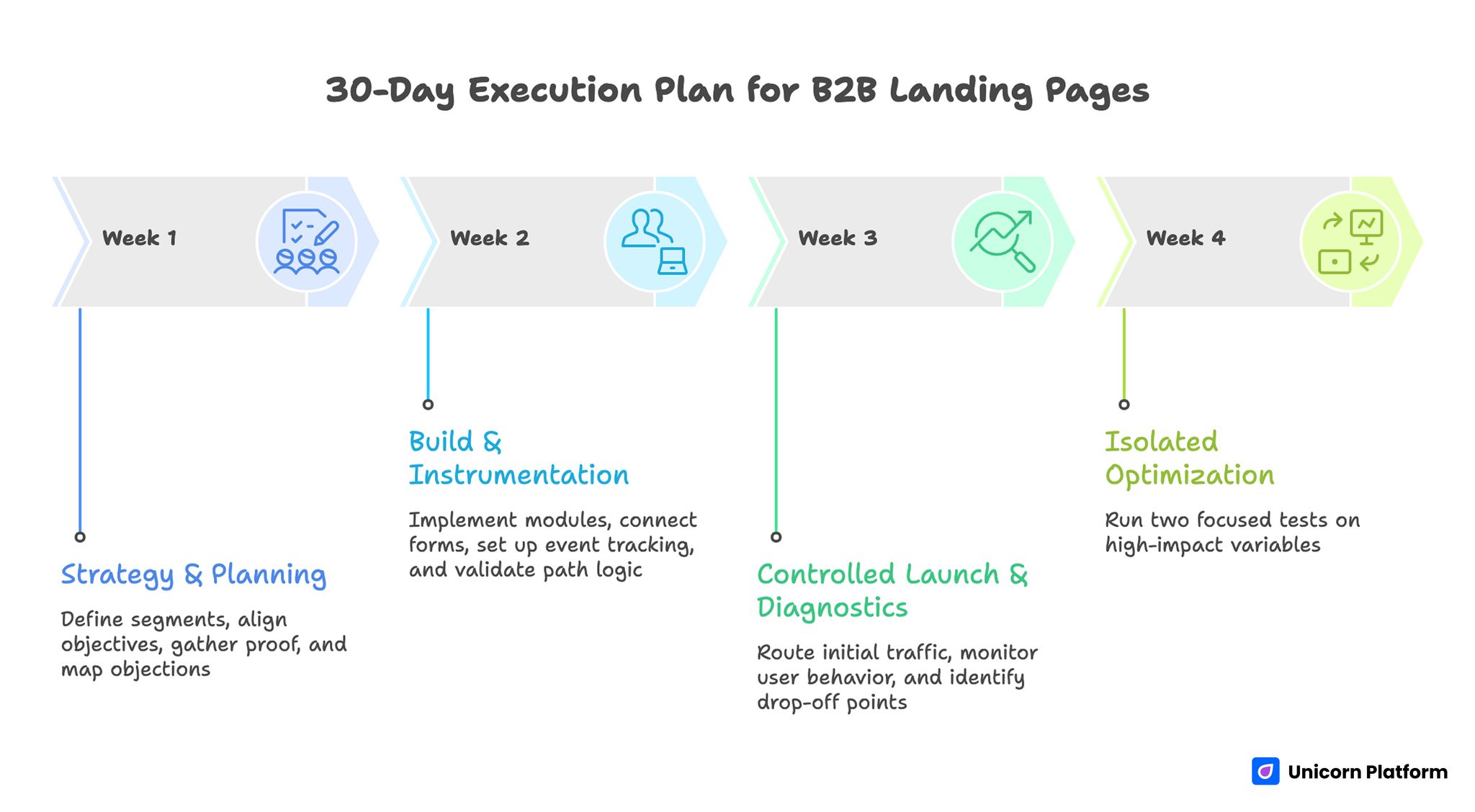
30-Day Execution Plan for B2B Teams
Week 1: Should focus on strategy and section planning. Segment definition, objective alignment, proof requirements, and objection mapping should be completed before build begins.
Week 2: Should focus on build and instrumentation. Implement page modules in Unicorn Platform, connect forms and event tracking, and validate path logic across devices.
Week 3: Should focus on controlled launch and diagnostics. Route initial traffic from aligned sources and evaluate where users lose confidence or stall before action.
Week 3: Should focus on isolated optimization. Run two focused tests on high-impact variables such as headline specificity, proof placement, or CTA phrasing.
This cadence creates fast learning while preserving interpretation quality.
60-Day and 90-Day Scaling Model
By day sixty, teams should have early evidence on message patterns and module performance. Scaling should build on those validated elements, not restart from blank-page redesign.
Days 31 to 60 should prioritize segment variant development and source-level comparison. The goal is to improve relevance while keeping architecture stable.
Days 61 to 90 should prioritize funnel continuity and downstream quality metrics. Conversion volume alone is not enough. Teams should also monitor qualified opportunities, meeting rates, and pipeline movement tied to landing sources.
A centralized experiment log with hypothesis, exact change, primary metric, and result creates compounding operational knowledge. This log becomes a practical asset for future campaigns and new team onboarding.
Governance and QA for Consistent Output
Quality drops quickly when multiple contributors edit pages without shared standards. A lightweight governance model protects quality without slowing execution.
Assign clear owners for message quality, analytics integrity, and launch QA. Role clarity reduces revision conflicts and prevents overlooked readiness checks.
Weekly review rituals should remain structured. Teams should examine channel changes, friction hotspots, next-priority test, and decision metric in each cycle.
QA should include message clarity checks, CTA function checks, form-path tests, mobile behavior validation, and event integrity confirmation before each major traffic push.
Consistency in these basics is what makes no-code velocity sustainable.
Common Mistakes and How to Fix Them
1. Broad segment targeting
Overly broad targeting creates generic copy and weak relevance. Narrow segment definition and outcome framing improve clarity quickly.
2. Feature-heavy messaging
Feature-first language often underperforms in B2B because buyers evaluate business impact first. Outcome-led copy with mechanism support works better.
3. Isolated proof section
Proof that appears only once can be missed or disconnected from claims. Distributed proof placement improves trust continuity.
4. Form friction imbalance
Forms that are too short or too long both create problems. Staged qualification usually balances completion and lead quality.
5. CTA mismatch by stage
One CTA style does not fit all audiences. Align CTA language with buyer readiness and campaign source.
6. Weak measurement setup
Without clear event taxonomy, teams cannot identify true conversion blockers. Instrumentation must be reliable before scaling traffic.
7. Launch-and-forget behavior
B2B landing performance improves through continuous refinement. Weekly tests and monthly structural reviews keep momentum and quality aligned.
FAQ: B2B Landing Pages
What is the key difference between B2B and B2C landing pages?
B2B pages usually require deeper trust, clearer process expectations, and stronger proof because buying decisions involve more risk and more stakeholders.
How long should a B2B landing page be?
Length should match decision complexity. Scannable long-form pages often perform well when they maintain clear section roles and answer practical objections.
Should pricing be shown on B2B landing pages?
Pricing visibility depends on offer model. If transparency improves qualification, include it. If scope varies, explain the evaluation path clearly.
How many CTAs should be on one page?
One primary CTA should dominate. Secondary actions can support different readiness levels, but hierarchy should remain clear.
What proof matters most in B2B?
Role-specific outcomes, implementation realism, and contextual testimonials usually create stronger trust than generic brand logos.
How can we improve lead quality without hurting conversion too much?
Staged qualification forms and clearer expectation copy often improve lead fit while keeping completion healthy.
What should we test first after launch?
Start with first-screen message fit, then test proof placement and CTA wording.
Are no-code tools sufficient for serious B2B programs?
Yes, when supported by strong strategy, QA discipline, and measurement rigor.
How often should B2B landing pages be updated?
Weekly focused improvements plus monthly structural audits usually produce stable gains.
What creates long-term compounding performance?
Reusable modules, documented experiments, and clear governance across messaging, design, and analytics.
Final Takeaway
B2B landing pages succeed when they are built as decision systems, not just design assets. Clear segment focus, practical proof, staged conversion logic, and disciplined optimization are the fundamentals that drive reliable outcomes.
Teams using Unicorn Platform can execute this model quickly without sacrificing quality. Launch fast, measure accurately, and refine in focused cycles to build compounding conversion performance.