Table of Contents
- What High-Performing Pages Are Doing Better
- 42 High-Value App Landing Patterns You Can Adapt
- Information Architecture Blueprint You Can Deploy in Unicorn Platform
- 30-Day Implementation Plan in Unicorn Platform
- Applied Build Scenarios: Turning Patterns Into Real Pages
- FAQ
Most teams that search for a unique and creative app landing strategy are not actually blocked by design software. They are blocked by message clarity, proof sequencing, and conversion architecture. Their page looks modern, but visitors still hesitate because the page never resolves the core decision questions fast enough: is this for me, can I trust it, and what should I do next.
That gap is exactly why this guide exists. Instead of collecting random inspiration screenshots, it translates the strongest high-performance patterns in this category into a practical system you can execute in Unicorn Platform. The goal is not imitation. The goal is to borrow logic that helps pages earn trust quickly, then apply it in original form with stronger positioning and better implementation depth.
A second reason this matters in 2026 is that discovery happens across multiple surfaces, not one channel. Pages that are both comprehensive and structurally clean are easier for people to evaluate quickly. If your page is visually attractive but semantically thin, it can lose attention even if your product is better.
So this article is deliberately long, structured, and operational. It includes pattern analysis, execution frameworks, message templates, conversion plans, and implementation steps you can use immediately.
sbb-itb-bf47c9b
Key Takeaways Before You Dive In
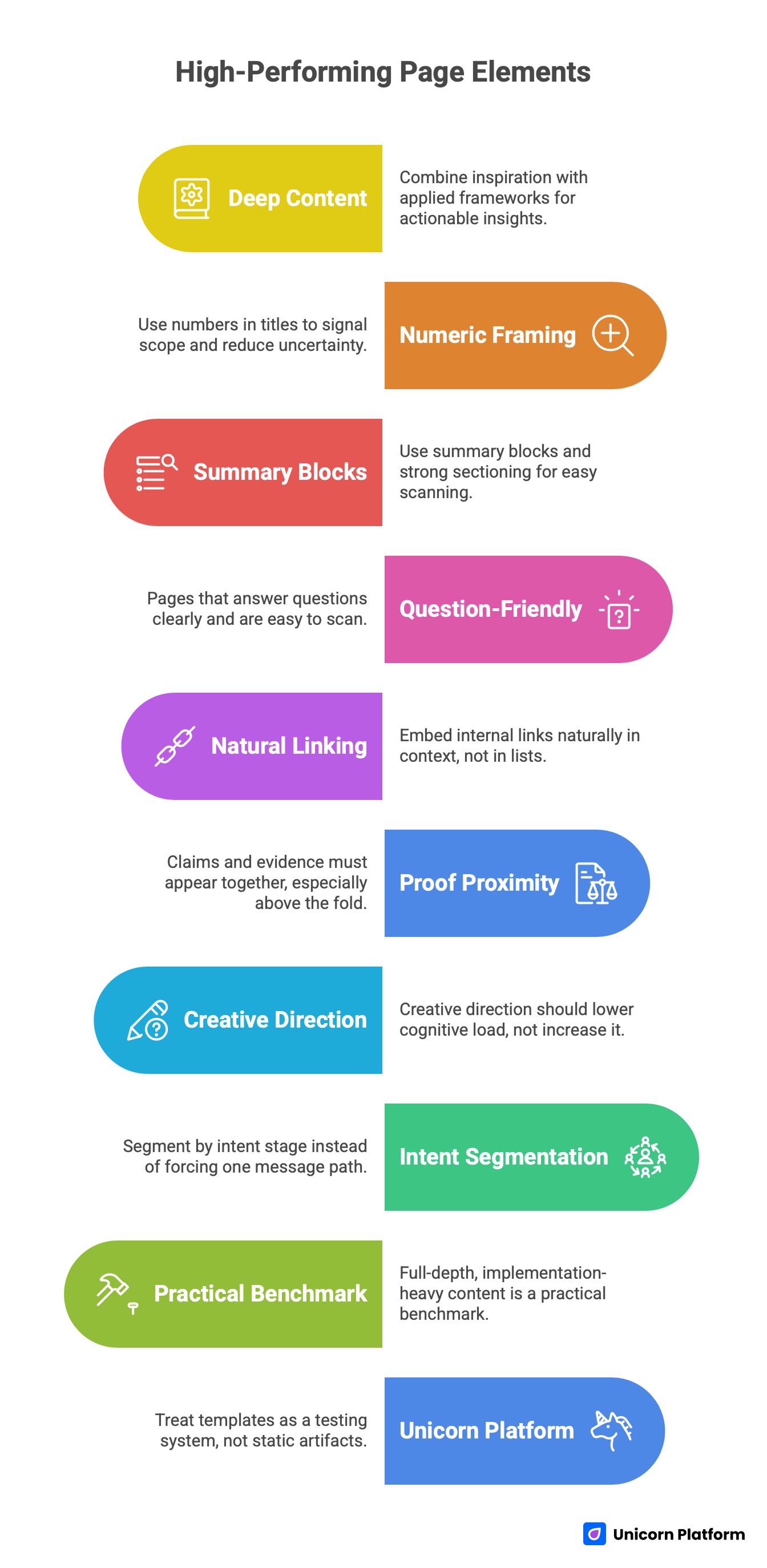
High-Performing Page Element
- High-performing pages in this space are deep, not short. They combine inspiration with applied frameworks, so users can act without leaving the page.
- Numeric framing in titles and H1s works because it signals scope and reduces uncertainty about depth.
- Winning pages use summary blocks, key takeaways, and strong sectioning so readers can scan first and decide where to engage deeply.
- Pages that perform well across modern discovery surfaces are question-friendly, definition-rich, and easy to scan into clear answers.
- Internal linking works best when embedded naturally in context, not dumped in standalone "related links" lists.
- Proof proximity is a major conversion lever: claims and evidence must appear together, especially above the fold and before the first CTA.
- Creative direction helps only when it lowers cognitive load. Motion and visual novelty that delay understanding usually hurt conversion.
- The strongest app landing pages segment by intent stage (cold, warm, decision) instead of forcing one message path for all traffic.
- A practical benchmark for this group is full-depth, implementation-heavy content, not thin opinion pieces.
- Unicorn Platform can support this strategy if you treat templates as a testing system, not as static page artifacts.
Why This Topic Is Harder Than It Looks
This topic sounds like a design brief, but in practice it is a conversion and content architecture challenge. Teams often over-index on aesthetics and under-index on information hierarchy. They optimize hero visuals and animation details while leaving core value communication ambiguous.
The result is predictable. Traffic arrives with intent, users scan quickly, and they bounce because the page does not provide decision-grade clarity. In most underperforming pages, the first 20 seconds are spent on interpretation instead of conviction.
There is also a false binary that hurts execution: teams think they must choose between educational depth and conversion-first page design. The strongest pages in this category prove the opposite. The pages that win combine list-driven depth, practical explanation, and clear action pathways. That is the model we are applying here.
What High-Performing Pages Are Doing Better (Pattern Extraction)
High-Performing Pages Patterns
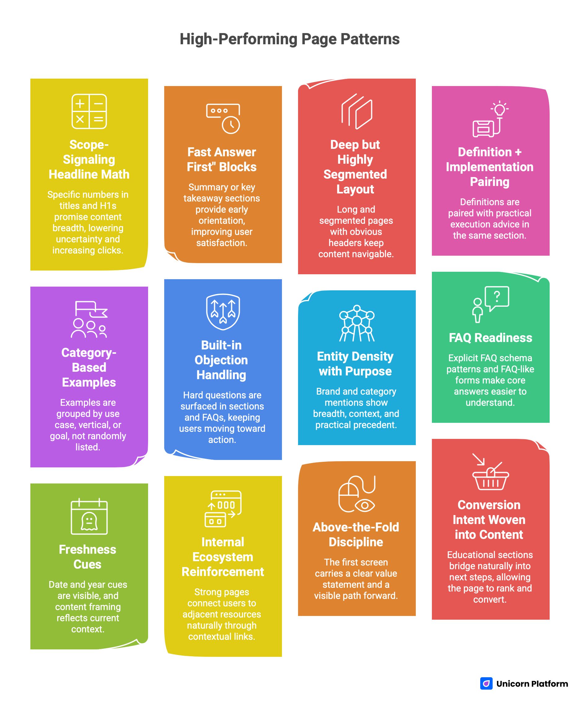
Pattern 1: Scope-signaling headline math
When readers see a specific number in the title and H1, they get a clear promise about content breadth. This lowers uncertainty and increases clicks for users who want depth, not thin commentary. It also supports scan behavior because numbered sections create natural stopping points.
Pattern 2: "Fast answer first" blocks
Strong pages provide early orientation with summary or key takeaway sections before deep detail. This improves user satisfaction and makes key answers easier to find quickly. Readers who need a quick conclusion can still benefit, while committed readers continue into deeper modules.
Pattern 3: Deep but highly segmented layout
High word count alone does not win. The best-performing pages are long and segmented, with obvious headers, numbered sections, and predictable module boundaries. This keeps long content navigable and lowers perceived effort.
Pattern 4: Definition + implementation pairing
Top pages do not stop at "what this is." They pair definitions with practical execution advice in the same section. This is crucial because many visitors are not researching theory; they are trying to build or improve a live page this week.
Pattern 5: Category-based examples
Examples are grouped by use case, vertical, or goal, not randomly listed. This helps users find relevance quickly and keeps the page semantically rich across multiple intent clusters.
Pattern 6: Built-in objection handling
Instead of hiding hard questions, top pages surface them in sections and FAQs: what makes a page effective, what mistakes to avoid, what conversion rates mean, and what to optimize first. This keeps users moving toward action.
Pattern 7: Entity density with purpose
Brand and category mentions are not decorative. They show breadth, context, and practical precedent. This increases topical authority and gives users confidence that advice is grounded in real-world patterns.
Pattern 8: FAQ readiness
At least one strong page uses explicit FAQ schema patterns with concise answers, and others structure content in FAQ-like forms even without heavy schema emphasis. This makes core answers easier to understand in fast-scan contexts.
Pattern 9: Freshness cues
Date and year cues are visible, and content framing reflects current context rather than evergreen vagueness. In competitive spaces, freshness signals help users trust relevance and reduce hesitation.
Pattern 10: Internal ecosystem reinforcement
Strong pages connect users to adjacent resources naturally through contextual links. When this is done inside narrative flow, it strengthens authority without feeling forced.
Pattern 11: Above-the-fold discipline
The first screen carries a clear value statement, orienting context, and a visible path forward. Users are not forced to scroll to discover what the page is about.
Pattern 12: Conversion intent woven into content
Educational sections are not detached from conversion outcomes. They bridge naturally into next steps, which means the page can rank and convert instead of only doing one job. These are the mechanisms we need to out-execute.
How to Build a Unique and Creative App Landing Page That Actually Converts
The framework below is built for teams that want a publish-and-improve system, not a one-off redesign sprint.
Step 1: Define one audience-job pair
Start with one audience and one job-to-be-done. A page that tries to serve every segment at once usually becomes generic. If your app serves founders, marketers, and operators, choose one for the primary page variant and create parallel variants later.
This single decision improves every downstream choice: headline precision, proof selection, CTA phrasing, section order, and objection handling. Teams skip this step because it feels obvious, but it is often the highest leverage move in the entire process.
Step 2: Build a first-screen message stack
The first-screen stack should answer three questions in order: who this is for, what outcome it creates, and what action is expected next. If any of these are unclear, your creative layer is not helping performance. A practical stack is:
- outcome-led headline
- plain-language subheadline
- one trust signal (customer count, result metric, or relevant logo)
- one primary CTA
- one low-friction secondary action (optional)
Step 3: Place proof close to claims
Do not let proof drift far below claims. If you promise speed, show workflow compression evidence right there. If you promise higher conversion quality, show relevant customer or cohort examples immediately after the claim. Proof proximity matters more on mobile because users are less likely to tolerate long claim-only stretches before seeing evidence.
Step 4: Use section-level conversion jobs
Every section needs one job. A page with ten sections and no explicit jobs feels busy but weak. Good section jobs include:
- clarify mechanism
- resolve a known objection
- compare options
- demonstrate use case fit
- trigger next action
This approach turns content architecture into conversion logic.
Step 5: Design for scan-first reading
Most visitors scan before committing to full reading. Use short intro paragraphs, clear headings, and predictable section patterns so readers can orient quickly. Scannability is not "dumbing down" content. It is a usability requirement. Pages that rank well in this space are not simple; they are easy to navigate.
Step 6: Embed internal links where decision context exists
If you mention page architecture, naturally connect users to your detailed guide on high-converting landing page structure in that same paragraph.
If mobile-first concerns become central to the section, add the mobile implementation resource in the mobile-focused section rather than bundling multiple links in one paragraph. This keeps reading flow clean and keeps each link useful.
Step 7: Add AI-answer-friendly blocks
Answer engines prefer clean, extractable text blocks. You can support this by using direct question headings, concise definitions, and explicit short answers before elaboration. If you explain experimentation, a strong pattern is: one sentence definition, one sentence practical implication, one short execution list. Structured, answer-first formatting aligns with how modern search and AI systems extract information from long-form content.
Step 8: Run a publish-test cadence, not a "final design" mindset
The page you ship first is not the page you should keep forever. In Unicorn Platform, treat each variant as a controlled test unit with explicit hypotheses. Keep structure stable and vary one high-impact variable per test cycle. This gives better signal quality and reduces the risk of random churn.
42 High-Value App Landing Patterns You Can Adapt (Without Copying)
The point of this section is not to replicate brand layouts. It is to understand patterns and adaptation logic.
Product clarity and mechanism patterns
1) Visual workflow compression
Show a three-step visual flow that turns abstract product claims into concrete process understanding. This pattern works for automation tools, dashboards, and collaboration apps where users need to "see" process simplification. In Unicorn Platform, use a simple step module with short captions and one supporting micro-proof near the third step.
2) "Before and after" interface framing
A strong before/after contrast can instantly clarify outcome value. This works especially well when switching costs are a concern and users need confidence that change produces measurable benefit. Keep the comparison focused on one outcome metric instead of many weak claims.
3) Feature-to-outcome mapping
Instead of listing features in isolation, map each feature to a business outcome. This improves persuasion for buyers who care about impact rather than technical vocabulary. This pattern is common in top SaaS examples and consistently improves clarity.
4) Role-based mechanism explanation
If your product serves multiple roles, explain mechanism by role. A founder and an operator often care about different workflows. Use short role tabs or segmented cards without overcomplicating the layout.
5) Friction-reduction CTA phrasing
"Start free" is weaker than "Build your first page in 15 minutes" when speed is a major objection. The strongest CTA copy sets expectation about effort and outcome. Anchor CTA language to first-value realization.
6) Demo-first middle-funnel block
Warm visitors often need product confidence more than brand storytelling. A demo-first block near the middle of the page can capture this intent without disrupting top-of-page narrative flow. Use a short context line that explains what the demo proves.
7) Use-case path cards
When one product supports many use cases, use path cards that route visitors to relevant flows. This keeps main narrative clean while preserving breadth. High-performing pages often use this approach through category grouping and segmented lists.
8) Outcome-specific micro-headlines
Replace generic section headings with outcome language. For example, "Reduce launch time" is stronger than "Launch features." Micro-headlines that sound like decisions improve scanning quality. Use this pattern consistently across the page.
Trust and proof patterns
1) Evidence near first claim
Trust should begin before the first scroll depth drop. Place one solid trust cue near first promise, not only in the bottom half of the page. This can be a customer metric, adoption signal, or relevant brand mention.
2) Proof by buyer similarity
Testimonials convert better when reader identity matches speaker identity. A startup founder quote is stronger for founder traffic than a generic user quote. Segment testimonial placement by likely entry channel where possible.
3) Quantified benefit statements
Whenever possible, use metrics in proof blocks. "Faster" is weaker than "reduced launch-cycle time by 43%." Specificity increases credibility and reduces interpretation burden. Avoid inflated or unverifiable numbers.
4) Objection-first trust section
Build a short section that answers common objections directly: setup complexity, migration risk, team adoption, and maintenance effort. This pattern appears repeatedly in high-performing long-form pages. It prevents users from leaving to search those questions elsewhere.
5) Reliability and control language for AI products
For AI-driven apps, explicitly describe human control points. Phrases like "human review before publish" reduce perceived risk and improve buyer confidence. This is a strong pattern for conservative teams and regulated workflows.
6) Comparative trust framing
Without attacking alternatives directly, you can frame why your approach is safer or easier by contrasting process models. This helps decision-stage readers who are already evaluating options. Keep language factual and non-defensive.
7) Social proof stratification
Use layered proof instead of one giant proof dump: top-of-page signal, middle-case snippet, and bottom decision proof. This distributes trust where users need it across the reading journey. It is more effective than placing all logos in one section.
8) Fresh proof maintenance
Outdated proof degrades trust quickly. Establish a refresh cadence for testimonials, numbers, and case references every quarter. In Unicorn Platform, modular proof blocks make this maintenance less painful.
Structure and navigation patterns
1) Summary-first opening
A summary section near the top reduces bounce among high-intent readers. It also helps fast-scan readers find practical conclusions quickly. Use practical takeaways, not vague motivational bullets.
2) Numbered list architecture
Numbered architecture helps users estimate effort and scope. It also supports citation-like references in discussions and internal team reviews. This pattern is especially useful in long pages above 5,000 words.
3) Section purpose labels
Give each major section a clear job in the heading language. This improves navigation and keeps writing focused. Avoid decorative headings that hide purpose.
4) Question-led heading design
Question headings match user mental models and improve answer extraction. They also reduce ambiguity because each section starts with a known decision point. Use questions where readers commonly hesitate.
5) Mid-page reorientation module
In long pages, include occasional reorientation blocks that recap what has been covered and where to go next. This reduces fatigue and keeps engagement stable. Think of these as micro wayfinding cues.
6) Intent-layer sequencing
Sequence sections from broad orientation to detailed execution to decision-stage prompts. This mirrors user progression and keeps logic coherent. Random section ordering is a hidden conversion leak.
7) Early vs. late CTA intent matching
Early CTAs should be low-friction and exploratory. Late CTAs can ask for stronger commitment after sufficient proof. This progression aligns with how confidence is built.
8) FAQ near decision zone
FAQ sections perform best when placed near the bottom decision zone, not at random. At that point users are evaluating edge-case concerns. Keep answers specific and short first, then expand.
Messaging and conversion copy patterns
1) Outcome-led headline formulas
Headline language should prioritize end-state benefit over process detail. Visitors decide relevance based on outcomes first, then evaluate mechanisms. A clean formula is: target audience + core outcome + speed/confidence qualifier.
2) Subheadline de-jargonization
Subheadlines that remove jargon outperform technical phrasing for mixed-intent traffic. Keep sentence structure plain and test comprehension with non-specialist readers. Clarity beats cleverness consistently.
3) Mechanism sentence immediately after claim
After making a promise, explain mechanism in one sentence. This bridges aspiration and credibility quickly. Without mechanism, bold promises look like marketing inflation.
4) Objection-aware microcopy near forms
Small form microcopy about privacy, setup time, or cancelability can materially improve completion quality. Many users abandon forms due to unanswered concern, not form length alone. Use concise reassurance near interaction points.
5) CTA expectation setting
Define what happens after click. "Start trial" is weaker than "Start trial, launch first page in 20 minutes." This reduces uncertainty and improves click quality. Expectation clarity lowers drop-off after CTA.
6) Comparative language without hostility
Decision-stage users want comparison context, but aggressive language often hurts trust. Use calm, criteria-based framing. Describe process advantages instead of attacking alternatives.
7) Language hierarchy for skim readers
Use strong lead sentences that carry section value even if readers skip details. This pattern supports realistic scan behavior. Then provide depth for readers who continue.
8) Message consistency across modules
Ensure headline promise is echoed in proof, CTA, and FAQ language. Inconsistent message themes fragment trust. Consistency is a conversion multiplier.
Example entities and use-case adaptation patterns
1) Wellness and habit apps (e.g., Calm-like positioning)
These pages perform best with emotional clarity and low-friction onboarding cues. The promise should center on immediate personal benefit, then support with gentle proof. Avoid overloading with enterprise-style feature taxonomy.
2) Marketplace and logistics apps (e.g., DoorDash-like patterns)
Focus on speed, reliability, and operational predictability. Use trust cues around fulfillment confidence and transparent next steps. Operational clarity often outranks visual novelty in this category.
3) Professional network and career apps (e.g., LinkedIn-like cues)
Emphasize identity value, reputation leverage, and role-based utility. Proof works better when it references career outcomes or team-level efficiency. Segment language by user maturity level where possible.
4) Ecommerce-adjacent app experiences (e.g., Zola-like inspiration)
Use visual persuasion with practical pathing. Buyers need to understand both emotional payoff and process simplicity. Balance aspirational imagery with concrete interaction cues.
5) Productivity and planning apps (e.g., Opal/Finy-style clarity)
Show information architecture and workflow outcomes early. These users evaluate whether complexity is reduced. A clean interface walkthrough can outperform long persuasive copy.
6) Fitness and behavior apps (e.g., FitnessAI-style framing)
Demonstrate progression logic and personalization mechanics quickly. Users want to know if the app adapts to real behavior. Use examples that show practical first-week outcomes.
7) Collaboration tools for teams
Highlight alignment, visibility, and handoff speed. Trust cues should include role fit and operational reliability. Avoid generic "team productivity" language without specifics.
8) Builder and creator tools
These pages benefit from tangible "build in minutes" pathways and template scaffolds. Creativity must map to concrete launch outcomes. Decision-stage users need confidence about execution effort.
9) AI-assisted app products
Clearly separate automation from oversight. State where AI helps and where users retain control. This transparency reduces skepticism and supports adoption.
10) Early-stage startup products
For startup products without massive social proof, use founder clarity and process transparency as trust substitutes. Show what the product does, who it helps, and what happens next. Crisp positioning can offset limited brand familiarity.
Information Architecture Blueprint You Can Deploy in Unicorn Platform
Information Architecture Blueprint Ready for Deployment in Unicorn Platform
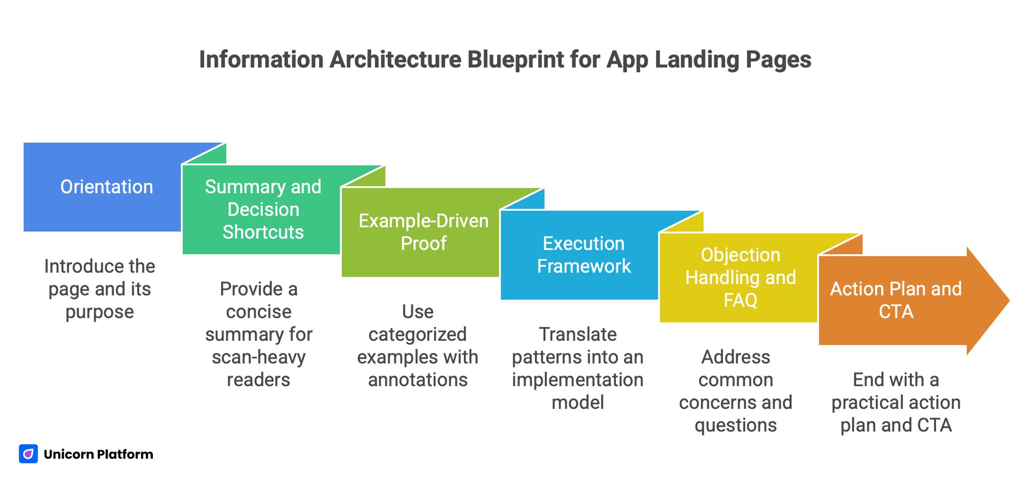
A strong article and app landing flow should map structure to user decisions. The blueprint below is designed for mixed-intent traffic while maintaining conversion focus.
Module 1: Orientation
Begin with headline, subheadline, and a one-screen explanation of who the page is for and what outcome it creates. Include one trust cue and one primary CTA. Keep visual hierarchy clean and avoid decorative distractions.
This module is not for exhaustive explanation. It is for relevance confirmation.
Module 2: Summary and decision shortcuts
Provide a concise summary or key takeaways block for scan-heavy readers. This increases utility for users with limited time and supports AI extraction. The summary should contain practical statements, not abstract claims.
Module 3: Example-driven proof
Use categorized examples with short "why this works" annotations. Keep each example anchored to one conversion principle so readers can transfer insight to their own context. This section should feel like a playbook, not an inspiration gallery.
Module 4: Execution framework
Translate patterns into an implementation model with section-level jobs, message templates, and CTA logic. This is where readers should be able to copy a process, not just ideas. A practical execution section is often the difference between high time-on-page and actual conversion movement.
Module 5: Objection handling and FAQ
Address common concerns around complexity, timelines, proof quality, and measurement. Place this near the lower decision zone where hesitation typically rises. Clear answers reduce abandonment and repeated support friction.
Module 6: Action plan and CTA
End with a practical action plan and explicit next step. If your content does not direct action, it will underperform commercially even if it ranks. Use clear CTA language linked to realistic first-value outcomes.
Conversion Copy Frameworks for App Landing Pages
Below are reusable frameworks designed to support both content depth and conversion clarity.
Framework 1: Headline formula stack
Use three candidate headline angles per variant:
- Outcome-first: "Launch high-converting app pages in days, not weeks"
- Proof-first: "How app teams reduce launch friction with conversion-ready page systems"
- Audience-first: "For startup and SaaS teams that need faster app landing execution"
Then test one at a time with stable section structure.
Framework 2: Subheadline clarity filter
Every subheadline should pass this test:
- Is the audience explicit?
- Is the outcome explicit?
- Is the mechanism implied or stated?
- Is expected effort realistic?
If any answer is no, rewrite before publishing.
Framework 3: CTA ladder by intent stage
- Cold traffic CTA: "See the conversion blueprint"
- Warm traffic CTA: "Review app landing patterns by use case"
- Decision traffic CTA: "Start building your page in Unicorn Platform"
This ladder improves action quality because it matches confidence level.
Framework 4: Proof block templates
For each major claim, include:
- one quantified statement
- one role-specific quote or scenario
- one risk-reduction cue
This blend usually outperforms logo-only trust strips.
Framework 5: Objection mini-library
Pre-build short responses to recurring objections:
- "We do not have time"
- "We do not have design capacity"
- "We are unsure about conversion tracking"
- "We need mobile confidence"
Then place relevant answers where objections typically emerge.
Design and UX Rules That Support Creative Performance
Creative quality does not mean visual complexity. It means visual decisions that accelerate understanding.
Rule 1: One focal intent per screen
Each screen should have one dominant objective. If a section asks users to read details, watch a demo, compare plans, and sign up simultaneously, clarity drops. Keep visual hierarchy aligned with section job.
Rule 2: Motion with purpose
Use motion to explain interactions or transitions, not as ambient decoration. Motion that delays comprehension is expensive in conversion terms. If animation does not teach or reassure, remove or simplify it.
Rule 3: Contrast and readability discipline
Ensure body text, headings, and CTA labels are legible across devices and lighting conditions. Stylish low-contrast designs often fail in real usage contexts. Readability is a conversion feature, not a cosmetic detail.
Rule 4: Mobile-first QA before launch
Do not treat mobile checks as post-publish cleanup. Validate first-screen clarity, CTA visibility, form usability, and section spacing on mobile before shipping. If mobile is weak, overall performance usually suffers regardless of desktop quality. Google's Core Web Vitals framework has repeatedly highlighted how mobile experience directly impacts engagement and visibility.
Rule 5: Component consistency
Reusable component logic in Unicorn Platform should preserve brand coherence while enabling rapid iteration. Inconsistent component behavior creates hidden friction and reduces trust. Create a small component governance rule set and enforce it.
Measurement: What to Track So Improvements Compound
Without measurement discipline, page iterations become opinion cycles.
Primary metrics
- qualified conversion rate
- first-value completion rate
- form completion quality by source
- CTA click-to-completion ratio
Secondary diagnostics
- scroll depth by section
- time to first meaningful interaction
- section exit points
- device-level variance
Decision cadence
Run weekly diagnostic review and biweekly experiment decisions. Keep experiment scope narrow so causality remains interpretable.
Attribution hygiene
Track by traffic intent class where possible. A page can look successful on aggregate while failing for high-value cohorts. This is one reason pages with clear intent segmentation can outperform broad, generic pages.
A structured experiment cadence is critical. Research and case studies from platforms like CXL consistently show that controlled hypothesis testing outperforms random design iteration.
30-Day Implementation Plan in Unicorn Platform
This plan is built for teams with limited bandwidth that still need measurable progress.
Week 1: Foundation and architecture
Audit current page against the pattern list in this article. Identify the biggest gap in first-screen clarity, proof placement, and section purpose labeling. Build a revised structural draft in Unicorn Platform with clear module jobs and mobile-first spacing. By the end of week one, you should have one coherent primary variant with summary block, categorized example logic, and intentional CTA ladder.
Week 2: Message and proof hardening
Rewrite headline/subheadline pair for one audience-job focus. Replace weak generic claims with mechanism-backed statements and place proof immediately near each major claim. Add objection handling language where likely friction appears. During this week, also tighten form microcopy and remove any decorative section that does not support decision progression.
Week 3: Intent-stage varianting
Clone the primary page into two intent variants: one for colder educational traffic and one for warmer evaluation traffic. Keep structural backbone stable and vary message angle, proof emphasis, and CTA intensity. This gives better signal quality than testing random design changes.
Week 4: Experiment and governance
Run one major A/B hypothesis at a time, preferably around headline angle, proof ordering, or CTA ladder. Review both conversion volume and conversion quality. Document wins as reusable component and copy rules. By week four, you should have a repeatable process instead of one static redesign artifact.
Common Failure Modes and Fixes
Failure mode 1: Beautiful hero, weak narrative
If the hero is visually strong but semantically vague, conversion stalls. Fix this by rewriting top-stack copy around audience, outcome, and immediate next step. Then place one trust cue near the top promise.
Failure mode 2: Proof without relevance
Generic proof blocks do not persuade high-intent visitors. Replace with role-aligned examples and measurable outcomes tied to the claim above. Relevance is the key variable, not proof volume.
Failure mode 3: CTA overpopulation
Too many CTA types early in the page confuse intent. Keep one primary action and one optional low-friction secondary path. Add stronger CTA options only after trust has been earned.
Failure mode 4: Unstructured long content
Long content can rank and convert, but only if segmented cleanly. Add question headings, numbered sections, and clear section jobs. Structure creates usability at scale.
Failure mode 5: No update cadence
A strong page decays without refresh routines. Set a quarterly review for proof freshness, messaging relevance, and mobile QA. A live governance cadence protects long-term performance.
Applied Build Scenarios: Turning Patterns Into Real Pages
The fastest way to misuse inspiration is to read examples and then produce generic advice. To avoid that, this section converts pattern logic into concrete build scenarios you can run in Unicorn Platform. Each scenario includes the intent profile, the section sequence, the proof model, and the first test to run.
Scenario 1: Early-stage SaaS launching a new workflow product
For early-stage SaaS launches, the main risk is not low traffic. The main risk is that the page attracts curiosity but not qualified action because the mechanism is unclear. Start with a clear value statement tied to one pain point, then use a short three-step mechanism block to explain how work changes after adoption.
Your proof stack should begin with one quantified outcome claim, followed by one role-specific testimonial and one setup-friction answer. Keep the first CTA low-friction, such as a guided product walkthrough, and move stronger CTAs after the proof section. First test: compare mechanism-first hero against benefit-first hero while keeping everything else stable.
Scenario 2: AI app with trust-sensitive buyers
AI app pages often lose conversions because the promise sounds powerful but control boundaries are unclear. To fix this, add explicit language that shows where automation helps and where humans stay in control. This single change can reduce hesitation dramatically for teams with governance concerns.
Structure the page with a trust-first section immediately after the hero. Include an "AI output quality" block, a "human review" block, and a "risk mitigation" block. Use short, concrete examples instead of broad claims. First test: "faster outcomes" framing versus "controlled outcomes" framing by traffic source.
Scenario 3: B2B app selling into multiple departments
When one app serves marketing, product, and operations teams, broad messaging creates weak relevance for everyone. Build a primary path for one role and include role-switch modules for secondary visitors. In Unicorn Platform, this can be done with segmented cards and clear role labels without fragmenting the page into separate microsites.
In the proof section, align each role card with one business metric that role owns. Avoid the common mistake of using one generic testimonial for every segment. First test: role-selection module near top versus role modules in mid-page to measure where segmentation creates less friction.
Scenario 4: Consumer app with strong visual brand but weak trial rate
Consumer teams often build beautiful pages that under-convert because benefit claims are emotional but action pathways are vague. Keep visual identity strong, but tighten transition language between inspiration and action. Every visual block should answer "what this changes for me" and "what I do next."
Add one short comparison block showing current-state pain versus future-state benefit with the app. Then place CTA labels that set action expectations clearly. First test: "Start free" versus "Start and get first result in 10 minutes" for users entering from paid social campaigns.
Scenario 5: Marketplace app with two-sided audience
Two-sided marketplaces need careful narrative sequencing because one page is trying to reassure both supply and demand participants. The highest-performing approach is usually to select a primary audience in the top half and provide a clearly marked alternate path for the second audience below.
Use proof separately for each side. Supplier-side proof and buyer-side proof should not be mixed in one undifferentiated slider. In Unicorn Platform, duplicate proof modules and label them by audience to preserve clarity. First test: single blended narrative versus split-audience narrative with explicit path choice.
Scenario 6: App with high traffic but poor lead quality
This pattern appears often when the page is optimized for click-through but not qualification. Keep top-of-page momentum, but add qualification cues before strong commitment steps. Explain who gets the best fit and what implementation baseline is expected.
Do not make forms long by default. Instead, use progressive qualification so you can preserve completion while improving downstream quality. First test: low-friction top CTA with qualification in step two versus qualification embedded directly in primary form.
Scenario 7: Founder-led app with limited brand authority
When brand recognition is limited, trust comes from specificity and operational transparency. Use clear mechanism language, implementation expectations, and realistic timelines. Avoid inflated claims that cannot be supported with evidence.
In this scenario, structured educational depth becomes a trust asset. A long, clear page with practical frameworks can outperform shorter "brand" pages because it demonstrates competence. First test: founder-story-first page versus process-and-proof-first page for organic and referral traffic.
Scenario 8: Feature launch page for existing customer base
Feature launch pages fail when they read like release notes instead of decision pages. Existing customers still need to understand why the feature matters, how it affects their workflow, and how much effort activation requires.
Keep the top stack concise, then move into use-case blocks that map feature behavior to outcomes by role. Add a short activation checklist near CTA to reduce friction. First test: long technical explanation versus use-case-led explanation with activation checklist.
Scenario 9: App in a crowded category with little differentiation
Crowded categories punish vague positioning. If every option claims speed and simplicity, your page needs decision-grade differentiation anchored in use-case outcomes, not adjectives. Build a "why this approach" section that explains your mechanism difference in plain language.
Then reinforce with proof that supports that mechanism, not generic trust badges. First test: category-generic benefit framing versus mechanism-differentiation framing with matched proof cues.
Scenario 10: App targeting agencies and service providers
Agency buyers evaluate risk transfer, reliability, and client-facing confidence. Your page should reflect that by emphasizing repeatability, delivery predictability, and team-scale collaboration. General consumer-style persuasion is usually too soft for this audience.
Use scenario blocks: handoff quality, approval speed, and client reporting. Each block should include one metric and one implementation note. First test: "faster work" messaging versus "safer client delivery" messaging.
Scenario 11: No-code app builder audience
No-code traffic often includes motivated but cautious users. They want speed, but they also fear dead ends and rework. The page should acknowledge both and show a guided path from first build to publish confidence.
A practical sequence is: start speed claim, template guidance, integration clarity, and maintenance reassurance. If you discuss no-code strategy broadly, add context naturally by referencing adjacent execution paths such as building custom websites without coding where relevant to user goals. First test: template-first top stack versus use-case-first top stack.
Scenario 12: App that depends on integrations for value
When product value is integration-dependent, conversion drops if integration concerns are delayed until late in the page. Add integration readiness near the first mechanism explanation so technical blockers are answered early.
In Unicorn Platform, use a compact integration section with plain-language setup expectations and one "time to value" estimate. This reduces hidden uncertainty that often kills qualified conversions. First test: integrations section near top versus near bottom.
Editorial QA Workflow for Long-Form Competitive Pages
Long pages only win when they are edited with discipline. Without QA, deep pages become repetitive and noisy, which weakens both comprehension and conversions.
Stage 1: Structural QA
Check whether each H2 has a clear job and whether section order follows user intent progression. If two sections do the same job, merge them. If a section exists only for phrasing coverage and not for decision value, remove or rewrite it.
Also verify heading hierarchy consistency. Mixed heading logic creates scan friction and harms extraction quality for AI systems.
Stage 2: Message QA
Review top-stack language for audience specificity and outcome clarity. Then evaluate whether each major claim has nearby evidence. If claim-evidence distance is too large, move proof up or tighten claim language.
At this stage, rewrite weak transitions so each section flows into a logical next decision. Abrupt jumps reduce perceived coherence in long content.
Stage 3: Conversion QA
Audit CTA ladder by intent stage. Early CTA should be exploratory, mid CTA should be evaluative, and late CTA should be commitment-ready. If every CTA asks for the same commitment level, the page is not aligned with realistic confidence progression.
Check forms and microcopy for friction cues. Unanswered privacy, effort, or setup concerns can undercut strong messaging.
Stage 4: Answer-readiness QA
Confirm that key sections include concise answer-first blocks before detailed explanation. Add question-led headings where user intent is naturally phrased as a question. Keep definitions short and practical so they can be surfaced in AI answers without distortion.
Then verify internal link placement quality. Links should appear where readers genuinely need adjacent context, not in forced clusters.
Stage 5: Freshness and maintenance QA
Update dates, examples, and proof modules on a cadence. Stale proof cues can silently reduce trust and lower performance over time. Long-form pages should be treated as maintained assets, not one-time publications.
In practical terms, assign one owner for message relevance, one for proof freshness, and one for release QA. This ownership clarity prevents gradual quality decay.
FAQ: Unique and Creative App Landing Pages in 2026
What makes an app landing page "unique" without hurting conversions?
A page is meaningfully unique when creative choices improve understanding and confidence faster than generic templates do. Unique does not mean unusual for its own sake. It means your messaging, proof, and structure clearly reflect your product category, audience priorities, and decision friction points. In practice, the safest way to stay unique without sacrificing performance is to keep core conversion architecture stable and customize brand expression, proof narrative, and use-case framing.
How long should an app landing article or guide be if similar pages are very long?
Use category depth as a benchmark, not an arbitrary fixed number. In this group, one strong benchmark sits around 7,000 words, with deeper outliers above 10,000. You do not need to match the longest page exactly, but you do need enough depth to cover intent comprehensively.
The key is useful depth. Expand with examples, frameworks, and implementation details, not filler paragraphs.
Should we copy the same heading structure as other leading pages?
No. Copying structure too closely creates originality and quality risks. You should borrow logic, not templates. For example, adopting summary-first blocks, question-led sections, and categorized examples is smart. Reproducing exact sequence and phrasing is not. Transformed originality with equivalent utility is the right standard.
Do listicles really help for app landing topics?
They help when they set clear expectations and organize depth effectively. Numeric framing can improve click qualification and scanning behavior because readers know what kind of depth they are entering.
However, list format alone is not enough. Each item must include practical interpretation and application guidance.
How should internal links be handled for best user experience?
Internal links should be embedded exactly where the reader needs deeper context, inside complete sentences. Link dumps at the bottom or in isolated "resources" blocks are weaker for user flow and can feel manipulative. When link placement follows decision context, both user experience and topical reinforcement improve.
What is the most important above-the-fold rule for app landing pages?
The first screen must immediately communicate audience fit, outcome promise, and next action. If users need to scroll to understand what the product does for them, the first-screen stack needs revision. Strong first-screen clarity consistently improves downstream engagement and action quality.
How many examples should we include in a competitive guide?
There is no universal number, but breadth should match intent complexity. For a competitive topic like this, using dozens of categorized examples can be valuable if each one includes a clear why/how interpretation. A shorter example count can still work if analysis quality is high and categories map to real buyer intents.
How do we balance discoverability, answer clarity, and conversion focus?
They should be handled as one system. Use clear structure for indexing and extraction, direct answers for AI surfaces, and conversion architecture for action. The same section can satisfy all three if it is written with purpose. Pages fail when teams separate these goals into disconnected content tasks.
What should we test first if we only have bandwidth for one experiment?
Start with first-screen message stack experiments. Test one headline/subheadline angle with stable structure and existing proof placement. This usually gives faster signal than deep design overhauls. Once message fit improves, test proof order and CTA ladder next.
How frequently should we refresh high-performing app landing pages?
At minimum, run quarterly refresh cycles for proof freshness, relevance updates, and mobile QA. If your product category changes quickly, monthly mini-refreshes on proof and objection content can be justified. The objective is to keep the page operationally current, not to redesign constantly.
Can Unicorn Platform support serious optimization or only quick publishing?
It can support serious optimization if you use it as an experimentation workflow, not just a page builder. With reusable components, intent-based variants, and disciplined measurement, teams can iterate quickly while keeping structure coherent.
The tool is not the ceiling. Execution rigor is.
Final Takeaway
If you want to outrank and out-convert pages in this group, do not chase novelty as a design aesthetic. Build an intentional system where structure, proof, and messaging are aligned to real user decisions. That is what top performers do consistently, whether they present 13 examples, 40 examples, or 75 ideas.
A unique and creative app landing strategy wins when creativity reduces cognitive load, content depth matches intent, and conversion pathways are explicit. With Unicorn Platform, you can operationalize this through reusable modules, intent-stage variants, and a clean publish-test cadence.
Use this page as a growth asset, not a campaign artifact. Keep it current, keep it structured, and keep every section accountable to one question: does this help the right visitor make the right next decision faster.# Markdown syntax guide