Table of Contents
- How to Choose the Right Palette for Your Startup
- Applying Color Theory Without Overcomplication
- Common Palette Mistakes Startup Teams Make
- A 4-Week Palette Implementation Plan
- Advanced Color Workflow for Scaling Teams
- FAQ
Color decisions influence how fast users understand your message, how trustworthy your brand feels, and whether key actions stand out at the right moments. For startup websites, that impact is amplified because attention windows are short and first impressions often decide conversion quality.
Minimalist palette strategy is not about making a site look plain. It is about reducing visual noise so your message, product value, and calls to action are easier to process. Done well, it improves clarity, consistency, and design speed across landing pages, blog content, and product pages.
This guide gives you a practical system for selecting and applying minimalist palettes in Unicorn Platform. You will get ten startup-ready palette directions, decision frameworks, accessibility guardrails, and implementation steps that keep your design clean without feeling generic.
Key Takeaways
Choose And Implement A Brand Color Palette
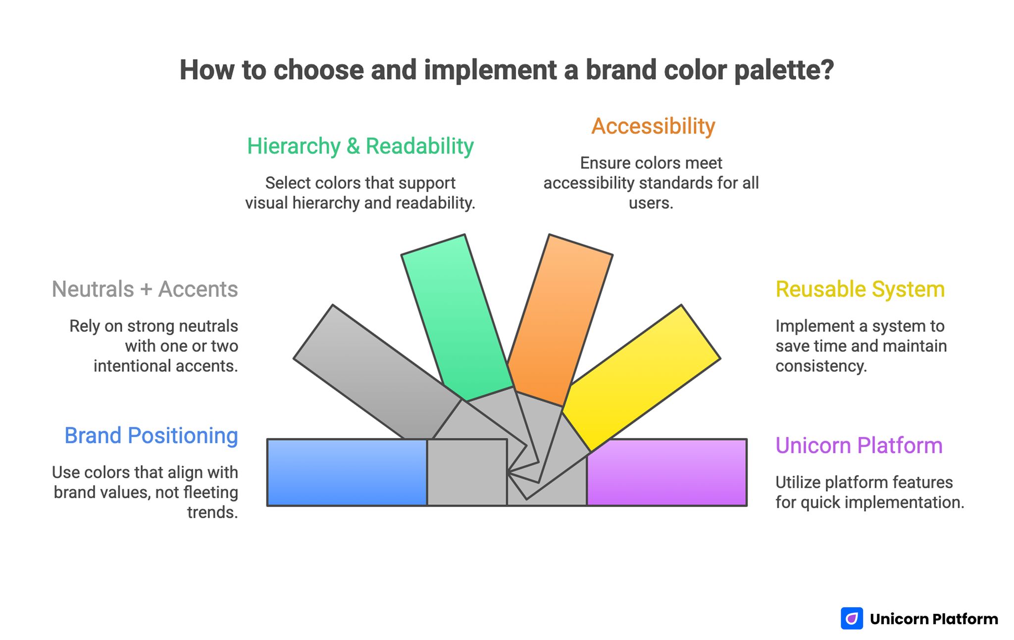
- Minimalist palettes improve clarity when they are tied to brand positioning, not trends.
- The best startup palettes typically rely on strong neutrals plus one or two intentional accents.
- Color choices should support hierarchy, readability, and conversion behavior.
- Accessibility checks are mandatory for text, buttons, and interactive states.
- A reusable color system saves design time and keeps multi-page websites consistent.
- Unicorn Platform users can implement palette systems quickly with reusable section patterns and disciplined style rules.
What Minimalist Color Strategy Actually Means
A minimalist palette is a constrained set of colors that creates visual order. In practical terms, most startup sites can perform well with one primary brand color, one accent color, and a neutral scale for backgrounds, text, and UI surfaces.
This constraint is useful because it forces better decisions. Instead of adding color whenever a section feels empty, you define a hierarchy where color has a clear job: orientation, emphasis, status, or action.
Minimalism in color does not mean low personality. It means your personality comes from deliberate choices rather than uncontrolled variation.
Core principles
A strong minimalist palette is built on three principles.
- Simplicity: limited colors with clear roles.
- Harmony: colors that feel coherent together.
- Balance: enough contrast between surfaces, text, and action elements.
When one principle is missing, the site may still look attractive in static previews but can fail in real browsing conditions.
Why startups benefit more from minimalist systems
Startups usually iterate quickly, publish pages often, and operate with lean design bandwidth. A constrained palette reduces decision fatigue and makes every new section easier to ship.
It also improves consistency across marketing channels. When your page visuals, email headers, social assets, and product screenshots share a controlled color language, brand recognition grows faster.
How to Choose the Right Palette for Your Startup
Startup Color Palette Selection
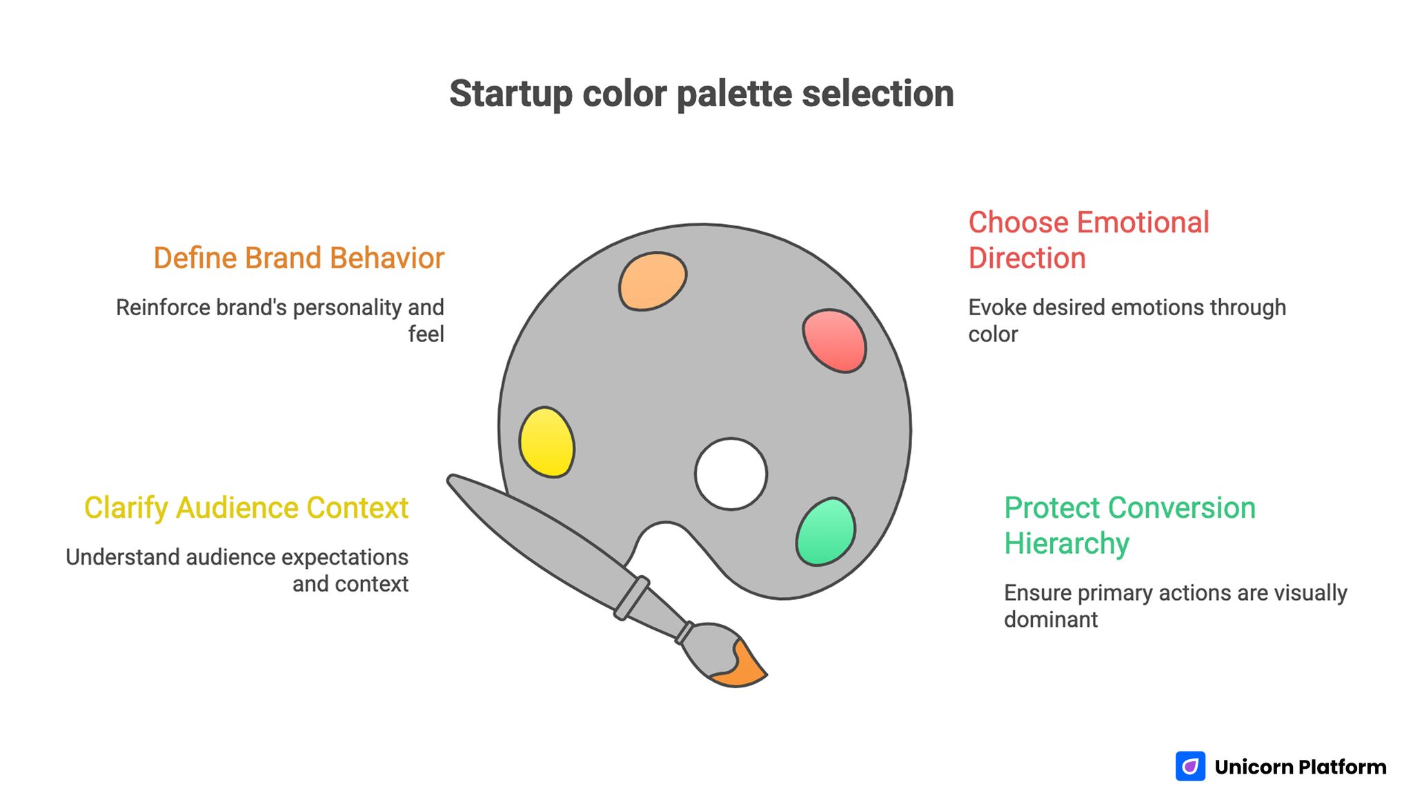
Before selecting colors, align on positioning. Your palette should communicate what your brand promises and who it serves.
A fast decision framework:
- Define your audience context.
- Define your brand behavior.
- Define your desired emotional response.
- Define your conversion priorities.
This keeps color strategy connected to business outcomes instead of visual preference alone.
Step 1: Clarify audience context
Ask where your audience sees your site and what they are trying to accomplish. A founder evaluating B2B tools on desktop has different expectations from a consumer discovering a wellness app on mobile.
Audience context influences contrast needs, visual energy, and the acceptable level of experimentation.
Step 2: Define brand behavior
Your brand behavior is how the product feels in use. Is it calm and dependable, bold and fast-moving, premium and precise, or playful and expressive?
Color should reinforce this behavior. If behavior and palette conflict, trust signals weaken.
Step 3: Choose emotional direction carefully
Colors influence perception, but meaning is context-dependent. Instead of relying on generic color psychology rules, test whether your palette supports the emotions that matter for your offer: confidence, relief, speed, clarity, or excitement.
Use emotion as validation, not as your only selection method.
Step 4: Protect conversion hierarchy
Your primary action elements should remain visually dominant across every page template. If accent colors are overused, button contrast loses impact and conversion attention drops.
Define which color is reserved for primary calls to action and keep that rule consistent.
10 Minimalist Palette Directions for Startup Websites
Each direction below includes visual character, ideal use cases, and implementation guidance. Treat these as strategic templates you can adapt.
1. Nature Neutrals
Nature Neutrals combine warm stone, muted green, and soft blue-gray tones. This direction feels grounded, calm, and trustworthy.
Suggested base set:
- Background: #F4F2ED
- Surface: #E6E2D7
- Primary text: #2E3A36
- Accent: #6A8C7A
- Secondary accent: #8AA7B1
Use this when your startup positioning emphasizes sustainability, balance, wellness, or low-friction experiences.
Implementation notes:
- Use muted green for buttons only if text contrast remains strong.
- Keep large blocks light and textured with whitespace, not gradients.
- Pair with clean typography so the palette does not feel rustic.
2. Bold Monochrome
Bold Monochrome uses one hue family across dark, mid, and light values. It creates a modern, confident look without introducing many color variables.
Suggested base set:
- Background: #F3F5FA
- Surface: #DCE2F2
- Primary: #4A67B8
- Dark contrast: #1F3263
- Highlight: #8DA3E0
This works well for SaaS products that want to signal focus, reliability, and technical clarity.
Implementation notes:
- Use dark variant for headings and key UI separators.
- Reserve the strongest blue for primary CTA and active states.
- Avoid adding unrelated accent colors unless necessary for status signals.
3. Pastel Signal
Pastel Signal blends soft tones with one defined action color. It feels approachable while preserving conversion focus.
Suggested base set:
- Background: #FFF8F7
- Surface: #F7EEF4
- Primary text: #3D2F39
- CTA accent: #E467A2
- Support accent: #A5B8E8
This direction is useful for creator tools, consumer apps, and education products where friendliness matters.
Implementation notes:
- Keep CTA color saturated enough to stand out against pastels.
- Use pastel blocks for section grouping, not for body text background overload.
- Validate contrast aggressively on smaller text.
4. Urban Chic
Urban Chic combines dark neutral infrastructure with high-energy accents. It is useful when the brand voice is expressive, innovative, or trend-aware.
Suggested base set:
- Background: #121416
- Surface: #1B2026
- Primary text: #E9EDF1
- Accent 1: #FF5A36
- Accent 2: #3CB6FF
This direction can work for media products, dev tools, and creative startups.
Implementation notes:
- Limit bright accents to actions and key highlights.
- Keep paragraph text high contrast for readability.
- Test dark-mode-like layouts on older displays and low brightness.
5. Minimal Luxe
Minimal Luxe uses soft neutrals with premium metallic-inspired accents. It communicates refinement and high-value positioning.
Suggested base set:
- Background: #FAF8F4
- Surface: #EFEAE1
- Text: #2F2A25
- Primary accent: #B08D57
- Deep accent: #5B4630
Ideal for high-ticket services, design agencies, and premium B2B offers.
Implementation notes:
- Keep accent usage sparse to preserve premium effect.
- Use generous spacing and restrained iconography.
- Avoid too many competing gradient or shadow effects.
6. Vibrant Duo
Vibrant Duo uses two contrasting strong colors supported by clean neutrals. This can produce high memorability when applied with discipline.
Suggested base set:
- Background: #F8FAFC
- Text: #1A2230
- Accent 1: #5E5BFF
- Accent 2: #FF6A5E
- Surface neutral: #E9EEF7
Useful for early-stage products that need distinct identity and energetic tone.
Implementation notes:
- Assign one accent to actions and the other to highlights.
- Avoid alternating both accents randomly in long pages.
- Keep form fields neutral so actions remain obvious.
7. Soft Gradient Minimal
Soft Gradient Minimal uses subtle transitions across adjacent hues while keeping text and UI structure neutral.
Suggested base set:
- Background gradient: #F4F8FF to #F9F5FF
- Surface: #FFFFFF
- Text: #273244
- Accent: #6F78FF
- Secondary: #8AA5D8
This direction fits products that want a calm but modern visual atmosphere.
Implementation notes:
- Keep gradients low-contrast and broad, not striped.
- Avoid placing long text directly on gradient transitions.
- Use solid surfaces for cards and forms.
8. Monochromatic Neutrals
Monochromatic Neutrals rely on value contrast instead of hue contrast. It gives strong editorial clarity and professional tone.
Suggested base set:
- Background: #F6F6F6
- Surface: #ECECEC
- Text primary: #202020
- Text secondary: #5A5A5A
- Accent: #3E3E3E
Great for B2B infrastructure, consulting, and knowledge-heavy pages.
Implementation notes:
- Use weight and spacing to create hierarchy, not extra colors.
- Add one restrained accent if you need clearer CTA distinction.
- Ensure link styles are obvious without relying only on hue.
9. Earth Tones Modernized
Earth Tones Modernized brings warm naturals into a cleaner digital framework. It is less rustic than traditional earthy palettes.
Suggested base set:
- Background: #F7F3EE
- Surface: #EDE5DA
- Text: #2C2A26
- Accent: #8A6D4C
- Support: #687B6D
Useful for brands emphasizing craftsmanship, sustainability, or thoughtful growth.
Implementation notes:
- Pair earth accents with minimal icon sets.
- Keep navigation and CTA elements structurally crisp.
- Avoid muddy mid-tones by checking contrast in real components.
10. Bold Contrast Minimal
Bold Contrast Minimal combines bright action colors with calm neutral infrastructure to create immediate scan priority.
Suggested base set:
- Background: #FFFFFF
- Surface: #F2F4F8
- Text: #141B26
- CTA accent: #FF4F3E
- Secondary accent: #2563FF
Works for startups that need clear CTA performance while maintaining clean layout structure.
Implementation notes:
- Reserve red-orange for primary action only.
- Use blue for links and supporting interaction states.
- Test form validation states so error and action colors are not confusing.
Applying Color Theory Without Overcomplication
Color theory is useful, but startup teams often over-index on complex systems they cannot maintain.
Use a practical version.
Build from role first, not hue first
Define roles before final colors:
- Background role.
- Surface role.
- Primary text role.
- Secondary text role.
- Primary action role.
- Feedback/status role.
Once roles are fixed, choose colors that satisfy contrast and brand behavior.
Use the 60-30-10 heuristic carefully
The 60-30-10 split can work as a starting point.
- 60 percent dominant neutral.
- 30 percent supporting neutral or secondary tone.
- 10 percent accent and action color.
Consider it directional guidance, not a hard law. Long-form editorial pages may need more neutral space and less accent use.
Protect color consistency across states
Your palette is incomplete if it defines only default colors. You also need hover, active, focus, disabled, and error states.
State inconsistency causes usability confusion even when static designs look polished.
Accessibility Rules You Cannot Skip
Accessible color choices are fundamental for usability, conversion, and trust. Minimalism is not accessible by default.
Prioritize text contrast
Body text should remain readable against all background surfaces. Headline styles, button labels, form helper text, and captions all need contrast checks.
When in doubt, increase contrast and reduce decorative color usage around text blocks.
Validate interactive elements
Buttons, links, tabs, and input states should be distinguishable without relying on color alone. Use underline, weight, icon, or border cues where needed.
This improves accessibility for users with color vision differences and supports faster scanning for all users.
Plan for status colors
Error, success, warning, and info states need dedicated colors that stay readable and semantically distinct from brand accents.
Do not overload your primary CTA color for warning states. State confusion increases form abandonment and support friction.
Test on real devices
Simulators are useful, but real devices reveal practical issues such as low brightness contrast loss and display calibration differences.
Test palette behavior on at least one older phone and one average laptop screen before finalizing.
How Color Choices Influence Conversion and UX
Palette quality affects conversion indirectly through clarity and confidence.
If your primary action blends into the page, users hesitate. If the page feels visually unstable, trust drops. If text is hard to read, bounce increases.
Create predictable visual hierarchy
Users should quickly identify:
- What the page is about.
- What matters most.
- What action to take next.
Color supports this flow when it is used predictably across sections.
Reduce cognitive load
Excessive color switching forces users to re-interpret section meaning repeatedly. Minimal palettes reduce this load and make page narrative easier to follow.
Lower cognitive friction can improve completion rates for forms, pricing exploration, and call-to-action clicks.
Improve perceived product quality
Consistent color systems signal design maturity. For startups, that can influence trust when users compare multiple products quickly.
A polished palette will not replace product value, but it can support first impression confidence.
Common Palette Mistakes Startup Teams Make
Mistake 1: Choosing colors from trend boards without brand fit
Fix: evaluate each palette against audience context and brand behavior before implementation.
Mistake 2: Using too many accents
Fix: limit to one primary action accent and one secondary highlight accent.
Mistake 3: Ignoring accessibility until late stage
Fix: run contrast checks during palette selection, not after page production.
Mistake 4: No state color definitions
Fix: define hover, active, disabled, and status styles at system level from day one.
Mistake 5: Different pages using different color logic
Fix: create a shared palette token sheet and enforce it across templates.
Mistake 6: Overusing gradients and colored backgrounds
Fix: keep backgrounds quiet and let spacing, typography, and layout carry structure.
Mistake 7: Low contrast text on tinted surfaces
Fix: use stronger text values and simplify tinted sections where readability suffers.
How to Apply This in Unicorn Platform
Unicorn Platform users can turn palette strategy into a repeatable implementation workflow instead of one-off design experiments.
Start by defining a compact color system with named roles:
- bg-primary
- bg-surface
- text-primary
- text-secondary
- action-primary
- action-secondary
- status-error
- status-success
Keep this system documented in your project notes and use it for every new page section.
Build one master page as your palette reference
Create one internal reference page in Unicorn Platform with all core section types:
- Hero block.
- Feature cards.
- Pricing table.
- Testimonials.
- FAQ.
- Form block.
Apply your palette once and use this page to verify visual consistency before rolling changes across live pages.
Use section-level rules for CTA clarity
In each section, confirm the primary action style is visually dominant. If two buttons appear together, keep hierarchy clear by using filled and outline variants with consistent color roles.
This prevents conversion ambiguity on long landing pages.
Run a mobile pass before publishing
Preview each updated section on mobile. Check heading readability, button visibility, form field contrast, and link distinction.
If a color looks good on desktop but fails on mobile, adjust quickly before distribution campaigns start.
Maintain update discipline
When your brand evolves, update palette tokens centrally first, then propagate changes to sections. Avoid manual per-section color edits that create drift over time.
For teams publishing frequently, this discipline saves substantial rework.
Connect palette choices to content performance
Color decisions should be evaluated with behavioral data. Track CTA clicks, scroll depth, and form completion before and after major palette changes.
Use this feedback to refine emphasis choices, not to chase arbitrary style changes.
If you need a fast draft layout to test palette directions quickly, the Unicorn Platform guide on how to generate a landing page with AI in minutes can speed up initial structure work before final visual tuning.
A 4-Week Palette Implementation Plan
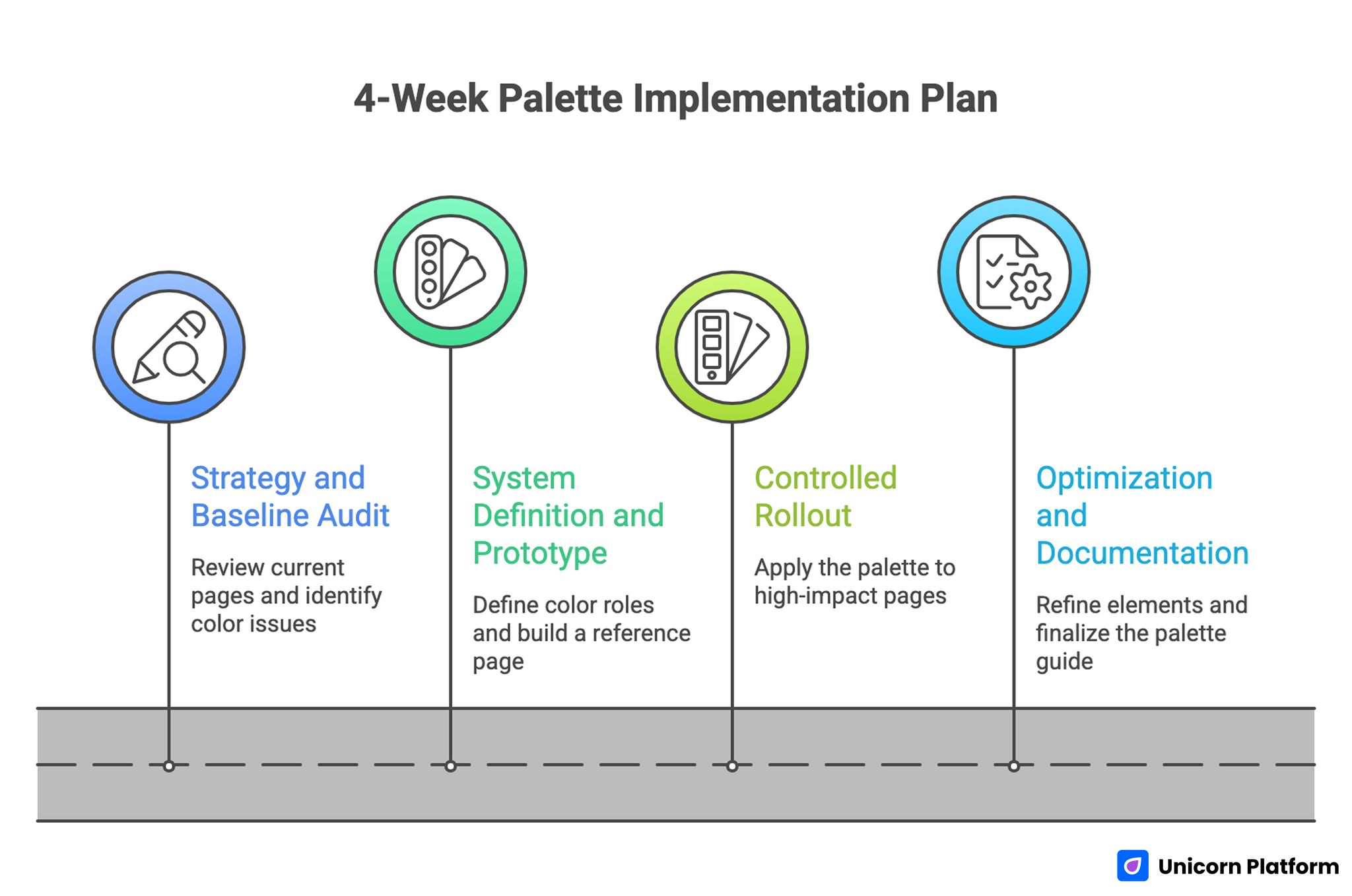
A 4-Week Palette Implementation Plan
Week 1: Strategy and baseline audit
Review current pages and identify color inconsistencies, contrast risks, and CTA visibility problems. Define brand behavior and audience context.
Choose one candidate palette direction and one fallback option.
Week 2: System definition and prototype
Define color roles, interaction states, and status colors. Build a reference page and apply the full system to core sections.
Run accessibility checks and initial team review.
Week 3: Controlled rollout
Apply the palette to highest-impact pages first: homepage, main landing page, and pricing or signup flow.
Measure baseline metrics before and after rollout.
Week 4: Optimization and documentation
Refine low-performing elements, adjust contrast where needed, and finalize the shared palette guide.
Archive decisions so future pages start from the same system.
Advanced Color Workflow for Scaling Teams
As your startup grows, palette governance becomes more important than palette selection.
Create a simple design token reference
Even without a full design system toolchain, maintain a plain token map with hex values, usage rules, and state mapping.
This reduces alignment time between design, marketing, and product contributors.
Define "no-go" rules
No-go rules prevent drift. Examples:
- No new accent colors without explicit review.
- No tinted paragraph backgrounds below readability thresholds.
- No component published without state checks.
Rules like these preserve quality at speed.
Use periodic visual QA
Schedule monthly visual QA on core templates. Look for contrast regressions, inconsistent button hierarchy, and accidental color overrides.
Small issues compound quickly when left unreviewed.
Align color system with brand updates
When rebranding or repositioning, update the system in phases. Start with high-traffic pages, then move to long-tail pages and blog templates.
Phased rollout reduces disruption and helps you monitor impact.
Component-Level Color Mapping for Better Conversion Clarity
Many palette guides fail because they stop at color swatches. Startup teams need component-level mapping so choices stay consistent while pages evolve.
Hero sections
Hero blocks usually define first impression confidence. Use a calm background, high-contrast heading, and one clearly dominant action color.
If your hero includes two CTAs, assign a fixed hierarchy: primary filled button and secondary outline or text button. Do not alternate this logic across pages, because inconsistency weakens user response patterns.
Navigation and header states
Navigation colors should prioritize readability and orientation. Keep top-level links and hover states distinct, but avoid overly bright hover effects that compete with main CTA colors.
Sticky headers need special attention. As users scroll across mixed sections, ensure header backgrounds and text remain readable across all states.
Feature card grids
Feature sections can become visually noisy when each card gets a different color tint. In minimalist systems, use one card surface color and reserve accent color for icons, tags, or key metrics.
This keeps scanning predictable and helps users compare features faster.
Pricing sections
Pricing is where color hierarchy often breaks. Teams highlight too many plan cards and lose decision clarity.
Use one strong highlight for the recommended plan and keep other plans neutral. Button colors should reinforce that hierarchy while staying accessible.
Forms and lead capture blocks
Forms need strong contrast and clear interaction feedback. Define color roles for default, focus, success, and error states before launch.
Avoid very light placeholder text and low-contrast borders. Form readability problems reduce completion rate more than most teams expect.
Social proof and testimonials
Testimonial sections work best with restrained backgrounds and clear text contrast. Color should support credibility, not dominate attention.
If avatars or logos bring many colors into the section, keep surrounding surfaces neutral so the layout still feels cohesive.
Palette Selection by Startup Category
Not every startup needs the same visual tone. The categories below help you choose a palette direction that matches user expectations.
B2B SaaS and internal tools
B2B users often prioritize clarity, reliability, and speed of understanding. Monochrome or neutral-led palettes usually perform well, with one clear action accent.
Strong text contrast and restrained surfaces are especially important for feature-heavy pages.
AI and developer products
AI and dev audiences tend to accept bolder visual cues, but clarity still matters. Dark-neutral systems with one or two sharp accents can work if interaction hierarchy remains disciplined.
Avoid using multiple saturated accents for equivalent actions, because this reduces decision confidence.
Wellness, education, and creator-focused products
Approachable palettes with gentle tones often support trust and emotional comfort in these categories. Pastel-adjacent systems can work well when anchored with strong text values and clear CTA contrast.
For educational products, readable typography and stable section backgrounds should take priority over decorative gradients.
Premium consulting and high-ticket services
Premium positioning benefits from restrained palettes, wide spacing, and carefully limited accent usage. Minimal Luxe directions can perform well when messaging and visuals both convey confidence and depth.
Overly bright accents can undermine premium tone unless used very intentionally.
Ecommerce-adjacent startup pages
If your startup includes product visuals or catalog elements, neutral backgrounds help product imagery stand out naturally. Use accent colors for promotional badges and checkout actions, not for every content block.
Consistency between landing pages and checkout flows is critical for conversion trust.
Advanced Color Workflow for Scaling Teams
Accessibility work is often postponed because teams think it requires complex tooling. A lightweight process is enough for early-stage teams.
Step 1: Check key text pairs first
Start with these combinations:
- Body text on main background.
- Body text on card surfaces.
- CTA text on button fill.
- Link text in paragraph context.
- Form labels and helper text.
If these pass, the majority of usability issues are already reduced.
Step 2: Validate interaction states
Test hover, focus, active, and disabled states for all interactive elements. Focus states are especially important for keyboard users and overall usability.
Focus visibility should be obvious without relying only on subtle border shifts.
Step 3: Run quick real-content checks
Use actual content length rather than placeholder text. Real headlines, long labels, and mixed-language snippets can expose contrast and spacing issues that mock text hides.
Step 4: Test under imperfect conditions
Test your pages at lower screen brightness and outdoors if possible. Real-world conditions often reduce perceived contrast more than design previews suggest.
Step 5: Document decisions
When you adjust a color for accessibility reasons, document why. This prevents future overrides that reintroduce the same problem.
A Startup-Friendly Color Audit Checklist
Run this checklist before major launches or campaign pushes.
Strategy audit
- Does the palette reflect current brand positioning?
- Is color hierarchy aligned with business priorities?
- Are primary actions visually consistent across core pages?
UI audit
- Are buttons, links, and form states consistent?
- Do card and section backgrounds maintain readable contrast?
- Are status colors semantically clear and distinct?
Content audit
- Do long-form pages remain easy to scan?
- Are highlights used sparingly and intentionally?
- Are blog templates aligned with landing page palette logic?
Performance audit
- Do palette choices support CTA click visibility?
- Has form completion changed after style updates?
- Are bounce patterns stable on key entry pages?
This audit helps teams connect visual choices to practical outcomes instead of subjective debates.
Building a Reusable Palette Library in Unicorn Platform
A reusable palette library saves time when you publish frequently. Instead of re-deciding styles per page, you rely on pre-approved combinations.
Define approved combinations
Create a short list of approved combinations, such as:
- Light background + dark text + primary action color.
- Muted section background + standard text + secondary action color.
- Dark section background + inverted text + constrained accent highlights.
Keep combinations simple so non-design contributors can apply them correctly.
Pair combinations with section purpose
Map each combination to section types:
- Hero sections use combination A.
- Feature grids use combination B.
- CTA strips use combination C.
This mapping prevents accidental visual drift and speeds page assembly.
Add review gates before publish
Before publishing, run a two-minute review:
- Is this section using an approved combination?
- Is CTA hierarchy still clear?
- Is readability preserved on mobile?
Short review gates reduce regressions without slowing output.
Maintain one style owner
Even with shared contribution, one person should approve palette changes. Central ownership keeps your visual system coherent and prevents inconsistent experiments from reaching production pages.
FAQ: 10 Minimalist Color Palettes for Startup Websites
1. How many colors should a startup website use?
Most startup websites perform well with one primary, one secondary accent, and a neutral scale. Keep the system tight and purposeful.
2. Are minimalist palettes only for B2B products?
No. They work for B2B and B2C when the palette supports brand behavior and user expectations.
3. Should I pick colors based on other market palettes?
Use adjacent market examples for context, not copying. Your palette should reflect your own positioning and conversion priorities.
4. Can I use bright colors in a minimalist design?
Yes, if bright colors are limited to clear roles such as CTA emphasis or key highlights.
5. What is more important: aesthetics or accessibility?
Accessibility comes first. A beautiful palette that reduces readability harms user experience and performance.
6. Do I need different palettes for desktop and mobile?
Usually no. Use one system, but validate contrast and emphasis on mobile where visual density is higher.
7. How often should I change my website palette?
Only when strategy changes or performance evidence justifies updates. Frequent cosmetic changes can confuse returning users.
8. Should every section have a different background color?
Not usually. Too many background variations increase cognitive load. Use spacing and typography for structure first.
9. How do I know if CTA color is working?
Track click-through and completion behavior before and after style updates. Pair metric changes with session reviews where possible.
10. What is the biggest color mistake early-stage teams make?
Adding color without defined role logic. That creates inconsistency, weak hierarchy, and harder future scaling.
Final Takeaway
A strong minimalist palette is a strategic asset for startup websites. It improves clarity, supports trust, and keeps your message-action flow easier to navigate.
The highest return comes from combining constrained color roles, accessibility discipline, and repeatable implementation workflows in Unicorn Platform.
Choose your direction, define your rules, apply consistently, and iterate based on user behavior instead of visual guesswork.


